
X

modue
Year
2025-2026
Client
modue
Timeframe
5 weeks
modue came to us with a strong product, growing interest and a clear ambition for launch — but the store itself wasn’t making the buying decision as easy as it should. The experience felt too complex, the pre-order model wasn’t explained clearly enough, and the overall design lacked the consistency the product deserved.
Our goal was to redesign the entire ecommerce experience around clarity, faster decision-making and a more coherent visual system — so the site could better explain the product, guide users toward the right setup and support stronger conversion.
The challenge
The biggest issue wasn’t the product. It was the path to purchase.
Users were landing on the site and being asked to understand too much, too early. Instead of being guided toward the right setup, they had to figure out the product logic, the pre-order model and the buying options on their own. That created friction and made the whole experience feel more confusing than it needed to be.
At the same time, the store relied on a paid configurator, which added unnecessary cost and complexity. Visually, the site also felt inconsistent — different sections didn’t fully belong to the same system, which weakened clarity and made the experience feel less polished than the product itself.
This wasn’t the first time we had seen this kind of problem. In Funzy, the issue was also strong traffic combined with a weak path to action, while in Brandive the challenge was turning scattered communication into one clear conversion-focused flow. The pattern was similar here too: the product had potential, but the experience around it made the decision harder than it should have been.

The solution
We rebuilt the store around two clear buying paths.
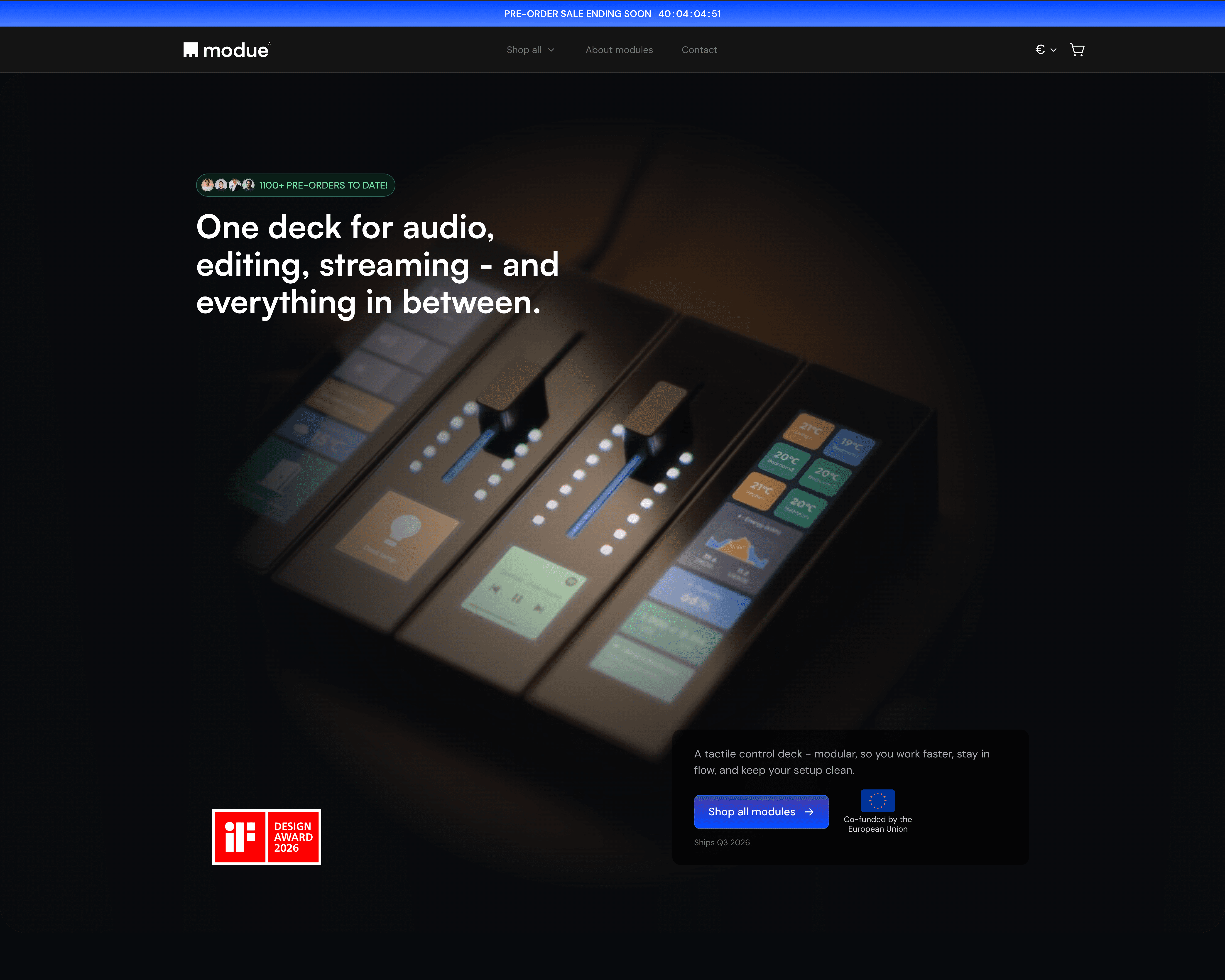
The first one was designed for speed: ready-made bestselling sets placed high on the page, so users could quickly choose a setup that matches their use case without having to build everything from scratch. Whether someone is a gamer, streamer, music producer or content creator, the decision now starts from an easier and more guided place.
The second path was designed for flexibility: a “Build your own setup” journey that lets users browse all modules and create their own configuration directly inside the store. This allowed modue to move away from the previous paid configurator and replace it with a cleaner, more scalable buying flow built into the ecommerce experience itself.
Beyond the core journey, we also reworked the supporting structure of the page: clearer feature presentation, stronger segmentation by user type, a more understandable pre-order explanation, new FAQ, testimonials and a stronger final CTA. At the same time, we unified the visual language of the site so every section finally felt like part of one coherent system.

What we delivered
A full ecommerce redesign and implementation focused on clarity, conversion and a more scalable purchase flow.
This included:
a new store structure and wireframe plan for the entire buying journey
a complete visual redesign aligned with the quality and positioning of the product
a faster purchase path built around bestselling sets
a new “Build your own setup” flow that reduced reliance on the paid configurator
a redesigned cart experience with built-in pre-order discount logic
a progress bar mechanism showing how much is left to unlock the next discount tier
new supporting sections such as a feature bento grid, personas slider, testimonials, pre-order explanation, FAQ and final CTA
We also translated the existing business logic into a more intuitive shopping experience. The cart now supports tiered pre-order discounts, with clear progress messaging designed to encourage higher order value instead of leaving users to figure it out on their own.


Final effect
The result is a store that finally feels aligned with the product behind it.
Instead of forcing users into a fragmented and overly complex buying process, modue now gives them two clearer ways to buy: choose a setup fast or build one from scratch. The experience is easier to understand, the pre-order model is communicated much more clearly, and the entire store feels more polished, more intentional and more ready to support growth.
Just as importantly, the new setup supports the business beyond aesthetics. It reduces unnecessary friction, removes dependence on the previous paid configurator, introduces stronger AOV mechanics inside the cart and gives the brand a much more solid foundation for turning traffic into actual orders.
If you’re dealing with a similar issue — strong product, decent traffic, but a buying flow that still underperforms — start with our 48h Audit. The same kind of conversion blockers tends to show up again and again, even in very different projects.


