X

Wall Pix
Year
2024
Client
Wall Pix
Timeframe
3 weeks
Wall Pix came to us with a service that was visually striking, highly differentiated and still unfamiliar to many potential clients.
Their offer — large-scale graphics printed directly on walls — had real commercial potential, but the website needed to do much more than just look good. It had to explain what wall printing actually is, show why it is worth choosing over more traditional solutions, and turn that curiosity into qualified conversations with businesses looking for a custom interior or branded space solution.
The challenge
The biggest challenge was not traffic. It was understanding and trust.
Wall printing is not yet a service that most business owners instantly understand. That meant the page had to educate first, but without feeling heavy or overexplained. People needed to quickly understand what the service is, how it works, why it is worth considering and what kind of effect they can expect in their space.
At the same time, the website also had to position Wall Pix as a serious partner for higher-value commercial projects. On the current Ravelink case page, this challenge is framed around a weak existing presence, buried proof of expertise and an unclear path from interest to contact — which led to lower-quality briefs and a slower path to first conversation.
A similar clarity challenge appeared in Tomicki Consulting, where the main task was to explain an offer that users did not immediately understand, while in Brandive the focus was on making the path from interest to action much more deliberate and conversion-focused.

The solution
We built the Wall Pix website around one core idea: make the service easy to understand and easy to act on.
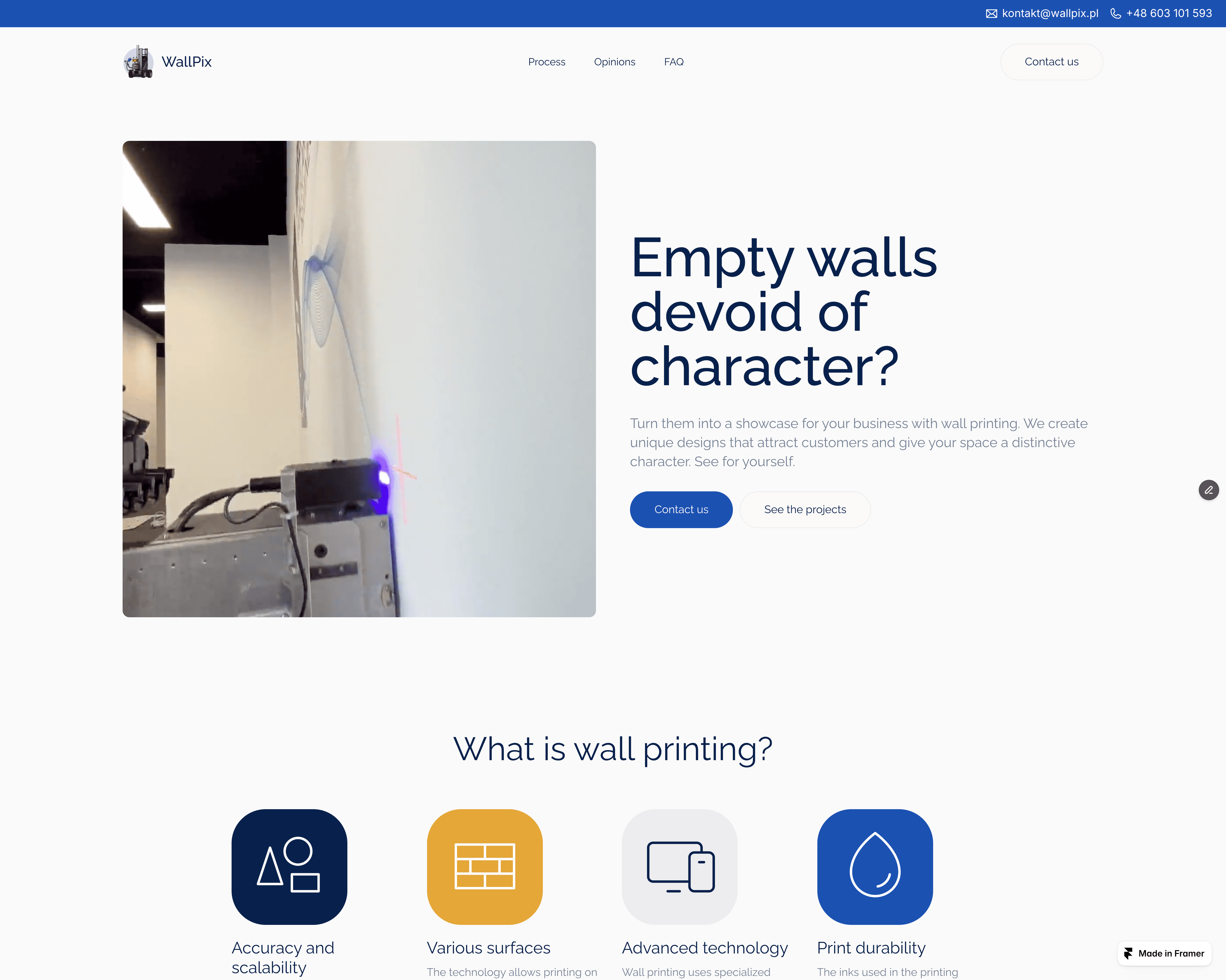
The page starts by reframing the problem from the client’s perspective — empty, characterless walls — and immediately connects it to a visually distinctive business outcome. From there, the structure moves into education: what wall printing is, how the technology works, what kinds of surfaces it supports and why it can be a better option than more traditional decorative solutions. Those sections are all visible on the live site today through the hero, “Czym jest druk ścienny?” and “Dlaczego druk ścienny?” blocks.
To build trust, we also supported the page with examples, social proof, client opinions, FAQ and a clear contact path. The current live site includes testimonials, process navigation, realizations and a direct contact CTA, while the Ravelink case study highlights that the entire site was rebuilt specifically to turn briefs into calls, with clearer CTAs and stronger proof placement.
This is also what makes the project similar to Funzy in one important way: both pages had to take a service or product that needed explanation and structure it around a much clearer conversion path.

What we delivered
A conversion-focused website designed to explain the Wall Pix offer clearly and generate more qualified inquiries.
This included:
a hero section built around the business value of wall printing
an educational structure explaining what wall printing is and how it works
sections focused on the advantages of the technology, including precision, speed and durability
a clearer explanation of the service process
proof-building sections with realizations and client opinions
FAQ content designed to reduce uncertainty and answer objections
a contact form and CTA flow focused on turning interest into real conversations
On the live site, this structure is already visible through the educational sections, process, opinions, FAQ and contact flow. The page also uses social proof such as the claim that 58 companies had trusted the business since May 2024.


Final effect
The result is a website that does much more than present a visually interesting service.
It explains the offer in a way that feels clear and accessible, strengthens trust through proof and process, and gives potential clients a much more direct route to contact. Instead of relying on novelty alone, the page now supports the commercial side of the business by helping visitors understand the value and move toward a real inquiry.
The public case study also confirms that the impact was not only visual. According to the current Wall Pix project page, qualified corporate briefs increased by around 2.3x, and the time from first contact to first call became significantly shorter.
If you’re dealing with a similar issue — your service may be strong, but the page still does not explain it clearly enough to convert — start with 48h Audit.


