Website Audit Checklist: Fix the Conversion Leaks Before You Spend More on Ads

@nadolconverts
Kacper Nadol

If your site isn’t converting, buying more traffic is usually the most expensive way to learn the same lesson. This checklist helps you find where users get confused, lose trust, or simply stop caring, then tells you what to fix first.
Quick scenario.
Someone launches ads. CPC looks fine. Traffic is coming in. Then they probably end up saying: “The ads don’t work.”
You launch a campaign. Clicks come in. CPC is acceptable. CTR is fine. Then someone says: “Ads are not working.”
So you open the landing page. And you see the usual pattern:
the headline sounds impressive but could belong to any company
the first screen has no proof, just a nice visual
the CTA is visible, but the next step feels risky or unclear
the form asks for too much too early
the page loads slowly on mobile, so half the visitors never even see the offer
None of this is “branding”. It is conversion leakage. And it adds up fast.
Here is a simple way to think about it. If you pay $2 per click and 1,000 people visit a page, that is $2,000 spent just to earn the right to convert them. If your page could convert at 2 percent but you are sitting at 0.8 percent, you are not “a little off”. You are losing more than half of the potential results from the same traffic.
This is why you audit first.
What a real audit does
A conversion audit is not “make it prettier”.
It answers two questions:
where are people dropping off, exactly
what should you fix first, if you want impact and not busywork
Most teams do the opposite. They polish what is visible and ignore what is decisive.
The 10-second test (do this first)
Open your homepage or landing page and try to answer out loud:
What do you do?
Who is it for?
Why should I trust you?
What is the next step?
If you cannot answer cleanly, you do not have a traffic problem. You have a clarity problem.
The checklist (with examples, not generic advice)
1) Clarity and messaging (the “do I get it?” layer)
The biggest leak is also the most boring one: vague copy.
You have seen it everywhere:
“Modern solutions for growing teams.”
“Everything you need to scale.”
“Data-driven growth.”
It looks professional, but it produces no picture in the reader’s head. No picture means no decision.
A useful headline does one thing. It creates immediate specificity. It tells the visitor what changes after they choose you.
Here are examples of how specificity changes the whole page:
vague: “Manage your workflow in one place”
specific: “Reduce handoff delays by keeping requests, approvals, and updates in one timeline”
vague: “Increase revenue with a better website”
specific: “Turn your product pages into decision pages with clearer comparisons, proof, and fewer steps to checkout”
What to check on your page:
your headline: can a competitor copy it word for word without lying?
your first paragraph: does it explain the outcome in plain language, or does it introduce your company?
your audience: do you say who this is for, or are you trying to be for everyone?
your first screen: does it make sense without scrolling?
Small fix that works surprisingly well:
Take your headline and add one constraint. Time, context, or audience.
“Get X” becomes “Get X for Y, without Z.”
2) Structure and flow (the “where do I look?” layer)
Most pages are not missing content. They are missing order.
People do not read websites like books. They scan. They look for proof. They want to know if you are real before they invest attention.
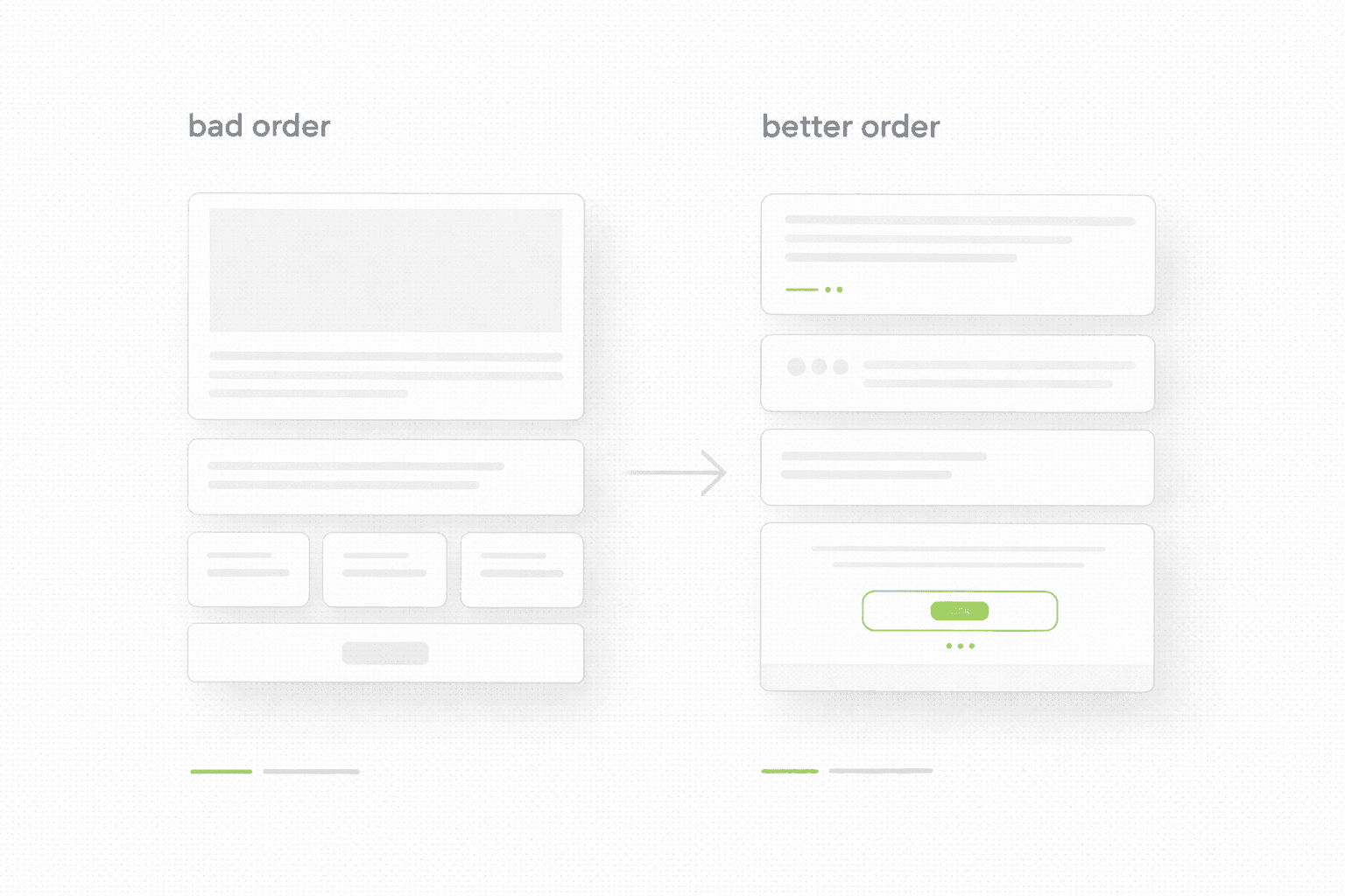
A common “bad order” looks like this:
a large hero visual
a long “about” section
a feature list
proof somewhere near the bottom
the CTA repeated, but never justified
A “better order” is boring, but it converts:
clear promise on the first screen
proof immediately after the promise, sometimes inside the first screen
short explanation of how it works
details only for people who want them
one clear next step
You can spot a structure problem fast. If your page forces a visitor to read for 30 seconds before seeing proof, you are asking for trust you have not earned yet.
3) Proof and trust (the “do I believe you?” layer)
If you claim you are “data-driven” or “the best”, but you show no proof, visitors will assume you are guessing. That is not cynicism. That is pattern recognition.
Proof can be simple. It just has to be real:
numbers: “Reduced support tickets by 18 percent after clarifying onboarding steps”
outcomes: “Cut time-to-first-value from 3 days to 30 minutes”
screenshots: a before/after of a page section
quotes: short lines that mention a specific result, not “great service”
comparisons: “Why choose us” that actually compares, not flatters
Weak proof looks like this:
“We deliver high-quality work.”
“Trusted by many clients.”
Real proof looks like this:
“After changing the pricing page structure, demo requests increased while sales calls got shorter.”
“After removing two steps from checkout, cart abandonment dropped.”
What to check:
does proof appear early, or is it hidden behind storytelling?
do you show examples, or do you only describe them?
do you reduce risk with clear next steps, timelines, and expectations?
4) Friction and forms (the “can I act easily?” layer)
Friction is not always bad. Sometimes it filters. But most pages add friction by accident.
Common leaks:
asking for too much too early
unclear next steps after the form
slow or clunky mobile experience
buttons that do not match intent, like “Get started” when the visitor is still evaluating
A practical rule:
The less trust you have earned on the page, the easier the next step must feel.
What to check:
is the first action low-risk, or does it feel like commitment?
do you explain what happens after someone clicks or submits?
does the page work smoothly on mobile, where most traffic will land?
5) Speed and UX basics (the silent conversion tax)
Speed is not a technical detail. It is a conversion tax.
If your page takes 4 seconds to load on mobile, many visitors never see your headline. It does not matter how good your copy is. They are gone.
What to check:
load time on mobile data, not your Wi-Fi
layout stability, no jumping while loading
image weight and compression
tap targets, text size, readability
You do not need a perfect score. You need a page that feels instant.
What to fix first (so you see results)
If you want a simple priority order:
first screen clarity: headline, first paragraph, next step
early proof: something real above the second scroll
friction: reduce unnecessary steps, make next step feel safe
speed basics: images, layout stability, mobile feel
polish last: aesthetics, micro-copy, animation
Most teams start from the bottom of that list. That is why they stay stuck.
If you want help applying this to your site
If you want a clean, prioritized fix list applied to your pages, not generic advice, start here.
Keep reading