Call to Action Examples: What Actually Makes a CTA Convert (Beyond Button Color)

@nadolconverts
Kacper Nadol
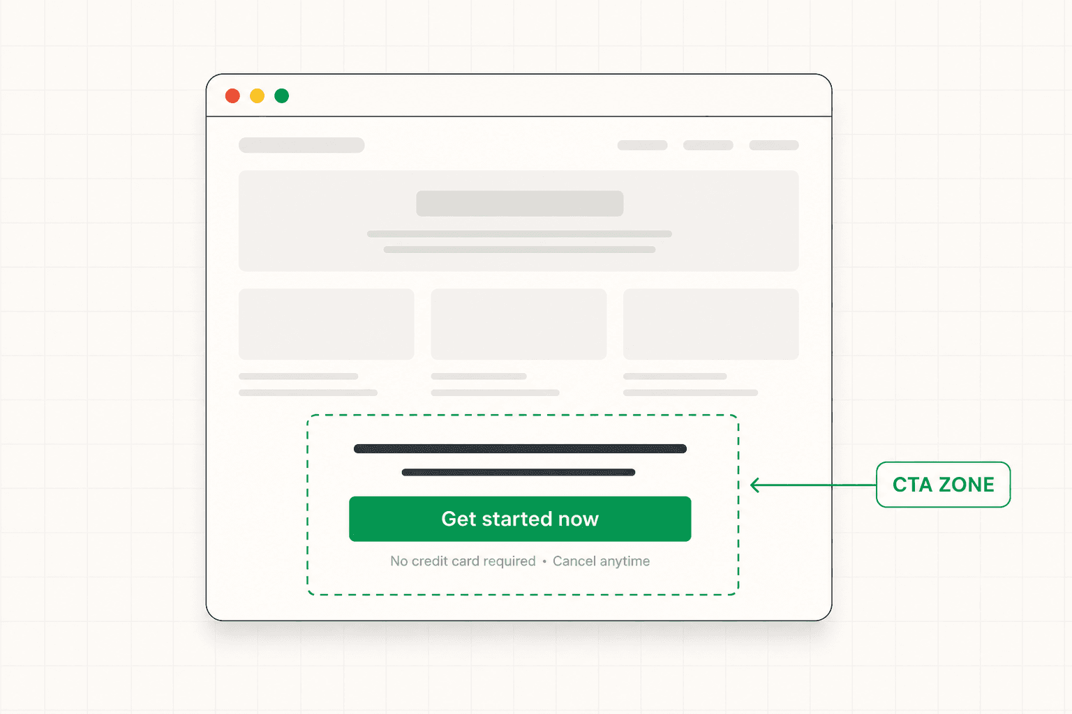
Most articles about CTAs show you twenty button screenshots and call it a guide. The real lesson is not in the words on the button. It is in what the CTA is asking for, where it sits in the page, and whether the surrounding copy is doing its job. This article breaks down what actually makes a CTA convert.
Why CTA Articles Are Usually Useless
Search "call to action examples" and you will find a hundred articles that all do the same thing. They show twenty or thirty screenshots of CTA buttons from well-known companies, add a single line of commentary under each one, and call it a lesson.
The problem is that the button is the smallest part of what makes a CTA work.
A button reading "Start your free trial" might convert at 8% on one page and 1.5% on another with the exact same wording. The difference is not in the button. It is in everything around it. Whether the page has built enough conviction by the time the visitor reaches that point. Whether the ask is proportionate to where the visitor realistically is in their decision process. Whether the copy immediately above and below the button is resolving the final hesitation. Whether the button is the obvious next step in a coherent argument, or a jarring interruption in a page that has not yet earned the right to ask for anything.
Copying the button copy from a high-converting page does not give you the conversion rate of that page. It gives you the same words doing entirely different work, often badly, because the context that made them work has not been recreated.
The useful version of this article is different. It breaks down what actually makes a CTA convert, with example wording where useful. But the wording is the surface. The decisions underneath are what produce the result.
The Three Decisions That Matter Most
Every effective CTA reflects three decisions made well. Most underperforming CTAs reflect at least one of those decisions made poorly or skipped entirely.
Decision one: what are you actually asking for?
This is the decision most teams treat as obvious and most often get wrong. The CTA is not "what we want the visitor to do." It is "what is realistic to ask of this specific visitor at this specific moment given everything that has happened on the page so far."
A "book a demo" CTA from a cold visitor who landed on the page thirty seconds ago is asking for a thirty-minute time commitment from someone who has not yet decided this is worth their attention. The CTA copy could be perfect and the button could be a beautiful color and the conversion rate would still be low, because the ask is mismatched to the moment.
The right ask depends on traffic temperature, product complexity, and the natural rhythm of the buying process. Cold paid traffic usually warrants a lower-commitment ask first. Warm referral traffic can handle a heavier ask. Sometimes the answer is offering two paths at once — a primary high-intent CTA for buyers who are ready, and a secondary lower-friction option for buyers who are interested but not yet ready.
Decision two: where in the page does the CTA appear?
A CTA above the fold works for visitors who arrived ready to act. A CTA at the end of the page works for visitors who needed the argument to build first. The right answer is almost always both — visible above the fold for the ready buyer, and a more developed CTA section at the end for the buyer who needed convincing.
The mistake is placing CTAs throughout the page without being intentional about why each one is there. Three CTAs scattered across the middle of a page that has not yet established trust mostly produce friction, not conversions. Each CTA placement should correspond to a logical moment where the visitor has been moved closer to the decision.
Decision three: what is the copy doing around the CTA?
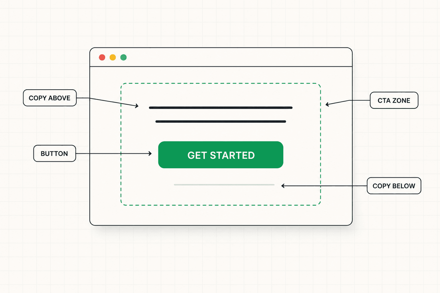
The button is the smallest piece of copy in the CTA section. The sentences immediately above and below it usually matter more.
The copy above the button does friction-reduction work. It addresses the last hesitation. It restates the specific value of taking the action. It removes uncertainty about what happens next. The copy below the button often handles the residual objection — "no credit card required," "30-day money-back guarantee," "20-minute call, no pitch." This is not decoration. It is the final piece of conversion architecture before the click.
Pages that treat the CTA as a button decision tend to under-invest in this surrounding copy. Pages that treat the CTA as a moment — a small zone of the page doing concentrated conversion work — tend to convert better, even with identical button text.
What Strong CTA Copy Actually Looks Like
With the structural decisions clarified, the wording of the button itself becomes a smaller question. There are a few patterns that consistently work better than the generic alternatives.
Describe the action and the immediate outcome of taking it.
"Submit" tells the visitor nothing. "Get started" tells them slightly less. "Book my 20-minute strategy call" tells them exactly what is about to happen. The visitor should be able to read the button and know what the next part of their experience looks like.
This pattern reduces the small hesitation that builds at the moment of decision. The visitor is not asking "should I do this?" in the abstract. They are asking "what specifically am I committing to right now?" A button that answers that question removes a meaningful friction point.
Use first-person possessive when it fits.
"Get my audit" tends to outperform "Get your audit." The shift from "your" to "my" creates a small psychological ownership effect. The visitor reads the button as if they have already mentally taken the action. This sounds like a copywriting parlor trick. In tests it produces small but consistent conversion lifts on most pages.
It does not always fit. Some products and audiences require a different tone. But the default version is worth trying before defaulting to second person.
Be specific about the unit of value.
"Get the full report" is stronger than "download now." "Start the 14-day trial" is stronger than "start your trial." "See the case study" is stronger than "learn more." Specificity in the noun reduces ambiguity about what the click delivers. Vague nouns produce hesitation. Specific nouns reduce it.
Match the energy of the surrounding page.
A page written in plain, direct, conversational language should have a CTA that sounds plain, direct, and conversational. A page written in more formal B2B register should have a CTA that matches that register. A jarring mismatch between the page voice and the CTA voice creates a small dissonance that costs conversions without being easy to identify in analytics.
What Most "CTA Examples" Get Wrong
A lot of CTA advice that appears in roundup articles is actively wrong or at least misleading. A few patterns worth questioning.
Manufactured urgency.
"Only 3 spots left." "Offer expires in 24 hours." Countdown timers on lead generation pages. These work for some specific contexts — flash sales, limited cohorts with genuine constraints, time-bound events. They do not work as general CTA enhancers, especially in B2B. Sophisticated buyers see through manufactured urgency immediately, and the trust erosion costs more than the urgency lift produces.
If the urgency is real, name it specifically with verifiable details. If it is not real, do not invent it. The conversion penalty for getting caught faking urgency is higher than the lift for using it.
Aggressive directives.
"Don't miss this!" "Act now!" "Hurry!" These felt fresh in 2008. They read as desperate now, especially to B2B buyers who associate that tone with low-quality offers. Confidence in the value of the offer reads as more credible than urgency about the action.
Multi-step value stacks above the button.
"Get instant access to: ✓ 50+ templates ✓ 12 video lessons ✓ Bonus checklist ✓ Email support ✓ Lifetime updates." This pattern feels comprehensive and tends to convert worse than a single sharp line about what the visitor is actually getting. Length is not value. Specificity is.
Color and size tests treated as primary optimization.
The button needs to be visible and visually distinct from other elements on the page. Beyond that, color is rarely the deciding conversion factor. Teams that spend three weeks A/B testing button colors on a page with a vague CTA ask, weak surrounding copy, and a mismatched ask-to-readiness ratio are optimizing the wrong thing. The button color test will produce a winner. The page will still underperform.
CTA Patterns by Page Type
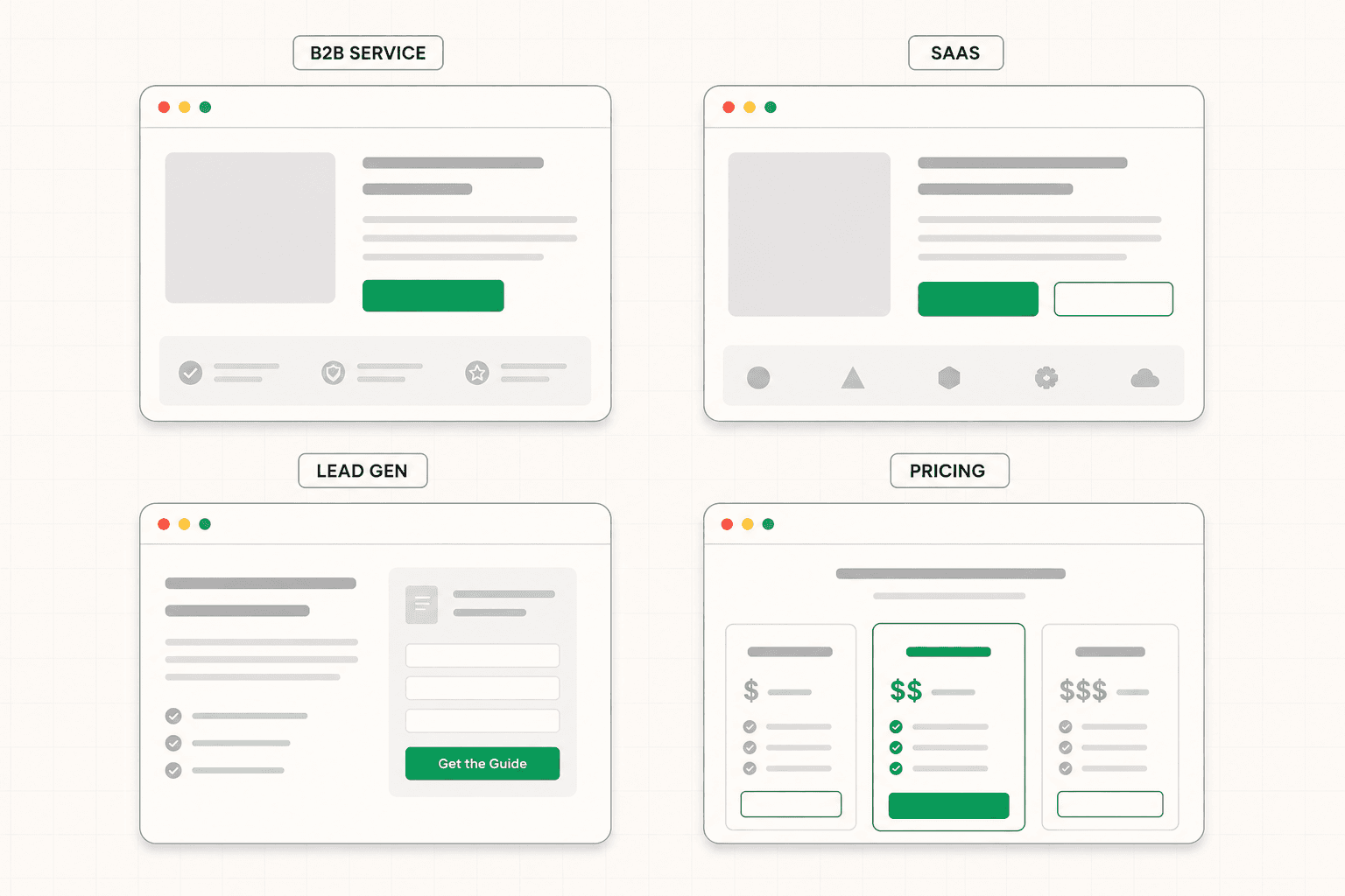
Different types of pages need different CTA approaches. A single template across every page is rarely optimal.
SaaS product pages.
The strongest pattern is usually a primary "start free trial" or "start free" CTA paired with a secondary "book a demo" or "see a demo" option. The free trial captures product-led buyers who want to experience the product. The demo captures sales-led buyers who need a human conversation. Forcing one path on all visitors loses one of these groups. The full breakdown of how this plays out specifically for SaaS is here: SaaS Landing Page: What Makes It Convert in 2026
B2B service pages.
The strongest pattern is often a primary "book an intro call" or "see if we are a fit" CTA, sometimes paired with a secondary lower-commitment option like a case study or a guide. The service CTA should signal that the call is a conversation, not a hard pitch, because the implicit question in the buyer's mind is usually "how aggressive will this sales process be."
Lead generation pages.
The strongest pattern is a single CTA tightly matched to the offer. If the page offers a guide, the CTA describes the guide specifically. If it offers a webinar, the CTA names the webinar topic and what the visitor will learn. Generic "sign up" or "download" CTAs underperform offer-specific ones because they do not reinforce the value of what is being received in exchange for the email address. The full framework for lead gen pages is here: Lead Generation Landing Page: What Makes It Actually Produce Leads
Pricing pages.
The strongest pattern is usually multiple CTAs aligned to the different tiers, each one specific to what the visitor would be starting. "Start Free," "Start Pro Trial," "Talk to Sales" each speak to a different buyer at a different stage. A uniform "Sign Up" CTA across all tiers loses the differentiation that the pricing structure was designed to express.
How to Audit Your Own CTA
If you want to evaluate the CTAs on a page you control, run through these questions in order.
Is the ask proportionate to where the realistic visitor is when they reach this point? If most of your traffic is cold and the only CTA is "book a demo," the ask is probably too heavy.
Does the button copy describe the action and the immediate outcome of taking it? Or does it use generic language like "submit," "get started," or "learn more"?
Is there copy immediately above the button doing friction-reduction work? Or is the button sitting in isolation, asking the visitor to make the decision without any surrounding support?
Is there copy immediately below the button handling residual objections? Or does the page end at the button itself?
Does the CTA placement make sense in the flow of the page? Or are CTAs scattered across the page at moments where the visitor has not yet been moved toward the decision?
If you cannot answer "yes" to all of these confidently, the CTA is probably leaving conversions on the table. The fix is usually not changing the button. It is rebuilding the small zone of copy and structure around it.
If you are not sure what to fix first on your page, a focused diagnosis identifies where the breakdown is happening before any rewriting begins. See how the 48h Audit works
The Short Version
A CTA is not a button. It is a small zone of the page doing concentrated conversion work — the ask itself, the placement, the copy above and below the button, and the visitor's readiness when they reach it.
The wording of the button matters less than most CTA articles suggest. The decisions underneath the button matter more.
Strong CTAs describe the action and the immediate outcome. They match the ask to the visitor's realistic readiness. They sit in the right places in the page. And they are surrounded by copy that does the real conversion work the button gets credit for.
Copy the surface and you get a different conversion rate. Copy the thinking underneath and you build a CTA that actually works.
Keep reading