Landing Page Hero: What Actually Goes Above the Fold (And Why Most Get It Wrong)

@nadolconverts
Kacper Nadol

The hero section is the single most important component on any landing page. It is also the one most teams treat as a design decision rather than a conversion decision. This article breaks down what the hero actually needs to contain, how the pieces work together, and where most heroes fail in ways that cost meaningful conversion.
Why the Hero Carries More Weight Than the Rest of the Page Combined
Every other section on a landing page exists in a conditional state. The features section, the proof, the pricing, the FAQ, the CTA — none of them get read unless the hero earned the scroll first. This makes the hero the gatekeeper for everything else, not just the introduction.
The math is simple but underappreciated. If 70% of visitors leave from the hero, every improvement to the sections below it is only working on the 30% who made it past. Improvements to the hero affect the entire visitor population. The hero is where the leverage is.
Despite this, the hero usually gets the least strategic attention during a landing page build. The team agrees on a headline quickly. The designer fills in the visual treatment. Someone picks a CTA color. The page ships. And then everyone wonders why conversion is below target while the time being spent on optimization focuses on sections that fewer visitors are even reading.
A different relationship with the hero — treating it as the most consequential thirty seconds of work on the entire page — produces dramatically different results. Every component needs a specific job. Every decision needs a reason. Every word needs to be earning the next sentence the right to be read.
What the Hero Actually Contains
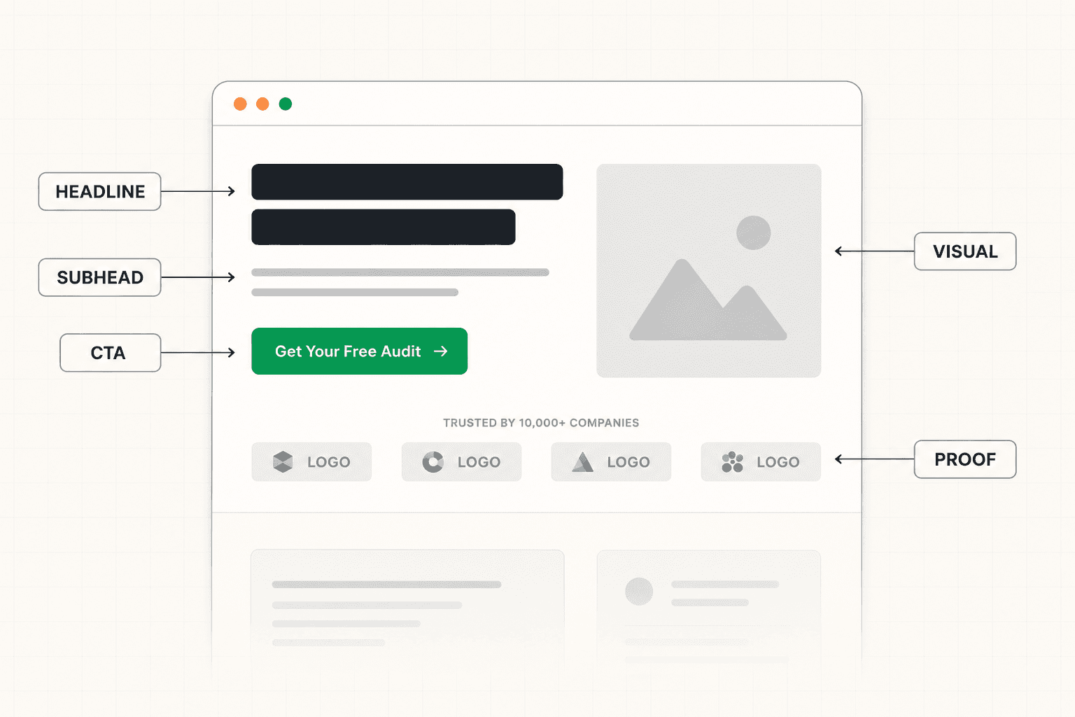
A complete landing page hero usually contains five components, each doing distinct work. Most underperforming heroes have all five present but at least one of them doing the wrong job.
The headline. The sentence that earns the rest of the page the right to be read. It names a specific outcome, situation, or tension the target buyer recognizes immediately.
The subheadline. The sentence that adds the information the headline does not include. Specificity about who this is for, how the solution works at a high level, or what makes it different from the obvious alternatives.
The primary CTA. The visible next step for visitors who arrived ready to act. Specific in its language, proportionate to where the realistic visitor is when they reach it.
The visual. The image, screenshot, illustration, or controlled negative space that either reinforces the message or stays out of its way. Not decoration. Either a function or an absence.
The credibility signal. Some form of immediate trust marker that appears within the first viewport. Logos, a notable testimonial, a specific metric, a press mention. The exact form depends on what is available and what the target buyer trusts.
These five components are not optional add-ons. They are the structural pieces of what makes a hero do its job. Removing any of them creates a gap that the rest of the page has to compensate for, usually unsuccessfully.
The Headline Carries the Heaviest Load
The headline is the single most read sentence on the entire page, and the difference between a strong one and a weak one moves more conversion than almost any other intervention.
A strong landing page headline is specific, outcome-focused, and immediately relevant to the target buyer. It does not try to be clever or memorable. It tries to be impossible for the right person to ignore.
The most common failure mode is the headline that is accurate but generic. "A comprehensive platform for modern teams." "The smarter way to manage your business." "Empower your workforce with intelligent automation." Each of these is technically true. None of them creates any reason to scroll, because they describe a category rather than a situation.
The fix is specificity. Name the role, the industry, the problem, or the goal explicitly. Make the right visitor feel recognized within the first second. The visitors who get filtered out by a more specific headline were almost never going to convert anyway. Specificity is not a risk. Generality is. The full framework for what makes a strong headline is here: Landing Page Headline: How to Write One That Actually Stops the Scroll
A useful test: cover everything else on the page and read only the headline. Does it tell the target visitor what this is, who it is for, and why they should care? If not, the headline is not doing its job, regardless of how clean the rest of the design looks.
The Subheadline Has a Specific Job
The subheadline is the most commonly wasted real estate in any hero section. It usually restates the headline in different words and accomplishes nothing.
A subheadline that does work answers the question the headline raises. If the headline names a specific outcome, the subheadline explains who it is for and how the solution works. If the headline articulates a problem, the subheadline introduces the mechanism that solves it. If the headline makes a bold claim, the subheadline supplies the specificity that makes the claim credible.
The test for a working subheadline is simple. Cover the subheadline and read only the headline. Then cover the headline and read only the subheadline. If both sentences are communicating the same information, the subheadline is wasted. Rewrite it to add what the headline does not include.
Subheadlines that work usually include one of three things: a more specific definition of who this is built for, a high-level description of how the solution actually works, or a specific differentiator that separates this from the alternatives the buyer is already considering. Pick the one that adds the most value at the moment the headline lands.
The CTA in the Hero Is Not the Final CTA
This distinction matters more than most teams treat it.
The CTA in the hero exists for visitors who arrived ready to act. These visitors do not need the argument to build. They need a visible path to the next step. The hero CTA serves them.
The CTA at the end of the page exists for visitors who needed the argument to build first. By the time they reach the bottom, they have been moved through the case. Their CTA serves a different version of the same buyer at a different moment.
Treating the hero CTA as the only CTA, placed in isolation without considering this difference, produces one of two failure modes. Either the hero CTA is too heavy an ask for visitors who have just landed (a "book a demo" button thirty seconds in) and most of them leave, or the page ends without a developed conversion section because the team assumed the hero CTA would do the work.
The pattern that consistently works on B2B and SaaS pages: a visible primary CTA in the hero, calibrated for ready buyers, with a fuller CTA section at the end of the page for buyers who needed the journey. Sometimes a secondary lower-commitment option in the hero for buyers who are interested but not ready to commit to the heavier ask. The full breakdown of how to think about CTA decisions is here: Call to Action Examples: What Actually Makes a CTA Convert (Beyond Button Color)
The Visual Is Either a Function or an Absence
Most hero visuals are decorative. They occupy significant space in the most valuable part of the page and communicate nothing specific to the visitor.
Abstract gradients. Stock photos of people smiling at laptops. Generic illustrations of cogs, lightbulbs, or floating browser mockups. Polished but informationless. These visuals look professional and add no commercial work to the hero. The visitor scans past them. The space they occupy is space the message could have used.
The visuals that earn their place in a hero do one of three things. They show the product in realistic use, giving the visitor a concrete picture of what they would actually be using. They reinforce the specific outcome being promised, making the promise visible rather than abstract. Or they add credibility through specificity — a real client's workflow, a real result, a real situation rather than a stock scenario.
If none of those apply, the alternative is not a worse visual. It is no visual at all. Controlled negative space in the hero can outperform decorative imagery, because it keeps the visitor's eye on the message rather than splitting attention between message and decoration.
The test: cover the visual element of your hero and ask whether anything is actually lost. If the answer is no, the visual is decoration. Replace it with something that adds information or remove it entirely.
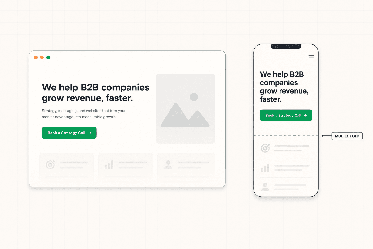
Where Mobile Heroes Fail Differently
Most heroes are designed on desktop. The mobile version is treated as a layout adaptation rather than its own problem. This is one of the most common ways heroes underperform without being obvious in the data.
On mobile, the fold is much higher. The screen is narrower. The thumb has to reach the CTA. The headline that worked on desktop becomes either too small to read or too long for the available width. The hero image that looked balanced on desktop pushes everything below the fold. The CTA that was prominently placed disappears beneath the visual element.
A mobile hero needs to be designed from scratch with its own constraints. The headline often needs to be shorter to fit the narrower width without breaking. The subheadline sometimes needs to be cut entirely. The CTA needs to sit within thumb reach without scrolling. The visual element often needs to move below the text or be reduced significantly. The hierarchy needs to hold together at narrow widths even if it requires structural changes that the desktop version did not.
A mobile hero that converts at half the rate of the desktop equivalent is leaving meaningful revenue on the table, especially for B2B and SaaS pages where mobile is now a significant portion of traffic.
The Common Hero Failure Modes
Beyond the structural issues already covered, there are a few specific patterns that consistently show up on underperforming heroes and are worth naming directly.
Heroes that try to communicate everything.
A headline, two subheadlines, three CTAs, a value stack, four trust badges, a video thumbnail, and a chat widget all crammed into the first viewport. The intention is to give the visitor as much as possible upfront. The effect is to give them nothing they can hold onto, because attention is finite and splitting it across eight elements means none of them get the weight they need.
The discipline is reduction. Every element in the hero is competing with every other element for the visitor's attention. The hero that focuses the visitor on one clear message with one clear next step almost always outperforms the hero that tries to communicate seven things simultaneously.
Heroes with mismatched ask and traffic temperature.
A "book a demo" button on a hero that primarily serves cold paid traffic from a broad audience. A "join the waitlist" button on a hero that primarily serves warm referral traffic from buyers ready to purchase. The mismatch between what the page is asking and where the visitor realistically is creates friction that costs conversions before the rest of the page even gets a chance to work.
Heroes where the headline is the same as the page title.
The browser tab says "Best Project Management Software for Teams." The headline says "Best Project Management Software for Teams." The subheadline says "The best project management software for modern teams of all sizes." The visitor is being told the same thing four times within five seconds with no new information added. This is wasted real estate and reads as effort-free copy, which it usually is.
Heroes that use the company name as the first or second word.
"Acme is the platform for modern operations teams." "At Acme, we believe in seamless collaboration." The reader does not care about Acme yet. They care about their own situation. The hero should be about the reader's world, with the company introduced as the solution to that world's specific friction, not as the subject of the first sentence.
How to Audit Your Own Hero
If you want to evaluate the hero on your own landing page, run through these questions honestly.
If a stranger in your target audience saw this hero for five seconds and then closed the tab, could they describe what the offer is, who it is for, and what to do if interested? If they could not, the hero is failing at its primary job.
Does the subheadline add information the headline does not include, or is it restating the headline in different words?
Is the CTA copy specific about what happens when the visitor clicks, or does it use generic language like "get started" or "learn more"?
Does the visual element add concrete information about the product, the outcome, or the buyer, or is it decoration?
Is there at least one credibility signal visible in the first viewport, and is it specific enough to be convincing to the target buyer?
Does the mobile version of the hero work as its own composition, or has it been adapted from desktop in ways that broke the hierarchy?
If you cannot answer "yes" to most of these confidently, the hero is leaving conversion on the table. The fix is usually not redesigning the entire page. It is rebuilding the hero with each component doing its specific job. If you want a structured diagnosis of where your hero is failing before any rewriting begins, see how the 48h Audit works
The Short Version
The hero is the most consequential section on any landing page. It earns the rest of the page the right to be read, and a strong hero compounds the effect of every section below it while a weak one limits all of them.
A complete hero contains five components, each doing distinct work: the headline that earns the scroll, the subheadline that adds what the headline did not include, the CTA calibrated to ready visitors, the visual that either functions or absents, and the credibility signal that reduces immediate skepticism.
The most common failures are generic headlines, redundant subheadlines, decorative visuals, mismatched CTAs, and mobile versions that were adapted rather than designed. None of these are visible in a portfolio screenshot. All of them are visible in the conversion data.
The hero is where the leverage is. Treat it that way.
Keep reading