x


modue
E-commerce
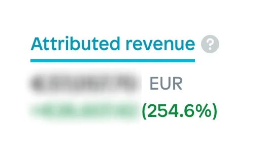
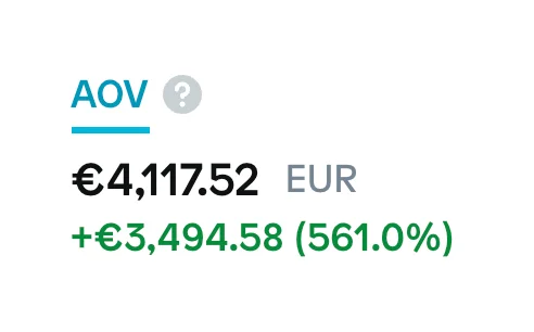
Rebuilt a confusing store into two clear buying paths - AOV up 561%, attributed revenue up 254.6%.
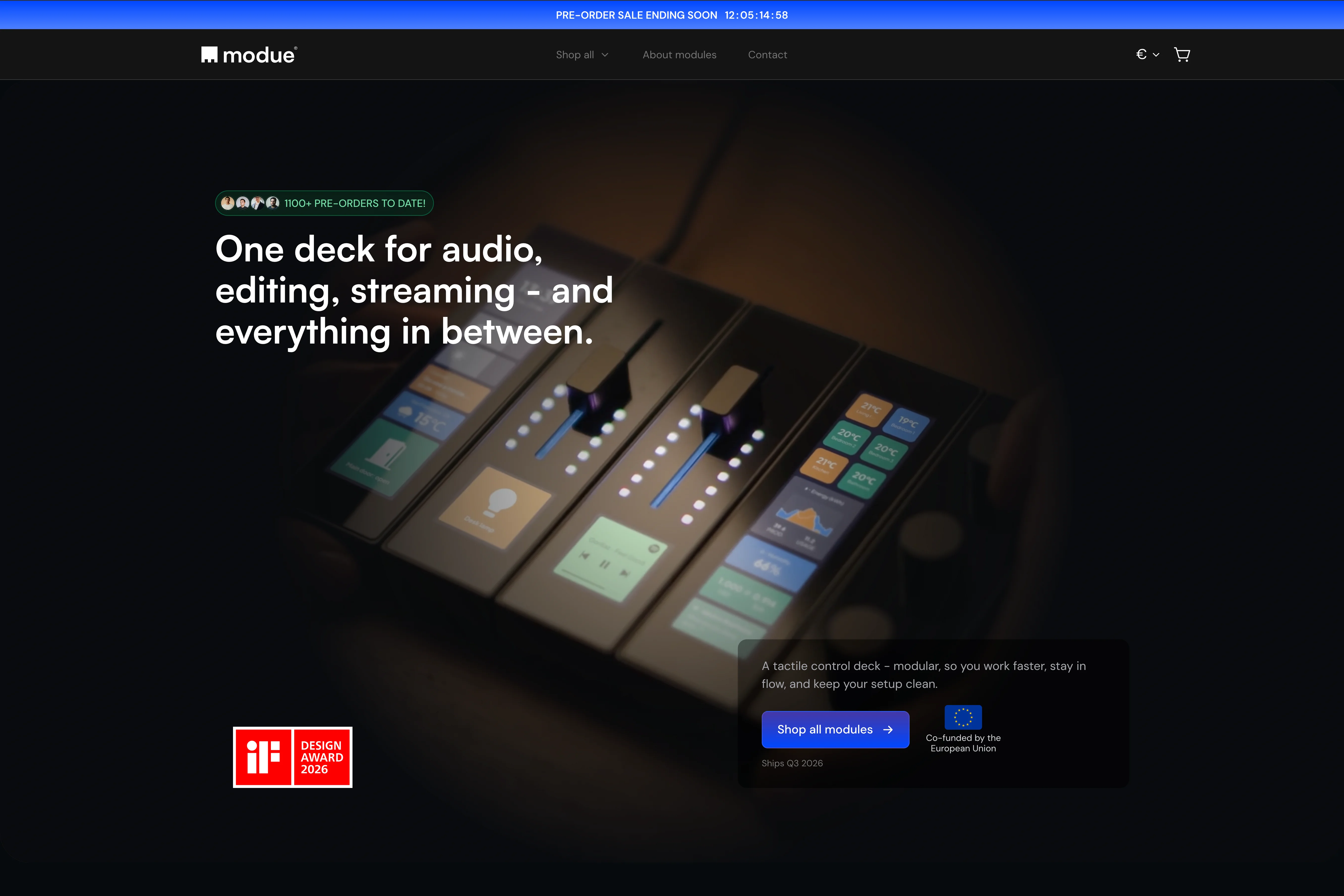
modue builds a next-gen modular control station - snap-together buttons, knobs, and sliders that give creators and smart-home users tactile control over their apps, games, and devices. Backed on Kickstarter, it integrates with Home Assistant to also control smart lighting and other devices from brands like Philips Hue and LIFX.

The challenge
What was the problem?
modue had a strong product and a checkout that got in its way.
Two ways to buy, neither one obvious. A paid configurator sat between the shopper and the cart - extra cost for modue, extra steps for the buyer. The buying decision was scattered across the page instead of guided, and the path ended on an FAQ with no clear next step.
People who already wanted the product couldn't find the fastest way to get it.
Scope
Store redesign + checkout rebuild + CRO
The fix
Here's what we've changed
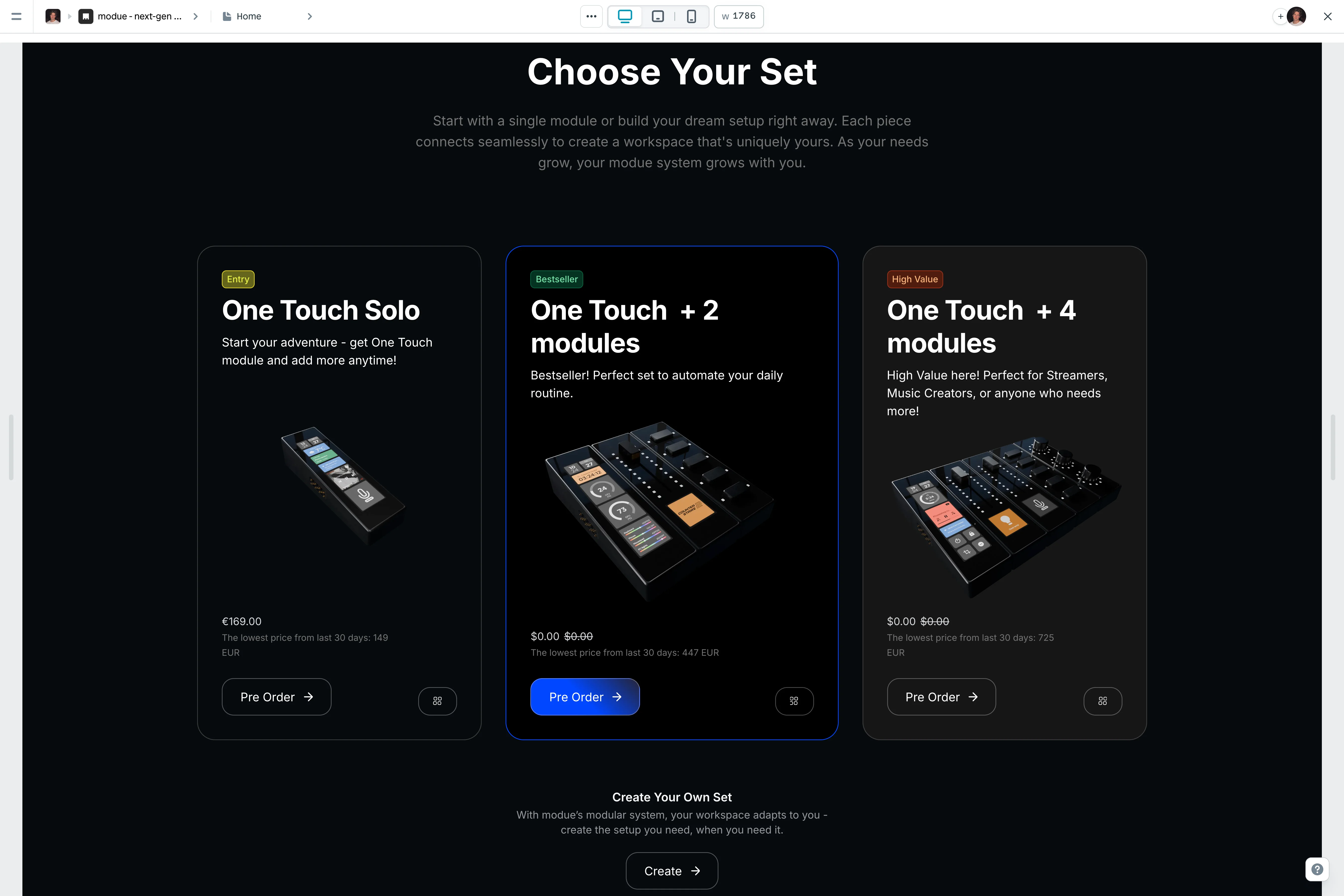
We rebuilt the store around two clear buying paths.
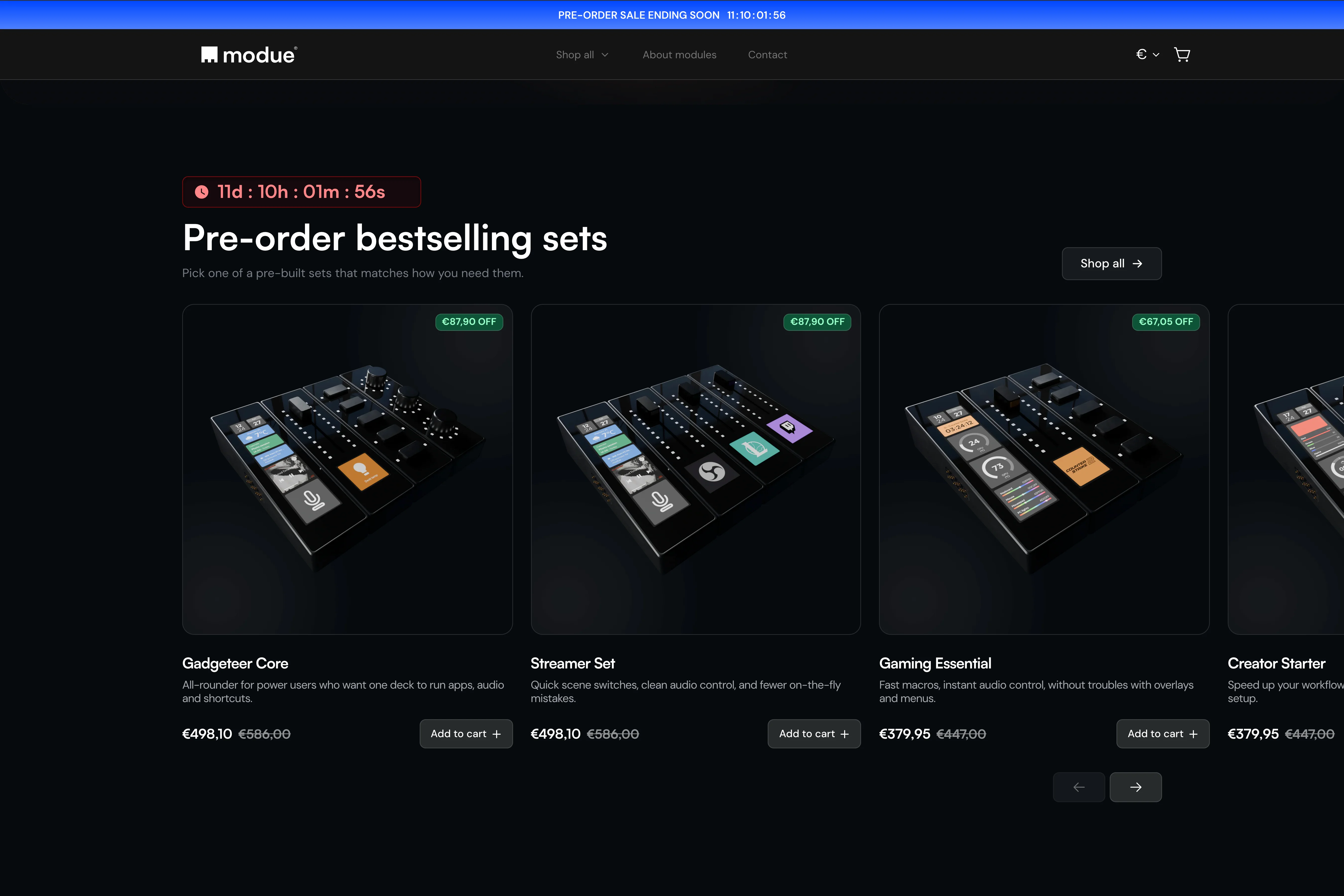
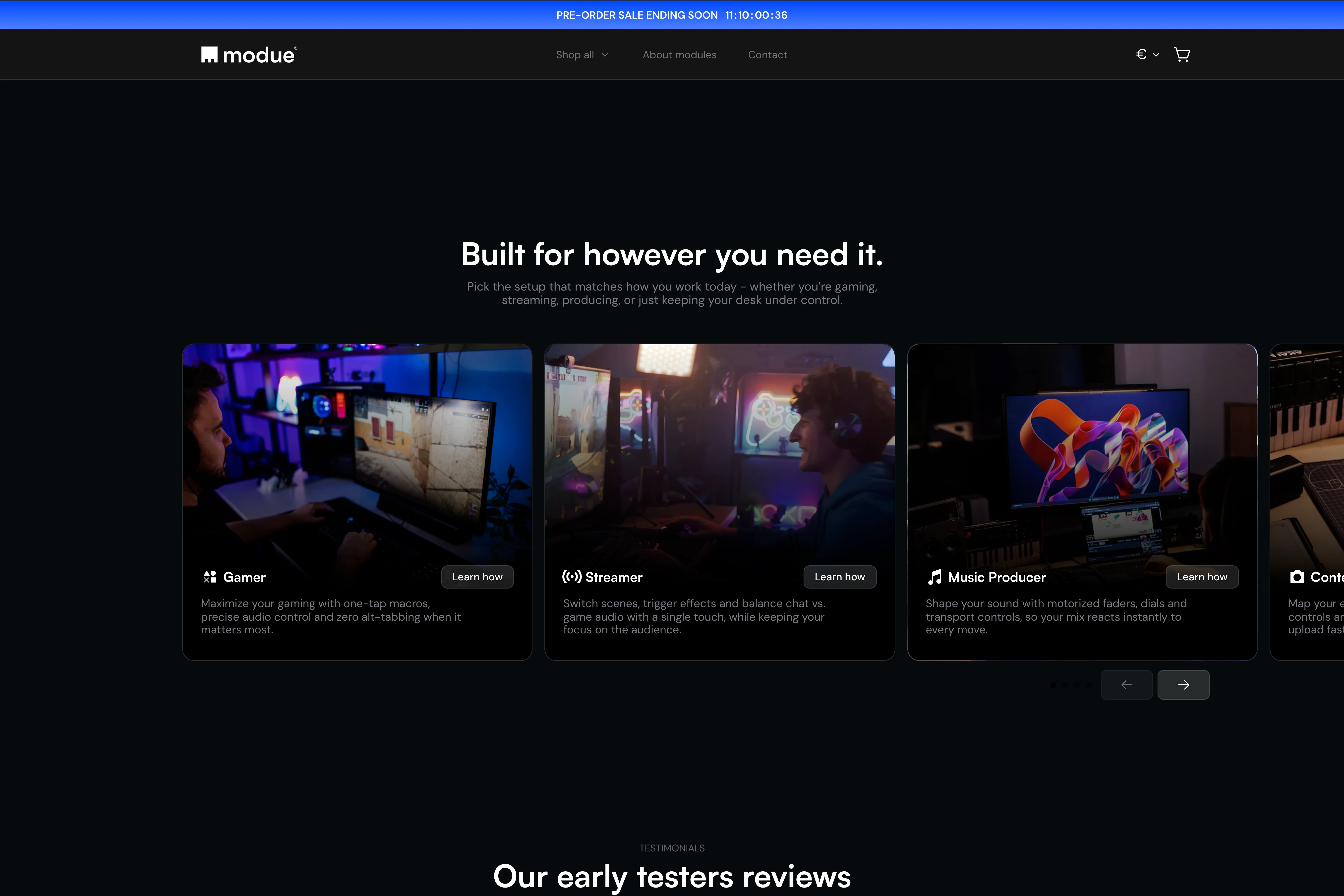
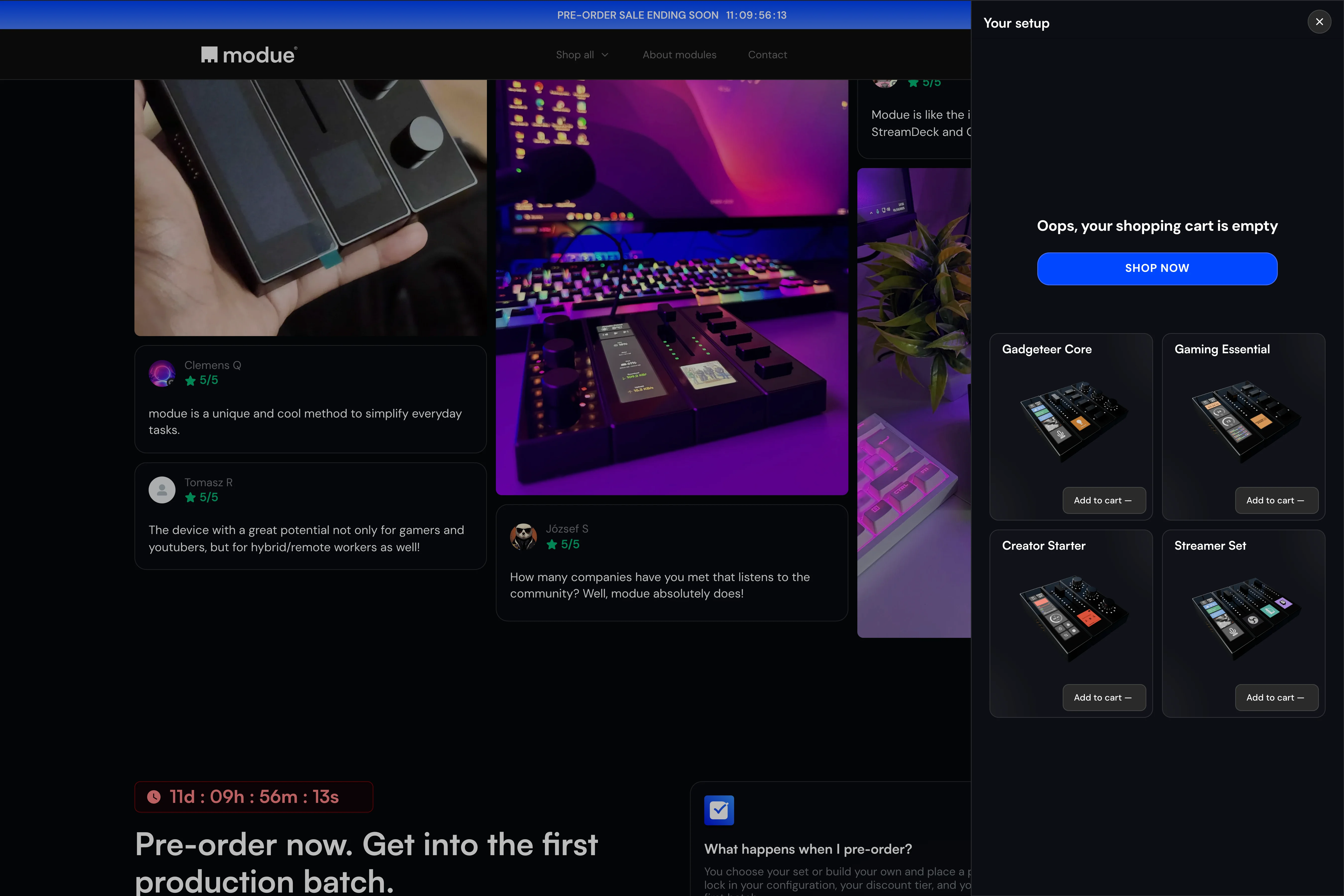
The fast path puts ready-made bestselling sets high on the page, so shoppers can pick a setup that matches their use case without building from scratch. Gamer, streamer, music producer, content creator - the decision now starts from a guided place instead of a blank one.
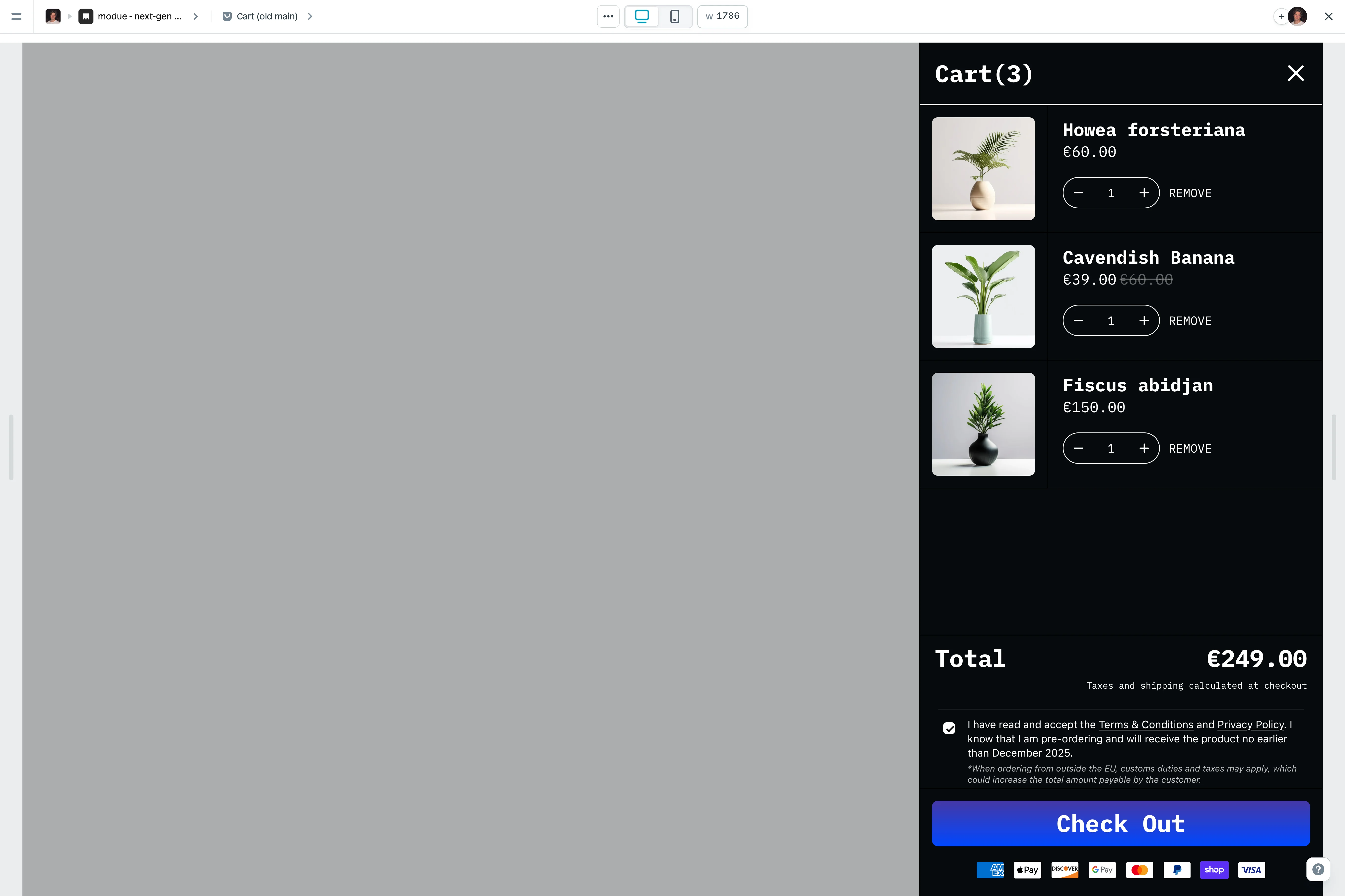
The flexible path is a "build your own setup" journey that lets users browse every module and configure directly inside the store. That let modue drop the paid configurator entirely and replace it with a cleaner flow built into the e-commerce experience itself.
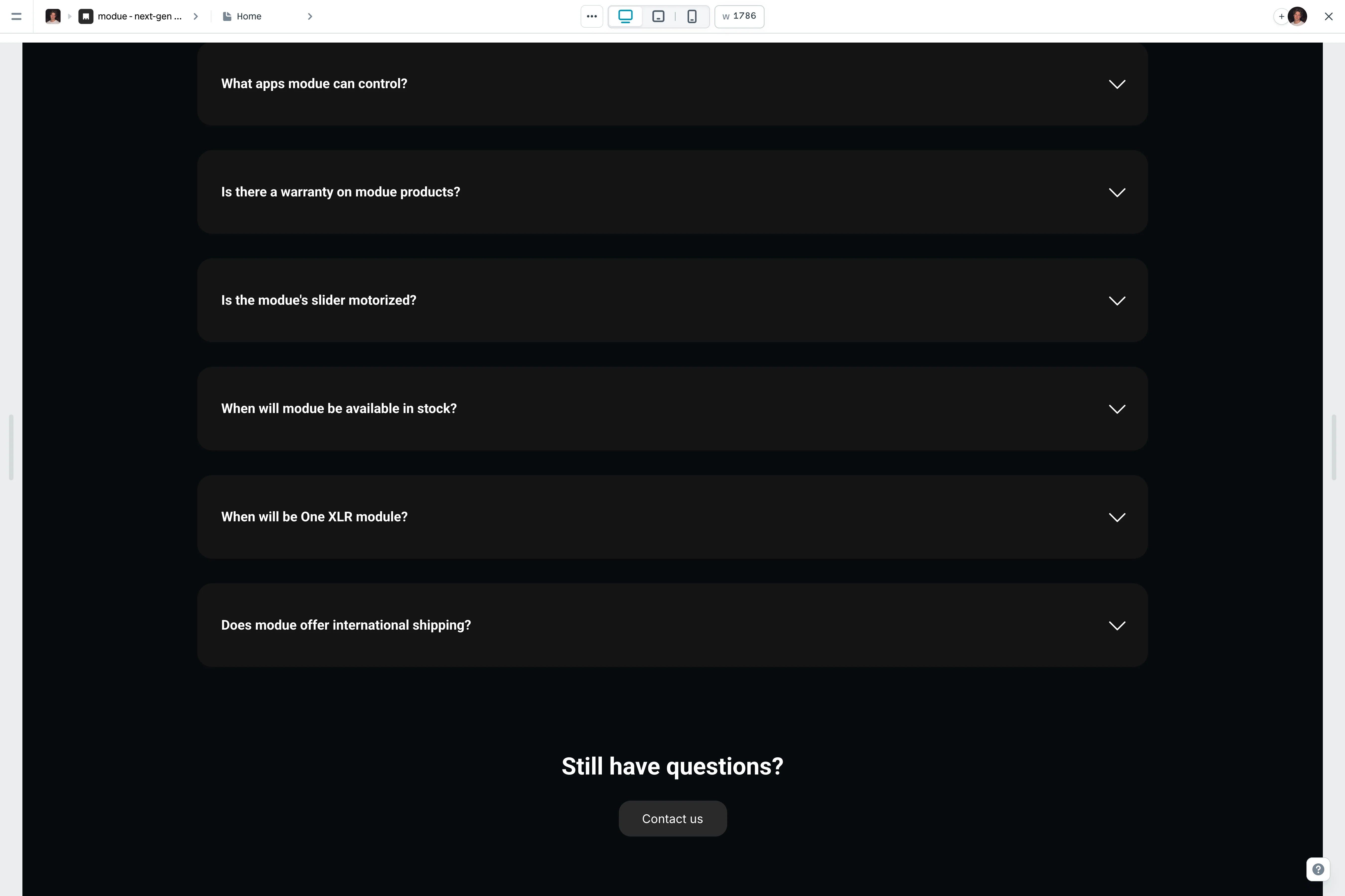
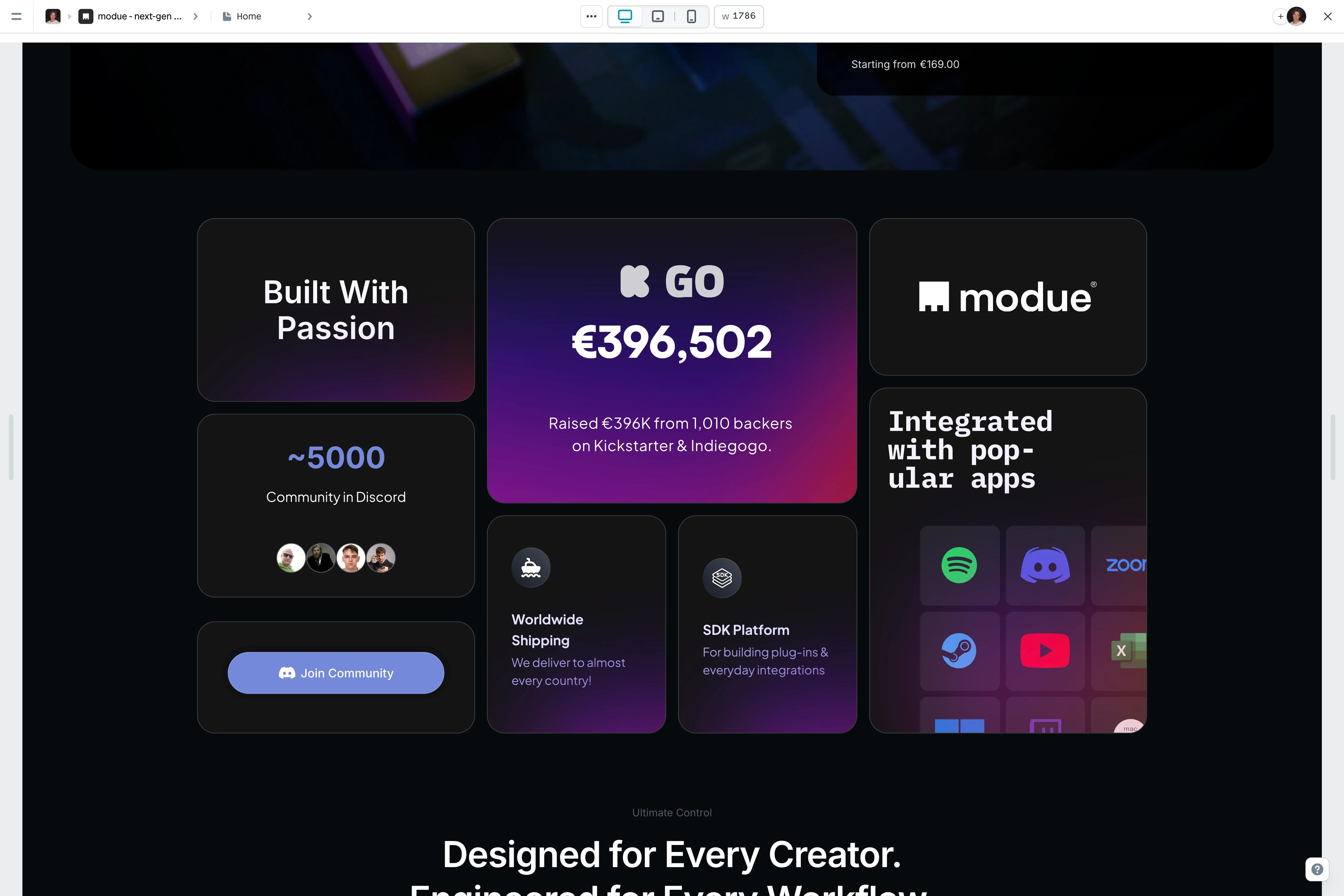
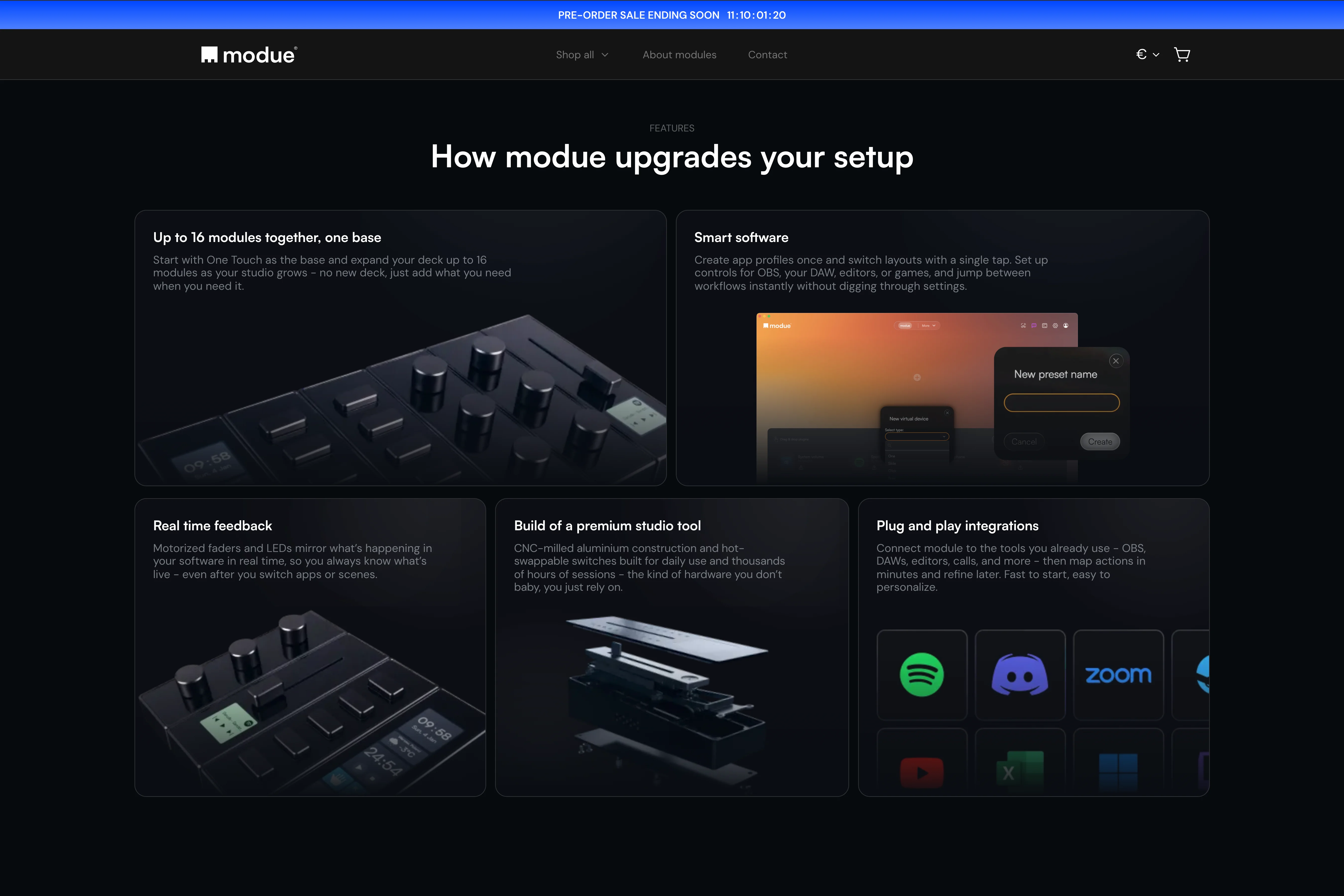
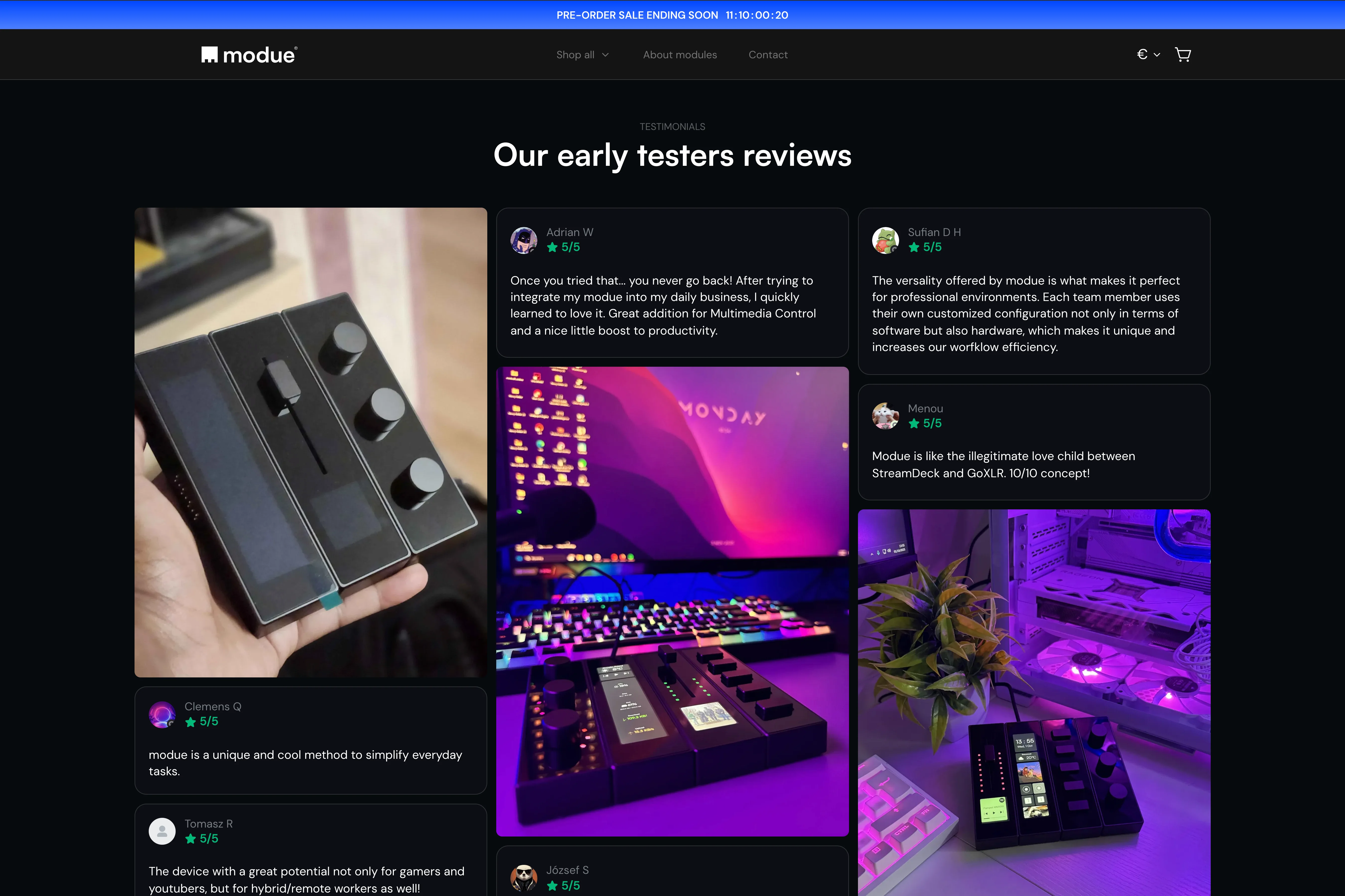
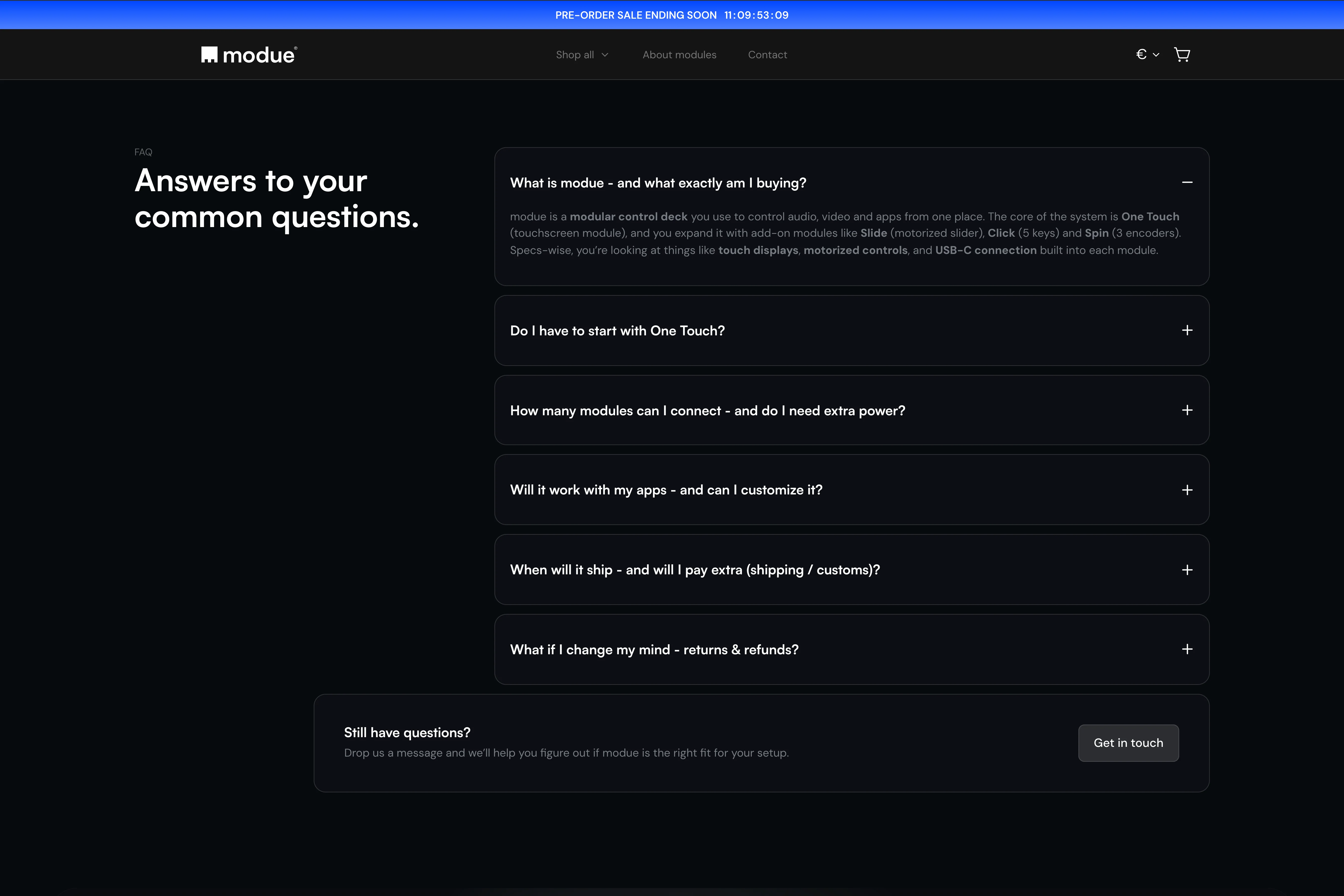
Around the core journey, we reworked the rest: clearer feature presentation, segmentation by user type, a pre-order explanation people actually understand, a real FAQ, testimonials in the right spot, and a final CTA that closes. We also unified the visual language so every section reads as one system.
The results
And did it actually work?
Results
Attributed revenue +254.6%
AOV +561.0%
Checkout completion +23.0%
The store finally feels aligned with the product behind it.
Instead of a fragmented, overly complex checkout, modue now gives shoppers two clear ways to buy: choose a setup fast, or build one from scratch. The pre-order model is communicated clearly, and the whole store feels more intentional and ready to scale.
It works beyond looks. We removed the dependence on the paid configurator, added AOV mechanics inside the cart, and gave the brand a solid foundation for turning traffic into orders.
If you've got the same problem - strong product, decent traffic, a buying flow that underperforms - start with the 48h Audit. The same conversion blockers show up again and again, even across very different projects.


Other projects