Above the Fold on a Landing Page: What It Is, Why It Matters, and How to Get It Right

@nadolconverts
Kacper Nadol

The area above the fold is the most valuable real estate on any landing page. Most sites waste it. This article covers what above the fold actually means today, what it needs to do, and the specific mistakes that cause it to fail even on pages that look polished.
What Above the Fold Actually Means Today
The term comes from print. Newspapers were folded in half on newsstands, so only the top half was visible. The most important stories went there because that was all a reader saw before deciding whether to pick it up.
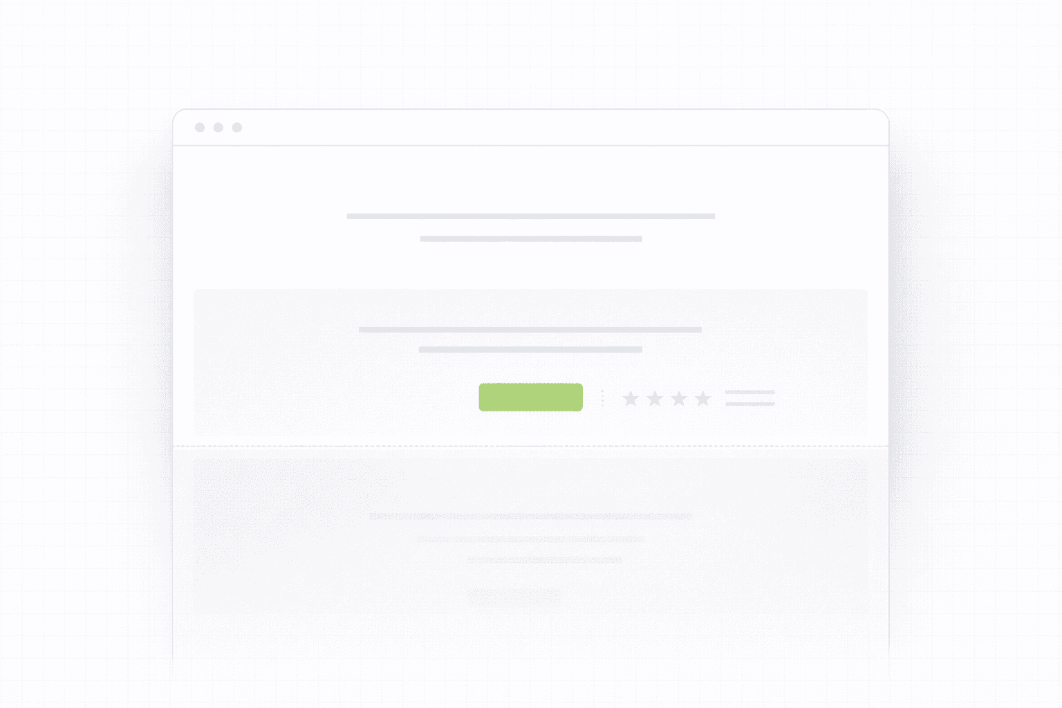
On a landing page, above the fold means everything visible on screen before the visitor scrolls. No click, no swipe, just the first frame of the page as it loads.
The complication in 2026 is that "the fold" is not a fixed line. It sits in a different place on a 27-inch desktop monitor, a 13-inch laptop, a tablet, and a phone. What is above the fold on one device is below it on another. This does not make the concept less useful. It makes it more important to think carefully about what you are prioritizing in that first visible frame across contexts, rather than designing for one screen size and hoping for the best.
The working definition that matters: above the fold is whatever a visitor sees in the first three to five seconds before they make a decision about whether to keep reading or leave. That decision happens fast, and it happens mostly based on what is in that first frame.

Why It Matters More Than Any Other Part of the Page
Every other section of your landing page, the features, the testimonials, the pricing, the FAQ, exists in a conditional state. Visitors only see those sections if they decided the first frame was worth scrolling past.
That makes above the fold a gatekeeper, not just an introduction. It is the section that earns the rest of the page the right to be read. If it fails, nothing below it matters because no one gets there.
This is why conversion improvements to the above-the-fold section tend to have a disproportionate impact compared to changes anywhere else on the page. You are not just improving one section. You are improving the percentage of visitors who engage with everything that follows.
The stakes are particularly high on paid traffic. When someone clicks an ad and lands on your page, you have roughly five seconds before they make a judgment. They are not reading carefully. They are scanning for signals that tell them whether this is worth their time. Everything in that first frame is either building momentum or killing it.
What the Above the Fold Section Needs to Do
There are four things the above the fold section of a landing page needs to accomplish, and it needs to accomplish all of them quickly.
Tell the visitor exactly what this is. Not what category it belongs to, not what industry you serve, not your company tagline. What this specific thing is and what it does. A visitor who cannot figure out within a few seconds what they are looking at will not scroll to find out.
Make clear who it is for. The fastest way to create relevance is specificity. "Project management software" is for everyone and therefore for no one. "Project management for creative agencies tired of missed deadlines" speaks to a specific person. That person recognizes themselves immediately and feels like the page was built for them. Everyone else self-selects out, which is fine.
Give a reason to keep reading. This is where most above-the-fold sections fail. They describe what the product is but give no reason to care. A strong above-the-fold section articulates an outcome, a tension, or a specific promise that makes the visitor curious enough to scroll. It creates a question in the reader's mind that the rest of the page answers.
Provide a clear next step. There should be one primary action visible above the fold. Not two, not a navigation menu with six options, not a banner announcement. One clear thing to do if the visitor is ready to act immediately. Some visitors will be. Make it easy for them.
The Most Common Above the Fold Mistakes
The headline describes the product instead of the outcome.
"An all-in-one platform for team collaboration" describes what the product is. "Ship projects on time without the status update meetings" describes what the product does for the person using it. The second version creates immediate relevance because it connects to something the visitor actually feels. Features describe. Outcomes persuade.
The subheadline repeats the headline.
A common pattern is a bold outcome-focused headline followed by a subheadline that essentially says the same thing in more words. The subheadline has a specific job: it should add information the headline did not include, usually specificity about who it is for, how it works at a high level, or what makes it different. If your subheadline could be deleted without losing any information, it is not doing its job.
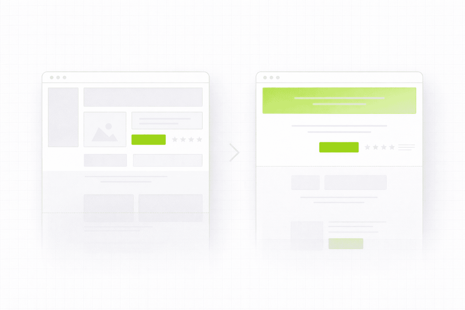
Too many competing elements.
Navigation menus with eight items, a cookie consent banner, a promotional ribbon at the top, a hero image, a headline, a subheadline, three CTA buttons, and a trust badge row. Every one of those elements is competing for the visitor's attention. Attention is finite. The more you split it, the less any single element gets. Above the fold should be ruthlessly edited. Every element that is not directly serving the four jobs listed above should be questioned.
The hero image is decorative rather than functional.
A lot of landing pages use a large hero image that looks impressive but communicates nothing. Abstract gradients, stock photos of people smiling at laptops, generic illustrations. These visuals take up significant space in the most valuable part of the page and add no information. A strong hero visual either shows the product in use, reinforces the specific outcome being promised, or adds credibility through specificity. Decoration is not a function.
The CTA is vague.
"Get started" and "learn more" are not calls to action. They are placeholders. A visitor reading "get started" has no idea what they are starting, what happens next, or what they are committing to. Specific CTAs convert better because they reduce uncertainty. "Start your free 14-day trial," "Book a 20-minute strategy call," "See how it works for SaaS teams." These tell the visitor exactly what the click means. This connects directly to a broader problem most landing pages share: Why Your Landing Page Doesn't Convert: 9 Real Reasons (And What to Fix First)
The mobile version is an afterthought.
Designing above the fold on desktop and then squishing it into a mobile layout produces pages where the headline is too small, the CTA is buried below the fold on a phone, and the hierarchy breaks down entirely. On mobile, the fold is much higher. There is less room. Everything needs to be more deliberate. The headline needs to be shorter. The subheadline might need to be cut entirely. The CTA needs to be immediately reachable with a thumb. Mobile above the fold should be designed as its own problem, not adapted from desktop.
What Strong Above the Fold Copy Actually Looks Like
The copy in the above the fold section does most of the work. Design creates the context. Copy creates the case.
A strong headline formula that works consistently for B2B and SaaS: outcome plus context. What the person gets, for whom, in what situation. It does not need to be clever. It needs to be clear and specific.
The subheadline should answer the question the headline raises. If the headline says "Turn your website traffic into qualified leads," the subheadline might say "We audit and rebuild landing pages for B2B companies getting traffic but not enough of the right conversions." Now the visitor knows what it is, who it is for, and what the mechanism is. That is enough to scroll.
The CTA should describe the action and the immediate outcome of taking it. Not "submit" or "go." Something that tells the visitor what the next thirty minutes of their life looks like if they click. Specificity removes hesitation.
One thing worth noting: above the fold copy is almost always the last thing that gets properly worked on during a build. Designers focus on the visual, developers focus on the build, and the copy gets written quickly at the end. This is backwards. The copy should drive the design, not the other way around. The words determine what space is needed, what hierarchy makes sense, and what the visual needs to support. If the copy on your page is not doing its job, this is the diagnostic place to start: Website Audit Checklist: Fix the Conversion Leaks Before You Spend More on Ads
How to Audit Your Own Above the Fold Section Right Now
Open your landing page on a fresh browser. Set a timer for five seconds. Look at the page. Close it.
Ask yourself: could you describe what the page was offering, who it was for, and what to do next? If you struggled to answer any of those three questions from a five-second look, your above the fold section is failing at its most basic job.
Then open it on your phone. Look at what is actually visible before you scroll. Is the headline readable? Is the CTA reachable? Is anything important being cut off? Mobile above the fold failures are some of the most common and most fixable conversion problems on otherwise decent pages.
If you want a more thorough look at what your first screen is and is not doing, a structured audit maps exactly those failure points before any redesign or rewrite begins. See how the 48h Audit works
The Short Version
Above the fold is not a design problem. It is a clarity problem.
The question it needs to answer in five seconds or less:
What is this?
Is it for me?
Why should I keep reading?
What do I do if I am ready now?
If your first screen answers all four, the rest of the page has a chance. If it does not, the rest of the page does not matter.
KEEP READING