Landing Page Optimization: What Actually Works (And What Wastes Your Time)

@nadolconverts
Kacper Nadol

Most landing page optimization advice focuses on tactical tweaks that produce small results when the page is fundamentally working. When the page is not, those tweaks produce nothing. This article covers what actually moves the conversion rate, in what order, and how to avoid the common optimization traps that consume time without improving results.
The Problem with How Most Optimization Gets Done
Landing page optimization tends to follow a predictable pattern that produces disappointing results.
The page underperforms. Someone runs through a checklist of best practices: change the button color, shorten the form, add an urgency element, test a different headline. Some of these get implemented. The conversion rate moves slightly in one direction or the other. Nobody can quite explain why. The cycle repeats.
This is activity that looks like optimization. It is rarely actual optimization.
Real optimization starts with diagnosis, not intervention. It identifies the specific reason a page is underperforming and addresses that specific reason. The tactical checklist approach assumes the diagnosis. It treats every page as if it has the same kind of problem and applies the same kinds of fixes regardless of what is actually wrong. The result is incremental movement on pages that have fundamental issues those tweaks cannot touch, and unpredictable changes on pages where the underlying logic is already sound.
The companies that improve landing page performance meaningfully tend to do one thing differently. They diagnose first. Then they fix the specific thing they identified. Then they measure. That sequence produces compounding results. The alternative produces a series of small changes that may or may not be moving the needle in the right direction.
Where Optimization Should Actually Start
Before changing anything on a page, it is worth being honest about what you actually know.
Do you know why qualified visitors are leaving without converting? If the answer is "because the page is not converting them," that is not a diagnosis. That is the symptom. The diagnosis is the specific reason it is happening, which usually requires looking at the page through the lens of the buyer rather than the metrics dashboard.
Do you know where in the page the breakdown is happening? Visitors who leave immediately are telling you something different than visitors who scroll through the entire page and never click the CTA. The first group has a problem with the first screen. The second group has a problem somewhere later, often around proof, objections, or the conversion ask itself. Treating these the same wastes effort.
Do you know whether the underperformance is a page problem or a traffic problem? A page that converts at 2% on poorly targeted traffic and at 8% on well-targeted traffic does not have a page problem. It has a targeting problem. Spending optimization effort on the page in that situation fixes the wrong thing.
These three questions are the starting point for any meaningful optimization work. Without honest answers, every subsequent change is essentially a guess. With honest answers, the path forward becomes specific. The full breakdown of how to think about conversion rate in context is here: What Is a Good Conversion Rate for a Landing Page?
The Highest-Leverage Optimizations
Once you have a diagnosis, certain interventions consistently produce larger results than others. Knowing the priority order saves time and avoids the trap of optimizing the wrong things.
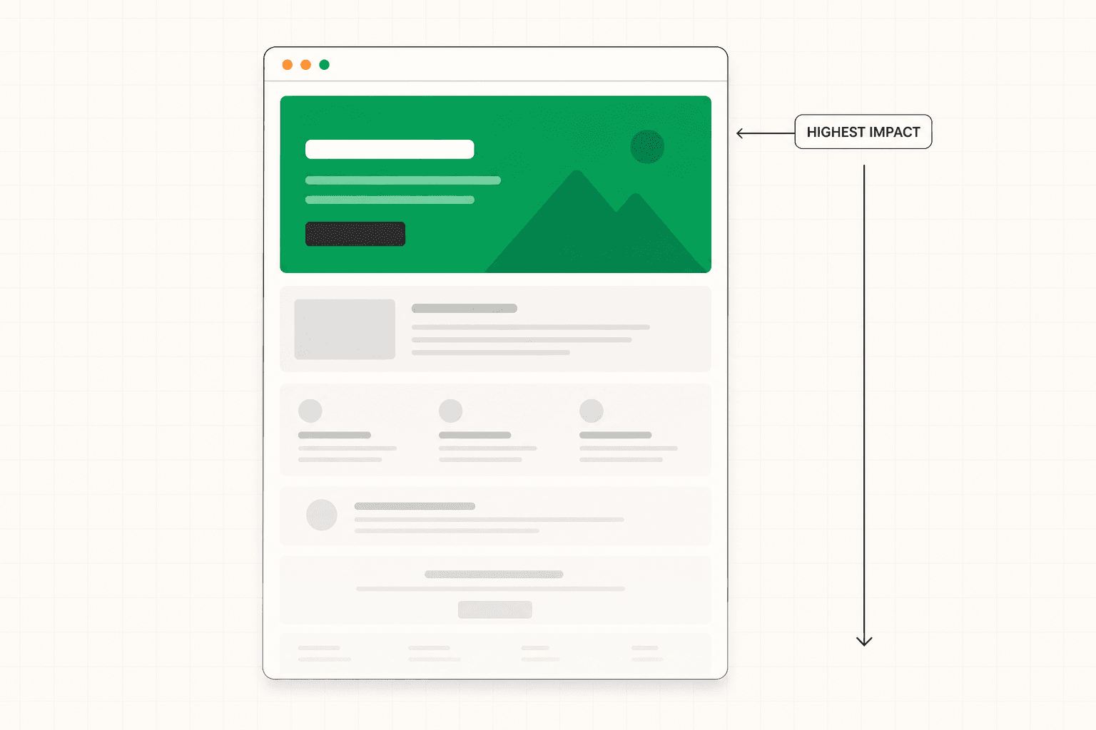
Rewriting the hero section to establish immediate relevance.
The above-the-fold section is where the majority of visitors decide whether to stay or leave. A vague headline rewritten to speak directly to the target visitor's specific situation produces conversion improvements that compound through every section below it. A subheadline that adds information rather than repeating the headline. A CTA that is visible and proportionate to visitor readiness. These first-screen improvements consistently produce the largest single lifts on underperforming pages.
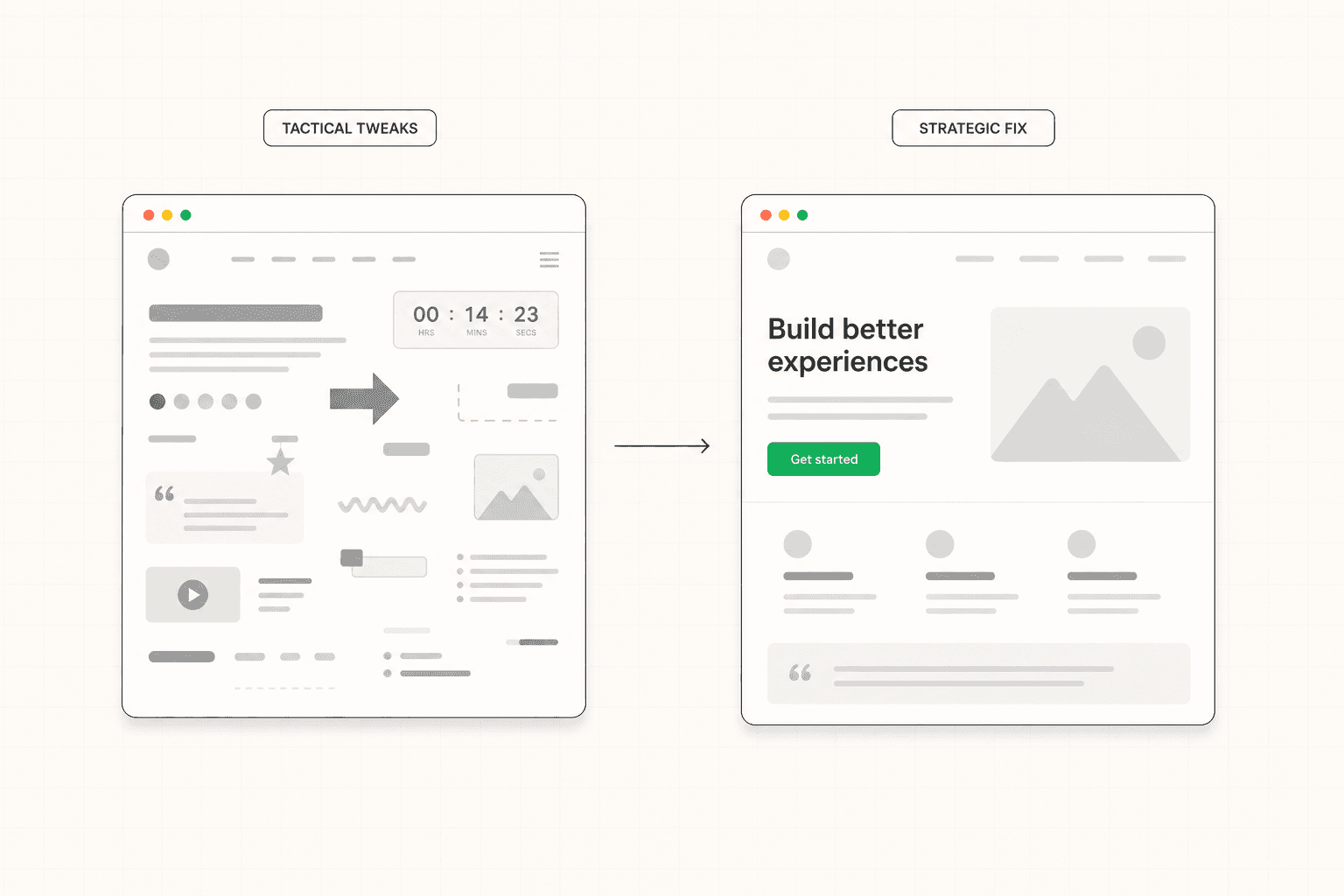
This is not a test. It is a strategic rewrite based on a clear understanding of the buyer. A/B testing variations of a vague headline against each other produces small movements. Replacing it with a specific headline that names the buyer's actual situation produces step-change improvements.
Improving the specificity of the messaging throughout the page.
Most underperforming pages are not too short. They are too vague. Generic claims, abstract benefits, language that could apply to any product in the category. Specificity is what creates relevance, and relevance is what creates conversion.
The fix is not adding more copy. It is replacing generic copy with specific copy. "Improve your team's productivity" becomes "Cut your status update meetings from three a week to one." "Comprehensive solution for modern teams" becomes "Built for product teams shipping more than ten features a quarter." The right visitor reads specificity and recognizes their own situation. Generic language reads as background noise that produces no recognition and no action.
Restructuring proof to be specific and contextually placed.
Most pages have proof. Few of them use it well. Logo grids of unrelated companies. Testimonials that say something positive but vague. Case study links buried in a section nobody reaches.
Better proof comes from being specific about what was achieved, by whom, in what context. "We reduced onboarding time from three weeks to four days for a 200-person SaaS company" is a different category of evidence than "great product, highly recommend." Better placement comes from putting proof at the point in the page where the relevant doubt is highest. A testimonial about implementation speed belongs in or near the section discussing implementation, not in a carousel at the bottom of the page.
This is one of the highest-leverage optimizations because it usually requires no design changes. It is purely a content and architecture decision. The strategic logic behind proof placement is covered in detail here: B2B Landing Page: What Makes It Actually Work
Addressing unresolved objections directly in the copy.
Every visitor who reads to the end of the page and does not click the CTA had a reason. Sometimes that reason is that they were not qualified. More often it is that the page left a question unanswered that they needed resolved before they would commit.
The most reliable source for these questions is the sales team. The three things prospects push back on most often in sales calls are almost certainly showing up as silent objections on the landing page. Writing specific, honest answers to those objections into the relevant sections of the page reduces friction at the CTA without requiring any change to the CTA itself.
Calibrating the CTA to match visitor readiness.
A "book a demo" button is a significant ask for someone who just landed on the page. It means thirty to sixty minutes of their time and the implicit acknowledgment that they are in a buying process. Many qualified buyers will not take that step at that moment even if they are interested.
Sometimes the right optimization is not improving the existing CTA. It is offering a lower-commitment alternative alongside it. A case study to download. A short product tour. A guide that addresses the specific concern the buyer is currently working through. This captures buyers who are interested but not yet ready for the heavier commitment, without diluting the primary path for those who are.
What Most Optimization Checklists Get Wrong
There is a standard set of optimization tactics that gets recommended constantly and produces less impact than the priority list suggests. Knowing which ones are overrated saves time.
Button color tests. The button needs to be visible and visually distinct from other elements on the page. Beyond that, color rarely produces meaningful conversion changes. Pages that show large lifts from button color tests almost always had a bigger problem with button visibility, not color preference.
Adding urgency elements. Countdown timers, "limited spots" messaging, and "only X left" indicators produce small conversion lifts on pages that are already converting reasonably and almost no lift on pages with fundamental problems. They also reduce trust in many B2B contexts where the urgency feels manufactured. Use sparingly and only when genuine urgency exists.
Removing form fields one at a time. Form length matters but field-by-field optimization usually produces incremental movement when the bigger question is whether the form is asking for the right things at the right time. Sometimes adding a field that helps with qualification improves the overall business outcome more than removing one that improves submission rate.
Above-the-fold CTA placement. The principle is sound but the execution is often wrong. Putting a CTA above the fold on a page where the visitor has not yet been given a reason to convert produces clicks from people who are not ready, which inflates conversion rate but reduces lead quality. The CTA should be visible above the fold for visitors who arrive ready to act, but the conversion work happens through the page, not at the top of it.
Endless A/B testing on small elements. Statistical significance requires meaningful traffic and meaningful effect sizes. Testing variations of small elements on pages with low to moderate traffic produces results that are unreliable, take months to converge, and rarely move the overall number more than the time invested could have moved it through targeted strategic improvements.
When Optimization Cannot Save the Page
This is worth saying directly because it is one of the most expensive lessons companies learn through trial and error.
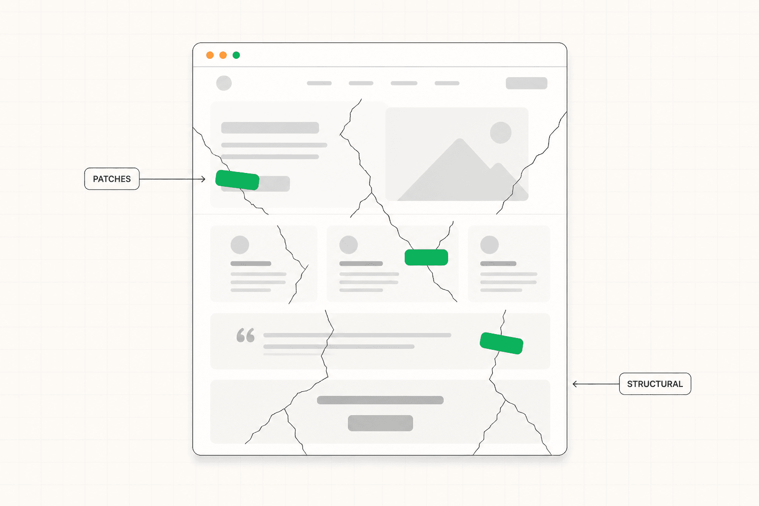
Some pages cannot be optimized into performance. The structure is wrong, the messaging is built around the wrong buyer, the proof is fundamentally weak, and the conversion architecture does not match how the actual visitor moves through the decision. In these cases, optimization tactics produce small movements that do not address the underlying issues. The page improves in the way that a bad essay improves with copy editing: marginally, while remaining a bad essay.
Recognizing when a page is in this category is hard. The instinct is always to keep optimizing because each individual change feels reasonable. But the cumulative effect of months of small optimizations on a fundamentally broken page is usually less than the effect of a single strategic rewrite that addresses the underlying problem.
The signs that optimization is not the right move are: the page has been worked on multiple times without meaningful improvement, the team disagrees about what the actual problem is, the underperformance has persisted for more than a few months, and the page is generating leads but the wrong kind. In these situations, a structured diagnosis followed by targeted strategic intervention almost always produces faster results than continued tactical optimization. The full case for diagnosing before optimizing is covered here: Website Conversion Audit: What It Is, What It Covers, and Whether You Need One
The Practical Sequence for Optimization Work
Given everything above, the sequence that produces the best results most reliably looks like this.
Start with diagnosis. Identify where the breakdown is actually happening. Check whether the problem is the page or the traffic before treating it as a page problem. Get specific about which section or moment in the visitor journey is losing the most conversions.
Address the highest-leverage strategic issues first. Hero specificity, messaging clarity, proof quality, objection handling, CTA appropriateness. These are the areas that produce step-change improvements when done properly.
Make one significant change at a time where possible. Multiple simultaneous changes produce results that cannot be attributed to any specific intervention.
Run tactical tests after the strategic foundation is right. Once the page is fundamentally working, A/B testing variations of headlines, CTAs, and visual elements can produce meaningful incremental improvements. Run on top of a broken foundation, the same tests produce noise.
Track the metric that matters past the conversion event. Conversion rate alone can hide quality problems. Lead quality, sales qualified rate, and close rate together tell you whether optimization is improving the business or just improving the metric.
The Short Version
Landing page optimization works when it starts with diagnosis, addresses the highest-leverage strategic issues first, and uses tactical testing to refine a foundation that is already working.
It fails when it applies a generic checklist of tactics to pages with fundamental problems, when it optimizes for the metric rather than the business outcome, and when it confuses activity with progress.
Diagnose before you intervene. Fix the foundation before you test. Measure past the conversion event.
That sequence produces compounding results. The tactical-checklist approach mostly produces fatigue.
Most landing page optimization advice focuses on tactical tweaks that produce small results when the page is fundamentally working. When the page is not, those tweaks produce nothing. This article covers what actually moves the conversion rate, in what order, and how to avoid the common optimization traps that consume time without improving results.
The Problem with How Most Optimization Gets Done
Landing page optimization tends to follow a predictable pattern that produces disappointing results.
The page underperforms. Someone runs through a checklist of best practices: change the button color, shorten the form, add an urgency element, test a different headline. Some of these get implemented. The conversion rate moves slightly in one direction or the other. Nobody can quite explain why. The cycle repeats.
This is activity that looks like optimization. It is rarely actual optimization.
Real optimization starts with diagnosis, not intervention. It identifies the specific reason a page is underperforming and addresses that specific reason. The tactical checklist approach assumes the diagnosis. It treats every page as if it has the same kind of problem and applies the same kinds of fixes regardless of what is actually wrong. The result is incremental movement on pages that have fundamental issues those tweaks cannot touch, and unpredictable changes on pages where the underlying logic is already sound.
The companies that improve landing page performance meaningfully tend to do one thing differently. They diagnose first. Then they fix the specific thing they identified. Then they measure. That sequence produces compounding results. The alternative produces a series of small changes that may or may not be moving the needle in the right direction.
Where Optimization Should Actually Start
Before changing anything on a page, it is worth being honest about what you actually know.
Do you know why qualified visitors are leaving without converting? If the answer is "because the page is not converting them," that is not a diagnosis. That is the symptom. The diagnosis is the specific reason it is happening, which usually requires looking at the page through the lens of the buyer rather than the metrics dashboard.
Do you know where in the page the breakdown is happening? Visitors who leave immediately are telling you something different than visitors who scroll through the entire page and never click the CTA. The first group has a problem with the first screen. The second group has a problem somewhere later, often around proof, objections, or the conversion ask itself. Treating these the same wastes effort.
Do you know whether the underperformance is a page problem or a traffic problem? A page that converts at 2% on poorly targeted traffic and at 8% on well-targeted traffic does not have a page problem. It has a targeting problem. Spending optimization effort on the page in that situation fixes the wrong thing.
These three questions are the starting point for any meaningful optimization work. Without honest answers, every subsequent change is essentially a guess. With honest answers, the path forward becomes specific. The full breakdown of how to think about conversion rate in context is here: What Is a Good Conversion Rate for a Landing Page?
The Highest-Leverage Optimizations
Once you have a diagnosis, certain interventions consistently produce larger results than others. Knowing the priority order saves time and avoids the trap of optimizing the wrong things.
Rewriting the hero section to establish immediate relevance.
The above-the-fold section is where the majority of visitors decide whether to stay or leave. A vague headline rewritten to speak directly to the target visitor's specific situation produces conversion improvements that compound through every section below it. A subheadline that adds information rather than repeating the headline. A CTA that is visible and proportionate to visitor readiness. These first-screen improvements consistently produce the largest single lifts on underperforming pages.
This is not a test. It is a strategic rewrite based on a clear understanding of the buyer. A/B testing variations of a vague headline against each other produces small movements. Replacing it with a specific headline that names the buyer's actual situation produces step-change improvements.
Improving the specificity of the messaging throughout the page.
Most underperforming pages are not too short. They are too vague. Generic claims, abstract benefits, language that could apply to any product in the category. Specificity is what creates relevance, and relevance is what creates conversion.
The fix is not adding more copy. It is replacing generic copy with specific copy. "Improve your team's productivity" becomes "Cut your status update meetings from three a week to one." "Comprehensive solution for modern teams" becomes "Built for product teams shipping more than ten features a quarter." The right visitor reads specificity and recognizes their own situation. Generic language reads as background noise that produces no recognition and no action.
Restructuring proof to be specific and contextually placed.
Most pages have proof. Few of them use it well. Logo grids of unrelated companies. Testimonials that say something positive but vague. Case study links buried in a section nobody reaches.
Better proof comes from being specific about what was achieved, by whom, in what context. "We reduced onboarding time from three weeks to four days for a 200-person SaaS company" is a different category of evidence than "great product, highly recommend." Better placement comes from putting proof at the point in the page where the relevant doubt is highest. A testimonial about implementation speed belongs in or near the section discussing implementation, not in a carousel at the bottom of the page.
This is one of the highest-leverage optimizations because it usually requires no design changes. It is purely a content and architecture decision. The strategic logic behind proof placement is covered in detail here: B2B Landing Page: What Makes It Actually Work
Addressing unresolved objections directly in the copy.
Every visitor who reads to the end of the page and does not click the CTA had a reason. Sometimes that reason is that they were not qualified. More often it is that the page left a question unanswered that they needed resolved before they would commit.
The most reliable source for these questions is the sales team. The three things prospects push back on most often in sales calls are almost certainly showing up as silent objections on the landing page. Writing specific, honest answers to those objections into the relevant sections of the page reduces friction at the CTA without requiring any change to the CTA itself.
Calibrating the CTA to match visitor readiness.
A "book a demo" button is a significant ask for someone who just landed on the page. It means thirty to sixty minutes of their time and the implicit acknowledgment that they are in a buying process. Many qualified buyers will not take that step at that moment even if they are interested.
Sometimes the right optimization is not improving the existing CTA. It is offering a lower-commitment alternative alongside it. A case study to download. A short product tour. A guide that addresses the specific concern the buyer is currently working through. This captures buyers who are interested but not yet ready for the heavier commitment, without diluting the primary path for those who are.
What Most Optimization Checklists Get Wrong
There is a standard set of optimization tactics that gets recommended constantly and produces less impact than the priority list suggests. Knowing which ones are overrated saves time.
Button color tests. The button needs to be visible and visually distinct from other elements on the page. Beyond that, color rarely produces meaningful conversion changes. Pages that show large lifts from button color tests almost always had a bigger problem with button visibility, not color preference.
Adding urgency elements. Countdown timers, "limited spots" messaging, and "only X left" indicators produce small conversion lifts on pages that are already converting reasonably and almost no lift on pages with fundamental problems. They also reduce trust in many B2B contexts where the urgency feels manufactured. Use sparingly and only when genuine urgency exists.
Removing form fields one at a time. Form length matters but field-by-field optimization usually produces incremental movement when the bigger question is whether the form is asking for the right things at the right time. Sometimes adding a field that helps with qualification improves the overall business outcome more than removing one that improves submission rate.
Above-the-fold CTA placement. The principle is sound but the execution is often wrong. Putting a CTA above the fold on a page where the visitor has not yet been given a reason to convert produces clicks from people who are not ready, which inflates conversion rate but reduces lead quality. The CTA should be visible above the fold for visitors who arrive ready to act, but the conversion work happens through the page, not at the top of it.
Endless A/B testing on small elements. Statistical significance requires meaningful traffic and meaningful effect sizes. Testing variations of small elements on pages with low to moderate traffic produces results that are unreliable, take months to converge, and rarely move the overall number more than the time invested could have moved it through targeted strategic improvements.
When Optimization Cannot Save the Page
This is worth saying directly because it is one of the most expensive lessons companies learn through trial and error.
Some pages cannot be optimized into performance. The structure is wrong, the messaging is built around the wrong buyer, the proof is fundamentally weak, and the conversion architecture does not match how the actual visitor moves through the decision. In these cases, optimization tactics produce small movements that do not address the underlying issues. The page improves in the way that a bad essay improves with copy editing: marginally, while remaining a bad essay.
Recognizing when a page is in this category is hard. The instinct is always to keep optimizing because each individual change feels reasonable. But the cumulative effect of months of small optimizations on a fundamentally broken page is usually less than the effect of a single strategic rewrite that addresses the underlying problem.
The signs that optimization is not the right move are: the page has been worked on multiple times without meaningful improvement, the team disagrees about what the actual problem is, the underperformance has persisted for more than a few months, and the page is generating leads but the wrong kind. In these situations, a structured diagnosis followed by targeted strategic intervention almost always produces faster results than continued tactical optimization. The full case for diagnosing before optimizing is covered here: Website Conversion Audit: What It Is, What It Covers, and Whether You Need One
The Practical Sequence for Optimization Work
Given everything above, the sequence that produces the best results most reliably looks like this.
Start with diagnosis. Identify where the breakdown is actually happening. Check whether the problem is the page or the traffic before treating it as a page problem. Get specific about which section or moment in the visitor journey is losing the most conversions.
Address the highest-leverage strategic issues first. Hero specificity, messaging clarity, proof quality, objection handling, CTA appropriateness. These are the areas that produce step-change improvements when done properly.
Make one significant change at a time where possible. Multiple simultaneous changes produce results that cannot be attributed to any specific intervention.
Run tactical tests after the strategic foundation is right. Once the page is fundamentally working, A/B testing variations of headlines, CTAs, and visual elements can produce meaningful incremental improvements. Run on top of a broken foundation, the same tests produce noise.
Track the metric that matters past the conversion event. Conversion rate alone can hide quality problems. Lead quality, sales qualified rate, and close rate together tell you whether optimization is improving the business or just improving the metric.
The Short Version
Landing page optimization works when it starts with diagnosis, addresses the highest-leverage strategic issues first, and uses tactical testing to refine a foundation that is already working.
It fails when it applies a generic checklist of tactics to pages with fundamental problems, when it optimizes for the metric rather than the business outcome, and when it confuses activity with progress.
Diagnose before you intervene. Fix the foundation before you test. Measure past the conversion event.
That sequence produces compounding results. The tactical-checklist approach mostly produces fatigue.
See more articles
Browse the archive for teardowns, checklists and playbooks you can copy straight into your next build.