Landing Page Design: What Actually Makes It Convert (Beyond Looking Good)

@nadolconverts
Kacper Nadol
Good landing page design is not about aesthetics. It is about creating a visual environment where the right argument lands clearly for the right person at the right moment. This article covers what conversion-focused design actually involves, where most pages get it wrong, and what to look for in design work that is built to produce results rather than portfolio screenshots.
The Misconception That Costs Most Landing Pages Their Conversion Rate
There is a widespread belief in the world of websites and landing pages that good design produces good conversion. The logic seems sound. A professional, polished page builds trust. Trust leads to conversion. Therefore design leads to conversion.
The problem is that this chain of reasoning skips the most important step. Design builds trust by communicating competence and credibility. But trust is not the same as conviction. A visitor can trust that a company is professional and still have no reason to act. Conversion requires conviction, and conviction comes from the argument the page is making, not from how well it is presented.
This is why beautifully designed landing pages underperform constantly. The design is creating the right impression. The copy and structure are failing to make the right case. The visitor leaves thinking "nice website" rather than "this is exactly what I need."
The inversion is also true but less common. A plainer page with a sharp, specific argument built for the right buyer will outperform a polished page with generic messaging almost every time. The argument is doing the work. The design is just not getting in the way.
Understanding this distinction changes how you think about landing page design. The goal is not a page that looks impressive. The goal is a page where the design is in service of the argument, making it easier to follow, harder to ignore, and more persuasive at every step.
What Conversion-Focused Design Actually Does
Design on a landing page has three jobs, all of them in service of the copy and the argument rather than the brand or the aesthetic.
It creates hierarchy. The visual design determines what the visitor reads first, second, and third. Headline size, weight, and positioning. Whitespace around key elements. Color used to signal importance rather than decoration. A visitor scanning a page for the first time follows the visual hierarchy to navigate the content. If the hierarchy is unclear or contradictory, the visitor does not know where to look and loses the thread of the argument before they have engaged with it.
It reduces friction. Every element on a page is either helping the visitor move forward or creating resistance. A navigation menu with eight options at the top of a landing page is resistance. It offers the visitor a way to leave the page without deciding. A form that asks for seven fields before the visitor has read three sections is resistance. It asks for more than the relationship has earned at that point. Conversion-focused design removes resistance systematically, not by making the page sparse for its own sake, but by questioning every element's right to exist relative to the conversion goal.
It builds credibility. Design signals competence. A page that looks professionally built tells the visitor something about the company behind it before a single word is read. This is not about expensive aesthetics. It is about consistency, attention to detail, and the absence of the small mistakes that signal carelessness. Inconsistent spacing, mismatched fonts, images that look like stock photos, CTAs that blend into the background. Each of these erodes the credibility the copy is trying to build.
The Elements That Matter Most in Landing Page Design
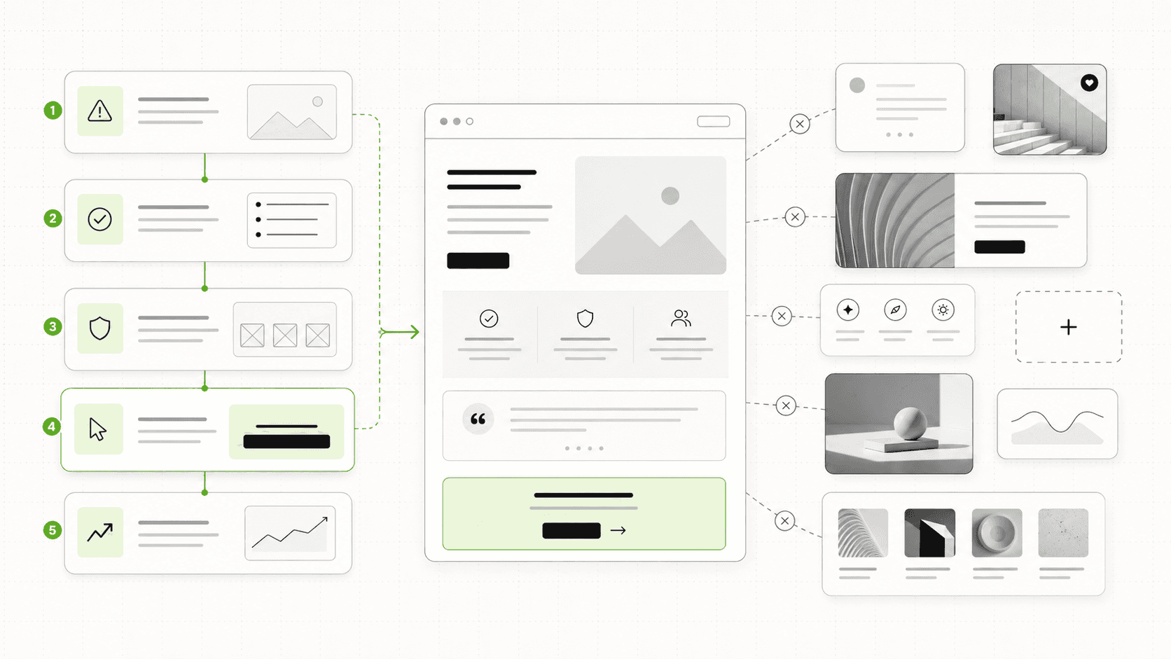
Typography and hierarchy. The size and weight relationship between the headline, subheadline, body copy, and CTA is the most important visual decision on the page. A headline that is not visually dominant enough to be read first breaks the intended flow immediately. Body copy that is too small or too dense to be comfortable at a quick read produces drop-off before the argument is complete. These are not aesthetic preferences. They are functional decisions that directly affect whether the argument gets read.
Whitespace. The empty space around elements is not wasted space. It is what makes individual elements stand out and what gives the reader's eye a place to rest between points. Pages that try to pack too much into the visible area create cognitive load that causes visitors to skim rather than read. Strategic whitespace around the headline, the primary CTA, and key proof elements gives those elements the visual weight they need to do their job.
Color used with restraint. Every color on a landing page carries a signal. Too many colors create visual noise that dilutes all of them. One accent color, used consistently and specifically, draws the eye to the elements that matter most. The CTA button. A key proof element. A critical section heading. When color is used consistently as a signal rather than as decoration, it reinforces the hierarchy rather than competing with it.
Visual proof. The images and visual elements on a page are either adding information or adding noise. A screenshot of the product in use, a chart showing a specific result, a photo of a real client in context. These add information. An abstract hero illustration, a generic stock photo, a decorative background pattern. These add noise. Conversion-focused design defaults to visual elements that carry specific meaning for the target visitor rather than elements that fill space attractively.
Mobile-first thinking. The majority of visitors on many pages arrive on a phone. A design conceived on desktop and adapted for mobile produces a mobile experience where the hierarchy breaks down, the CTA is buried, and the page loses the visual logic that made the desktop version work. Designing the mobile experience as its own problem from the start, with its own hierarchy decisions, produces pages that convert on the device most of the traffic is actually using.
The Relationship Between Design and Copy
This is where most landing page builds go wrong structurally, regardless of the quality of the individual work.
The typical process is: brief the designer first, get a design, then fill in the copy. Sometimes the copy is written in parallel. Almost never is the copy written before the design begins.
The problem is that copy and design are not parallel workstreams. Copy is the argument. Design is the presentation of that argument. The design needs to know what the argument is before it can present it effectively. How much space does the headline need? What sections of the page need visual emphasis? Where should the proof elements appear relative to the copy they support? What does the CTA area need to communicate beyond the button itself?
When design precedes copy, these decisions get made by default. The designer fills in the visual structure with placeholder assumptions about what the copy will say and how long it will be. The copywriter then has to fit the argument into a structure that was not built around it. The result is compromised on both sides.
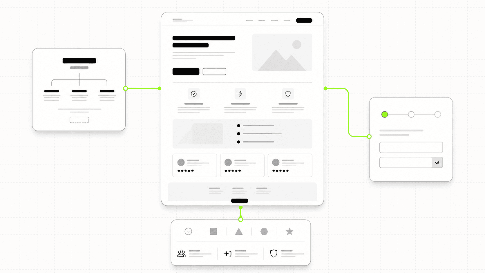
The right sequence is copy first, design second. The copy establishes the argument, the sections it needs, and the hierarchy of information. The design then creates a visual presentation that makes that specific argument as clear and compelling as possible. This is the process behind every landing page we build at Ravelink: see how it plays out in the Modue project
What to Look for When Evaluating Landing Page Design
If you are reviewing design work for a landing page, whether your own or from an agency, these are the questions worth asking before approving anything.
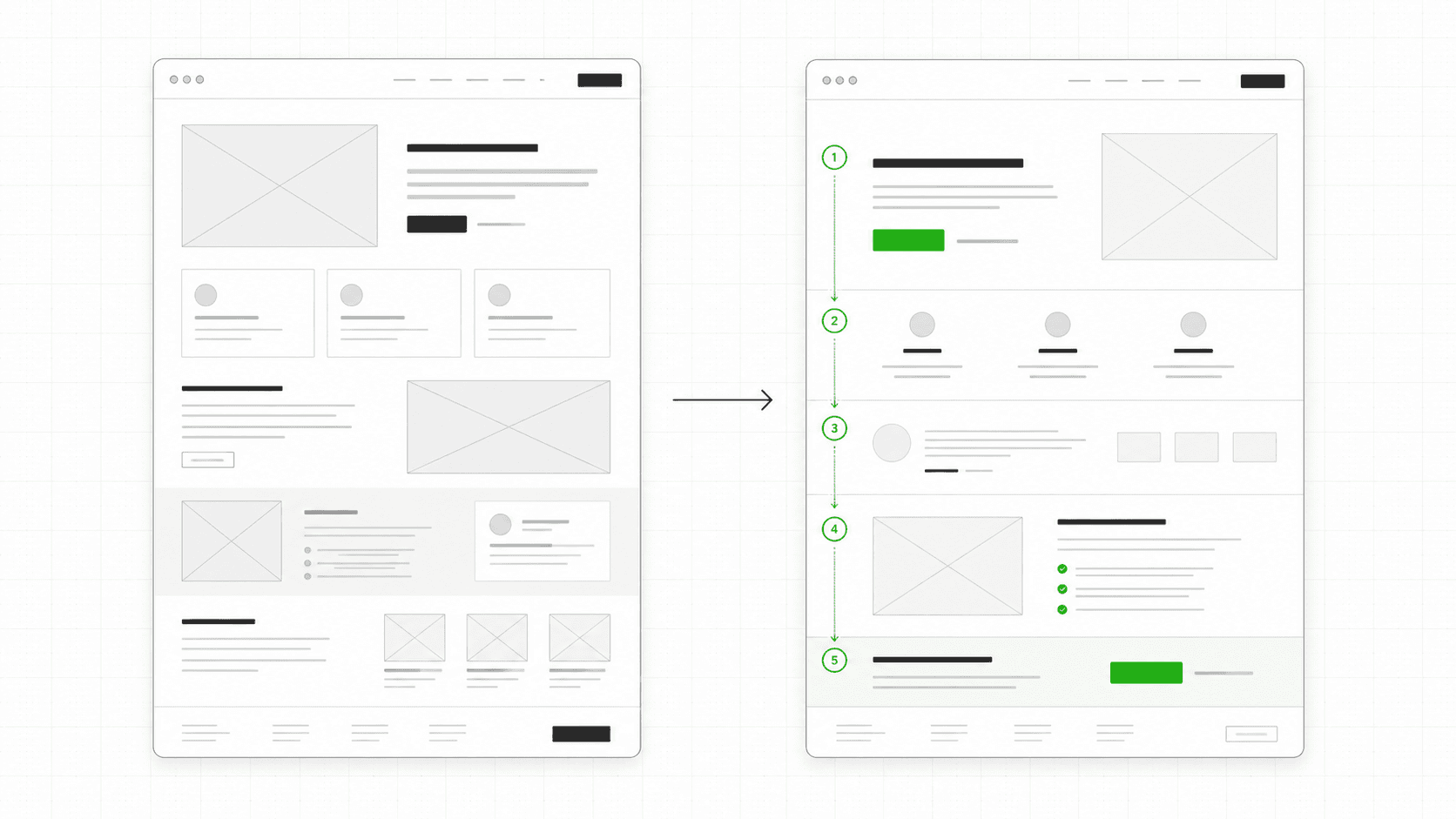
Is the hierarchy immediately clear? Open the page and look at it for three seconds. Is it obvious what to read first, second, and third? If you have to think about it, the hierarchy is not clear enough.
Is every element earning its place? For each visual element on the page, ask what information it is adding or what friction it is removing. If the honest answer is neither, the element should not be there.
Does the design serve the copy or compete with it? A visually dominant element that draws the eye away from the headline is competing with the argument rather than supporting it. The design should be directing attention toward the argument, not away from it.
Does the mobile version maintain the same hierarchy as the desktop version? Open the page on a phone. Is the headline still the most prominent element? Is the CTA visible without scrolling? Does the visual flow still make sense?
Does the page look like it was built for the specific visitor it is trying to convert? A page targeting enterprise buyers should feel different from a page targeting early-stage founders. Not just in content but in visual register. The design should signal that the company understands who it is talking to.
The Design Mistakes That Kill Conversion
Too many CTAs competing for attention. When a page has a primary CTA button, a secondary link, a navigation menu with clickable items, a chat widget, and a promotional banner all visible simultaneously, the visitor faces a choice about where to direct their attention at every moment. That cognitive load builds friction. One primary action, made visually clear, converts better than multiple competing options almost every time.
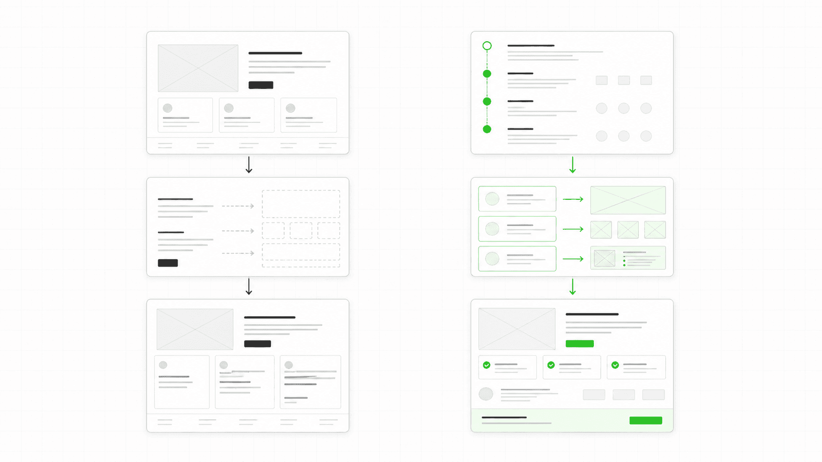
Hero images that communicate nothing. Abstract illustrations, generic stock photos, and decorative backgrounds fill the most valuable visual space on the page with information the visitor cannot use. A screenshot of the product in a realistic context, a visual representation of the outcome being promised, or a clean typographic hero with no competing visual element consistently outperforms decorative hero imagery.
Proof that is designed to look good rather than to convince. Logo grids with logos sized uniformly for visual balance rather than weighted by relevance to the target visitor. Testimonial carousels that make each testimonial equally visible rather than elevating the most specific and convincing ones. Review scores displayed prominently without the reviews themselves. These are design decisions that prioritize aesthetics over conversion function.
Animations that slow the page or distract from the argument. Entrance animations, scroll-triggered effects, and hover states can add polish and signal investment in the build. They can also slow the page, delay the visibility of the headline, and draw attention away from the copy at the moment the visitor needs to be reading it. The test for any animation is whether it makes the argument clearer or the experience smoother. If it does neither, it should not be there.
The Short Version
Landing page design earns its place by making the argument clearer, easier to follow, and more persuasive for the specific visitor the page is built for. It fails when it prioritizes aesthetic quality over conversion function.
The highest-leverage design decisions are in the hierarchy, the whitespace, the use of color as a signal, and the relationship between the visual and the copy. All of these serve the argument. None of them are about making the page look impressive for its own sake.
Copy before design. Argument before aesthetic. Conversion before portfolio.
That is the sequence that produces pages that actually work.
Good landing page design is not about aesthetics. It is about creating a visual environment where the right argument lands clearly for the right person at the right moment. This article covers what conversion-focused design actually involves, where most pages get it wrong, and what to look for in design work that is built to produce results rather than portfolio screenshots.
The Misconception That Costs Most Landing Pages Their Conversion Rate
There is a widespread belief in the world of websites and landing pages that good design produces good conversion. The logic seems sound. A professional, polished page builds trust. Trust leads to conversion. Therefore design leads to conversion.
The problem is that this chain of reasoning skips the most important step. Design builds trust by communicating competence and credibility. But trust is not the same as conviction. A visitor can trust that a company is professional and still have no reason to act. Conversion requires conviction, and conviction comes from the argument the page is making, not from how well it is presented.
This is why beautifully designed landing pages underperform constantly. The design is creating the right impression. The copy and structure are failing to make the right case. The visitor leaves thinking "nice website" rather than "this is exactly what I need."
The inversion is also true but less common. A plainer page with a sharp, specific argument built for the right buyer will outperform a polished page with generic messaging almost every time. The argument is doing the work. The design is just not getting in the way.
Understanding this distinction changes how you think about landing page design. The goal is not a page that looks impressive. The goal is a page where the design is in service of the argument, making it easier to follow, harder to ignore, and more persuasive at every step.
What Conversion-Focused Design Actually Does
Design on a landing page has three jobs, all of them in service of the copy and the argument rather than the brand or the aesthetic.
It creates hierarchy. The visual design determines what the visitor reads first, second, and third. Headline size, weight, and positioning. Whitespace around key elements. Color used to signal importance rather than decoration. A visitor scanning a page for the first time follows the visual hierarchy to navigate the content. If the hierarchy is unclear or contradictory, the visitor does not know where to look and loses the thread of the argument before they have engaged with it.
It reduces friction. Every element on a page is either helping the visitor move forward or creating resistance. A navigation menu with eight options at the top of a landing page is resistance. It offers the visitor a way to leave the page without deciding. A form that asks for seven fields before the visitor has read three sections is resistance. It asks for more than the relationship has earned at that point. Conversion-focused design removes resistance systematically, not by making the page sparse for its own sake, but by questioning every element's right to exist relative to the conversion goal.
It builds credibility. Design signals competence. A page that looks professionally built tells the visitor something about the company behind it before a single word is read. This is not about expensive aesthetics. It is about consistency, attention to detail, and the absence of the small mistakes that signal carelessness. Inconsistent spacing, mismatched fonts, images that look like stock photos, CTAs that blend into the background. Each of these erodes the credibility the copy is trying to build.
The Elements That Matter Most in Landing Page Design
Typography and hierarchy. The size and weight relationship between the headline, subheadline, body copy, and CTA is the most important visual decision on the page. A headline that is not visually dominant enough to be read first breaks the intended flow immediately. Body copy that is too small or too dense to be comfortable at a quick read produces drop-off before the argument is complete. These are not aesthetic preferences. They are functional decisions that directly affect whether the argument gets read.
Whitespace. The empty space around elements is not wasted space. It is what makes individual elements stand out and what gives the reader's eye a place to rest between points. Pages that try to pack too much into the visible area create cognitive load that causes visitors to skim rather than read. Strategic whitespace around the headline, the primary CTA, and key proof elements gives those elements the visual weight they need to do their job.
Color used with restraint. Every color on a landing page carries a signal. Too many colors create visual noise that dilutes all of them. One accent color, used consistently and specifically, draws the eye to the elements that matter most. The CTA button. A key proof element. A critical section heading. When color is used consistently as a signal rather than as decoration, it reinforces the hierarchy rather than competing with it.
Visual proof. The images and visual elements on a page are either adding information or adding noise. A screenshot of the product in use, a chart showing a specific result, a photo of a real client in context. These add information. An abstract hero illustration, a generic stock photo, a decorative background pattern. These add noise. Conversion-focused design defaults to visual elements that carry specific meaning for the target visitor rather than elements that fill space attractively.
Mobile-first thinking. The majority of visitors on many pages arrive on a phone. A design conceived on desktop and adapted for mobile produces a mobile experience where the hierarchy breaks down, the CTA is buried, and the page loses the visual logic that made the desktop version work. Designing the mobile experience as its own problem from the start, with its own hierarchy decisions, produces pages that convert on the device most of the traffic is actually using.
The Relationship Between Design and Copy
This is where most landing page builds go wrong structurally, regardless of the quality of the individual work.
The typical process is: brief the designer first, get a design, then fill in the copy. Sometimes the copy is written in parallel. Almost never is the copy written before the design begins.
The problem is that copy and design are not parallel workstreams. Copy is the argument. Design is the presentation of that argument. The design needs to know what the argument is before it can present it effectively. How much space does the headline need? What sections of the page need visual emphasis? Where should the proof elements appear relative to the copy they support? What does the CTA area need to communicate beyond the button itself?
When design precedes copy, these decisions get made by default. The designer fills in the visual structure with placeholder assumptions about what the copy will say and how long it will be. The copywriter then has to fit the argument into a structure that was not built around it. The result is compromised on both sides.
The right sequence is copy first, design second. The copy establishes the argument, the sections it needs, and the hierarchy of information. The design then creates a visual presentation that makes that specific argument as clear and compelling as possible. This is the process behind every landing page we build at Ravelink: see how it plays out in the Modue project
What to Look for When Evaluating Landing Page Design
If you are reviewing design work for a landing page, whether your own or from an agency, these are the questions worth asking before approving anything.
Is the hierarchy immediately clear? Open the page and look at it for three seconds. Is it obvious what to read first, second, and third? If you have to think about it, the hierarchy is not clear enough.
Is every element earning its place? For each visual element on the page, ask what information it is adding or what friction it is removing. If the honest answer is neither, the element should not be there.
Does the design serve the copy or compete with it? A visually dominant element that draws the eye away from the headline is competing with the argument rather than supporting it. The design should be directing attention toward the argument, not away from it.
Does the mobile version maintain the same hierarchy as the desktop version? Open the page on a phone. Is the headline still the most prominent element? Is the CTA visible without scrolling? Does the visual flow still make sense?
Does the page look like it was built for the specific visitor it is trying to convert? A page targeting enterprise buyers should feel different from a page targeting early-stage founders. Not just in content but in visual register. The design should signal that the company understands who it is talking to.
The Design Mistakes That Kill Conversion
Too many CTAs competing for attention. When a page has a primary CTA button, a secondary link, a navigation menu with clickable items, a chat widget, and a promotional banner all visible simultaneously, the visitor faces a choice about where to direct their attention at every moment. That cognitive load builds friction. One primary action, made visually clear, converts better than multiple competing options almost every time.
Hero images that communicate nothing. Abstract illustrations, generic stock photos, and decorative backgrounds fill the most valuable visual space on the page with information the visitor cannot use. A screenshot of the product in a realistic context, a visual representation of the outcome being promised, or a clean typographic hero with no competing visual element consistently outperforms decorative hero imagery.
Proof that is designed to look good rather than to convince. Logo grids with logos sized uniformly for visual balance rather than weighted by relevance to the target visitor. Testimonial carousels that make each testimonial equally visible rather than elevating the most specific and convincing ones. Review scores displayed prominently without the reviews themselves. These are design decisions that prioritize aesthetics over conversion function.
Animations that slow the page or distract from the argument. Entrance animations, scroll-triggered effects, and hover states can add polish and signal investment in the build. They can also slow the page, delay the visibility of the headline, and draw attention away from the copy at the moment the visitor needs to be reading it. The test for any animation is whether it makes the argument clearer or the experience smoother. If it does neither, it should not be there.
The Short Version
Landing page design earns its place by making the argument clearer, easier to follow, and more persuasive for the specific visitor the page is built for. It fails when it prioritizes aesthetic quality over conversion function.
The highest-leverage design decisions are in the hierarchy, the whitespace, the use of color as a signal, and the relationship between the visual and the copy. All of these serve the argument. None of them are about making the page look impressive for its own sake.
Copy before design. Argument before aesthetic. Conversion before portfolio.
That is the sequence that produces pages that actually work.
See more articles
Browse the archive for teardowns, checklists and playbooks you can copy straight into your next build.