x


Wall Pix
Wall printing
Turned a service people don't yet understand into a clear path from "what is this?" to a booked call.


The challenge
What was the problem?
The challenge wasn't traffic. It was understanding and trust.
Wall printing isn't a service most business owners instantly get. So the page had to educate first - without feeling heavy - and quickly answer what the service is, how it works, why it's worth considering and what effect it creates in a real space. At the same time, it had to position Wall Pix as a serious partner for higher-value commercial projects, not a novelty.
The existing presence was weak, the proof of expertise was buried, and the path from interest to contact was unclear - which meant lower-quality briefs and a slower path to the first conversation.
Scope
Service website + conversion structure
The fix
Here's what we've changed
We built the Wall Pix site around one idea: make the service easy to understand and easy to act on.
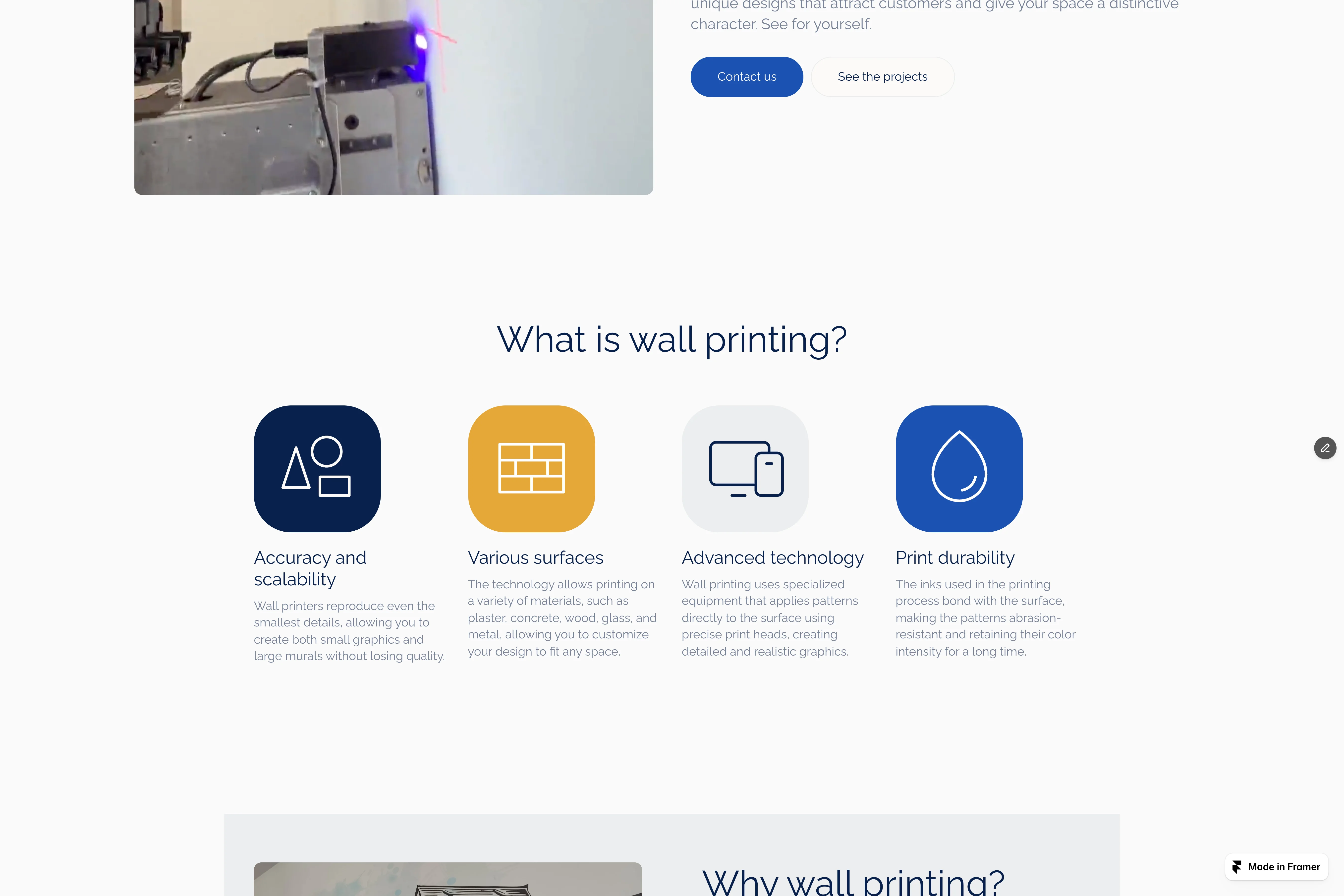
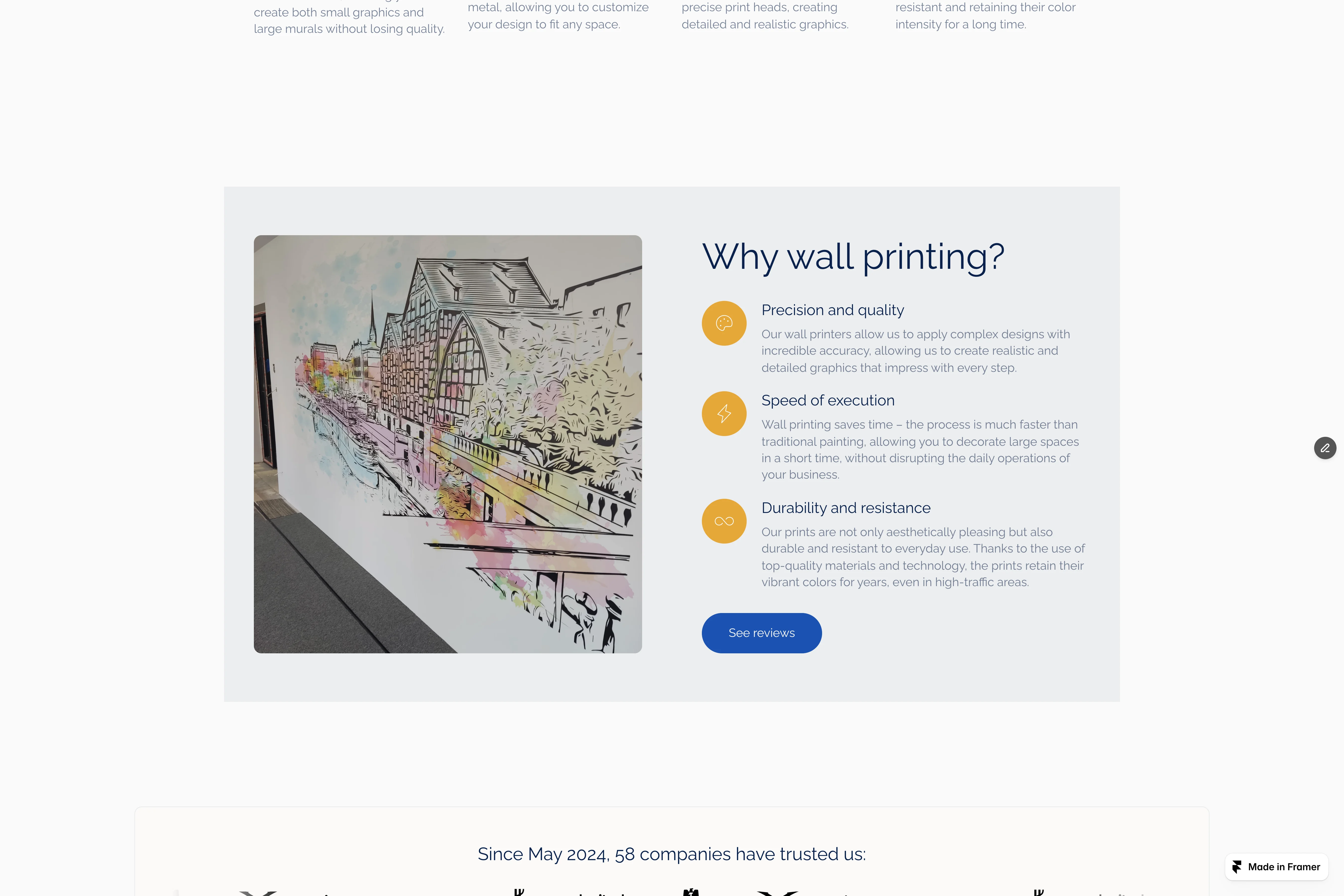
The page reframes the problem from the client's side - empty, characterless walls - and ties it straight to a distinctive business outcome. From there it moves into education: what wall printing is, how the technology works, which surfaces it supports, and why it can beat more traditional decorative options.
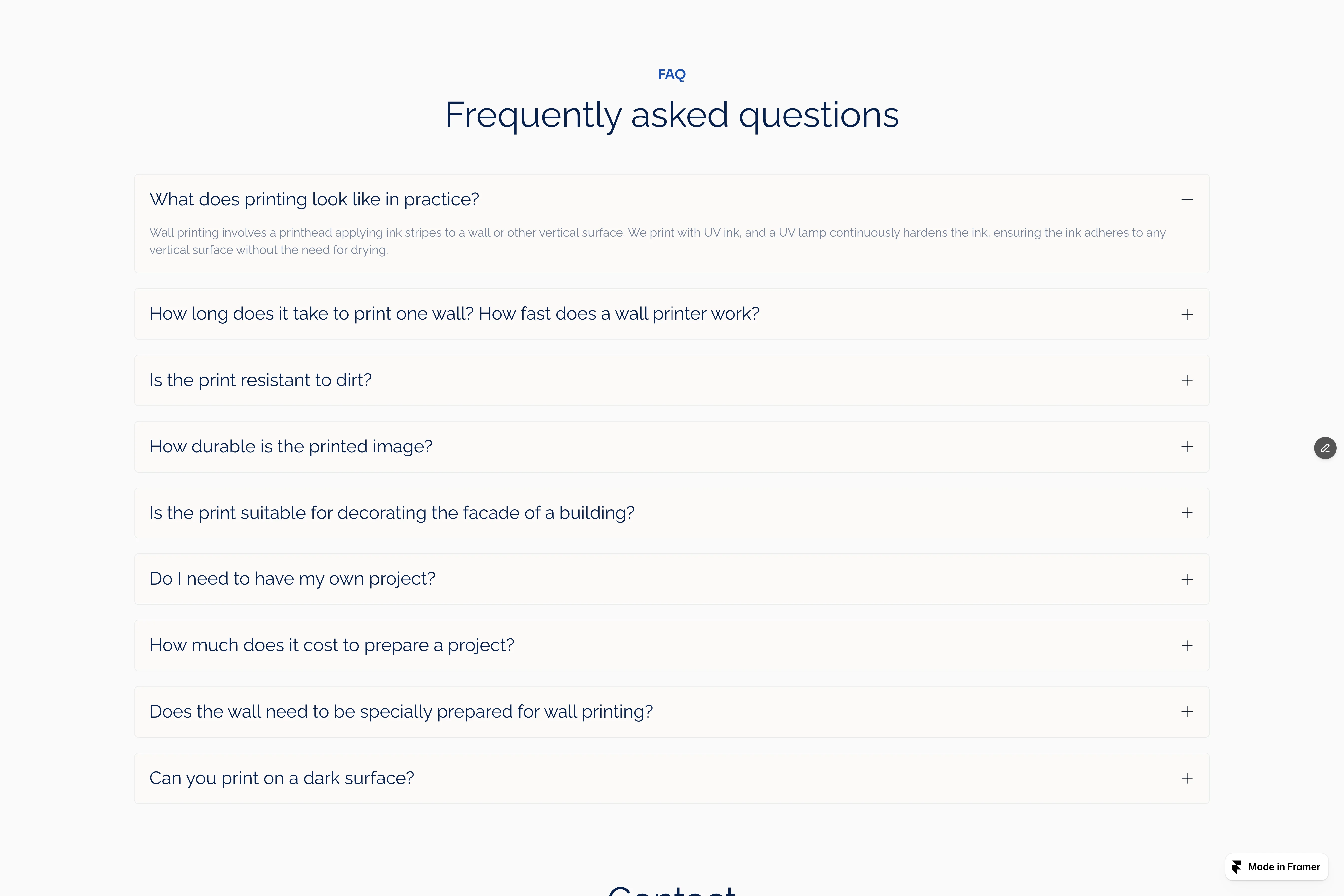
To build trust, we layered in examples, social proof, client opinions, an FAQ and a clear contact path. The whole site was rebuilt specifically to turn briefs into calls - stronger proof placement, clearer CTAs, a more deliberate route from interest to inquiry.

The results
And did it actually work?
Results
Qualified briefs 2.3x
Faster brief → first call
Built for commercial projects
The result is a site that does far more than present a visually interesting service.
It explains the offer in a way that feels clear and accessible, builds trust through proof and process, and gives potential clients a direct route to contact. Instead of leaning on novelty, the page now supports the commercial side of the business - helping visitors understand the value and move toward a real inquiry.
The impact wasn't only visual. The structure was built to lift the quality of incoming briefs and shorten the time from first contact to first call. (Jeśli masz realne 2.3x - wstaw tu jedno zdanie z tą liczbą.)
If your service is strong but the page doesn't explain it clearly enough to convert, start with the 48h Audit.


Other projects