Checkout Optimization: How to Build a Flow That Doesn't Lose Buyers

@nadolconverts
Kacper Nadol

The checkout is where committed buyers complete the purchase or vanish, and most checkouts are built in ways that quietly push them toward vanishing. This article breaks down how to build a checkout flow that removes friction at every step and converts the buyers who already decided to buy.
Why the Checkout Deserves More Attention Than It Gets
The checkout is the last thing standing between a buyer and a completed purchase, and it is handling the most valuable visitors in the entire store. Everyone who reaches the checkout has already decided to buy. They are not browsing, not comparing, not weighing whether they want the product. They want it. The only question left is whether the checkout will let them complete the purchase without giving them a reason to stop.
Most checkouts give them several reasons to stop.
The checkout is often the least optimized part of an online store because it feels like plumbing. It works, transactions complete, so it gets left alone while attention goes to the storefront, the product pages, and the marketing. But a checkout that converts 60% of the buyers who reach it versus one that converts 75% is a massive revenue difference applied to the most valuable traffic in the funnel. The buyers at the checkout are the ones you already paid to acquire, already convinced, and already got to the doorstep. Losing them there is the most expensive kind of loss.
Checkout optimization is not about adding features. It is about removing everything between the buyer's decision and the completed purchase. Every field, every step, every moment of friction that does not need to be there is costing conversions among buyers who were ready to pay. The related problem of why buyers abandon the cart specifically is covered here: Cart Abandonment: Why Buyers Leave at the Last Step (And How to Get Them Back)
The Core Principle: Remove, Don't Add
The single most important principle in checkout optimization is subtraction. The best checkouts are the ones that ask for the least, take the fewest steps, and put nothing between the buyer and the purchase that does not absolutely need to be there.
This runs against the instinct of most teams, who see the checkout as an opportunity. An opportunity to capture more data, to offer an account, to upsell, to collect a newsletter signup, to gather marketing preferences. Each of these additions feels reasonable in isolation. Together they turn a simple transaction into an obstacle course, and each obstacle is a place where a ready buyer can reconsider and leave.
The discipline is to treat every element in the checkout as guilty until proven necessary. Does this field need to be here to complete and fulfill the order? Does this step need to exist? Does this offer need to interrupt the purchase, or could it come after? Most checkouts, subjected to this scrutiny, turn out to be full of elements that serve the business's secondary goals at the expense of the primary goal, which is completing the sale.
A checkout optimized around subtraction is faster, simpler, and less prone to the second thoughts that longer checkouts invite. The buyer moves from cart to confirmation quickly enough that the momentum of their decision carries them through, before hesitation has time to creep in.
Guest Checkout Is Not Optional
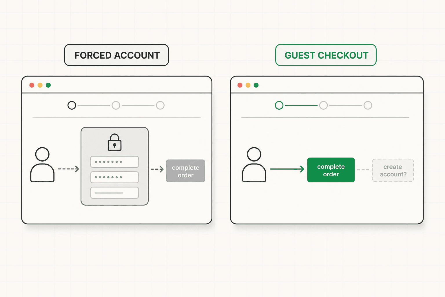
Forcing account creation before purchase is one of the most damaging and most common checkout mistakes, and it deserves its own attention because so many stores still get it wrong.
The logic behind forced accounts is understandable from the business side. Accounts enable repeat purchases, marketing, order history, and a relationship with the customer. But forcing account creation before the first purchase prioritizes those future benefits over the immediate sale, and many buyers will not make that trade. Faced with a demand to create an account, choose a password, and commit to a relationship with a store they are buying from for the first time, a significant share of buyers abandon.
Guest checkout solves this cleanly. Let the buyer complete the purchase with only the information needed to fulfill the order. Offer account creation after the purchase is complete, framed around the benefit to the buyer, when it no longer stands between them and the thing they came to buy. Many stores that switch to guest checkout recover a meaningful percentage of the buyers they were losing at the account step, with no downside, because the account can still be created after the fact.
The broader lesson is the same subtraction principle. The account serves the business. The purchase serves both the business and the buyer. When the two conflict at the checkout, the purchase wins, because a completed sale with no account is worth infinitely more than an abandoned cart with a half-created account.
Show the Full Cost Early
The most cited reason for checkout abandonment is unexpected costs appearing late in the process, which makes surfacing the full cost early one of the highest-impact checkout optimizations available.
The problem is a mismatch between the price the buyer accepted and the total they are asked to pay. When shipping, taxes, or fees appear only at the final step, the buyer experiences the gap as a surprise, even a betrayal, and the reaction is often to abandon rather than pay a total higher than what they had mentally committed to. The cost itself is frequently reasonable. The lateness of its appearance is what does the damage.
The fix is transparency throughout the flow. Show shipping costs, or at least a clear estimate, before the final step. Make free shipping thresholds visible so buyers know what they are working toward and can adjust. Surface taxes and fees early enough that the final total is never a surprise. The goal is for the number at the end of the checkout to match the number the buyer was expecting, so there is no jarring moment of recalculation that gives them a reason to leave.
This connects directly to the product page and cart, where the cost expectations are first set. A checkout that reveals costs the earlier pages hid is fighting a losing battle. The full picture of what the buyer will pay should build progressively from the product page through the cart to the checkout, with no surprises introduced at any step. The way hidden costs leak revenue across the whole funnel is covered here: Ecommerce Conversion Rate Optimization: What Actually Moves Revenue
Minimize Fields and Steps
Every field and every step in the checkout is a small opportunity for the buyer to slow down, reconsider, or make an error that costs them their progress. Minimizing both is core to checkout optimization.
For fields, the principle is to ask only for what is genuinely needed to complete and fulfill the order. Shipping address, payment details, and contact information for order updates cover most of what a transaction actually requires. Fields beyond that, marketing preferences, optional information, data collected for internal purposes, add friction without serving the buyer's goal of completing the purchase. Smart defaults, address autofill, and using the shipping address as the billing address by default all reduce the effort further.
For steps, the principle is to minimize the number of distinct stages between cart and confirmation. Some stores use a single-page checkout where everything happens on one screen. Others use a multi-step flow with clear progress indication. Both can work, and the right choice depends on the complexity of the order and the audience. What matters is that no step exists that does not need to, and that the buyer always knows where they are in the process and how much is left. Uncertainty about how many more steps remain is itself a source of abandonment.
Field validation matters here too. A checkout that validates input helpfully, catches errors clearly, and never loses the buyer's progress when something goes wrong removes a frustrating failure mode. The buyer who fills out a long form, hits an error, and loses everything is a buyer who often does not start again. The full framework for form design applies to checkout fields too: Lead Capture Form: How to Build One That Converts (And Qualifies)
Payment Options and Trust
The payment step is the moment of highest commitment and highest anxiety in the checkout, and two things determine whether the buyer completes it: whether they can pay the way they want, and whether they trust the store with their details.
On payment options, the principle is to meet buyers where they are. A buyer who cannot pay with their preferred method often abandons rather than adapting, especially as digital wallets and newer payment options become the default for many buyers. Offering the payment methods your specific audience expects removes a friction point that is entirely avoidable. The right set of options depends on the audience and the market, but the cost of missing a payment method a significant share of buyers want is real and measurable.
On trust, the payment step is where security anxiety peaks. The buyer is about to hand over card details, and anything that makes the checkout feel less than fully trustworthy can stop them at that moment. A professional, polished checkout design signals legitimacy. Visible security indicators reassure. A checkout that feels solid and secure reduces the last-second hesitation that costs sales at the payment step. This is not about adding excessive trust badges, which can look desperate, but about the checkout feeling trustworthy through its design, its clarity, and its professionalism. The way trust signals work at the point of decision is covered here: Social Proof: How to Use It So It Actually Converts (Not Just Decorates)
Mobile Checkout Is the Real Test
For most stores, a large and growing share of checkout traffic is on mobile, and mobile is where checkout friction becomes most severe. A checkout that is merely tedious on desktop can be genuinely painful on a phone.
The constraints are harsher on mobile. Every field requires tapping. The keyboard covers half the screen. Small touch targets produce errors. Long forms feel longer. Progress feels slower. All of the friction that a desktop checkout can absorb becomes amplified on a small screen, and the abandonment that results is often invisible to teams who test their checkout primarily on desktop.
A mobile checkout needs to be designed for the constraints of the device, not adapted from the desktop version. Fields sized for thumbs. The right keyboard type for each field, so a number field brings up a number pad. Autofill enabled wherever possible to reduce typing. Payment options that work smoothly on mobile, including the digital wallets that make mobile payment nearly frictionless. A layout that holds together at narrow widths without forcing the buyer to zoom or scroll horizontally.
The test is simple and most teams skip it. Complete your own checkout on a phone, as a real buyer, paying real attention to every point of friction. The mobile checkout experience is where a large share of modern ecommerce revenue is won or lost, and it is the part most likely to be neglected because the team building it works on desktop.
How to Optimize Your Own Checkout
If you want to improve your checkout, start by walking through it yourself as a buyer, on both desktop and mobile, and noting every point of friction.
Count the fields. Is each one genuinely needed to complete and fulfill the order, or does some of it serve internal goals at the cost of conversion? Cut what does not need to be there.
Count the steps. Is each step necessary, and does the buyer always know where they are and how much is left? Reduce the steps and clarify the progress.
Check when costs appear. Does the full cost build progressively so the final total matches expectations, or does something appear late that could trigger a surprise? Surface costs earlier.
Check whether guest checkout exists. If you are forcing account creation before purchase, that is likely costing you a meaningful share of first-time buyers. Add guest checkout.
Test the mobile experience specifically. This is where the friction is worst and the losses are largest, and it is the part most likely to have been neglected.
If you are losing buyers at the checkout and cannot pinpoint where, a structured diagnosis maps the specific friction points before any changes are made. See how the 48h Audit works
The Short Version
The checkout handles the most valuable visitors in the store, the ones who already decided to buy, and losing them there is the most expensive kind of loss.
Checkout optimization is about subtraction, not addition. Remove every field, step, and interruption that does not need to be there. Offer guest checkout so first-time buyers are not forced into account creation. Surface the full cost early so the final total is never a surprise. Minimize fields and steps and keep the progress clear. Offer the payment methods your audience expects and make the checkout feel trustworthy at the payment step. And design the mobile checkout for the constraints of the device, because that is where the friction and the losses are greatest.
The buyer at the checkout already wants to buy. Build a checkout that gets out of their way.
Keep reading