Landing Page Copywriting: What Actually Makes It Convert (And What Most Pages Get Wrong)

@nadolconverts
Kacper Nadol

Most landing page copy fails not because the writer lacks skill but because the copy was written with the wrong priorities. This article breaks down how conversion-focused copywriting actually works, what structure it follows, and where most pages lose the reader before the CTA even appears.
Why Landing Page Copy Is Different From Every Other Kind of Writing
Landing page copywriting is not content writing. It is not brand writing. It is not the same as writing a blog post, a LinkedIn update, or a product description for an e-commerce listing.
Every other type of writing has some tolerance for digression, atmosphere, and pace. Landing page copy has none of that. Every sentence exists to do one of two things: move the reader closer to believing the page's central argument, or move them closer to taking the action the page is built around. If a sentence does neither, it should not be there.
This is what makes landing page copy genuinely hard to write well. The constraint is severe. You are not trying to inform, entertain, or establish a voice. You are trying to take a specific person, in a specific mental state, with a specific problem, and move them from uncertainty to conviction in the space of a single page. That requires a very clear understanding of who that person is, what they already believe, what they are skeptical about, and what would actually shift them.
Most landing page copy fails because it was written without that understanding. It describes the product accurately but never connects to the reader's actual experience. It is correct but unconvincing.
Start With the Reader, Not the Product
The most common mistake in landing page copywriting is starting with the product.
A founder or marketer sits down to write the page and begins with what the product does, what its features are, what makes it technically impressive. This is natural. They know the product deeply and they are proud of it. But it produces copy that reads like a capabilities document rather than a conversion argument.
The reader does not care about the product yet. They care about their problem. They arrived at this page because something in their work or business is not working the way they want it to. They are looking for evidence that someone on this page understands that, and that there is a solution worth their time.
The strongest landing page copy starts with the reader's world, not the product's world. It reflects back the specific frustration, the specific situation, the specific goal. It makes the reader feel seen before it makes any claims. That feeling of recognition is what creates the psychological openness to hear what comes next.
This is why customer research is not optional in conversion copywriting. The language your buyers use to describe their own problems is almost always sharper and more convincing than anything you would write from scratch. Interviews, sales call notes, review mining, support tickets. These are copywriting sources, not just research exercises.
The Structure That Actually Works
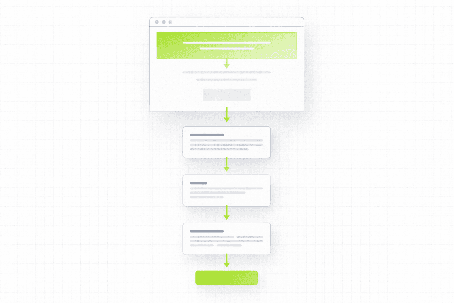
Landing page copy is not free-form. There is a logic to the order of information, and getting that order wrong is one of the most common structural failures on otherwise decent pages.
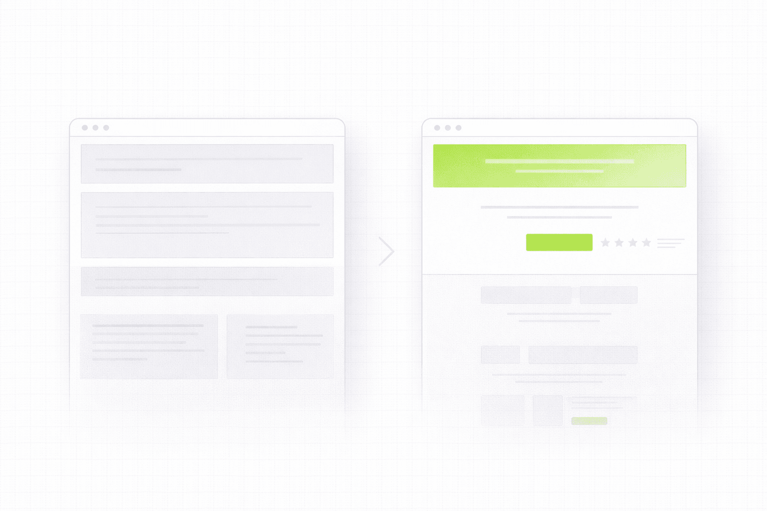
The headline carries the heaviest load.
It is the first thing read and often the only thing read if it fails. A strong landing page headline does not try to be clever or memorable. It tries to be immediately relevant to the specific person the page is built for. It names an outcome, a tension, or a situation that the reader recognizes as their own. This connects directly to what we covered in the above the fold article: Above the Fold on a Landing Page: What It Is, Why It Matters, and How to Get It Right
The test for a headline is simple: if the ideal customer reads it, do they immediately think "that is exactly my situation" or "that sounds like it could be for someone like me"? If the answer is yes, the headline is doing its job. If the answer is "maybe, I guess," it needs to be sharper.
The subheadline adds the information the headline omitted.
A subheadline that restates the headline in different words is wasted space. The subheadline should answer the question the headline raises. If the headline makes a bold claim or names a compelling outcome, the subheadline explains who it is for, how it works at a high level, or what makes this different from the obvious alternatives. It bridges the gap between the hook and the body of the page.
The body copy builds the argument section by section.
Each section of the page below the hero has a specific job. Features sections should lead with outcomes, not capabilities. A feature is "automated reporting." An outcome is "see exactly where your pipeline is leaking without pulling a single spreadsheet." The outcome answers the question the reader is actually asking, which is not "what does this do" but "what does this mean for me."
Social proof sections should be placed where the reader's doubt is highest, not grouped decoratively at the top of the page. If a visitor is reading the pricing section and wondering whether other companies like theirs have used this successfully, that is where the relevant testimonial or case study should appear. Proof placed at the point of doubt is three times more effective than proof placed where it looks good.
Objection handling should be woven into the body copy, not saved for an FAQ at the bottom. If you know the three things prospects always push back on in sales calls, those objections should be addressed directly within the relevant sections of the page. Waiting until the FAQ means most readers never get there.
The CTA is not an afterthought.
The call to action on a landing page is not a button label decision. It is the culmination of everything the page has been building toward. The copy around the CTA, immediately above and below the button, does significant work. It reduces the last friction before commitment. It restates the specific value of taking the next step. It handles the final hesitation.
The button copy itself should describe what happens next, not what the visitor is doing. "Book my free strategy call" is stronger than "submit." "Start converting more traffic" is stronger than "get started." The reader should be able to read the button and know exactly what the next thirty minutes of their life looks like if they click it.
The Tone Problem Most Pages Have
There is a particular tone that shows up on landing pages across almost every industry. It is confident to the point of being generic, polished to the point of being empty, and professional in a way that sounds like no real person actually wrote it.
Phrases like "empowering teams to do their best work" and "a seamless end-to-end solution" and "built for the modern enterprise." These sentences are not wrong. They are just meaningless. They could appear on any page in any industry and nothing would be lost or gained. They carry no information because they have been sanded down to the point where they communicate nothing specific.
The alternative is not being casual or using slang. The alternative is being specific. Specific language is almost always more persuasive than polished language because it implies knowledge. When a page uses the exact terminology a buyer uses internally, references the specific situation they are in, and names the exact outcome they are trying to achieve, it signals that the writer actually understands the problem. That signal builds trust faster than any amount of professional polish.
If you are reviewing your own landing page copy, do this test: read each sentence and ask whether it could appear on a competitor's page without changing a word. If the answer is yes, the sentence is not doing conversion work. It is just filling space.
Where Most Pages Lose the Reader
Understanding where copy tends to break down is as useful as knowing what strong copy looks like.
The most common drop-off points are predictable once you know what to look for.
The first is the transition from the hero to the body. The headline creates a promise or a hook. The next section needs to fulfill that promise or develop that hook in a way that justifies the scroll. If the first section below the hero feels unrelated to what the headline set up, the reader loses the thread and the page loses momentum. The body of the page should feel like a logical continuation of the opening argument, not a separate document stapled below it.
The second is the features section. This is where most B2B and SaaS pages stall. A list of features presented as capabilities rather than outcomes reads like a spec sheet. Readers who are not already deeply familiar with the product category scan it and feel nothing. Rewriting features as outcomes, each one connected to a specific situation the buyer recognizes, is one of the highest-leverage copy changes you can make on an existing page.
The third is the area immediately before the CTA. This is where hesitation concentrates. The reader has followed the argument to the end and is now facing the decision. This is the moment where unresolved objections surface, where uncertainty about commitment level appears, where questions about what happens next create friction. Strong landing page copy addresses all of this directly in the copy surrounding the CTA, rather than assuming the argument made earlier in the page is enough to carry the reader through. If your page is losing people at this stage, it is worth reading: Why Your Landing Page Doesn't Convert: 9 Real Reasons (And What to Fix First)
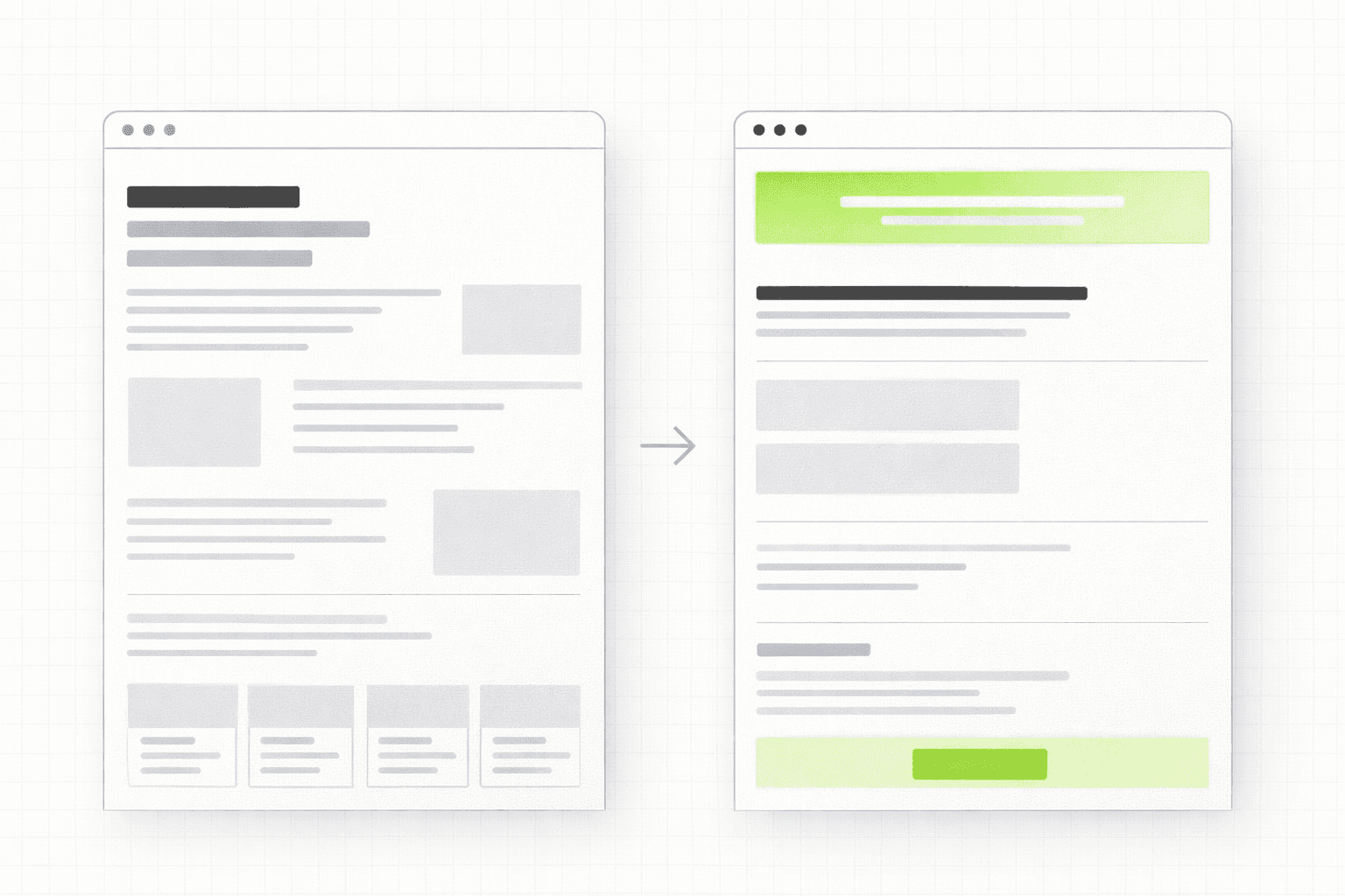
The Relationship Between Copy and Design on a Landing Page
Copy and design are not separate workstreams on a landing page. They are the same argument expressed in two different languages, and they need to be developed together to work properly.
Design creates the hierarchy that tells the reader what to read first, second, and third. It creates the visual weight that makes the headline feel important and the CTA feel like a natural endpoint. It creates the breathing room that makes copy readable rather than dense. But it can only do those things if the copy has been written first, because the copy determines what needs to be emphasized, what sections exist, and what the logical flow of the argument is.
When design comes before copy, which is how most landing pages are built, you end up with a beautiful container that the copy gets poured into afterwards. The result is almost always compromised. The headline gets truncated to fit a layout that was not designed around it. Sections that the copy needs do not exist in the template. The CTA is placed where the design looks balanced, not where the argument reaches its natural conclusion.
The right order is always copy first, design second. The copy defines the structure. The design makes that structure clear and compelling. This is something we think about on every build we do at Ravelink: see how it plays out in practice on projects like Brandive
How to Improve Your Landing Page Copy Without Starting From Scratch
If you have an existing page that is not converting the way it should, a full rewrite is not always the right first move. There are a few targeted interventions that tend to move the needle quickly.
Rewrite the headline to name a specific outcome for a specific person. Cut anything that could appear on a competitor's page. Make it about the reader's world, not the product's world.
Rewrite your features as outcomes. For each feature, ask "so what does that mean for the person using it" and write that answer instead of the feature itself.
Add specificity to your proof. Replace generic testimonials with ones that name a specific result, a specific situation, or a specific before and after. If you do not have those testimonials yet, that is a conversation to have with your best clients.
Rewrite the copy immediately above and below your CTA. Address the specific hesitation a qualified buyer would feel at that moment. Reduce the uncertainty about what happens next.
None of these changes require a redesign. They require honest copy work focused on the reader rather than the product.
If you are not sure which of these is the highest-leverage fix for your specific page, a focused audit maps the exact breakdown points before any rewriting begins. See how the 48h Audit works
The Short Version
Landing page copy works when it starts with the reader's world, builds a clear argument in the right order, uses specific language that signals real understanding, and removes every sentence that does not move the reader closer to conviction or action.
It fails when it describes the product accurately but gives the reader no reason to care, when it is polished but generic, and when it treats the CTA as a button label problem rather than the culmination of an argument.
The difference between a page that converts and one that does not is almost always in the copy. Everything else is scaffolding.
KEEP READING