B2B Landing Page: What Makes It Actually Work (And Why Most Get It Wrong)

@nadolconverts
Kacper Nadol
B2B landing pages fail in predictable ways. The messaging is vague, the proof is decorative, the CTA asks for too much too soon, and the page tries to speak to everyone instead of someone specific. This article breaks down what actually makes a B2B landing page convert, with no generic best practices and no filler.
Why B2B Landing Pages Are a Different Problem
Building a landing page for a B2B product or service is not the same problem as building one for a consumer product. The buying process is longer, the decision involves more people, the stakes are higher, and the visitor's level of skepticism when they land on the page is significantly greater.
A consumer landing page can lean on impulse, emotion, and social proof from peers. A B2B landing page has to work harder. It needs to establish credibility quickly, make a specific argument to a specific person, handle objections that the visitor is already carrying before they read the first word, and ask for a commitment that feels proportionate to the value being offered.
Most B2B landing pages fail not because they lack information but because they have the wrong information in the wrong order for the wrong person. They are built to impress rather than to persuade. They describe the product in detail without connecting to the specific situation of the buyer reading them. They look professional and communicate almost nothing.
The pages that actually convert in a B2B context do something simpler and harder at the same time: they speak directly to one person, about one problem, with one clear next step.
Who Is Actually Landing on a B2B Page
Before thinking about copy or structure, it helps to be precise about who the visitor is and what mental state they are in when they arrive.
Most B2B landing page visitors fall into one of three categories, and each requires a slightly different approach.
The first is the active searcher. They have a specific problem right now, they searched for a solution, and they ended up on the page. They are in research mode, probably comparing a few options, and they need to quickly understand whether this solution fits their situation. They have high intent but low patience. The page needs to establish relevance in the first few seconds or they are gone.
The second is the warm referral or retargeting visitor. They have already encountered the brand in some form, whether through a colleague's recommendation, a social post, an ad, or a previous visit. They have some context. They are less likely to bounce immediately but they need a reason to move forward rather than just confirming what they already vaguely knew.
The third is the cold paid traffic visitor. They clicked an ad based on a targeting signal, not because they were actively searching for a solution. Their intent is lower and their skepticism is higher. The page needs to work harder to establish why this is relevant to their situation before asking for anything.
Knowing which visitor type is most likely to land on a given page should shape almost every decision about copy, structure, and CTA. A page calibrated for active searchers will underperform on cold traffic and vice versa. This is closely connected to how traffic source affects conversion rate: What Is a Good Conversion Rate for a Landing Page?
The Messaging Problem Most B2B Pages Have
The single most common failure on B2B landing pages is messaging that describes the product without connecting to the buyer's experience.
"A comprehensive platform for managing your customer relationships" is accurate and meaningless. It describes what the product is without giving the reader any reason to care. The reader already knows they need a CRM. What they do not know yet is whether this one is right for their specific situation, whether the people who built it understand their problem, and whether the value it offers justifies the cost and the switching friction.
Strong B2B landing page messaging starts with the buyer's situation, not the product's capabilities. It names the specific problem in language the buyer uses internally. It acknowledges the cost of that problem, whether in time, money, missed opportunities, or operational drag. Then it introduces the product as the solution to that specific problem rather than as a general-purpose tool.
This shift from product-first to buyer-first messaging is one of the highest-leverage changes you can make to an underperforming B2B page. It requires knowing the buyer well enough to describe their situation accurately, which means the messaging work starts before any copy gets written. The framework for getting this right on the first screen is here: Homepage Messaging That Converts: A Simple Framework for Your First Screen
What B2B Buyers Need to See Before They Convert
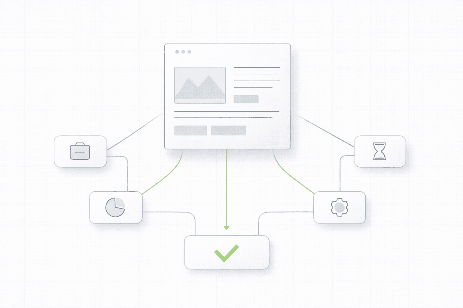
B2B conversion is not a single moment. It is a sequence of small trust-building steps that happen as the visitor moves through the page. Understanding what the buyer needs to see at each stage is what separates a page that converts from one that generates traffic and nothing else.
Immediate relevance. In the first five seconds, the visitor needs to know this page is for someone in their situation. Not for a vague target market. For them specifically. A headline that names their role, their industry, their problem, or their goal creates that recognition instantly. A generic headline makes them work to figure out if they belong here, and most of them will not do that work.
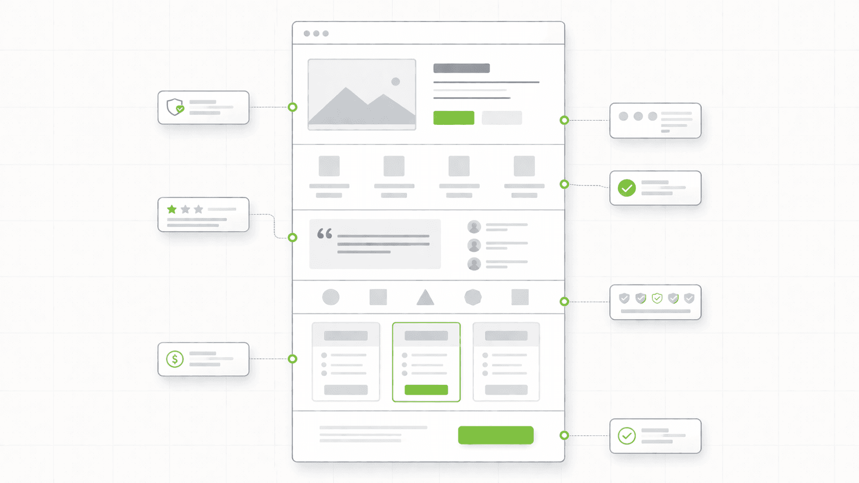
Credibility before claims. B2B buyers are trained to be skeptical of marketing claims. Before they will believe anything you say about the product, they need evidence that you understand the problem space and that other people like them have trusted you with it. This is why proof needs to appear early in a B2B page, not as a section at the bottom, but integrated into the argument as it builds. Logos of recognizable clients, specific results from relevant use cases, and testimonials that speak to the buyer's specific concern all do this work.
A clear, proportionate ask. The CTA on a B2B landing page needs to match the level of commitment the buyer is ready to make. Asking for a "book a demo" from a cold traffic visitor who has been on the page for forty-five seconds is often too much. Asking for an email address in exchange for something genuinely useful is more proportionate. The CTA should reflect where the visitor realistically is in their decision process, not where you want them to be.
Answers to the questions they are already carrying. Every B2B buyer lands on a page with a set of pre-existing questions. How much does it cost? How long does it take to implement? What happens to our data? Do companies like ours actually use this? These questions do not disappear because the page does not address them. They become objections that kill the conversion. A strong B2B landing page anticipates these questions and answers them within the flow of the page rather than leaving them for a sales call to resolve.
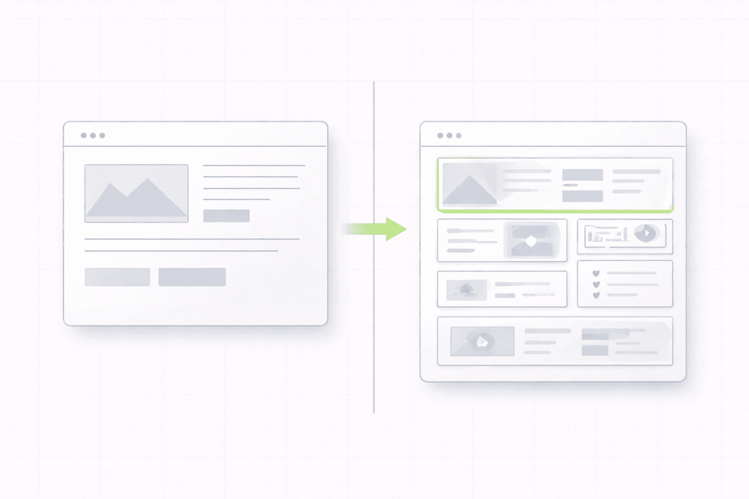
The Structure That Works for B2B
There is no single template that works for every B2B landing page, but there is a logic that consistently outperforms the alternatives.
Start with the buyer's situation, not the product pitch. The hero section should make the visitor feel recognized before it makes any claims. The headline names the problem or the goal. The subheadline adds specificity about who this is for and what the solution involves at a high level.
Follow with social proof that establishes credibility for the specific claim being made. Not a generic logo grid, but proof that speaks directly to the type of buyer reading the page. A testimonial from someone in the same role or industry as the target visitor carries significantly more weight than a logo from a recognizable company in a completely different context.
Build the argument in the middle sections. Explain what the product does, how it works at a level of detail that is useful without being technical, and what changes for the buyer after they use it. Lead with outcomes at every point. Features are supporting evidence for outcomes, not the main argument.
Handle objections before they become reasons to leave. If pricing is a concern, address it. If implementation complexity is a known hesitation, address it. If data security is relevant to the buyer's industry, address it. These conversations are happening in the buyer's head while they read the page. The page should be having them too.
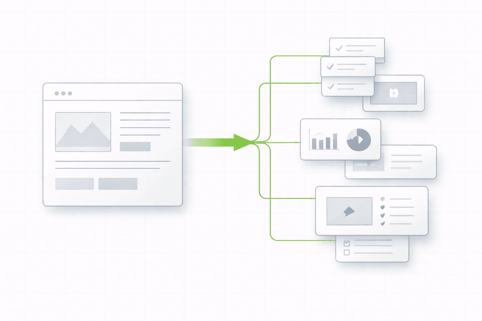
Close with a CTA that feels like a natural next step. Not a commitment, not a contract, just a clear and low-friction way to move forward. The copy around the CTA should reduce the uncertainty about what happens next and make the cost of clicking feel proportionate to the value the page has built. If you want to see how this structure plays out in a real build: see the Lokero project
The Proof Problem on B2B Pages
Most B2B pages have proof. Almost none of them use it well.
The typical pattern is a logo grid near the top of the page followed by two or three testimonials somewhere in the middle. The logos are chosen for brand recognition rather than relevance to the target buyer. The testimonials say something positive but vague about the product or the team.
This is proof as decoration. It signals that other companies have paid for the product without communicating anything specific about what those companies experienced or why it mattered to them.
Proof that actually moves B2B buyers is specific, contextual, and placed at the point of maximum relevance. A testimonial from a VP of Operations at a 200-person SaaS company saying "we reduced our onboarding time from three weeks to four days" is not just more credible than "great product, highly recommended." It is a different category of evidence entirely. It names a role, a context, and a specific measurable result. The right buyer reading it will immediately recognize their own situation and their own goal.
The placement matters as much as the content. A testimonial about implementation speed belongs next to the section where implementation is discussed, not in a testimonials carousel at the bottom of the page where half the visitors never reach it. Proof placed at the point of doubt does the work. Proof placed where it looks balanced does not.
What to Fix First If Your B2B Page Is Underperforming
If your B2B landing page is getting traffic but not converting at a rate that makes sense for the quality of that traffic, the diagnosis should come before any fixes.
The most common culprits in order of frequency are a hero section that does not establish relevance quickly enough, proof that is present but not specific or contextual enough to be convincing, a CTA that asks for more commitment than the visitor is ready to give at that stage of the page, and objections that are left unaddressed because the page assumes the sales team will handle them.
Each of these has a different fix. Conflating them and doing a full rewrite of the page all at once makes it impossible to know what actually moved the needle. The smarter approach is to identify which specific failure is costing you the most conversions and address that first.
A structured audit is almost always the fastest way to make that identification. It maps the breakdown points before any rewriting or rebuilding begins, which means the work that follows is targeted rather than speculative. See how the 48h Audit works
The Short Version
A B2B landing page works when it speaks to one specific buyer in one specific situation, builds credibility through specific and contextual proof, addresses the objections the buyer is already carrying, and asks for a next step that feels proportionate to where the buyer is in their decision.
It fails when it tries to speak to everyone, uses proof decoratively rather than strategically, describes the product without connecting to the buyer's experience, and leaves the hard questions for the sales team to handle.
The difference between the two is almost always in how well the page understands the buyer. That understanding starts before the brief and runs through every decision in the build.
KEEP READING