SaaS Landing Page: What Makes It Convert in 2026

@nadolconverts
Kacper Nadol

Most SaaS landing pages describe the product clearly and convert poorly. The problem is almost never the product. It is the page failing to make the right case to the right person at the right moment. This article covers what a high-converting SaaS landing page actually looks like and where most of them break down.
Why SaaS Landing Pages Fail Differently Than Other Pages
SaaS has a specific conversion problem that other industries do not share to the same degree. The product is often genuinely good. The team knows it. The existing customers love it. But the landing page sits between the product and the buyer and does a poor job of bridging that gap.
The failure mode is predictable once you have seen it enough times. The page leads with features rather than outcomes. The messaging speaks to everyone and resonates with no one. The proof is present but generic. The CTA asks for a commitment the visitor is not ready to make. And the first screen, the part the visitor sees before they scroll, fails to establish relevance quickly enough to earn the next ten seconds of attention.
SaaS landing pages also carry a specific challenge that product-led teams consistently underestimate: the people building the page know the product too well. They understand every feature, every use case, every technical advantage. That depth of knowledge makes it genuinely hard to write for someone who knows nothing yet. The result is copy that assumes context the visitor does not have and skips past the argument that would actually move them.
The Job a SaaS Landing Page Is Actually Hired to Do
Before optimizing anything, it helps to be precise about what the page needs to accomplish.
A SaaS landing page is not trying to explain everything about the product. It is trying to move one specific person from uncertainty to enough conviction to take one specific next step. That next step might be starting a free trial, booking a demo, signing up for a waitlist, or requesting a pricing conversation. The page's entire job is to make that one action feel like the obvious and low-risk thing to do for the right person.
This sounds obvious but it is violated constantly. Pages try to serve the awareness-stage visitor, the evaluation-stage visitor, and the decision-stage visitor simultaneously. They include sections for every possible use case and every possible buyer persona. The result is a page that is comprehensive and unconvincing, because conviction comes from specificity, not from coverage.
The strongest SaaS landing pages make a deliberate choice about who they are talking to and what that person needs to believe before they will take the next step. Everything on the page exists to build that specific belief. Everything else is cut.
What the First Screen Needs to Do
The above-the-fold section of a SaaS landing page carries a disproportionate share of the conversion work. It is where the visitor decides whether to stay or leave, and that decision happens faster than most teams assume.
In a SaaS context, the first screen needs to answer four questions immediately. What does this do? Who is it for? Why does it matter? What do I do if I want to know more? The visitor is not going to scroll to find out. If those four questions are not answered in the first frame, most visitors are already gone.
The headline is where this starts. A strong SaaS headline names an outcome the target buyer actually cares about, in language that reflects how they think about their own problem. Not a product category. Not a tagline. A specific outcome for a specific person. "Automate your client reporting in under ten minutes" is a SaaS headline. "The smarter way to manage client relationships" is a category description. One creates immediate relevance. The other creates mild curiosity that most visitors will not act on. The full breakdown of what the first screen needs to accomplish is here: Above the Fold on a Landing Page: What It Is, Why It Matters, and How to Get It Right
Features vs Outcomes: The Most Common SaaS Copy Mistake
SaaS teams are built around the product. Engineers, product managers, and founders think in features because features are what they build and ship. When those same people write landing page copy, features are what comes out.
The problem is that buyers do not buy features. They buy outcomes. They buy the version of their work life where the problem no longer exists, where the process runs smoothly, where the thing that was costing them three hours a week has disappeared. Features are the mechanism. Outcomes are the reason to care.
The rewrite from feature to outcome is always the same move. Take the feature. Ask what it means for the person using it. Write that instead.
"Automated reporting" is a feature. "Your Monday morning report writes itself" is an outcome. "Role-based access controls" is a feature. "Every team member sees exactly what they need and nothing they should not" is an outcome. "Real-time sync across all your tools" is a feature. "Your data is always current, wherever you look at it" is an outcome.
None of these require more words. They require a different starting point. Start with the buyer's experience, not the product's capabilities, and the copy almost writes itself. This is the central argument in the landing page copywriting article: Landing Page Copywriting: What Actually Makes It Convert
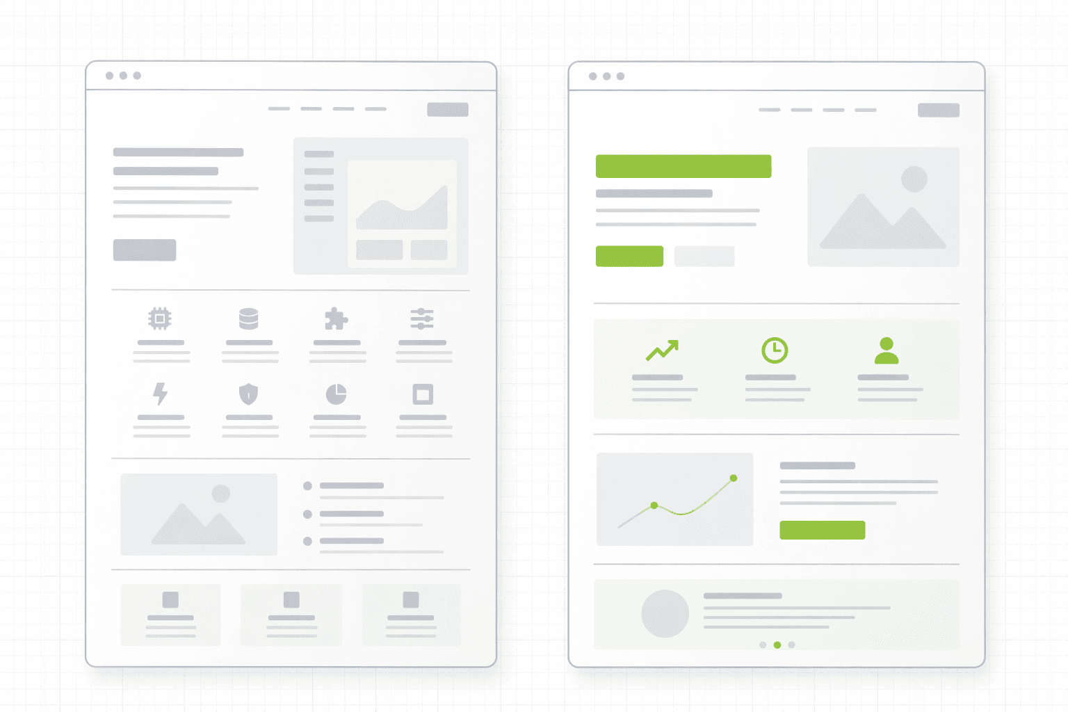
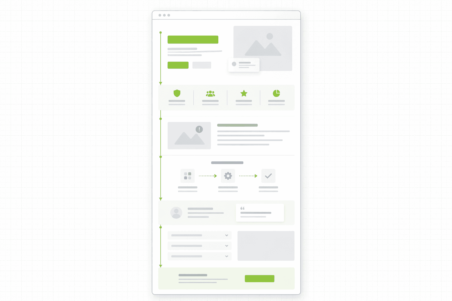
How to Structure a SaaS Landing Page That Converts
There is no single template that works universally, but there is a logic to the ordering of information that consistently outperforms the alternatives.
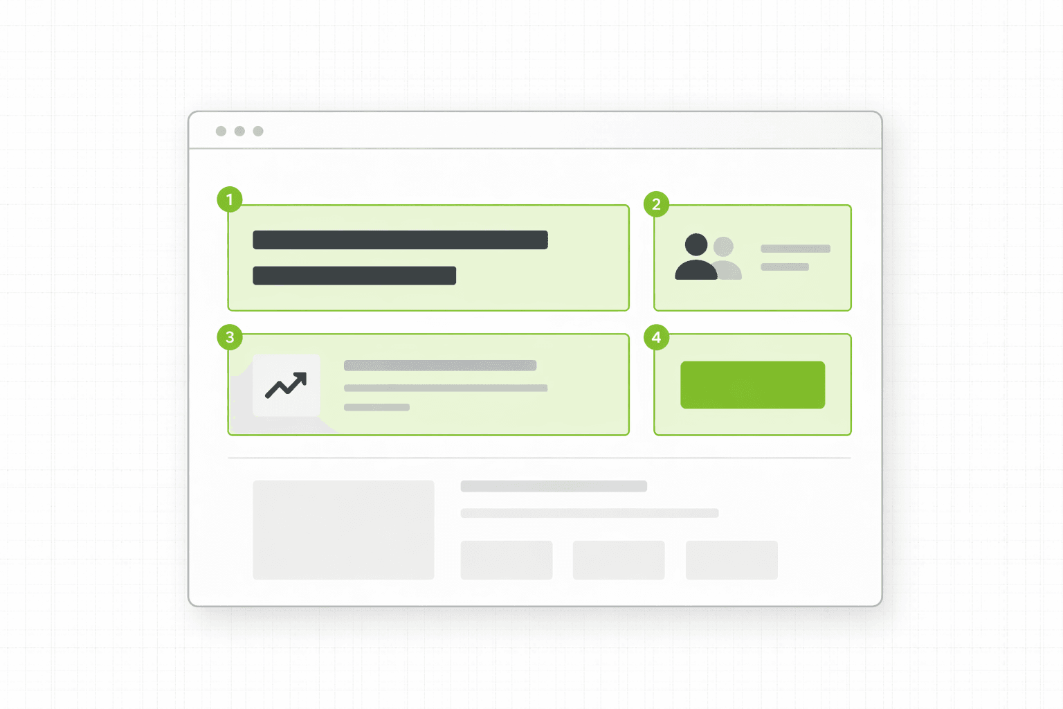
Hero section. One outcome-focused headline. A subheadline that adds specificity about who this is for and how it works at a high level. A primary CTA that matches the visitor's readiness level. A supporting visual that shows the product in context rather than an abstract illustration that communicates nothing.
Social proof above the scroll or immediately below it. Not a logo grid as decoration, but specific proof that signals this is used by people like the visitor. A recognizable logo from their industry, a specific metric from a relevant case study, or a testimonial from someone in their role carries weight at this stage. Generic "loved by thousands of teams" copy does not.
The problem section. Before explaining the solution, name the problem with enough specificity that the reader recognizes their own situation in it. This section earns the right to introduce the product by demonstrating that you understand what the buyer is dealing with. It is the part most SaaS pages skip entirely and its absence is consistently felt in the conversion rate.
The solution and how it works. Explain what the product does and how at a level of detail that is useful without being exhaustive. Lead with outcomes, support with features. Use specific examples and mini-scenarios rather than abstract capability statements. Make it easy to visualize what using the product actually looks like.
Proof at the point of maximum doubt. Case studies, testimonials, and results placed within the sections where the relevant skepticism is highest. If the objection is "this sounds complicated to set up," the proof that addresses it belongs in or immediately after the section discussing implementation. Not in a separate testimonials section three screens later.
Objection handling. The questions every prospect asks before signing up, addressed directly and honestly within the page rather than deferred to a sales call. Pricing transparency where possible, implementation clarity, data handling, support availability. The more of these the page resolves, the lower the friction at the CTA.
The CTA section. A clear, low-friction ask that reflects where a qualified visitor realistically is after reading the page. Strong supporting copy around the button that reduces the final hesitation and makes the next step feel obvious and safe.
The Proof Problem Specific to SaaS
SaaS pages often have a proof gap that is different from other categories. Early-stage products may have limited case studies. New features may not have metrics yet. The team knows the product works but the evidence base is thin.
The response to this is almost always to use the proof that exists badly. Logo grids of small companies the target buyer has never heard of. Testimonials from users who like the product but say nothing specific about results. Review scores from platforms that every SaaS product appears on.
There are better approaches to thin proof. One specific, detailed case study from a relevant client is worth more than ten generic testimonials. A transparent description of how the product works and what the implementation process looks like builds more trust than abstract credibility signals. Showing the product in action, through a demo video, a product tour, or well-chosen screenshots of real use cases, gives the visitor direct evidence rather than asking them to trust secondhand claims.
The goal is not to appear more established than you are. It is to give the visitor the specific evidence they need to make a confident decision. Sometimes that evidence is a case study. Sometimes it is a clear and honest explanation of how the product works and who it is for. The way proof functions architecturally across a page is something we dig into here: Why Your Landing Page Doesn't Convert: 9 Real Reasons (And What to Fix First)
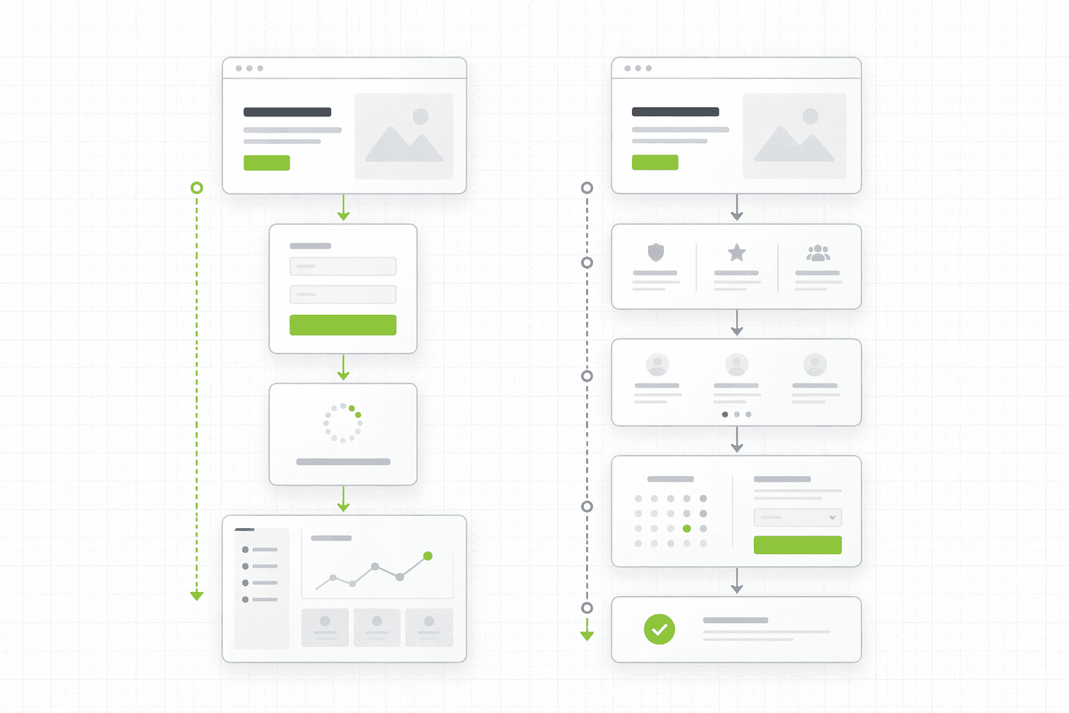
Free Trial vs Demo: Choosing the Right CTA for a SaaS Page
The conversion action on a SaaS landing page is one of the most consequential decisions in the build and one of the least discussed.
Free trial and demo request are not interchangeable CTAs. They attract different visitors, require different page structures, and produce different kinds of leads. Getting this wrong means either asking for too much from visitors who are not ready, or asking for too little from visitors who would have moved faster with a clearer path.
Free trial CTAs work best when the product has a short time-to-value, low setup friction, and a strong onboarding experience that can demonstrate value without human intervention. They also require the page to do more of the education work upfront, because the visitor is committing to trying before they fully understand the product.
Demo request CTAs work better for products with longer sales cycles, higher price points, more complex use cases, or implementation processes that benefit from guided onboarding. They require the page to build enough trust and clarity to make a thirty-minute conversation feel worth the visitor's time, which is a higher bar.
A useful middle ground for products caught between the two is a product tour or interactive demo that lets visitors experience the product without committing to a full trial or a sales call. This captures buyers who are interested but not yet ready for either heavier commitment.
Whatever the CTA, the copy around it matters more than most teams realize. The sentence immediately above the button and the one immediately below it are doing significant friction-reduction work at the moment of maximum hesitation. That copy deserves as much attention as the headline.
Before You Redesign, Do This
If your SaaS landing page is underperforming and the instinct is to rebuild, it is worth being precise about what is actually broken before committing the budget and the time.
Most underperforming SaaS pages have one or two specific failure points, not a global problem that requires starting from scratch. The hero is vague. The proof is generic. The CTA is mismatched to visitor readiness. The objections are unaddressed. Each of these has a targeted fix that is faster and cheaper than a full rebuild.
A structured audit identifies the specific failure points rather than generating a list of generic recommendations. It tells you what to fix first and why, which makes the work that follows intentional rather than speculative. See how the 48h Audit works
The Short Version
A SaaS landing page converts when it speaks to one specific buyer about one specific problem, leads with outcomes rather than features, uses proof that is specific and placed where the doubt is highest, and asks for a next step that matches the visitor's realistic readiness.
It fails when it tries to cover everything, speaks to everyone, and optimizes for looking comprehensive rather than being convincing.
The product being good is not enough. The page has to make the case.
Keep reading