Landing Page Checklist: What Actually Needs to Be on the Page (And Why)

@nadolconverts
Kacper Nadol
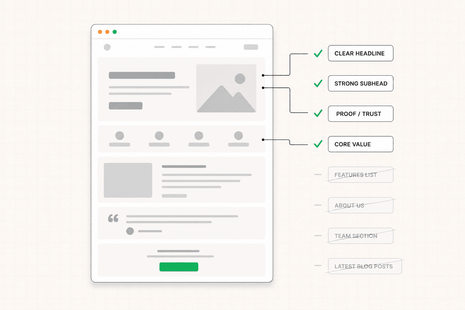
Most landing page checklists are 50-point lists that read like they were assembled by someone who has never built a converting page. This is the version that focuses on what actually matters — the elements that need to exist, why they exist, and how to know if each one is doing its job.
Why Most Landing Page Checklists Miss the Point
Search "landing page checklist" and you will find versions that list every imaginable element a page could contain. Hero section, value proposition, social proof, features, testimonials, FAQ, exit-intent popup, urgency banner, live chat widget, trust badges, video, animated counters, and on and on.
These lists are exhaustive and almost useless.
The problem is not that any single element on these lists is wrong. It is that the list itself is the wrong framing. A landing page is not a collection of recommended ingredients to be assembled in some quantity. It is a focused commercial argument, and most of the elements on a typical checklist exist on weak pages too. Having all the components does not produce conversion. Having the right components in the right order, each one doing actual work, does.
The useful version of this article is shorter and more specific. There are a small number of elements that need to exist on almost every landing page that converts. There are a smaller number of decisions about each one that determine whether the element is doing conversion work or just taking up space. This is that list.
Element One: A Hero Section That Earns the Scroll
The hero is the most important element on the page and the one with the most consistent failure mode.
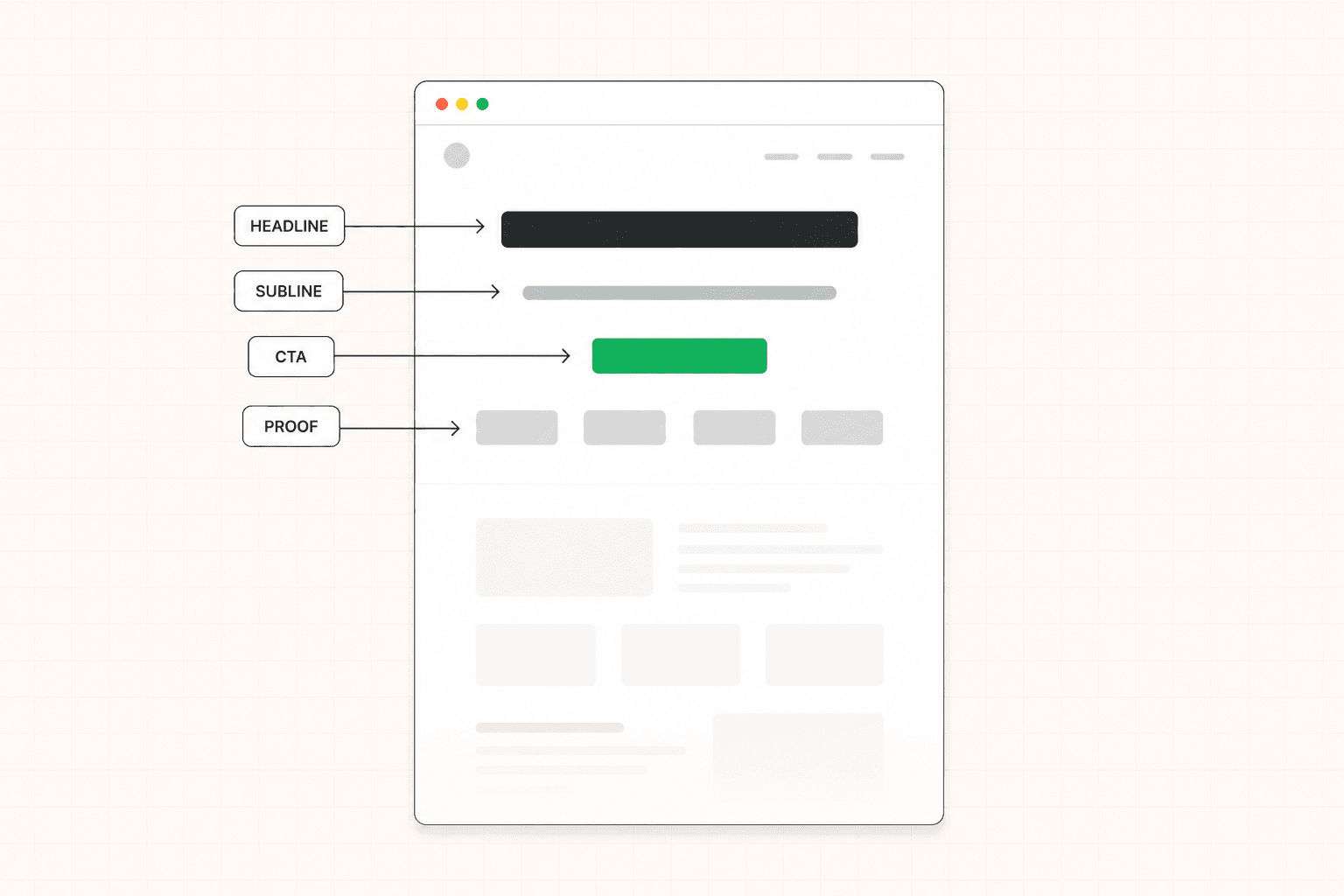
What needs to exist: a headline that names a specific outcome or situation the target buyer recognizes, a subheadline that adds information the headline does not include, a primary CTA, and either a supporting visual or controlled negative space that maintains focus on the words.
What it needs to do: make the right visitor feel, in under five seconds, that this page is for someone in their situation. Not for a category. For them.
What makes it fail: vague language, product-first headlines, subheadlines that restate the headline, CTAs that say "learn more" or "get started" with no specifics, and visual elements that compete with the message rather than supporting it.
The test for whether your hero is working is brutal but clarifying. Show the page to someone in your target audience for five seconds, then close it and ask them what the offer was, who it was for, and what to do if interested. If they cannot answer all three, the hero is failing at its primary job, and nothing below it is getting the audience it deserves. The full framework for what the first screen needs to accomplish is here: Above the Fold on a Landing Page: What It Is, Why It Matters, and How to Get It Right
Element Two: Immediate Social Proof
Most pages put social proof in a dedicated section halfway down. The pages that convert better treat early proof as part of the hero's job.
What needs to exist: some form of credibility signal within the first viewport. Client logos, a specific metric, a notable testimonial, a press mention, a review score. The specific form depends on what you have and what your target buyer trusts.
What it needs to do: reduce the immediate skepticism that builds in the first few seconds. The visitor lands on the page and starts evaluating whether this is legitimate. Early proof answers that question before it becomes a reason to leave.
What makes it fail: logos chosen for visual balance rather than relevance to the target buyer, testimonials that say something positive but vague, generic review scores from platforms every product appears on. Decoration without specific signaling.
The strongest version of early proof speaks to the same buyer the hero is targeting. If the page is for ops teams at series A SaaS companies, the logo or quote near the hero should be from a recognizable company in that exact category. Universal proof works less well than narrow, specific proof for the right reader.
Element Three: A Problem Section That Names the Situation
Most underperforming pages skip this and jump straight from the hero to features. The pages that convert better take a moment to name the problem before introducing the solution.
What needs to exist: a section that describes the buyer's current situation, frustration, or goal in language the buyer recognizes. This does not have to be long. Sometimes one specific paragraph or three concise lines is enough.
What it needs to do: establish that the page understands the buyer before it tries to sell to them. Recognition creates trust. Trust creates the willingness to keep reading. Without this step, the visitor reads the features section as a sales pitch from a stranger.
What makes it fail: vague descriptions of a problem space, references to the problem in abstract terms ("inefficient workflows," "lack of visibility"), and any framing that sounds like marketing rather than how the buyer actually thinks about their own situation.
The most effective version of this section often comes directly from customer interviews or sales call notes. The exact language buyers use to describe their own frustration is almost always sharper and more convincing than anything written from scratch by the marketing team.
Element Four: Features Framed as Outcomes
Every page has a features section in some form. The difference between pages that convert and ones that do not is usually in how the features are framed.
What needs to exist: a section that explains what the product or service does, organized around the outcomes those features produce for the buyer.
What it needs to do: connect the mechanism of the product to the buyer's experience. Show what changes for them when they use it.
What makes it fail: capability lists, technical specifications presented without context, and features described in terms of what the product does rather than what it does for the person using it. "Real-time sync" is a feature. "Your data is current wherever you check it" is an outcome. Same information, different work being done. The full breakdown of how to write this kind of copy is here: Landing Page Copywriting: What Actually Makes It Convert
The structure that consistently works is outcome first, then feature as evidence. Lead with what changes for the buyer. Follow with the specific capability that delivers that change. Buyers buy the change. They evaluate the feature only after they care about the change.
Element Five: Specific, Contextual Proof Placed at Doubt
Most pages have proof. The pages that convert have proof in the right places.
What needs to exist: testimonials, case studies, or specific results placed throughout the page rather than grouped in a single section.
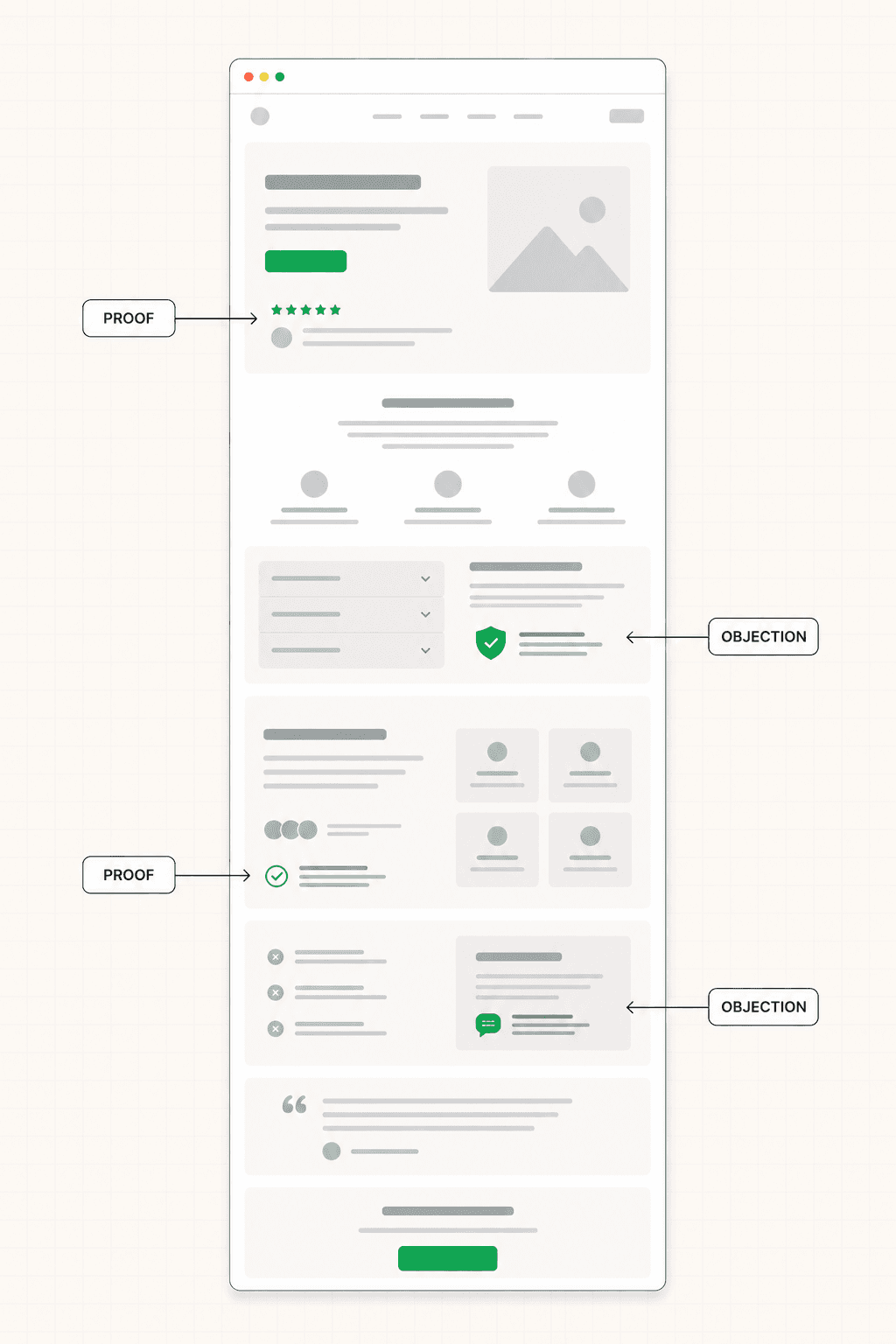
What it needs to do: address the specific doubts that form as the visitor moves through the argument. A claim about implementation speed gets followed by a testimonial about implementation speed. A claim about ROI gets followed by a case study with measurable results. Proof appears where the question would form, not where it looks balanced.
What makes it fail: testimonial carousels at the bottom of the page that most visitors never reach. Logo grids placed for visual decoration rather than specific relevance. Vague positive quotes that say nothing concrete about what changed or why it mattered.
A useful test for any piece of proof on your page is to ask what specific doubt it would resolve. If the answer is "it makes us look credible," that is not specific enough. If the answer is "it shows that companies similar to the target buyer have used this and gotten a measurable result," that is proof doing actual work.
Element Six: Objection Handling Inside the Copy
Every qualified buyer who does not convert had a reason. The pages that convert better address those reasons directly within the page rather than leaving them for a sales call to handle.
What needs to exist: explicit answers to the three to five questions that come up most often in your sales conversations, woven into the relevant sections of the page rather than relegated to a separate FAQ.
What it needs to do: reduce the friction that builds between interest and action. The visitor has a question, the page answers it before the question becomes a reason to leave.
What makes it fail: an FAQ section at the bottom that contains the actual objections, where it gets read by visitors who already converted or who already left. Objections need to be addressed in the body of the page, near the relevant claims, while the visitor is still building the argument.
The fastest way to identify which objections need to be on the page is to talk to your sales team. The three things that come up most often in calls — pricing concerns, implementation worries, integration questions, data security, contract terms — are almost certainly the same things blocking conversion on the page. Address them visibly.
Element Seven: A CTA Calibrated to Visitor Readiness
The CTA is the moment everything the page has been building toward becomes a decision. It is also where most pages quietly leave conversions on the table.
What needs to exist: a primary CTA that asks for something proportionate to where the realistic visitor is when they reach it. For some pages, that is a demo request. For others, a free trial signup. For others, a lower-friction lead capture in exchange for something useful. Sometimes a primary CTA plus a secondary lower-commitment option to capture buyers who are interested but not yet ready.
What it needs to do: make the next step feel like the obvious and low-risk thing to do for someone the page has just convinced.
What makes it fail: a CTA copy that says "submit" or "get started" with no specifics. A button that is visually indistinguishable from the rest of the page. A primary action that asks for too much commitment given how cold the traffic is. Surrounding copy that ignores the final hesitation that always builds at the moment of decision.
The CTA copy itself should describe what the visitor is doing and what happens next. "Book my 20-minute strategy call" tells the visitor exactly what they are committing to. "Get started" tells them almost nothing. Specificity reduces the small hesitation that costs conversions for purely linguistic reasons.
Element Eight: A Mobile Experience Designed Separately
Most pages get designed for desktop and adapted for mobile. The pages that convert well treat mobile as its own problem from the start.
What needs to exist: a mobile version of the page where the headline is readable without zooming, the CTA is reachable with a thumb without scrolling past it, the proof is visible within the natural scroll path, and the hierarchy holds together at narrow widths.
What it needs to do: convert mobile visitors at rates comparable to desktop. For most B2B and SaaS pages today, mobile is a significant portion of the traffic. A page that converts at 5% on desktop and 0.8% on mobile is leaving meaningful revenue on the table.
What makes it fail: mobile layouts where the headline becomes a wall of small text, the hero image takes up the entire first viewport pushing the headline below the fold, the CTA appears only after multiple swipes, and the navigation menu hijacks the top of the screen with a hamburger that opens to a dozen options at the moment the visitor was about to commit.
The test is the same as for desktop. Open your own page on a phone, time yourself, and note every moment where you slowed down. Each one is mobile-specific conversion friction.
What Most Checklists Include That You Can Skip
A few elements that show up on most landing page checklists deserve scrutiny because they often hurt more than they help.
Exit-intent popups irritate qualified buyers and produce low-quality conversions. They might work for ecommerce in some configurations. For B2B and SaaS they usually do more reputational damage than the conversion lift justifies.
Countdown timers and "limited spots" language manufacture urgency that most B2B buyers see through immediately. They erode trust in the same moment they are supposed to drive action. Use only when genuine urgency exists.
Live chat widgets default to costing more in attention than they generate in conversions. The widget pulls attention from the primary CTA, and most visitors who would have engaged with chat would have converted on the page anyway if the page was doing its job.
Animated counters showing customer numbers or money saved feel impressive and convert poorly. Specific testimonials with named outcomes do the same work without the gimmick.
Trust badge rows from generic platforms ("As Featured On...") are weaker than one specific testimonial from a relevant buyer. They add visual weight without adding specific credibility.
None of these are categorically wrong on every page. Each one is worth questioning before assuming it belongs.
Before You Use This Checklist
If you are about to build or rebuild a page, run through these elements as questions before any design or copy work begins.
Who is this page built for, specifically? What is the one situation a visitor is in when they land here? What is the one action this page exists to drive? What does the visitor need to believe before they take that action? What specific proof supports each of those beliefs? What are the three biggest objections a qualified buyer would have? How is the CTA calibrated to where the visitor realistically is when they reach it?
The answers to those questions are the foundation of the page. The checklist tells you what elements need to exist. The answers tell you what each element actually needs to say. The full framework for getting these answers before any design begins is here: How to Write a Landing Page Brief That Actually Gets You a Converting Page
If your current page is not converting and you are using this checklist as a diagnostic tool rather than a build guide, the most useful next step is figuring out which of these elements is the weakest link rather than trying to improve all of them at once. A focused audit identifies the specific failure points so the work that follows is targeted. See how the 48h Audit works
The Short Version
A landing page that converts has fewer elements than most checklists suggest. A hero that earns the scroll, immediate social proof, a problem section that names the situation, features framed as outcomes, specific proof placed at doubt, objection handling inside the copy, a CTA calibrated to readiness, and a mobile experience designed separately.
Each element has a specific job. Each one either does that job or it should not be on the page. The pages that convert are the ones where every element earns its place.
The number of components matters less than whether each one is doing actual conversion work.
KEEP READING