How to Qualify Leads on Your Website Without Killing Conversions

@nadolconverts
Kacper Nadol

A lot of websites have the opposite problem people assume. It is not that they get too few leads. It is that they get the wrong ones. The trick is qualifying earlier without making the next step feel heavier than it needs to be.
More leads is not always the win people think it is
A lot of teams say they want more leads when what they really want is fewer bad conversations.
That difference matters.
Because if your site is bringing in people who cannot afford you, do not need what you sell, are too early, are too small, or are simply not a fit, then “more leads” just means more noise. More calls that go nowhere. More inbox clutter. More sales time wasted on people who were never going to convert in the first place.
This is exactly why lead qualification matters so much on the page itself.
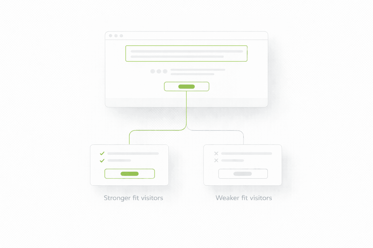
A website should not just attract attention. It should shape it. It should make the right people feel like they are in the right place, while making the wrong people quietly realise they are not.
If you want the broader conversion foundation behind that idea, start here: Website Audit Checklist
The mistake teams keep making
A lot of websites try to solve lead quality in the sales process instead of the page.
So they keep the site broad, the offer soft, the messaging vague, the CTA generic, and the form open to basically everyone. Then later they complain that too many leads are random, low-intent, low-budget, or not aligned.
That is not a sales problem first. It is often a page problem.
Because qualification usually starts before the form. It starts with:
who the page is clearly written for
what standard or threshold is implied
what the offer is really about
what kind of next step the CTA sets up
what the form asks, and what it does not
If those things are loose, the lead pool will be loose too.
Qualification starts with positioning, not with fields
This is where people often get it wrong.
They think lead qualification means adding more questions to the form. Bigger form. More screening. More fields. More friction.
That can work in some cases, but it is usually the clumsy version.
Better qualification starts earlier, in the message itself.
If your page clearly says:
who the offer is for
what kind of business it helps
what stage it is designed for
what level of need or seriousness is expected
then part of the filtering happens before the visitor even clicks.
That is cleaner, because the wrong-fit user self-selects out earlier.
If the first screen still feels too broad, start here: Homepage Messaging That Converts
The real goal is not to block people
It is to make the next step feel right for the right person.
That is an important distinction, because qualification can easily become heavy-handed.
If the page feels like a gatekeeper too early, good prospects may bounce. If it feels too open, the wrong people slide through. The job is not to make the page strict. The job is to make it specific enough that fit becomes obvious.
That can show up in simple ways:
naming the client type
naming the problem severity
naming the stage or budget range indirectly
making the outcome feel relevant only to the right audience
making the next step match the seriousness of the offer
This is why lead quality is so often a copy and structure problem before it becomes a form design problem.
Where websites usually qualify badly
The most common mistakes are boring, but expensive.
The page says things like:
“We help businesses grow”
“Book a call”
“Get started”
“Request a quote”
None of those are broken on their own. They are just too generic to do any filtering.
The wrong people do not feel pushed away. The right people do not feel specifically pulled in. Everyone gets the same broad invitation.
That usually creates one of two bad outcomes:
too many weak leads
too few total leads, because the page is vague and nobody feels addressed properly
Both problems often come from the same root cause.
A better way to qualify without making the page feel heavy
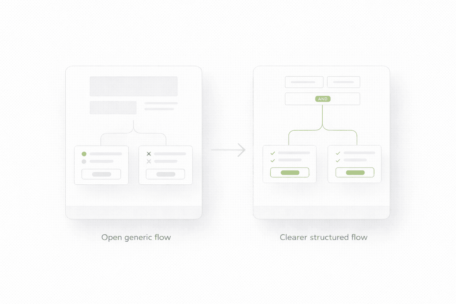
The cleanest qualification system usually has three parts.
First, the messaging makes the fit clearer.
Second, the structure makes the offer and next step more explicit.
Third, the form or CTA adds just enough friction to separate intent from curiosity.
Not maximum friction. Just enough.
Examples of “just enough” qualification:
a qualification-focused CTA instead of a generic one
a short pre-form explanation of who the next step is for
one or two form questions that reveal seriousness
a clear threshold or fit note on the page
stronger proof that speaks to the right kind of buyer
The key is proportion. If the page has earned trust, a slightly heavier next step can work. If the page is still cold, too much friction will hurt good-fit leads too.
Qualification and conversion are not opposites
This is one of the biggest misconceptions.
Teams often act like they have to choose:
either convert more people
or qualify harder
That is the wrong frame.
A stronger page can do both at once if it gets clearer about:
who it is for
what value it creates
why it is credible
what kind of next step makes sense
In other words, better qualification often improves conversion because the page becomes sharper.
The form is still part of the story
Even though qualification should start before the form, the form still matters.
A few common mistakes:
asking too many questions too early
asking nothing useful at all
making the form feel like homework
not explaining what happens next
using a CTA that feels disconnected from the page
A better form usually does two things:
confirms fit
preserves momentum
That is the balance.
You are not trying to interrogate the user. You are trying to turn intent into a cleaner next step.
When a qualification form makes sense
A qualification form usually makes more sense when:
the offer is higher-ticket
the buyer fit matters a lot
the sales process is not purely self-serve
low-fit calls are expensive
there is already enough demand that filtering matters
It makes less sense when:
the page has not earned enough trust yet
the product is low-friction and self-serve
you are starving for signal and need volume first
the real problem is weak messaging, not weak lead quality
This is one reason why some teams should fix the page before they add qualification layers. If the landing itself is weak, adding more friction can make a bad situation worse. This article connects directly: Why Your Landing Page Doesn’t Convert
Use structure to signal standards
This is subtle, but powerful.
A page does not need to literally say “Do not contact us unless…” to create standards. Standards can be implied by:
the way the offer is framed
the proof you choose
the language around outcomes
the seriousness of the CTA
the clarity of who the page is for
That is why two pages with the same form can produce very different lead quality. The form is not the whole filter. The page is the filter.
And if you are doing a broader rebuild rather than tuning one page, this becomes even more important across the site. For that scenario, read this: Website Redesign Checklist
What usually improves lead quality first
If you want the short version, the biggest wins usually come from:
clearer positioning, stronger proof, a more intentional next step, and just enough qualification to protect sales time without choking conversion.
The answer is usually not “make the form longer”.
It is usually “make the page sharper”.
If you want a clear recommendation for your site
If you want to know whether your website needs tighter qualification, better messaging, or a cleaner next step, start here.
A lot of websites have the opposite problem people assume. It is not that they get too few leads. It is that they get the wrong ones. The trick is qualifying earlier without making the next step feel heavier than it needs to be.
More leads is not always the win people think it is
A lot of teams say they want more leads when what they really want is fewer bad conversations.
That difference matters.
Because if your site is bringing in people who cannot afford you, do not need what you sell, are too early, are too small, or are simply not a fit, then “more leads” just means more noise. More calls that go nowhere. More inbox clutter. More sales time wasted on people who were never going to convert in the first place.
This is exactly why lead qualification matters so much on the page itself.
A website should not just attract attention. It should shape it. It should make the right people feel like they are in the right place, while making the wrong people quietly realise they are not.
If you want the broader conversion foundation behind that idea, start here: Website Audit Checklist
The mistake teams keep making
A lot of websites try to solve lead quality in the sales process instead of the page.
So they keep the site broad, the offer soft, the messaging vague, the CTA generic, and the form open to basically everyone. Then later they complain that too many leads are random, low-intent, low-budget, or not aligned.
That is not a sales problem first. It is often a page problem.
Because qualification usually starts before the form. It starts with:
who the page is clearly written for
what standard or threshold is implied
what the offer is really about
what kind of next step the CTA sets up
what the form asks, and what it does not
If those things are loose, the lead pool will be loose too.
Qualification starts with positioning, not with fields
This is where people often get it wrong.
They think lead qualification means adding more questions to the form. Bigger form. More screening. More fields. More friction.
That can work in some cases, but it is usually the clumsy version.
Better qualification starts earlier, in the message itself.
If your page clearly says:
who the offer is for
what kind of business it helps
what stage it is designed for
what level of need or seriousness is expected
then part of the filtering happens before the visitor even clicks.
That is cleaner, because the wrong-fit user self-selects out earlier.
If the first screen still feels too broad, start here: Homepage Messaging That Converts
The real goal is not to block people
It is to make the next step feel right for the right person.
That is an important distinction, because qualification can easily become heavy-handed.
If the page feels like a gatekeeper too early, good prospects may bounce. If it feels too open, the wrong people slide through. The job is not to make the page strict. The job is to make it specific enough that fit becomes obvious.
That can show up in simple ways:
naming the client type
naming the problem severity
naming the stage or budget range indirectly
making the outcome feel relevant only to the right audience
making the next step match the seriousness of the offer
This is why lead quality is so often a copy and structure problem before it becomes a form design problem.
Where websites usually qualify badly
The most common mistakes are boring, but expensive.
The page says things like:
“We help businesses grow”
“Book a call”
“Get started”
“Request a quote”
None of those are broken on their own. They are just too generic to do any filtering.
The wrong people do not feel pushed away. The right people do not feel specifically pulled in. Everyone gets the same broad invitation.
That usually creates one of two bad outcomes:
too many weak leads
too few total leads, because the page is vague and nobody feels addressed properly
Both problems often come from the same root cause.
A better way to qualify without making the page feel heavy
The cleanest qualification system usually has three parts.
First, the messaging makes the fit clearer.
Second, the structure makes the offer and next step more explicit.
Third, the form or CTA adds just enough friction to separate intent from curiosity.
Not maximum friction. Just enough.
Examples of “just enough” qualification:
a qualification-focused CTA instead of a generic one
a short pre-form explanation of who the next step is for
one or two form questions that reveal seriousness
a clear threshold or fit note on the page
stronger proof that speaks to the right kind of buyer
The key is proportion. If the page has earned trust, a slightly heavier next step can work. If the page is still cold, too much friction will hurt good-fit leads too.
Qualification and conversion are not opposites
This is one of the biggest misconceptions.
Teams often act like they have to choose:
either convert more people
or qualify harder
That is the wrong frame.
A stronger page can do both at once if it gets clearer about:
who it is for
what value it creates
why it is credible
what kind of next step makes sense
In other words, better qualification often improves conversion because the page becomes sharper.
The form is still part of the story
Even though qualification should start before the form, the form still matters.
A few common mistakes:
asking too many questions too early
asking nothing useful at all
making the form feel like homework
not explaining what happens next
using a CTA that feels disconnected from the page
A better form usually does two things:
confirms fit
preserves momentum
That is the balance.
You are not trying to interrogate the user. You are trying to turn intent into a cleaner next step.
When a qualification form makes sense
A qualification form usually makes more sense when:
the offer is higher-ticket
the buyer fit matters a lot
the sales process is not purely self-serve
low-fit calls are expensive
there is already enough demand that filtering matters
It makes less sense when:
the page has not earned enough trust yet
the product is low-friction and self-serve
you are starving for signal and need volume first
the real problem is weak messaging, not weak lead quality
This is one reason why some teams should fix the page before they add qualification layers. If the landing itself is weak, adding more friction can make a bad situation worse. This article connects directly: Why Your Landing Page Doesn’t Convert
Use structure to signal standards
This is subtle, but powerful.
A page does not need to literally say “Do not contact us unless…” to create standards. Standards can be implied by:
the way the offer is framed
the proof you choose
the language around outcomes
the seriousness of the CTA
the clarity of who the page is for
That is why two pages with the same form can produce very different lead quality. The form is not the whole filter. The page is the filter.
And if you are doing a broader rebuild rather than tuning one page, this becomes even more important across the site. For that scenario, read this: Website Redesign Checklist
What usually improves lead quality first
If you want the short version, the biggest wins usually come from:
clearer positioning, stronger proof, a more intentional next step, and just enough qualification to protect sales time without choking conversion.
The answer is usually not “make the form longer”.
It is usually “make the page sharper”.
If you want a clear recommendation for your site
If you want to know whether your website needs tighter qualification, better messaging, or a cleaner next step, start here.
See more articles
Browse the archive for teardowns, checklists and playbooks you can copy straight into your next build.