Website Redesign Checklist: What to Fix Before You Rebuild Anything

@nadolconverts
Kacper Nadol

Most redesigns fail before the new design even starts. Not because the team is lazy or the designer is weak, but because nobody gets clear on what is actually broken, what needs to stay, and what the new site is supposed to improve.
Redesigns go wrong in a very predictable way
A lot of redesigns start with the same sentence.
“We need a fresh look.”
Sometimes that is true. Usually it is not the real issue.
The real issue is that the current site is underperforming, but nobody has properly defined why. So the team jumps into moodboards, references, layouts, visual direction, maybe even a full Figma phase, before answering the only questions that actually matter:
What is broken right now?
What is already working?
What should the new version improve in measurable terms?
When those questions stay fuzzy, redesign turns into an expensive guessing game. People argue over style, not priorities. The new version launches, looks cleaner, maybe feels more premium, and then nothing really changes. Or worse, conversion drops, organic traffic tanks, and now the team has a prettier problem.
That is why a redesign checklist matters. Not because checklists are sexy, but because they stop you from rebuilding the wrong thing.
If you have not done a broader page-level review yet, start here first: Website Audit Checklist
The goal is not “a better website”
That phrase sounds fine in meetings and is useless in execution.
A redesign should improve something specific:
clearer positioning
stronger first-screen clarity
better lead conversion
better mobile experience
stronger page structure
cleaner internal linking
better support for paid traffic or SEO
If you cannot finish the sentence “This redesign should improve…” with something concrete, you are not ready to redesign. You are ready to explore, maybe, but not to commit budget and time.
This is also where a lot of teams confuse a landing page problem with a website problem. Sometimes you do not need a redesign. You need one focused page that actually converts. If that is the situation, read this too: Landing Page vs Website Redesign
What to check before you rebuild anything
1) What exactly is underperforming
This sounds obvious, but most teams are weirdly vague here.
They say:
“The site feels outdated”
“It is not converting well”
“Users seem confused”
“We are not getting enough leads”
Fine. But where, exactly?
Is the problem:
homepage clarity
low-converting service pages
weak product pages
poor mobile experience
too much friction in contact forms
weak trust signals
traffic mismatch
slow loading pages
messy navigation
These are not the same problem, so they should not lead to the same solution.
One of the fastest ways to waste a redesign is to treat “underperforming” like one big abstract blob.
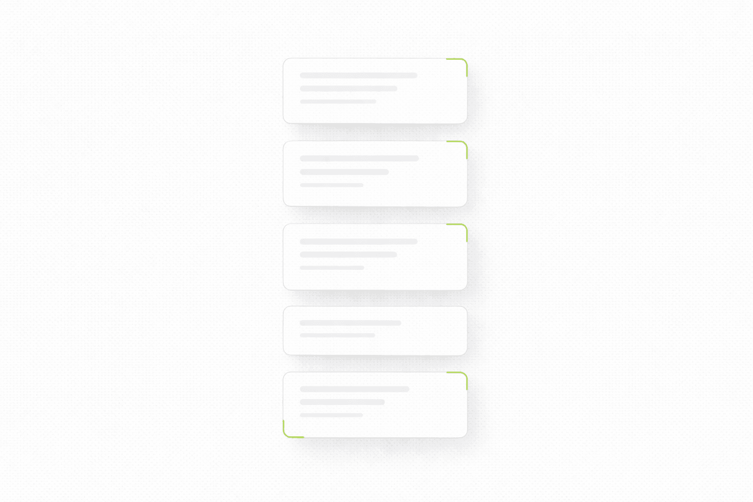
2) Which pages actually matter
Another classic mistake is giving equal attention to every page.
Not every page deserves the same effort. Some pages carry intent. Some pages exist mostly as support. Some pages barely matter at all.
Usually, the pages that deserve the most attention are:
homepage
main service or product pages
pricing or offer page
one or two high-intent blog articles
contact, booking, or conversion page
If you redesign everything equally, you dilute energy. If you prioritize pages that carry intent, the redesign gets sharper and usually performs better.
This matters for SEO too. Google does not care that you redesigned ten low-value pages. It cares whether the pages with real intent are stronger, clearer, and better connected.
3) What already works and should not be “cleaned up”
This one is painful because redesigns often destroy useful assets in the name of consistency.
Maybe your current site has:
one service page that ranks well
one section that consistently gets clicks
one testimonial format that feels real
one layout pattern that makes the offer easier to understand
one blog article that already pulls qualified traffic
And then the redesign wipes it out because the team wants everything to feel “more modern”.
That is how teams lose momentum they already paid for.
Before redesign, make a list of things that already work. Not things you like. Things that actually help users understand, trust, or act.
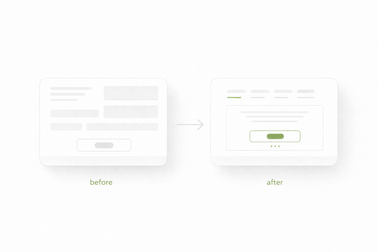
4) What the new version needs to say better
A lot of redesigns focus on how the new site should look. Not enough focus goes into what it should communicate more clearly.
That is backwards.
The first thing a redesign should improve is usually message clarity:
what you do
who it is for
what changes after choosing you
why someone should trust you
what the next step is
If your first screen is vague now, a redesign without a messaging reset is just a visual update on top of the same confusion.
For that part, this article connects directly: Homepage Messaging That Converts
The redesign checklist that actually matters
Use this before any visual exploration starts.
Check whether you can clearly answer these:
What is the real performance problem on the current site?
Which pages carry the most business value?
Which pages already perform well and should be preserved or improved, not rewritten blindly?
What does the new site need to communicate more clearly than the current one?
What actions should visitors take on each key page?
What proof is missing, weak, or buried too deep?
What friction exists on mobile?
Which pages already rank and need careful handling?
What internal links should be strengthened?
How will success be measured after launch?
If these answers are not clear, then redesign is still too early.
5) What not to redesign all at once
This is where teams get themselves into trouble.
They try to change:
positioning
copy
structure
visual identity
page hierarchy
offer packaging
CTA strategy
blog structure
analytics setup
all in one move.
That sounds efficient. In practice it makes learning harder, timelines longer, and decisions weaker.
If too many things change at once, and results move, you do not know why. If results get worse, you also do not know why.
A stronger approach is to define the redesign in layers:
what must change now
what should change soon after launch
what can wait
That is how you keep redesign tied to outcomes instead of ego.
6) What success should look like after launch
A redesign without post-launch success criteria is just expensive optimism.
You do not need twenty KPIs. You need a few useful ones:
stronger conversion on key pages
lower bounce on the first screen
more qualified inquiries
stronger engagement on mobile
clearer path to contact or purchase
no loss of important rankings on pages that already perform
Even if you are not deeply analytics-heavy, you still need to define what “better” means before launch. Otherwise every stakeholder will judge the redesign by vibes.
A redesign should remove confusion, not just improve visuals
This is probably the shortest honest way to say it.
A stronger site is not just prettier. It is easier to understand, easier to trust, and easier to act on.
If a redesign does not improve those three things, then what you launched is mostly decoration.
And to be fair, decoration is not worthless. Visual trust matters. Brand matters. Perception matters. But when people use redesign as a substitute for clarity, they end up polishing uncertainty.
That is why good redesign work usually starts with diagnosis, not inspiration.
If you are planning to build a focused page first instead of redesigning the whole thing, and you are considering Framer, this article helps: Framer Landing Pages
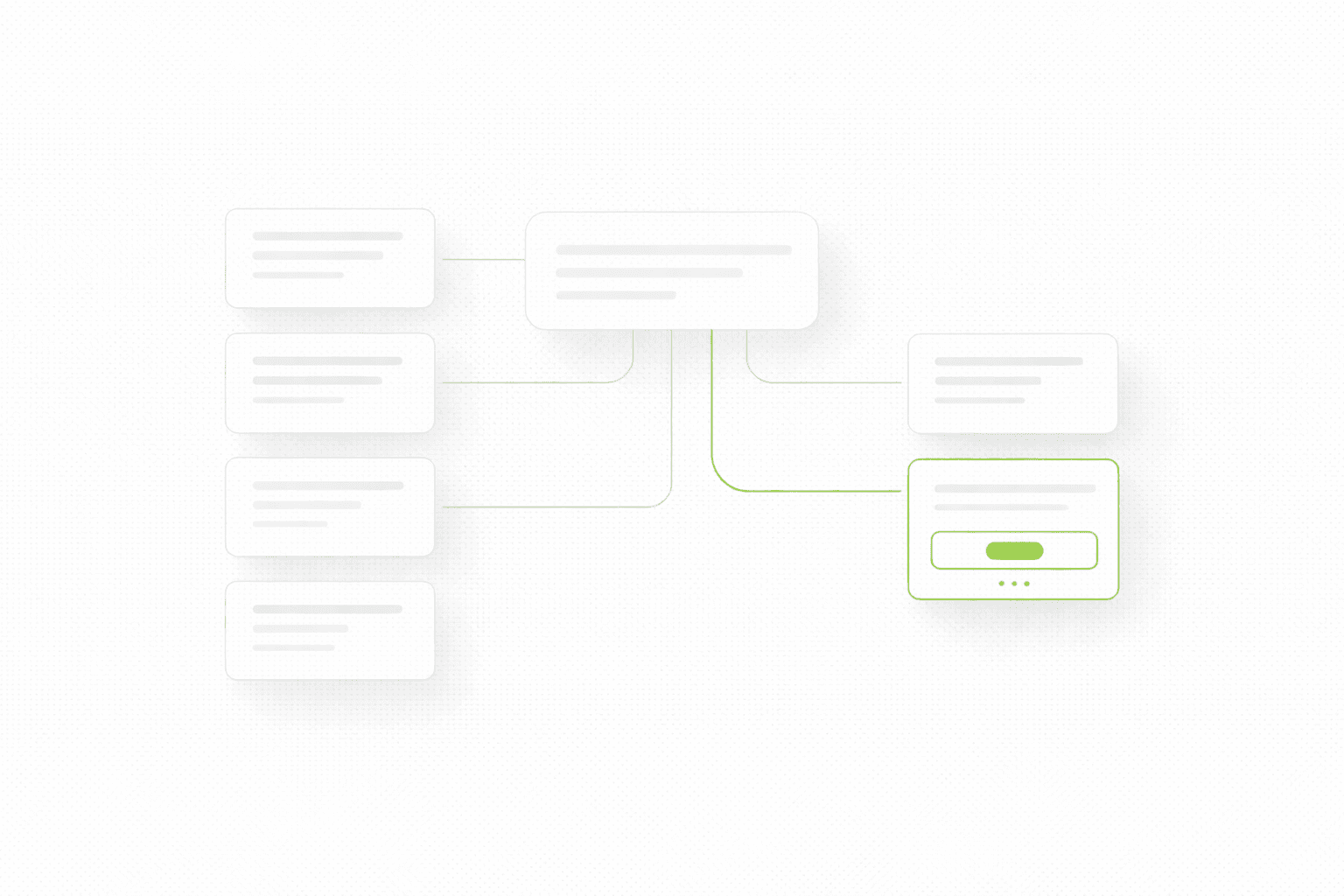
One more thing people underestimate
Internal linking.
Most teams treat redesign as if it is only visual and structural. It is not. It is also a chance to decide which pages deserve authority and how users should move through the site.
That means asking:
which blog articles support which service pages
which pages should link into high-intent money pages
which pages deserve links from navigation, footer, or contextual blocks
which old pages need redirects or updated anchor paths
If you skip that, redesign can accidentally weaken both SEO and user flow even if the new pages look great.
If you want to redesign without guessing
If you want a clear answer on what is actually broken, what matters most, and what should be rebuilt first, start here.
Most redesigns fail before the new design even starts. Not because the team is lazy or the designer is weak, but because nobody gets clear on what is actually broken, what needs to stay, and what the new site is supposed to improve.
Redesigns go wrong in a very predictable way
A lot of redesigns start with the same sentence.
“We need a fresh look.”
Sometimes that is true. Usually it is not the real issue.
The real issue is that the current site is underperforming, but nobody has properly defined why. So the team jumps into moodboards, references, layouts, visual direction, maybe even a full Figma phase, before answering the only questions that actually matter:
What is broken right now?
What is already working?
What should the new version improve in measurable terms?
When those questions stay fuzzy, redesign turns into an expensive guessing game. People argue over style, not priorities. The new version launches, looks cleaner, maybe feels more premium, and then nothing really changes. Or worse, conversion drops, organic traffic tanks, and now the team has a prettier problem.
That is why a redesign checklist matters. Not because checklists are sexy, but because they stop you from rebuilding the wrong thing.
If you have not done a broader page-level review yet, start here first: Website Audit Checklist
The goal is not “a better website”
That phrase sounds fine in meetings and is useless in execution.
A redesign should improve something specific:
clearer positioning
stronger first-screen clarity
better lead conversion
better mobile experience
stronger page structure
cleaner internal linking
better support for paid traffic or SEO
If you cannot finish the sentence “This redesign should improve…” with something concrete, you are not ready to redesign. You are ready to explore, maybe, but not to commit budget and time.
This is also where a lot of teams confuse a landing page problem with a website problem. Sometimes you do not need a redesign. You need one focused page that actually converts. If that is the situation, read this too: Landing Page vs Website Redesign
What to check before you rebuild anything
1) What exactly is underperforming
This sounds obvious, but most teams are weirdly vague here.
They say:
“The site feels outdated”
“It is not converting well”
“Users seem confused”
“We are not getting enough leads”
Fine. But where, exactly?
Is the problem:
homepage clarity
low-converting service pages
weak product pages
poor mobile experience
too much friction in contact forms
weak trust signals
traffic mismatch
slow loading pages
messy navigation
These are not the same problem, so they should not lead to the same solution.
One of the fastest ways to waste a redesign is to treat “underperforming” like one big abstract blob.
2) Which pages actually matter
Another classic mistake is giving equal attention to every page.
Not every page deserves the same effort. Some pages carry intent. Some pages exist mostly as support. Some pages barely matter at all.
Usually, the pages that deserve the most attention are:
homepage
main service or product pages
pricing or offer page
one or two high-intent blog articles
contact, booking, or conversion page
If you redesign everything equally, you dilute energy. If you prioritize pages that carry intent, the redesign gets sharper and usually performs better.
This matters for SEO too. Google does not care that you redesigned ten low-value pages. It cares whether the pages with real intent are stronger, clearer, and better connected.
3) What already works and should not be “cleaned up”
This one is painful because redesigns often destroy useful assets in the name of consistency.
Maybe your current site has:
one service page that ranks well
one section that consistently gets clicks
one testimonial format that feels real
one layout pattern that makes the offer easier to understand
one blog article that already pulls qualified traffic
And then the redesign wipes it out because the team wants everything to feel “more modern”.
That is how teams lose momentum they already paid for.
Before redesign, make a list of things that already work. Not things you like. Things that actually help users understand, trust, or act.
4) What the new version needs to say better
A lot of redesigns focus on how the new site should look. Not enough focus goes into what it should communicate more clearly.
That is backwards.
The first thing a redesign should improve is usually message clarity:
what you do
who it is for
what changes after choosing you
why someone should trust you
what the next step is
If your first screen is vague now, a redesign without a messaging reset is just a visual update on top of the same confusion.
For that part, this article connects directly: Homepage Messaging That Converts
The redesign checklist that actually matters
Use this before any visual exploration starts.
Check whether you can clearly answer these:
What is the real performance problem on the current site?
Which pages carry the most business value?
Which pages already perform well and should be preserved or improved, not rewritten blindly?
What does the new site need to communicate more clearly than the current one?
What actions should visitors take on each key page?
What proof is missing, weak, or buried too deep?
What friction exists on mobile?
Which pages already rank and need careful handling?
What internal links should be strengthened?
How will success be measured after launch?
If these answers are not clear, then redesign is still too early.
5) What not to redesign all at once
This is where teams get themselves into trouble.
They try to change:
positioning
copy
structure
visual identity
page hierarchy
offer packaging
CTA strategy
blog structure
analytics setup
all in one move.
That sounds efficient. In practice it makes learning harder, timelines longer, and decisions weaker.
If too many things change at once, and results move, you do not know why. If results get worse, you also do not know why.
A stronger approach is to define the redesign in layers:
what must change now
what should change soon after launch
what can wait
That is how you keep redesign tied to outcomes instead of ego.
6) What success should look like after launch
A redesign without post-launch success criteria is just expensive optimism.
You do not need twenty KPIs. You need a few useful ones:
stronger conversion on key pages
lower bounce on the first screen
more qualified inquiries
stronger engagement on mobile
clearer path to contact or purchase
no loss of important rankings on pages that already perform
Even if you are not deeply analytics-heavy, you still need to define what “better” means before launch. Otherwise every stakeholder will judge the redesign by vibes.
A redesign should remove confusion, not just improve visuals
This is probably the shortest honest way to say it.
A stronger site is not just prettier. It is easier to understand, easier to trust, and easier to act on.
If a redesign does not improve those three things, then what you launched is mostly decoration.
And to be fair, decoration is not worthless. Visual trust matters. Brand matters. Perception matters. But when people use redesign as a substitute for clarity, they end up polishing uncertainty.
That is why good redesign work usually starts with diagnosis, not inspiration.
If you are planning to build a focused page first instead of redesigning the whole thing, and you are considering Framer, this article helps: Framer Landing Pages
One more thing people underestimate
Internal linking.
Most teams treat redesign as if it is only visual and structural. It is not. It is also a chance to decide which pages deserve authority and how users should move through the site.
That means asking:
which blog articles support which service pages
which pages should link into high-intent money pages
which pages deserve links from navigation, footer, or contextual blocks
which old pages need redirects or updated anchor paths
If you skip that, redesign can accidentally weaken both SEO and user flow even if the new pages look great.
If you want to redesign without guessing
If you want a clear answer on what is actually broken, what matters most, and what should be rebuilt first, start here.
See more articles
Browse the archive for teardowns, checklists and playbooks you can copy straight into your next build.