Landing Page Examples: What Actually Makes Them Work (Beyond Looking Good)

@nadolconverts
Kacper Nadol

Most landing page example roundups show you what pages look like and call that the lesson. The actual lesson is in why they work. This article breaks down what separates landing pages that convert from ones that just look good, with specific principles you can apply to your own page.
Why Most Landing Page Example Articles Are Useless
Search "landing page examples" and you will find a hundred articles that all do the same thing. They show twenty or thirty screenshots of polished pages from well-known companies, add a single line of generic praise under each one, and call it a learning resource.
The problem is that screenshots are not lessons.
A page that looks beautiful in a screenshot might be working for reasons that are not visible in the image. The hero might be converting because of a specific message-to-traffic match that does not show up in a thumbnail. The proof section might be effective because of how it is placed relative to a particular objection that appears earlier in the copy. The CTA might be performing because the entire page has been calibrated for a specific buyer at a specific stage of awareness.
None of that comes through when someone shows you a screenshot and writes "look how clean this is." You are looking at the surface of something whose performance lives underneath. Copying the surface produces a page that looks similar and converts at half the rate, because the things that actually matter were never visible in the first place.
The useful version of this article is different. Instead of showing you twenty screenshots and explaining nothing, this is a breakdown of the specific principles that separate landing pages that work from ones that just look good. The examples are illustrative — they are how the principles show up in real pages — but the principles are the thing you actually take away.
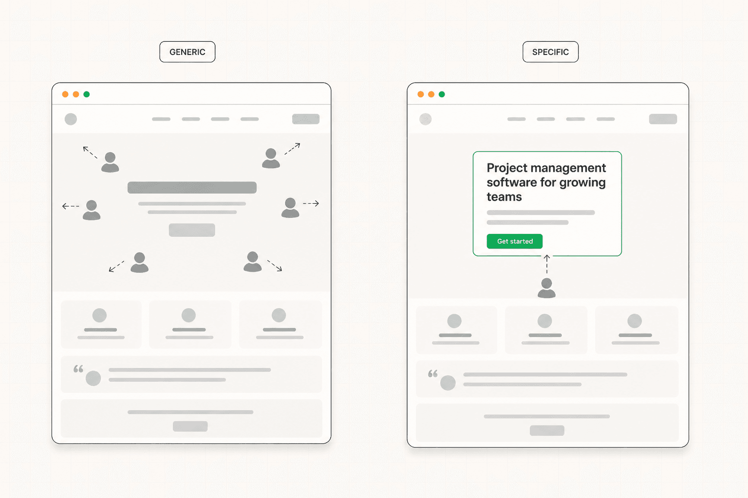
Principle One: The Page Is Built for One Specific Person
Every landing page that consistently converts has this in common. There is a single, clearly defined visitor the page is built for, and that visitor would feel immediately recognized within the first few seconds of reading.
What this looks like in practice is a hero section that names the role, the industry, the problem, or the situation specifically. Not "businesses of all sizes." Not "modern teams." Something concrete enough that the right person reads it and thinks "this is for someone like me" without having to translate.
A page targeting ops teams at series A to C SaaS companies should sound different from a page targeting agency owners with five to fifteen employees. The visual register changes. The vocabulary changes. The proof changes. The objections being addressed change. When you look at a high-converting landing page and ask yourself "who is this clearly for," you should be able to answer in one sentence. If the answer is "everyone" or "I'm not sure," the page is leaving conversion on the table.
The pages that try to speak to multiple audiences simultaneously usually fail at all of them. Specificity creates relevance. Relevance creates conversion. The visitors who get filtered out by a more specific page were almost never going to convert anyway. The full breakdown of why this matters so much is in the homepage messaging article: Homepage Messaging That Converts: A Simple Framework for Your First Screen
Principle Two: The Argument Is Built in the Right Order
Strong landing pages are not collections of sections. They are arguments built in a deliberate sequence, where each section earns the right to be read by what came before it.
The most common version of this sequence in B2B looks something like: name the situation the buyer is in, demonstrate that you understand it, introduce the solution, show how it works at a useful level of detail, prove it has worked for others, address the questions that would block conversion, and ask for the next step. The specific structure varies by product and audience, but the logic is the same. The page builds momentum section by section. Each one resolves a question the previous one raised.
The pages that fail at this tend to do one of two things. Either they skip the early work of establishing relevance and jump straight to features, which means the visitor has no reason to care about the features yet. Or they include all the right sections but in the wrong order, which means the argument never quite lands because the proof appears before the doubt, or the objection handling sits before the visitor has any objections to handle.
When you look at a landing page that works, trace the sequence. What is the page trying to get you to believe in section one? In section two? Where does it introduce proof relative to the moment doubt would form? Where does it answer the questions a real buyer would have? The answer is almost always intentional. That intention is doing the conversion work.
Principle Three: The Copy Leads with Outcomes, Not Features
Almost every underperforming landing page has the same copy pattern. Features described as capabilities. Lists of what the product does. Technical accuracy combined with commercial irrelevance.
The pages that convert do something different. They lead with what changes for the person using the product, then use features as evidence that the change is real.
"Real-time collaboration" is a feature. "Your team stops emailing files back and forth" is an outcome. "Automated reporting" is a feature. "Your Monday morning report writes itself" is an outcome. "Role-based permissions" is a feature. "Every team member sees what they need and nothing they should not" is an outcome. The information being communicated is similar. The framing is completely different. One describes the product. The other describes the buyer's experience after they use it.
This shift sounds small. In conversion impact it is one of the largest interventions you can make on a landing page that is not converting. Buyers do not buy features. They buy the version of their work life where the problem no longer exists. Pages that make that version visible convert better than pages that describe the mechanism that delivers it. This is the central argument we made in detail here: Landing Page Copywriting: What Actually Makes It Convert
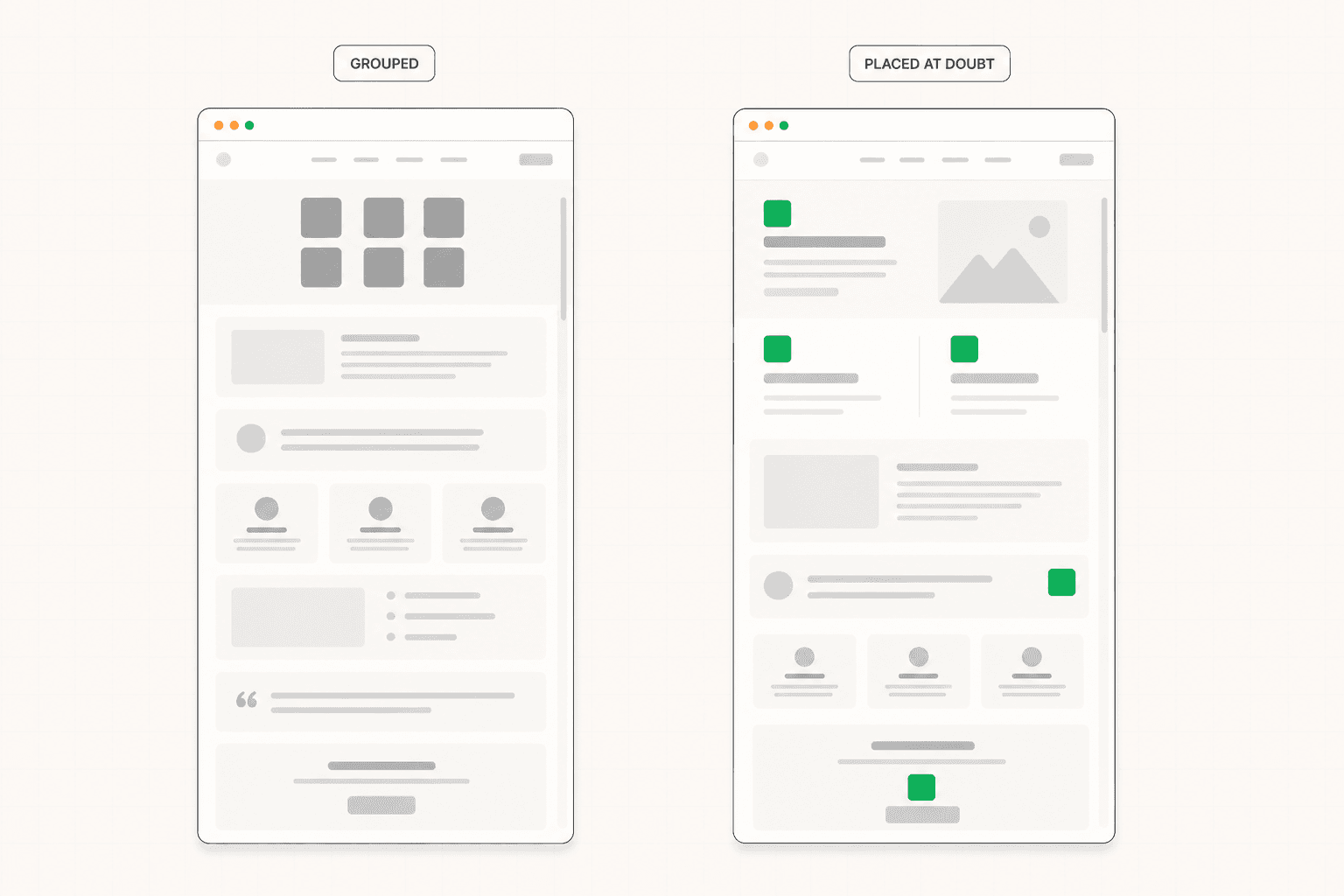
Principle Four: Proof Is Specific, Contextual, and Placed at the Point of Doubt
Most pages have proof. Few use it well.
The default pattern is a logo grid near the top, a few testimonials in the middle, maybe a case study link buried somewhere. The proof exists. It just is not doing the work it could do, because it is generic, decontextualized, and placed where it looks balanced rather than where it would actually move someone.
Strong landing page proof works differently. It is specific — naming a measurable outcome rather than expressing general satisfaction. It is contextual — coming from someone who looks like the target buyer rather than from a recognizable but irrelevant company. And it is placed at the point in the page where the relevant doubt is highest, not in a separate testimonial section three screens away from the question it would answer.
A testimonial that says "they helped us increase qualified demos by 47% in the first quarter, and the leads were people we could actually close" is doing different work than "great team, highly recommend." The first one is evidence. The second one is decoration. When that specific testimonial appears immediately after the section discussing demo conversion, it is doing maximum work. When it appears in a carousel at the bottom of the page, most visitors never see it. The architecture behind proof placement is covered in detail here: B2B Landing Page: What Makes It Actually Work
Principle Five: Friction Is Aggressively Removed at Every Step
Friction kills conversion in invisible ways. It does not show up in analytics as a discrete event. It shows up as small drop-offs at every transition point — the visitor who scrolls past the hero but does not engage with the next section, the one who reads the features but does not look at the pricing, the one who reaches the CTA but does not click.
Each of those moments has a cause. Sometimes the cause is structural — a navigation menu that offers a way to leave the page at the moment of decision, a form that asks for too much before the relationship has earned it, a pricing section that creates more questions than it answers. Sometimes the cause is cognitive — a sentence that requires a re-read, a layout that breaks the visual flow, a CTA that uses vague language and forces the visitor to think about what clicking means.
Pages that convert well have been audited for these moments and ruthlessly cleaned. Every element on the page either earns its place by helping the visitor move forward, or it gets cut. This sounds simple. It is one of the hardest disciplines in landing page work because removal feels like loss, especially to teams that built each section deliberately.
The practical test for friction is a five-second walkthrough. Open your own page as a stranger with a specific goal. Time yourself. Note every moment where you slowed down, hesitated, or had to look for something. Each one is a friction point. Each one is conversion you are leaving on the table.
Principle Six: The CTA Asks for Something Proportionate to Visitor Readiness
A "book a demo" CTA on a page where most visitors are landing for the first time and have never heard of the company is asking for too much too soon. A "join our newsletter" CTA on a page where the visitor has already engaged with three pieces of content and visited the pricing page is asking for too little.
The pages that convert well have CTAs calibrated to where the visitor realistically is when they reach the bottom of the page. Sometimes that means offering two options at different commitment levels — a primary high-intent path for buyers who are ready, and a secondary lower-friction path for buyers who are interested but need more time. Sometimes it means rethinking what the page is trying to convert at all. A landing page targeting cold paid traffic should probably not be optimizing for the same conversion event as a page targeting warm referral traffic.
The CTA copy itself matters more than most teams treat it. "Submit" tells the visitor nothing. "Get started" tells them slightly less. "Book my 20-minute strategy call" tells them exactly what is about to happen. Specificity in the button copy reduces the small hesitation that builds at the moment of decision. The result is fewer abandoned conversions for purely linguistic reasons.
How to Look at Landing Pages You Admire
Here is a more useful version of "show me good landing page examples." Take three or four pages from companies whose work you respect. For each one, ask the following questions in this order.
Who is this page built for, specifically? Read the hero and answer in one sentence. If you cannot, the page is not as well-targeted as it looks.
What is the argument the page is making? Walk through it section by section and describe what each one is trying to get the visitor to believe. A strong page has a clear answer. A weak page has sections without an apparent purpose.
Where is the proof, and what doubt is it answering? Look at the testimonials, case studies, and credibility signals. Each one should be sitting next to a section that raises a question that proof would resolve. If they are clustered together away from the relevant doubt, the page is missing an opportunity.
Where would I drop off if I were the target visitor? Walk through the page in the buyer's shoes. Where do you slow down? Where does the argument feel weak? Where is the friction? These are the optimization targets, even on a good page.
Doing this with three or four pages teaches you significantly more than scrolling through fifty screenshots. The principles become visible because you are looking for them rather than admiring the surface.
Before You Build Your Own
If you are about to build or rebuild a landing page, the most useful thing you can do is not study more examples. It is to be precise about what your specific page needs to accomplish — who it is for, what action it needs to drive, what the visitor needs to believe before they take that action, and what evidence supports each of those beliefs.
Once that foundation is clear, examples become useful. You can look at other pages and see which principles to apply to your specific situation. Without that foundation, examples are just screenshots, and the lessons stay invisible. If you want to see how this thinking shows up in real client work, the projects page has the most direct version: View our projects
The Short Version
The lesson in any landing page worth studying is not in how it looks. It is in why it works.
The pages that consistently convert speak to one specific buyer, build their argument in a deliberate order, lead with outcomes rather than features, place specific proof at the point of relevant doubt, remove friction aggressively, and calibrate their CTA to visitor readiness.
These are principles, not templates. They show up differently on different pages because different buyers, products, and situations require different expressions of the same underlying logic. Recognize the principles in the examples you study, and you will build pages that work. Copy the surface, and you will build pages that look familiar and convert poorly.
KEEP READING