Website Mistakes That Cost You Leads (And How to Fix Them)

@nadolconverts
Kacper Nadol

Most websites that underperform are not broken in dramatic ways. They fail through a set of specific, common, entirely fixable mistakes that quietly cost leads every day. This article covers the ones that do the most damage and what to do about each.
The Mistakes Are Rarely Dramatic
When a website is not generating the leads it should, the instinct is to look for something badly wrong. A design that looks dated. A structure that is confusing. Something obviously broken that explains the underperformance.
But most underperforming websites are not obviously broken. They look fine. They function properly. Nothing about them screams failure. And yet they leak leads every single day through a set of specific mistakes that are common enough to be almost invisible, precisely because so many sites make them.
This is what makes these mistakes so expensive. They do not announce themselves. There is no error message, no crash, no obvious signal that something is wrong. The site simply converts at a fraction of what it could, and the team, seeing a site that looks perfectly reasonable, concludes that the problem must be traffic, or the market, or the offer.
The mistakes below are the ones that do the most damage across the sites that underperform. Each of them is fixable. Most of them are fixable without a redesign. And identifying which ones your site is making is usually the fastest path to more leads from the traffic you already have.
Mistake One: The Homepage Says Nothing Specific
The most common and most costly website mistake is a homepage that describes the business in terms so general that no visitor learns anything useful.
"We help businesses grow through innovative solutions." "Your partner for digital transformation." "Empowering teams to work smarter." These sentences appear on thousands of homepages. They are grammatically correct, professionally toned, and completely empty. A visitor reads them and learns nothing about what the business does, who it serves, or why it matters to them.
The cost of this is enormous because it happens at the very top of the funnel, before anything else on the site gets a chance to work. A visitor who cannot quickly understand what the business does and whether it is for them leaves within seconds. Every improvement below the hero is irrelevant to the visitor who never scrolled past it.
The fix is specificity. Name what you actually do, who you actually do it for, and what actually changes for them. Not in abstract terms, but in language concrete enough that the right visitor recognizes their own situation immediately. Specificity feels risky because it excludes people, but the people it excludes were not converting anyway, and the people it attracts convert far better because they feel recognized. The framework for getting the first screen right is here: Homepage Messaging That Converts: A Simple Framework for Your First Screen
Mistake Two: Everything Is About You, Not the Buyer
The second most common mistake is a site written entirely from the perspective of the business rather than the visitor.
"We are a leading provider." "Our team has over twenty years of experience." "Founded in 2015, we serve clients across three continents." Every sentence begins with the company. The site is a monologue about the business, delivered to a visitor who does not yet care about the business and is trying to figure out whether their own problem can be solved here.
The visitor arrives with a problem. They want to know whether this solves it. A site that talks about itself instead of their problem is answering a question they did not ask, and they leave to find a site that answers the one they did.
The fix is a perspective shift that sounds simple and changes everything. Rewrite the site from the visitor's point of view. Lead with their situation, their problem, their goal. Introduce the business as the answer to that, not as the subject of the page. The information can be similar. The framing determines whether it lands. The full breakdown of buyer-first copy is here: Website Copywriting: What Actually Makes a Site Convert (And Where Most Copy Fails)
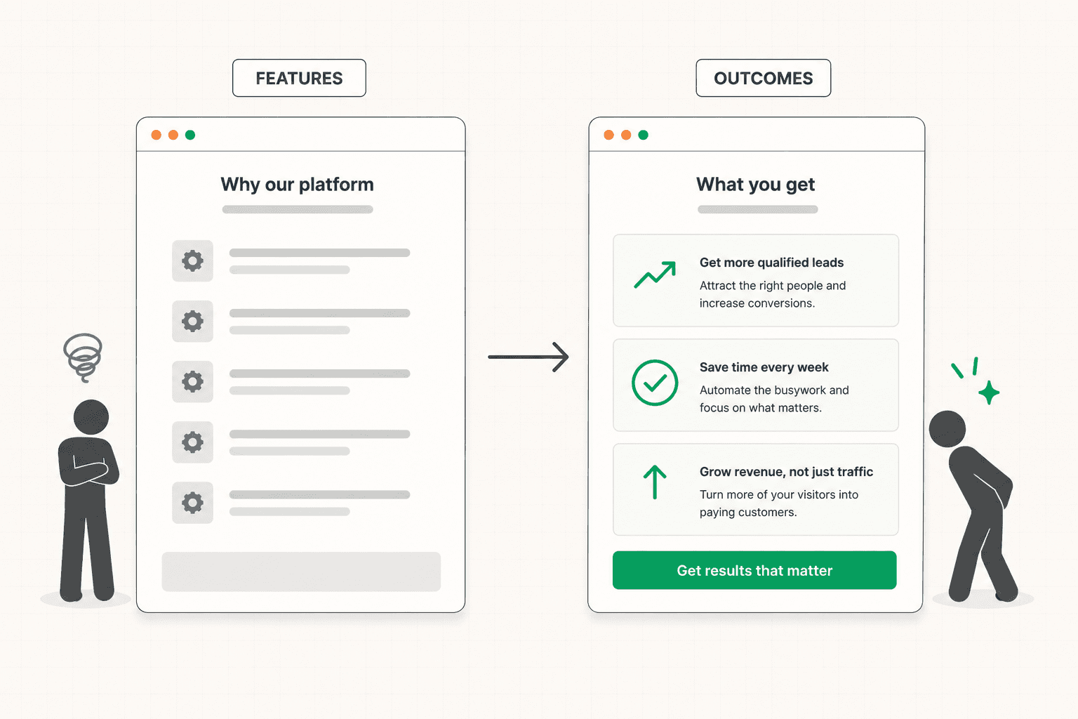
Mistake Three: Features Instead of Outcomes
Sites consistently list what they offer rather than what those offerings do for the buyer, and the difference costs conversions.
"Real-time reporting, custom dashboards, API access, and role-based permissions." This is accurate and unpersuasive. The buyer does not want real-time reporting. They want to know what is happening in their business without spending an afternoon assembling data. The feature is the mechanism. The outcome is the reason to care, and leading with the mechanism assumes the buyer will infer the value themselves, which most will not bother to do.
The fix is mechanical once you see it. For every feature, ask what it means for the person using it, and lead with that answer. Support it with the feature as evidence. Buyers buy the outcome and evaluate the feature only after they care about the outcome. Getting the order right is one of the highest-impact copy changes available on most sites. The framework for outcome-led copy is here: Landing Page Copywriting: What Actually Makes It Convert
Mistake Four: Proof That Decorates Instead of Convincing
Almost every site has social proof, and almost none of it is placed or written in a way that actually converts.
The typical pattern is a logo grid on the homepage chosen for recognition rather than relevance, a testimonials section somewhere in the middle full of vague praise, and case studies buried where few visitors find them. The proof exists. It signals that the business has customers. It does not resolve the specific doubts standing between a particular visitor and a conversion.
Proof converts when it is specific, relevant to the actual buyer, and placed at the point where the relevant doubt forms. A testimonial that names a specific result from a buyer who resembles the visitor, placed next to the section that raises the doubt it resolves, does real work. The same testimonial in a carousel at the bottom of the page does almost none, because most visitors never reach it and the doubt it addresses formed three screens earlier.
The fix is to audit every piece of proof on your site for specificity, relevance, and placement. Cut the generic praise. Get specific testimonials that name results. Move each piece of proof to sit beside the concern it answers. The full framework is here: Social Proof: How to Use It So It Actually Converts (Not Just Decorates)
Mistake Five: Objections Are Left Unaddressed
Every qualified buyer who does not convert had a reason, and most of those reasons are questions the site never answered.
How much does this cost? How long does implementation take? What happens if it does not work out? Will this integrate with what we already use? Is there a contract? These questions form in the buyer's head as they move through the site, and a site that does not answer them leaves the buyer to either guess, go looking, or, most commonly, leave.
Most sites bury these answers in an FAQ at the bottom, where they get read by visitors who already converted or already left. The objections need to be addressed in the body of the site, near the relevant claims, while the visitor is still building their decision.
The fix starts with knowing what the objections actually are, which means talking to your sales team. The three to five things prospects push back on most in real conversations are almost certainly the same things blocking conversion on the site. Address them visibly, in context, before they become reasons to leave.
Mistake Six: The CTA Asks for Too Much
A site that asks a cold, first-time visitor to book a demo or start a sales conversation is asking for a level of commitment most of them are not ready to give, no matter how interested they are.
The visitor has been on the site for ninety seconds. They are interested. And the only path forward is a thirty-minute call with a salesperson. For many qualified buyers, that gap between their current readiness and the ask is too wide, so they leave, intending to come back later, which they usually do not.
The fix is calibration. The primary CTA should ask for something proportionate to where the realistic visitor is when they reach it. For sites that serve mostly cold traffic, offering a lower-commitment option alongside the primary ask captures buyers who are interested but not yet ready for a sales conversation. These are not lost leads. They are earlier-stage leads who need a lighter first step. The framework for calibrating the ask is here: Call to Action Examples: What Actually Makes a CTA Convert (Beyond Button Color)
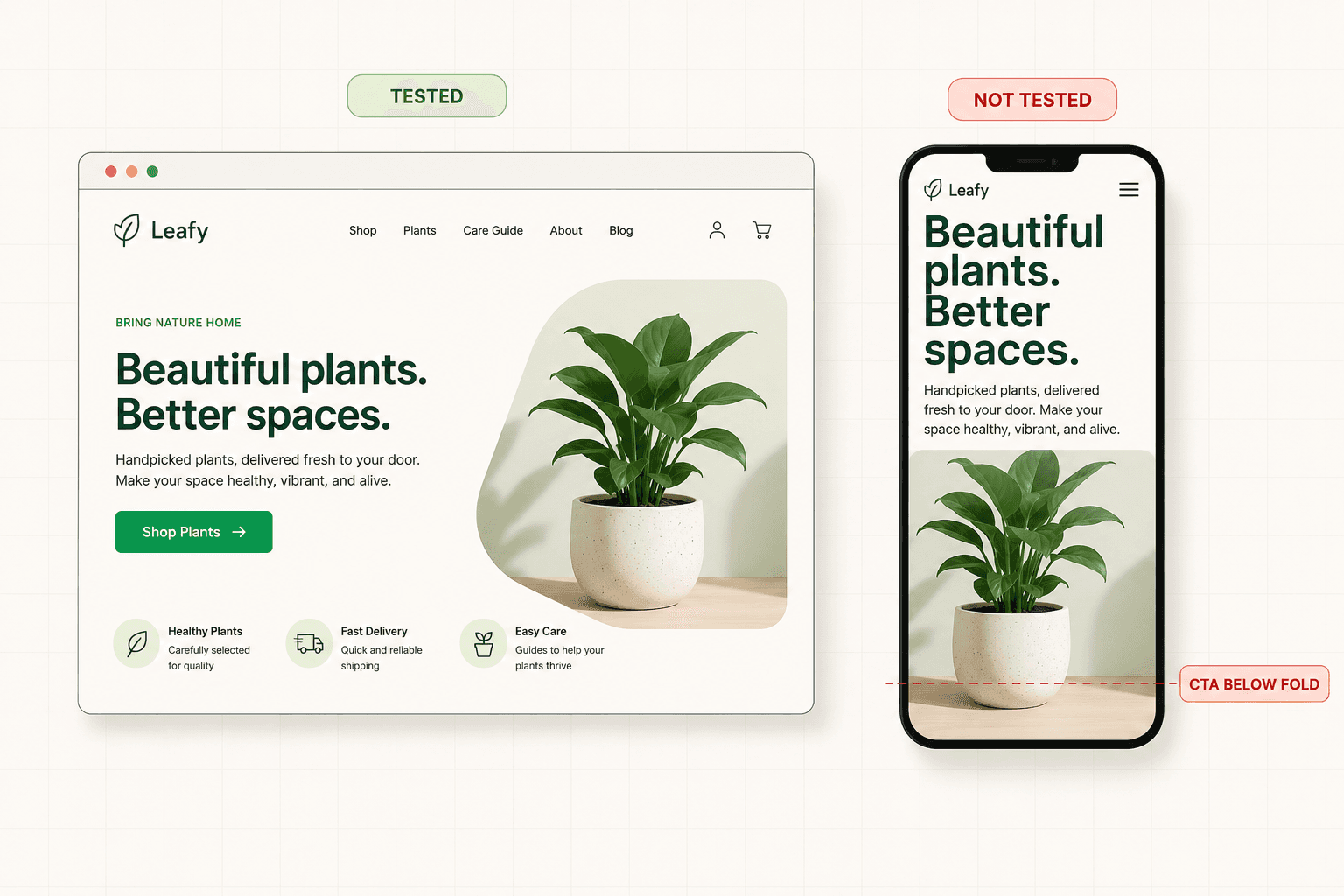
Mistake Seven: Mobile Was an Afterthought
For most sites today, a large share of traffic is on mobile, and for many sites the mobile experience converts at a fraction of the desktop rate for reasons nobody has looked at.
The pattern is almost always the same. The site was designed on desktop and adapted for mobile. In the adaptation, the headline became too small or too long. The hero image pushed everything below the fold. The CTA disappeared beneath the visual. The forms became painful to fill out. The hierarchy that made the desktop version work broke down at narrow widths.
None of this is visible to a team that tests primarily on desktop, which is most teams. The mobile experience quietly underperforms and the losses go unnoticed because nobody segments the conversion data by device.
The fix is to check. Open your own site on a phone and go through it as a buyer. Note every point where the layout breaks, the text is hard to read, the CTA is hard to reach, or the form is painful to complete. Each one is conversion you are losing from a large and growing share of your traffic.
Mistake Eight: The Site Converts, But the Wrong People
This one is easy to miss because it does not look like a problem. The conversion rate is fine. Leads are coming in. And yet the pipeline is not growing, because the leads are not the right ones.
A site that is too broad in its messaging attracts everyone and qualifies no one. The friction to convert is low enough that vaguely curious people fill out the form, and the sales team spends its time on conversations that were never going to close. The conversion rate looks healthy in the report and produces nothing in revenue.
This is a qualification failure disguised as conversion success, and the fix is counterintuitive. You need to be more specific, and probably convert fewer people. A site that clearly signals who it is for and who it is not for will produce fewer leads that close at a dramatically higher rate. The metric goes down and the business goes up. The full framework for balancing this is here: How to Qualify Leads on Your Website Without Killing Conversions
How to Find Which Mistakes Your Site Is Making
Most sites are making several of these mistakes at once, and trying to fix all of them simultaneously produces results that are impossible to interpret.
The more useful approach is to find which one is costing the most and fix that first. Look at where visitors are dropping off. If they leave immediately, the problem is in the first mistakes on this list, the vague homepage and the business-first messaging. If they scroll and do not convert, the problem is more likely in the proof, the objections, or the CTA. If they convert but the leads are wrong, the problem is qualification.
The drop-off pattern points to the mistake. And fixing the biggest one first, measuring the result, then moving to the next produces compounding improvement rather than a scattered set of changes with unclear effects.
If you cannot tell which mistake is costing you the most, a structured diagnosis identifies the specific failure points before any changes get made. See how the 48h Audit works
The Short Version
Websites that underperform are rarely broken in obvious ways. They leak leads through a set of specific, common, fixable mistakes that are invisible precisely because so many sites make them.
The homepage says nothing specific. The copy is about the business instead of the buyer. Features get listed instead of outcomes. Proof decorates instead of convincing. Objections go unaddressed. The CTA asks for more than the visitor is ready to give. Mobile was an afterthought. And sometimes the site converts plenty of people who were never going to buy.
Each of these is fixable, most without a redesign. Find the one costing you the most, fix it, measure, and move to the next. The compounding effect of that is worth more than any single dramatic rebuild.
Keep reading