Mobile Conversion Optimization: Why Most Sites Lose Sales on Phones

@nadolconverts
Kacper Nadol

For most sites, mobile is the majority of the traffic and a minority of the revenue, and almost nobody has looked at why. This article covers where mobile conversion breaks down, why teams miss it, and what to fix on the device most of your visitors are actually using.
The Gap Nobody Looks At
For most websites today, more than half the traffic arrives on a phone. For many, it is well over that. And for a large share of those sites, mobile converts at a fraction of the desktop rate, which means the majority of the traffic is producing a minority of the results.
The strange thing is how invisible this usually is. The team knows mobile traffic is high. They see it in the analytics. But almost nobody segments the conversion rate by device, so the gap between how mobile and desktop perform never surfaces. The aggregate conversion number looks acceptable, blended from strong desktop performance and weak mobile performance, and the weak half hides inside the average.
The reason this happens is simple and human. Teams build on desktop. They design on desktop, review on desktop, test on desktop, and experience their own site almost entirely on large screens. The mobile version gets checked occasionally, usually to confirm it "works," which means it loads and nothing is obviously broken. Whether it actually converts is a different question, and one that rarely gets asked.
The result is that mobile conversion is the largest untapped opportunity on many sites, sitting in plain sight, unmeasured and unaddressed, while the team looks for growth in more traffic and better ads.
Why Mobile Converts Worse
Some of the gap between mobile and desktop conversion is natural. People browse on phones in more distracted contexts, in shorter sessions, often earlier in their consideration. A modest gap is expected and not a problem to solve.
But most of the gap on most sites is not natural. It is friction, and it comes from a small number of recurring causes.
The screen is small, which means everything competes for limited space and the hierarchy that worked on desktop often falls apart. The headline that fit neatly beside an image on desktop now stacks awkwardly or shrinks to fit. The hero image that framed the message now fills the entire first screen and pushes the message and the CTA out of view.
Interaction is harder. Every input requires tapping rather than typing on a full keyboard. Small touch targets produce errors. Forms that were mildly tedious on desktop become genuinely painful. The keyboard covers half the screen, hiding context and making multi-field forms disorienting.
Connections are often slower and less stable, which makes page speed matter more. A site that loads acceptably on desktop broadband can be frustratingly slow on mobile data, and the visitor leaves before they see anything.
And attention is shorter. The mobile visitor is more likely to be interrupted, more likely to be doing something else, less likely to push through friction. Anything that slows them down or makes them think is more costly on mobile than on desktop, because the threshold for abandoning is lower.
None of this is inherent to mobile as a channel. It is the result of experiences designed for desktop and adapted for mobile rather than designed for the constraints of the device. The way friction compounds across a page applies doubly on mobile: Why Your Landing Page Doesn't Convert: 9 Real Reasons (And What to Fix First)
The First Screen Is Even More Critical on Mobile
The above-the-fold section matters on every device, and on mobile it matters more, because the fold is higher, the space is smaller, and the visitor's patience is shorter.
On mobile, the first screen has room for very little. A headline, maybe a subheadline, maybe a CTA, and that is often all that fits before the visitor has to scroll. Every one of those elements has to earn its place, and anything that occupies the first screen without doing conversion work is pushing the things that matter out of view.
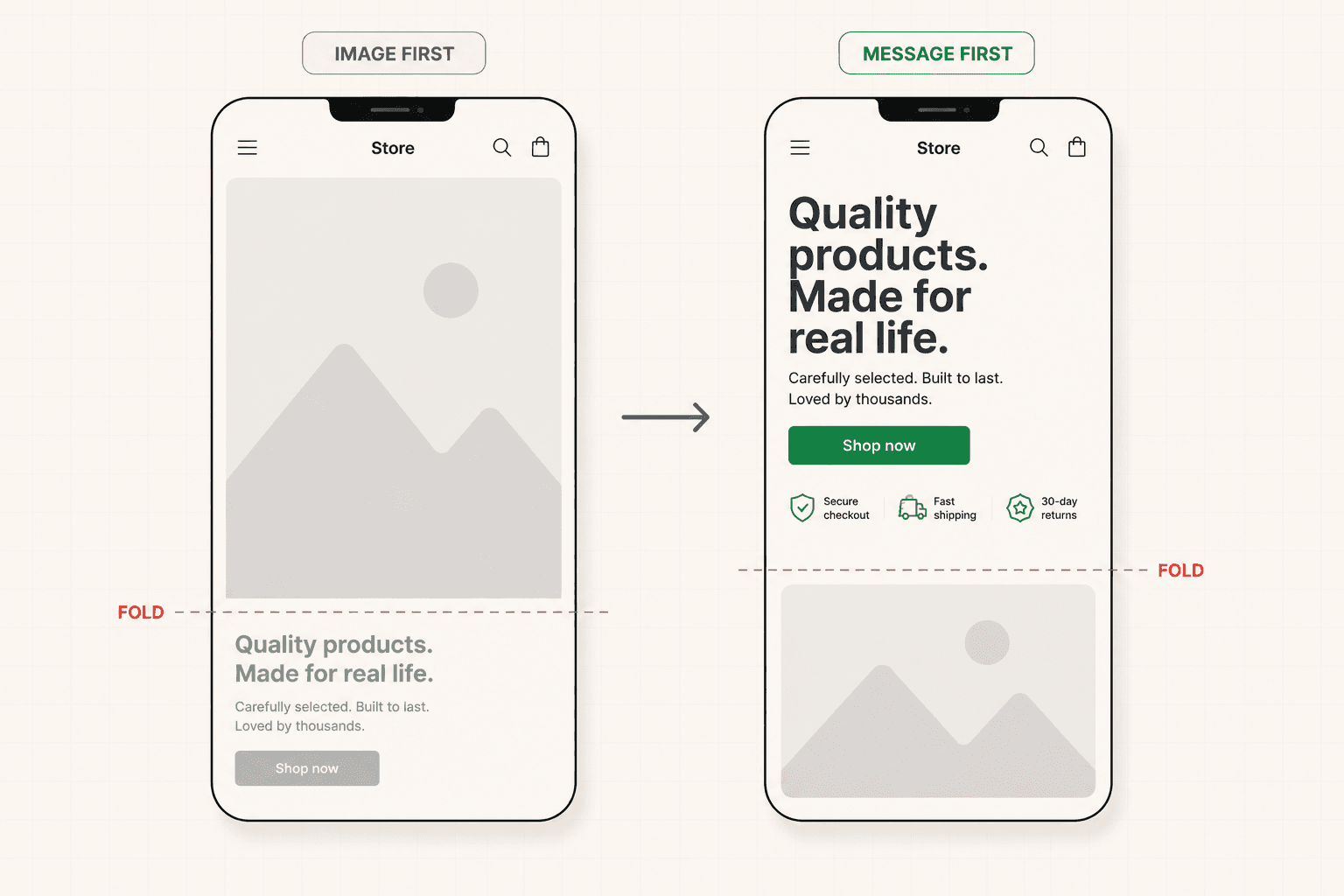
The most common mobile hero failure is the oversized image. A hero image that looks balanced on desktop, sharing the screen with the headline, takes over the entire first screen on mobile, so the visitor's first view is a photo with the actual message somewhere below the fold. The visitor has to scroll to learn what the site is even about, and many will not.
The second common failure is the headline that does not adapt. A headline written for desktop width either shrinks to stay on one line, becoming hard to read, or wraps into an awkward block that dominates the small screen. Mobile headlines often need to be shorter, tighter, and specifically shaped for the narrow column.
The third is the buried CTA. On desktop the CTA sits comfortably in the hero. On mobile, after the image and the headline and the subheadline stack vertically, the CTA has been pushed well below the fold, so the visitor who arrived ready to act cannot see how. The full framework for the hero, including its mobile behavior, is here: Landing Page Hero: What Actually Goes Above the Fold (And Why Most Get It Wrong)
Forms and Checkouts Are Where Mobile Bleeds
If there is one place where mobile friction turns directly into lost revenue, it is forms and checkouts, because that is where the visitor has to do the most work on the device that makes work hardest.
Every field in a form is more costly on mobile. The visitor has to tap into it, bring up the keyboard, type on a small screen, and move to the next field, all while the keyboard obscures part of the page. A form that felt reasonable on desktop can feel like a chore on mobile, and each additional field increases the chance the visitor gives up partway through.
Small things make a large difference here. Using the right keyboard type for each field, so a phone number field brings up a number pad and an email field brings up the email keyboard, removes small frictions that add up. Enabling autofill so the browser can populate name, address, and payment details saves the visitor from typing information they have entered a hundred times before. Sizing touch targets so fingers hit them reliably prevents the errors that cost progress and patience.
For ecommerce, the mobile checkout is where a large share of revenue is won or lost. The accelerated checkout options that let a buyer complete a purchase with a couple of taps, bypassing manual entry entirely, are close to essential on mobile, because the alternative is asking a buyer to type card and address details on a phone, which is exactly the friction that produces abandonment. The full framework for reducing checkout friction is here: Checkout Optimization: How to Build a Flow That Doesn't Lose Buyers
The test for all of this is simple and almost nobody does it: complete your own forms and checkout on a phone, as a real user, paying attention to every point of friction. The experience is almost always worse than the team assumes, because the team built it on desktop.
Speed Is a Mobile Problem First
Page speed affects conversion on every device, and it affects mobile most, because mobile connections are slower and mobile visitors are less patient.
The causes of slow mobile pages are usually the same as slow pages generally, but their impact is amplified. Large uncompressed images, which are often the single biggest contributor to page weight, take longer to load on mobile data. Heavy scripts, tracking tags, and third-party widgets each add delay that a fast desktop connection absorbs and a mobile connection does not. Feature-heavy designs with animations and sliders add weight that costs more on mobile than the visual polish returns.
The visitor experience of a slow mobile page is a blank or half-loaded screen while they wait, and the threshold for abandoning that wait is low. A meaningful share of mobile visitors leave before a slow page finishes loading, which means they never see the content, never reach the product, and never had a chance to convert regardless of how good the page would have been.
Fixing mobile speed is often the highest-leverage mobile improvement available, because it affects every visitor before anything else on the page has a chance to work. Compressing images, removing unnecessary scripts, and being disciplined about weight all pay off disproportionately on the device where most of the traffic is.
Do Not Just Shrink the Desktop Site
The underlying mistake behind most mobile conversion problems is treating mobile as a smaller version of desktop rather than a different context with its own constraints.
A responsive design that reflows the desktop layout to fit a narrow screen is the minimum, not the goal. It prevents the site from being broken on mobile, but it does not make the site convert on mobile, because the decisions that work on a large screen do not automatically work on a small one. The hierarchy, the emphasis, the length of the copy, the size of the images, the placement of the CTA, all need to be considered for the mobile context specifically, not inherited from desktop and squeezed.
The strongest approach is to think about the mobile experience as its own problem. What does the mobile visitor need to see first? How much can fit before they scroll? What is the shortest path to the conversion action? Where will the friction be, and how do you remove it? These questions produce different answers than the desktop equivalents, and designing around them produces a mobile experience that converts rather than one that merely functions.
This does not mean building two entirely separate sites. It means making deliberate decisions about how the experience adapts, rather than letting the desktop design dictate the mobile one by default. The instinct to design for the desktop first and let mobile inherit whatever falls out is exactly backwards for most sites, given where the traffic actually is. That reversal, designing for the device most visitors actually use, is one of the shifts I come back to most in the newsletter.
How to Find Your Mobile Gap
If you want to know whether mobile is costing you, the first step takes about two minutes.
Segment your conversion rate by device. If mobile converts meaningfully below desktop, and it usually does, you have found a significant opportunity, and the size of the gap tells you how much is at stake.
Then go through your own site on a phone, as a visitor, on a normal mobile connection rather than office wifi. Note where the page loads slowly, where the hierarchy breaks, where the CTA is hard to find, where the forms are painful, where you have to zoom or scroll to do something that should be easy. Each of these is a specific point where real mobile visitors are leaving.
Pay particular attention to the first screen, the forms, the checkout, and the load speed, because those are where mobile friction concentrates and where the losses are largest.
If mobile is underperforming and you are not sure what specifically is causing it, a structured diagnosis identifies the mobile failure points before any changes are made, so the work is targeted rather than guessed. See how the 48h Audit works
The Short Version
For most sites, mobile is the majority of the traffic and a minority of the revenue, and the gap is invisible because almost nobody segments conversion by device.
Most of that gap is not natural. It is friction from experiences designed for desktop and adapted for mobile. The first screen matters more on mobile because the fold is higher and space is scarce, and oversized images routinely push the message and CTA out of view. Forms and checkouts bleed conversions because every input is harder on a phone. Speed matters most on mobile, where connections are slower and patience is shorter.
The underlying fix is to stop treating mobile as a shrunk-down desktop site and start designing for the constraints of the device most of your visitors are actually using.
Segment your conversion by device. Go through your own site on a phone. The gap is almost always bigger than the team assumes, and closing it is some of the highest-leverage work available.
Keep reading