Pricing Page: How to Design One That Actually Converts (Not Just Lists Prices)

@nadolconverts
Kacper Nadol

The pricing page is one of the highest-intent pages on any site and one of the most commonly mishandled. Visitors who reach it are close to deciding, and a confusing or poorly structured pricing page loses them at the exact moment they were ready to commit. This article breaks down what actually makes a pricing page convert.
Why the Pricing Page Punches Above Its Weight
The pricing page is one of the most visited and most decisive pages on most websites. Visitors who reach it are not browsing. They are evaluating. They have moved past the question of whether they are interested and into the question of whether they will buy, and the pricing page is where that question gets answered.
This makes the pricing page disproportionately important and disproportionately mishandled. Because it feels like a page that just needs to display prices, teams treat it as a layout exercise. List the tiers, show the features, add some buttons. But the pricing page is doing far more than displaying numbers. It is helping a high-intent visitor make a decision, manage their uncertainty about cost and value, and choose between options. A page that just lists prices without doing that work loses people at the exact moment they were closest to converting.
The pricing page is also where a specific kind of anxiety peaks. The visitor is now confronting the actual cost, weighing it against the value, comparing options, and trying to figure out which choice is right for them. A pricing page that reduces that anxiety and guides the decision converts. One that amplifies it through confusion, hidden information, or overwhelming choice does the opposite.
The Clarity Problem
The single most common pricing page failure is a lack of clarity about what each tier actually offers and who it is for.
Visitors land on the pricing page and face a wall of tiers, each with a long list of features, many of which they do not understand or cannot easily compare. They cannot quickly tell which tier is right for them. The differences between tiers are buried in feature lists that require careful reading to parse. The page asks the visitor to do a significant amount of work to figure out what they should buy, and a meaningful percentage of them will not do that work. They will leave to think about it, which often means they do not come back.
The pricing pages that convert well do the opposite. They make it immediately obvious which tier is right for which kind of buyer. They label tiers in ways that help the visitor self-identify, often with a short line describing who each tier is for rather than just a name. They make the differences between tiers easy to see at a glance rather than requiring a careful comparison of feature lists. They reduce the cognitive work of choosing.
This clarity is not just about layout. It is about understanding how the visitor thinks about the decision and structuring the page to support that thinking. The visitor is asking "which one is right for me?" The page should answer that question quickly, not bury the answer in detail the visitor has to excavate. The same buyer-first clarity principle drives all conversion work: Why Your Landing Page Doesn't Convert: 9 Real Reasons (And What to Fix First)
Anchoring and the Psychology of Tier Design
How the tiers are structured and presented has a significant effect on which option visitors choose and whether they convert at all.
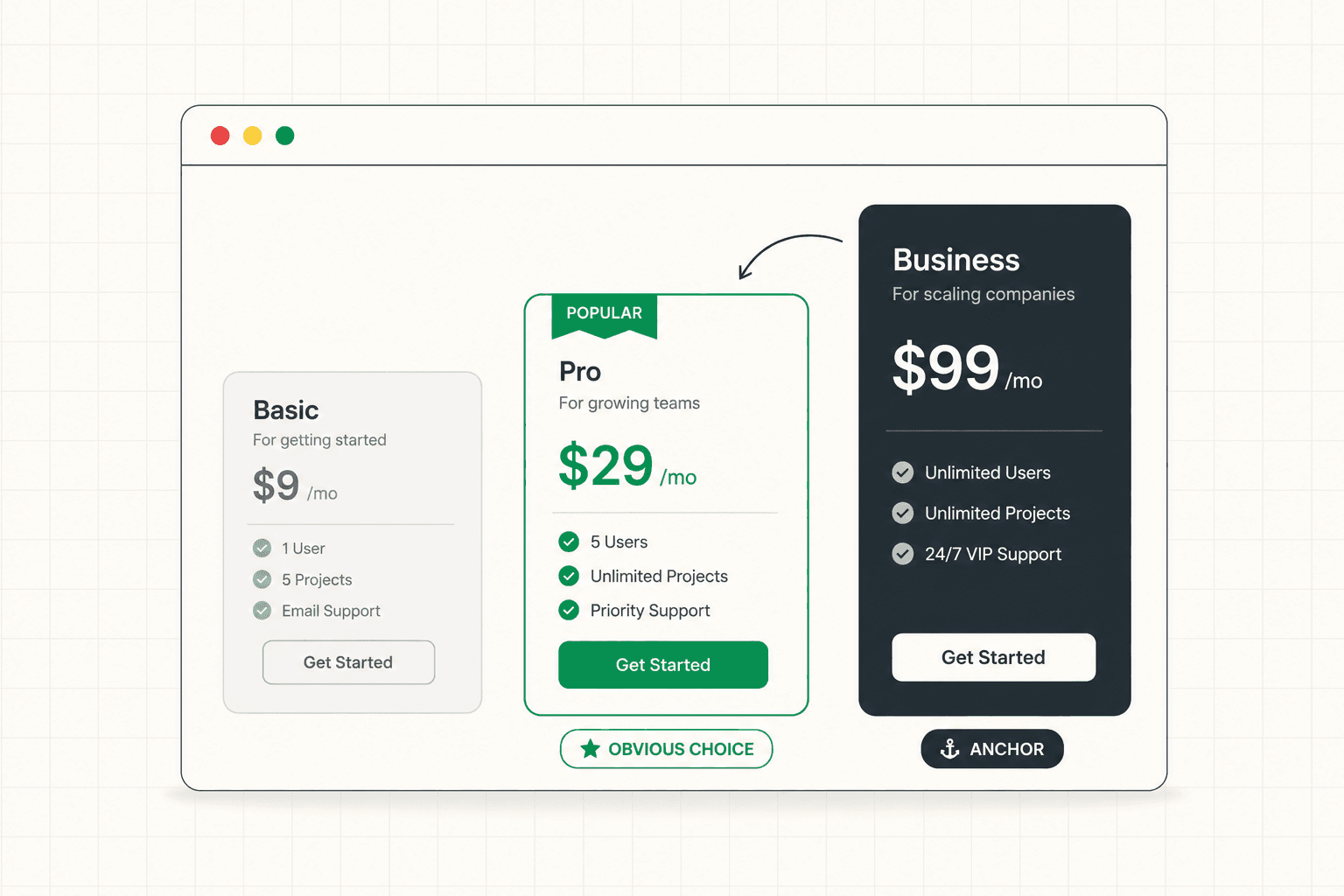
The number of tiers matters. Too few and the page fails to serve the range of buyers it needs to. Too many and the choice becomes overwhelming, which causes decision paralysis and abandonment. Three tiers is a common sweet spot for a reason: it offers enough range to serve different buyers while keeping the choice manageable, and it allows for a natural anchoring structure where the middle option often becomes the obvious choice.
Anchoring is one of the most powerful and underused tools in pricing page design. When a higher-priced tier is present, it makes the tiers below it feel more reasonable by comparison. A visitor looking at a mid-tier option in isolation evaluates it against their budget. The same visitor looking at it next to a higher tier evaluates it against that anchor, which makes the mid-tier feel like a sensible, moderate choice rather than an expense.
Guiding the choice also helps. Most strong pricing pages highlight a recommended or most-popular tier, which reduces the visitor's decision-making burden by suggesting a default. Faced with three options and uncertainty about which is right, many visitors gravitate toward the one the page signals as the popular or recommended choice. This is not manipulation. It is reducing the cognitive load of a decision the visitor wants help making.
The framing of the prices themselves matters too. Annual versus monthly presentation, how discounts are shown, whether prices are presented as the cost or as the value relative to the cost. Each of these framing decisions affects how the price is perceived, independent of the actual number.
Hidden Costs and the Trust Problem
Nothing erodes trust on a pricing page faster than the sense that the real cost is being concealed.
Visitors are wary on pricing pages. They have been burned before by products that advertised one price and charged another, by setup fees that appeared after signup, by usage charges that were not clear upfront, by "contact us for pricing" that signals the price is high enough to need a sales conversation to justify. When a pricing page feels like it is hiding the true cost, the visitor's trust drops at the exact moment they need to feel confident enough to commit.
The pricing pages that convert well are transparent. They show the actual cost clearly, including the elements that buyers commonly worry are hidden. If there are setup fees, usage charges, or limits that affect the real cost, they address these openly rather than letting the visitor discover them later and feel misled. Transparency here is a conversion tool, not just an ethical one, because it removes the suspicion that quietly kills conversions on pricing pages.
The "contact us for pricing" approach deserves particular scrutiny. For genuinely enterprise, custom-scoped offerings, it makes sense. But used as a default to avoid showing prices, it costs conversions, because many buyers will not start a sales conversation just to find out whether they can afford something. If the goal is to qualify or to enable custom pricing, that can often be achieved while still giving the visitor enough information to know whether it is worth pursuing. The framework for how transparency around cost affects conversion applies across the funnel: B2B Landing Page: What Makes It Actually Work
Connecting Price to Value
A pricing page that shows price without reinforcing value is asking the visitor to evaluate cost in a vacuum. The strongest pricing pages keep the value visible right at the moment the visitor is confronting the cost.
This is why the best pricing pages are not just tables of numbers. They remind the visitor what they are getting for the price, frame the cost in terms of the outcome it delivers, and sometimes include proof or reassurance right on the pricing page itself. A testimonial about ROI placed near the pricing tiers does different work than the same testimonial buried elsewhere. A short line connecting the price to the value it produces reframes the cost from an expense into an investment.
The framing of what the buyer gets matters as much as the number. A price presented next to a clear articulation of the outcome it delivers feels different from the same price presented as a bare number. The visitor is always doing a value-versus-cost calculation on the pricing page. The page can either help them do that calculation favorably by keeping the value visible, or leave them to do it alone with only the cost in front of them.
This is also where the value proposition needs to remain present. The pricing page is not separate from the rest of the conversion argument. It is the moment where the argument is tested against the actual cost, and the value the page has built throughout needs to be reinforced rather than abandoned at the pricing step. The framework for building and reinforcing value is here: Value Proposition: How to Write One That Actually Makes People Buy
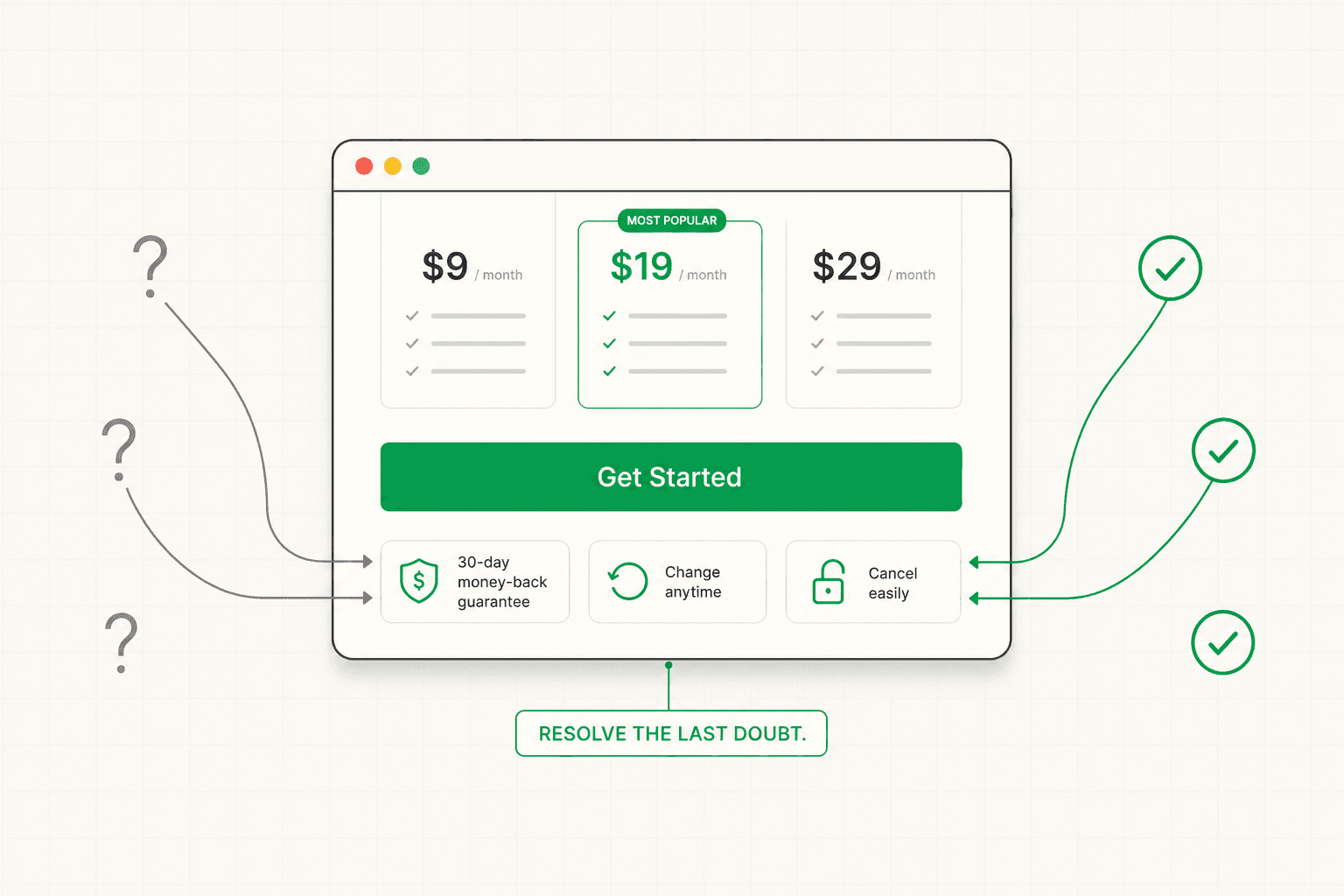
Handling Objections Right on the Pricing Page
The pricing page is where the final objections concentrate, and the pages that convert well address them directly rather than leaving them to fester.
The visitor on the pricing page has specific concerns. What if I pick the wrong tier? What if it does not work for me? Can I change later? Is there a commitment I am locking into? What happens if I want to cancel? These questions, unanswered, become reasons to delay, and delay on a pricing page often means the visitor never returns.
Strong pricing pages anticipate these questions and answer them in context. A clear, generous trial or money-back policy reduces the risk of committing. A statement that tiers can be changed later removes the fear of choosing wrong. Transparency about cancellation removes the fear of being locked in. A short FAQ addressing the most common pricing concerns, placed right on the pricing page, resolves the hesitations at the moment they arise rather than requiring the visitor to go searching for reassurance.
These reassurances do real conversion work because they target the specific anxiety that peaks on the pricing page. The visitor is closest to buying and also closest to talking themselves out of it. The page that resolves their final concerns converts them. The page that leaves those concerns unaddressed loses them to "let me think about it."
The CTA on Each Tier
The buttons on a pricing page are often treated as an afterthought, but they do meaningful work in guiding the visitor toward the right action.
Each tier's CTA should be specific to what the visitor is choosing rather than a uniform "sign up" across all tiers. "Start Free," "Start Pro Trial," and "Talk to Sales" each communicate something different about what happens when the visitor clicks, and they help the visitor understand the nature of each option. The differentiation reinforces the structure of the tiers and reduces the ambiguity about what each choice means.
The visual treatment of the CTAs also guides the choice. The recommended tier's button is usually given more visual weight, reinforcing the page's suggestion about which option most buyers should choose. The buttons on the other tiers are present and clear but slightly less prominent, which supports the anchoring and guidance without removing the visitor's ability to choose differently. The full breakdown of what makes CTAs convert is here: Call to Action Examples: What Actually Makes a CTA Convert (Beyond Button Color)
How to Evaluate Your Own Pricing Page
If you want to assess your pricing page, run through these questions as a first-time visitor with a real buying decision in mind.
Can you tell, within a few seconds, which tier is right for someone like you? If you have to study the page carefully to figure out which option fits, the page is asking too much cognitive work and losing visitors who will not do it.
Is the actual cost clear, including anything that might feel hidden? Or does the page create suspicion that the real cost is higher than what is shown?
Does the page connect price to value, or does it present cost in a vacuum? Is the value the visitor is getting visible at the moment they confront the price?
Are the final objections addressed on the page? Trial, money-back, ability to change tiers, cancellation? Or are these left unanswered at the exact moment the visitor's anxiety peaks?
Does each tier's CTA communicate what choosing it means, and does the page guide the visitor toward a recommended option?
If you cannot answer these confidently, the pricing page is likely losing high-intent visitors who were close to converting. A structured diagnosis identifies where the page is failing before any redesign begins. See how the 48h Audit works
The Short Version
The pricing page serves high-intent visitors at the decisive moment, which makes it one of the most important and most commonly mishandled pages on a site.
It converts when it makes the right tier obvious quickly, structures the tiers to guide the choice through anchoring and recommendation, stays transparent about the real cost, keeps the value visible at the moment of the price, and addresses the final objections right on the page.
It fails when it presents a wall of tiers and features that the visitor has to excavate, hides costs in ways that erode trust, shows price without value, and leaves the final anxieties unresolved.
The pricing page is not a table of numbers. It is the page where a nearly-convinced buyer makes the decision. Build it to help them make it.
KEEP READING