Product Page Optimization: What Actually Turns Browsers Into Buyers

@nadolconverts
Kacper Nadol
The product page is the hardest-working page in any online store and usually the most underoptimized. It is where the buyer decides whether to trust you with their money, and most product pages give them reasons to hesitate instead of reasons to buy. This article breaks down what actually moves product page conversion.
Why the Product Page Carries the Sale
In most online stores, the product page is where the actual buying decision happens. The homepage gets the visitor interested. The category page helps them narrow down. But the product page is where they decide whether to commit, and it is doing more conversion work than any other page in the store.
Despite this, the product page is usually the most neglected page in the optimization process. Teams spend time on the homepage hero, the ad creative, the email flows, and the checkout, while the page where the buyer actually decides to purchase gets a stock template, a few product photos, and a manufacturer-supplied description.
The buyer arrives at the product page with a specific question: should I buy this, from this store, right now? Everything on the page either moves them toward yes or gives them a reason to hesitate. And in ecommerce, hesitation usually means a closed tab, because the buyer has eleven other stores selling something similar and no particular reason to push through their uncertainty on yours.
The product pages that convert well are the ones built to resolve that uncertainty rather than just display the product. That shift, from displaying to resolving, is the core of product page optimization.
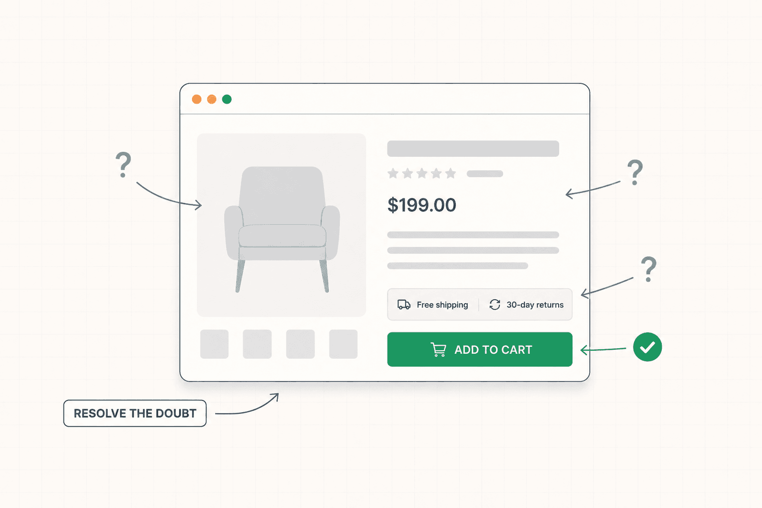
The Buyer's Uncertainty Is the Thing to Solve
Every visitor on a product page is carrying a set of unspoken questions. Will this actually do what I need? Is the quality what the photos suggest? Will it fit, work, or match what I expect? What happens if it is wrong? How long will it take to arrive? Can I trust this store with my payment details?
The product pages that convert poorly leave these questions unanswered, forcing the buyer to either hunt for the information or guess. The product pages that convert well anticipate each question and answer it before it becomes a reason to leave.
This reframes the entire job of the product page. It is not a display surface. It is an objection-handling surface. The product images exist to answer "is the quality what I expect." The description exists to answer "will this do what I need." The reviews exist to answer "have people like me been happy with this." The shipping and returns information exists to answer "what happens if this is wrong and how long until it arrives." Each element is resolving a specific uncertainty.
When you look at a product page through this lens, the gaps become obvious. Every question the page does not answer is a hesitation point. Every hesitation point is conversion you are leaving on the table. The optimization work is identifying the questions your specific buyers carry and making sure the page answers each one clearly. This is the same buyer-first logic that drives all conversion work: Why Your Landing Page Doesn't Convert: 9 Real Reasons (And What to Fix First)
Product Images Do More Selling Than the Copy
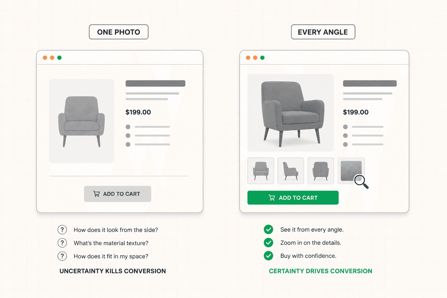
For physical products, the images are often the single most important conversion element on the page. The buyer cannot touch, hold, or try the product, so the images are doing the work that physical inspection would do in a store.
Most stores underinvest here in predictable ways. Too few images. Only one angle. No sense of scale. No detail shots. No context showing the product in use. No demonstration of the features that matter. The buyer is left guessing about exactly the things that would make them confident enough to buy.
Strong product imagery answers the buyer's visual questions systematically. Multiple angles so they can see the whole product. Detail shots of the parts that matter, like material texture, stitching, finish, or mechanism. Scale references so they understand the actual size. In-context shots showing the product being used, worn, or placed, so they can imagine it in their own life. For some products, video that shows movement, function, or fit in ways static images cannot.
The investment in better product imagery often produces conversion improvements larger than any copy or layout change, because it resolves the fundamental uncertainty of buying something unseen. A buyer who can see exactly what they are getting, from every angle that matters, hesitates less than one squinting at a single low-resolution photo trying to figure out what the thing actually looks like.
The Description Should Sell the Outcome, Not List the Specs
Most product descriptions read like spec sheets. Dimensions, materials, technical features, and a manufacturer paragraph that was written to describe rather than to sell.
Specs matter and should be available, but they are not what convinces someone to buy. What convinces them is understanding what the product will do for them, how it will fit into their life, and why it is the right choice for their specific need. The description that converts leads with that and supports it with the specs, rather than leading with the specs and hoping the buyer infers the value.
A coffee grinder described as "40mm conical burrs, 15 grind settings, 250g hopper capacity" is accurate and unpersuasive. The same grinder described as "consistent grounds for everything from espresso to French press, with enough capacity for a week of mornings, and burrs that will not heat-damage your beans the way blade grinders do" sells the outcome and includes the specs as evidence. Same product. Different conversion rate.
This is the same outcome-first principle that drives landing page copy, applied to the product page. Lead with what changes for the buyer. Support with the features that deliver it. The buyer cares about the outcome and evaluates the specs only after they care. The full framework for outcome-led copy is here: Landing Page Copywriting: What Actually Makes It Convert
Reviews and Social Proof Belong Where the Doubt Is
Reviews are one of the most powerful conversion elements on a product page, and most stores either bury them or present them in a way that does not actually build confidence.
The buyer wants to know that people like them bought this and were happy. Generic star ratings help a little. Specific, detailed reviews from buyers with similar needs help a lot more. A review that says "I was worried about the size but it fit perfectly in my small kitchen" resolves a specific doubt that the buyer might be carrying. A review that says "great product, five stars" does not.
The placement matters as much as the presence. Reviews buried at the bottom of the page get seen by fewer buyers than reviews integrated near the relevant decision points. Some of the strongest product pages surface specific reviews near the parts of the page where the relevant doubt would form, in addition to the full review section lower down. A review addressing fit appears near the sizing information. A review addressing durability appears near the materials description.
Beyond reviews, other forms of social proof reduce purchase anxiety. The number of people who bought this. User-generated photos showing the product in real use. Ratings broken down by the specific attributes buyers care about. Each of these answers a version of "can I trust this" and "will I be happy with this," which are the core questions standing between the browser and the buy. The principle of placing proof at the point of doubt applies the same way here as everywhere: B2B Landing Page: What Makes It Actually Work
Shipping, Returns, and the Hidden Cost Problem
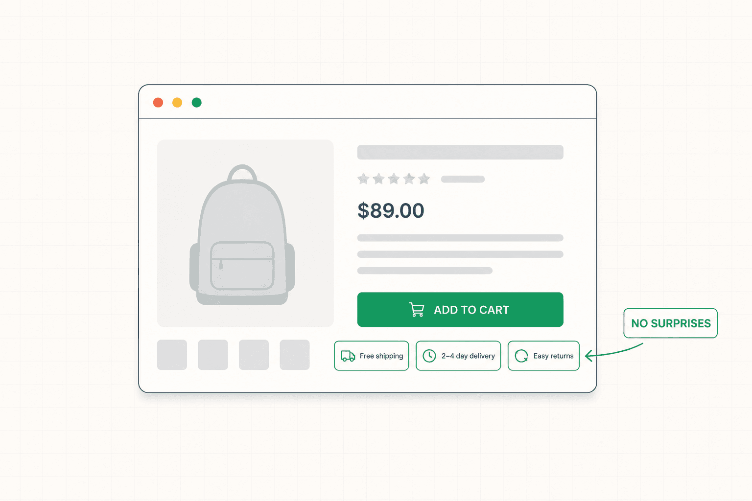
One of the most common product page conversion killers is uncertainty or unwelcome surprises around shipping and returns.
The buyer wants to know, before they commit, how much shipping costs, how long delivery takes, and what happens if they need to return the item. When this information is hidden, vague, or only revealed at checkout, it creates hesitation at best and abandonment at worst. Unexpected shipping costs discovered at checkout are one of the single biggest causes of cart abandonment in all of ecommerce.
The fix is to surface this information on the product page itself, clearly and early. Free shipping thresholds stated where the buyer can see them. Delivery estimates shown near the buy button. Return policy summarized in a way that reduces the risk of purchase rather than burying it in a footer link. A generous, clearly stated return policy is itself a conversion tool, because it lowers the perceived risk of buying something the buyer cannot physically inspect.
The stores that handle this well treat shipping and returns information as part of the conversion argument rather than as fine print. Reducing the buyer's uncertainty about what happens after they click buy is as important as convincing them to want the product in the first place. The full breakdown of how hidden costs leak revenue across the ecommerce funnel is here: Ecommerce Conversion Rate Optimization: What Actually Moves Revenue
The Buy Button and the Path to Purchase
The add-to-cart button is the conversion point of the product page, and small details around it have outsized impact.
The button needs to be obvious, visible without scrolling on most screens, and visually distinct from everything else on the page. Buyers should never have to look for how to purchase. On long product pages, the button often needs to remain accessible as the buyer scrolls, through a sticky element or a repeated button, so the path to purchase is always one click away regardless of where the buyer is on the page.
The copy on and around the button matters too. The button itself should be clear and action-oriented. The area around it is good real estate for the final reassurances that reduce last-second hesitation: stock availability, the shipping and returns summary, payment options, and any guarantee that lowers the risk of buying.
The transition from the product page to the cart and checkout should be as frictionless as possible. Every additional step, every unexpected interruption, every moment of confusion between deciding to buy and completing the purchase is a place where committed buyers leak out of the funnel. The product page's job does not quite end at the button. It extends to making the next step feel effortless.
How to Optimize Your Own Product Pages
If you want to improve your product pages, the most useful starting point is not a checklist of best practices. It is identifying what your specific buyers are uncertain about and where your pages are failing to resolve that uncertainty.
Look at your analytics to see where buyers drop off. Are they leaving the product page without adding to cart, which points to a consideration problem on the page itself? Are they adding to cart and then abandoning, which points to a cart or checkout problem downstream? The drop-off pattern tells you where to focus.
Read your own product pages as a skeptical first-time buyer. What questions come up that the page does not answer? Where do you hesitate? What would you want to know before spending your own money that the page makes you hunt for or guess at? Each of those is an optimization target.
Look at your reviews and support tickets for the questions buyers ask repeatedly. Those recurring questions are almost certainly the same uncertainties costing you conversions on the page. Answering them directly on the product page removes the friction before it forms.
If you are not sure which of these is costing you the most, a structured audit maps the specific breakdown points in your store before any changes are made. See how the 48h Audit works
The Short Version
The product page is where the buying decision actually happens, and it converts best when it is built to resolve the buyer's uncertainty rather than just display the product.
Rich product imagery resolves the doubt of buying something unseen. Descriptions that sell the outcome rather than list the specs give the buyer a reason to care. Specific reviews placed near the relevant doubts build confidence. Clear shipping and returns information surfaced early removes the hidden-cost hesitation that kills sales. And an obvious, accessible buy button with reassuring copy around it makes the final step effortless.
Every question your product page does not answer is a hesitation point. Every hesitation point is conversion you are leaving on the table. Find the questions your buyers carry and make sure the page answers each one.
KEEP READING