SaaS Landing Page Best Practices: What Actually Moves Signups

@nadolconverts
Kacper Nadol

A lot of SaaS landing pages look polished and still struggle to convert. Usually the problem is not the product. It is that the page makes the value feel abstract, the proof too soft, and the next step harder than it needs to be.
SaaS pages rarely fail because they “look bad”
That would actually be easier.
Most SaaS landing pages fail in a more annoying way. They look clean enough. The product screenshots are polished. The UI feels modern. The headline sounds expensive. The page checks all the obvious boxes. And yet signups, demo requests, or trial starts stay weaker than expected.
That is exactly why SaaS pages are so easy to misread. When the page looks “pretty good”, people start blaming channels, pricing, or market maturity before they look hard at the page itself.
Sometimes those things are the issue. A lot of the time, the page is simply not doing enough to move someone from curiosity into intent.
If you want the broader foundation behind that thinking, start here: Website Audit Checklist
What makes SaaS landing pages harder than they look
SaaS is not like a simple local service page where the visitor already understands the category. A SaaS landing page often has to do several jobs at once.
It has to explain what the product does.
It has to explain who it is for.
It has to make the mechanism believable.
It has to show that the product is real.
It has to reduce the fear that switching, learning, or buying will be annoying.
That is a lot to ask from one page.
So when a SaaS page underperforms, it is usually not because one thing is catastrophically wrong. It is because the page is slightly too vague, slightly too broad, slightly too feature-heavy, slightly too weak on proof, and slightly too demanding in the next step. Small misses stack up.
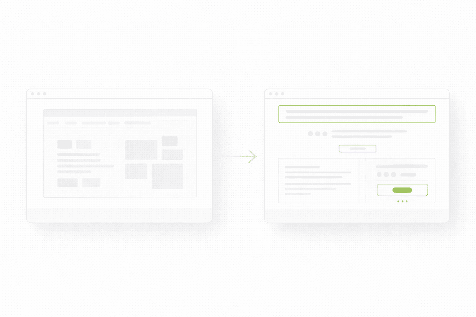
Best practice #1: Make the first screen about the outcome, not the interface
This is probably the most common SaaS mistake.
The team is proud of the product, so the page opens with UI. Screenshots. Dashboard visuals. Product shots. Small animations. The problem is that UI is not value. Not at first.
If the visitor does not yet understand why the product matters, the interface is just visual noise.
A stronger first screen usually gives the visitor four things quickly:
the outcome
the audience
a believable mechanism
a safe next step
That does not mean screenshots are bad. It means screenshots should support understanding, not replace it.
If this part feels weak on your site, this article connects directly: Homepage Messaging That Converts
Best practice #2: Stop trying to speak to every user on one page
A lot of SaaS pages quietly sabotage themselves by trying to work for:
founders
operators
marketers
product teams
enterprise buyers
self-serve users
all at once.
The result is predictable. The page gets softer. The wording gets broader. The examples become less specific. The CTA becomes more generic. The visitor has to do the mental work of deciding whether the product is actually for them.
That is expensive.
Even if your product serves multiple segments, the page still needs a dominant point of view. One audience can be primary. Others can be supported lower on the page or through separate pages.
A page that tries to say everything usually says nothing with enough conviction.
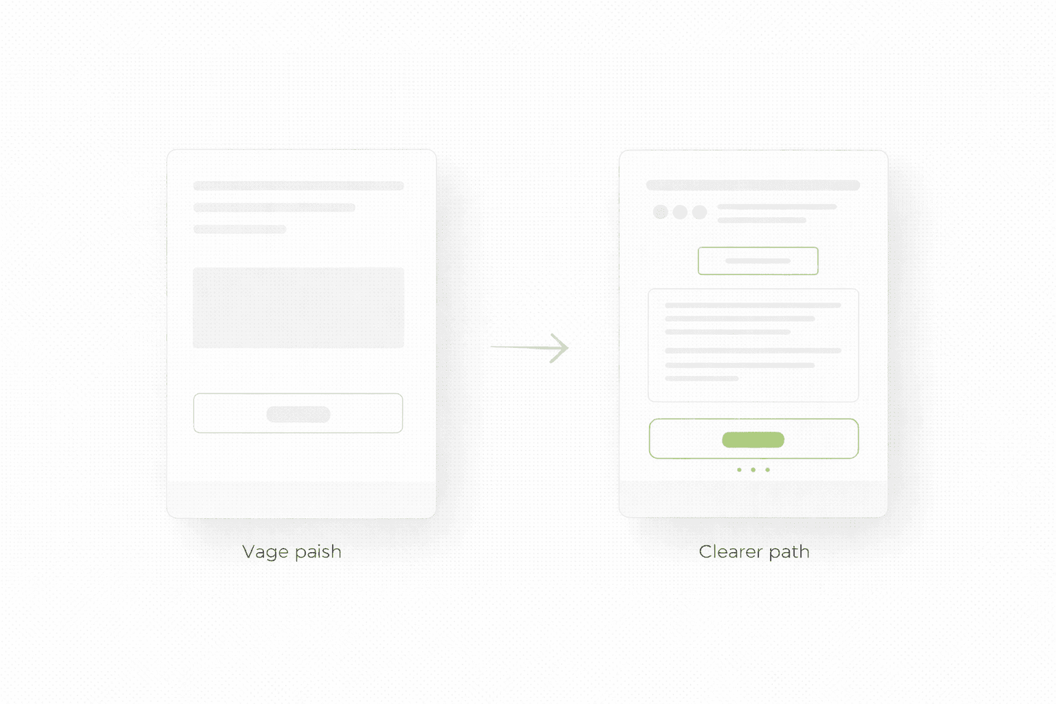
Best practice #3: Show proof before the visitor has to “believe”
SaaS buyers are used to polished websites. They have seen beautiful interfaces attached to weak products. So the page cannot rely on polish alone.
Proof has to show up early enough to carry the claim.
Strong proof for SaaS usually looks like:
a clear customer outcome
a recognizable client logo row
a short testimonial that mentions a concrete result
a product-specific metric
a visual explanation that makes the mechanism feel obvious
Weak proof usually looks like:
“trusted by innovative teams”
“used worldwide”
“streamline your workflow”
That is not proof. That is decorative reassurance.
If you want to see how this kind of conversion-first structure looks in practice, browse a few recent landing page projects here.
Best practice #4: Explain the mechanism before you list features
A lot of SaaS pages jump straight into feature grids.
That sounds logical until you remember that features only matter after the visitor understands the job the product is doing.
A stronger order is:
what changes
why that matters
how the product makes it happen
then features that support that story
This is one reason feature walls often underperform. They answer a question the visitor is not asking yet.
The visitor is not thinking: “How many modules does this product have?”
The visitor is thinking: “Will this solve my problem without creating three new ones?”
Mechanism is what makes the promise believable. Features are what deepen it.
Best practice #5: Make the next step feel proportional
A lot of SaaS pages quietly kill intent with badly timed CTAs.
If the page is still in evaluation mode and the next step feels heavy, people hesitate. If the page is already persuasive and the CTA still feels vague, people drift.
The right next step depends on the sales motion:
self-serve products can usually push trials or signup faster
higher-ticket SaaS often needs demos or qualification
newer products may need a softer step like waitlist, walkthrough, or product tour
The important part is that the CTA matches the stage of trust the page has earned.
A page that says very little and asks for a demo immediately often feels premature.
A page that builds conviction and still hides behind “Learn more” feels weak.
Best practice #6: Treat mobile like the real buying environment
This still gets underestimated, especially in SaaS teams that review everything on big monitors.
A page can feel perfectly fine on desktop and still underperform on mobile because:
the headline wraps badly
the proof row gets pushed too low
the screenshots dominate the first screen
the CTA feels visually secondary
the page loads just slowly enough to weaken momentum
If a meaningful portion of your acquisition is coming from social, branded search, communities, or even mobile search, then mobile is not the backup version. It is one of the main places first impressions happen.
And first impressions decide whether the rest of the page gets a chance.
Best practice #7: Do not confuse “more pages” with “better page strategy”
Some SaaS teams respond to weak conversion by adding more sections, more use cases, more feature detail, more FAQs, more screenshots, more social proof, more integrations, more everything.
That can help if the problem is lack of information.
A lot of the time, it just creates more scroll, more noise, and more decision fatigue.
A better question is not “What else should we add?”
It is “What is the minimum this page needs to communicate clearly enough to move the right person forward?”
That shift alone usually improves pages faster than another round of additions.
If you are deciding whether the real answer is a focused landing page or a broader rebuild, this is the right companion read: Landing Page vs Website Redesign
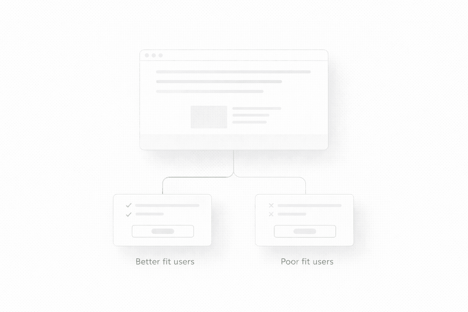
Best practice #8: Use your structure to qualify, not just attract
A stronger SaaS landing page does not just generate more signups. In many cases, it generates better signups.
That matters more than people admit.
A weak page can produce volume and still waste sales time because the wrong people click through, book calls, or start trials with the wrong expectation. A stronger page clarifies the fit earlier, which means the next step gets cleaner.
This is exactly why better messaging and structure often improve both conversion rate and lead quality at the same time. On Ravelink’s site, Brandive is presented as a case where a redesigned main landing page plus a qualification form produced +239% qualified-only leads, which is a good example of conversion quality mattering as much as raw volume.
What usually moves SaaS signups first
If you want the practical version, the first wins usually come from:
clearer first-screen messaging, earlier proof, a more proportional CTA, and less friction in the next step.
Not from making the page longer.
Not from adding more animations.
Not from replacing one pretty screenshot with a prettier screenshot.
A SaaS landing page starts performing when the visitor no longer has to do the strategic work themselves.
If you want a clear fix list for your SaaS page
If you want to know what is weakening signups, where the friction is, and what to fix first, start here.
A lot of SaaS landing pages look polished and still struggle to convert. Usually the problem is not the product. It is that the page makes the value feel abstract, the proof too soft, and the next step harder than it needs to be.
SaaS pages rarely fail because they “look bad”
That would actually be easier.
Most SaaS landing pages fail in a more annoying way. They look clean enough. The product screenshots are polished. The UI feels modern. The headline sounds expensive. The page checks all the obvious boxes. And yet signups, demo requests, or trial starts stay weaker than expected.
That is exactly why SaaS pages are so easy to misread. When the page looks “pretty good”, people start blaming channels, pricing, or market maturity before they look hard at the page itself.
Sometimes those things are the issue. A lot of the time, the page is simply not doing enough to move someone from curiosity into intent.
If you want the broader foundation behind that thinking, start here: Website Audit Checklist
What makes SaaS landing pages harder than they look
SaaS is not like a simple local service page where the visitor already understands the category. A SaaS landing page often has to do several jobs at once.
It has to explain what the product does.
It has to explain who it is for.
It has to make the mechanism believable.
It has to show that the product is real.
It has to reduce the fear that switching, learning, or buying will be annoying.
That is a lot to ask from one page.
So when a SaaS page underperforms, it is usually not because one thing is catastrophically wrong. It is because the page is slightly too vague, slightly too broad, slightly too feature-heavy, slightly too weak on proof, and slightly too demanding in the next step. Small misses stack up.
Best practice #1: Make the first screen about the outcome, not the interface
This is probably the most common SaaS mistake.
The team is proud of the product, so the page opens with UI. Screenshots. Dashboard visuals. Product shots. Small animations. The problem is that UI is not value. Not at first.
If the visitor does not yet understand why the product matters, the interface is just visual noise.
A stronger first screen usually gives the visitor four things quickly:
the outcome
the audience
a believable mechanism
a safe next step
That does not mean screenshots are bad. It means screenshots should support understanding, not replace it.
If this part feels weak on your site, this article connects directly: Homepage Messaging That Converts
Best practice #2: Stop trying to speak to every user on one page
A lot of SaaS pages quietly sabotage themselves by trying to work for:
founders
operators
marketers
product teams
enterprise buyers
self-serve users
all at once.
The result is predictable. The page gets softer. The wording gets broader. The examples become less specific. The CTA becomes more generic. The visitor has to do the mental work of deciding whether the product is actually for them.
That is expensive.
Even if your product serves multiple segments, the page still needs a dominant point of view. One audience can be primary. Others can be supported lower on the page or through separate pages.
A page that tries to say everything usually says nothing with enough conviction.
Best practice #3: Show proof before the visitor has to “believe”
SaaS buyers are used to polished websites. They have seen beautiful interfaces attached to weak products. So the page cannot rely on polish alone.
Proof has to show up early enough to carry the claim.
Strong proof for SaaS usually looks like:
a clear customer outcome
a recognizable client logo row
a short testimonial that mentions a concrete result
a product-specific metric
a visual explanation that makes the mechanism feel obvious
Weak proof usually looks like:
“trusted by innovative teams”
“used worldwide”
“streamline your workflow”
That is not proof. That is decorative reassurance.
If you want to see how this kind of conversion-first structure looks in practice, browse a few recent landing page projects here.
Best practice #4: Explain the mechanism before you list features
A lot of SaaS pages jump straight into feature grids.
That sounds logical until you remember that features only matter after the visitor understands the job the product is doing.
A stronger order is:
what changes
why that matters
how the product makes it happen
then features that support that story
This is one reason feature walls often underperform. They answer a question the visitor is not asking yet.
The visitor is not thinking: “How many modules does this product have?”
The visitor is thinking: “Will this solve my problem without creating three new ones?”
Mechanism is what makes the promise believable. Features are what deepen it.
Best practice #5: Make the next step feel proportional
A lot of SaaS pages quietly kill intent with badly timed CTAs.
If the page is still in evaluation mode and the next step feels heavy, people hesitate. If the page is already persuasive and the CTA still feels vague, people drift.
The right next step depends on the sales motion:
self-serve products can usually push trials or signup faster
higher-ticket SaaS often needs demos or qualification
newer products may need a softer step like waitlist, walkthrough, or product tour
The important part is that the CTA matches the stage of trust the page has earned.
A page that says very little and asks for a demo immediately often feels premature.
A page that builds conviction and still hides behind “Learn more” feels weak.
Best practice #6: Treat mobile like the real buying environment
This still gets underestimated, especially in SaaS teams that review everything on big monitors.
A page can feel perfectly fine on desktop and still underperform on mobile because:
the headline wraps badly
the proof row gets pushed too low
the screenshots dominate the first screen
the CTA feels visually secondary
the page loads just slowly enough to weaken momentum
If a meaningful portion of your acquisition is coming from social, branded search, communities, or even mobile search, then mobile is not the backup version. It is one of the main places first impressions happen.
And first impressions decide whether the rest of the page gets a chance.
Best practice #7: Do not confuse “more pages” with “better page strategy”
Some SaaS teams respond to weak conversion by adding more sections, more use cases, more feature detail, more FAQs, more screenshots, more social proof, more integrations, more everything.
That can help if the problem is lack of information.
A lot of the time, it just creates more scroll, more noise, and more decision fatigue.
A better question is not “What else should we add?”
It is “What is the minimum this page needs to communicate clearly enough to move the right person forward?”
That shift alone usually improves pages faster than another round of additions.
If you are deciding whether the real answer is a focused landing page or a broader rebuild, this is the right companion read: Landing Page vs Website Redesign
Best practice #8: Use your structure to qualify, not just attract
A stronger SaaS landing page does not just generate more signups. In many cases, it generates better signups.
That matters more than people admit.
A weak page can produce volume and still waste sales time because the wrong people click through, book calls, or start trials with the wrong expectation. A stronger page clarifies the fit earlier, which means the next step gets cleaner.
This is exactly why better messaging and structure often improve both conversion rate and lead quality at the same time. On Ravelink’s site, Brandive is presented as a case where a redesigned main landing page plus a qualification form produced +239% qualified-only leads, which is a good example of conversion quality mattering as much as raw volume.
What usually moves SaaS signups first
If you want the practical version, the first wins usually come from:
clearer first-screen messaging, earlier proof, a more proportional CTA, and less friction in the next step.
Not from making the page longer.
Not from adding more animations.
Not from replacing one pretty screenshot with a prettier screenshot.
A SaaS landing page starts performing when the visitor no longer has to do the strategic work themselves.
If you want a clear fix list for your SaaS page
If you want to know what is weakening signups, where the friction is, and what to fix first, start here.
See more articles
Browse the archive for teardowns, checklists and playbooks you can copy straight into your next build.