Why Your Website Gets Traffic But No Leads (And What's Actually Broken)

@nadolconverts
Kacper Nadol

Traffic without leads is one of the most demoralizing situations a founder or marketer can face. You have the rankings, you have the sessions, and somehow none of it converts. This article breaks down the real reasons why that happens and what to fix first.
Traffic Is Not Proof That Your Website Works
There is a specific kind of frustration that comes from having a website that looks like it is performing. The rankings are decent. Monthly sessions look respectable. Someone on your team runs the analytics report and says "traffic is up." And yet the pipeline is quiet. Leads are thin, or the ones that do come in are wrong, or sales keeps saying "the quality just is not there."
This situation is more common than most people admit, and it creates a strange paralysis. Because if traffic is up, something must be working. So you keep the page as it is, run more ads, maybe commission more content. And nothing really changes.
The problem is that traffic and conversion are two entirely separate problems.
Traffic is an acquisition problem. Conversion is a clarity and positioning problem. You can solve one without touching the other. And when most websites underperform, it is almost never the traffic that is broken.
What Visitors Are Actually Experiencing
Stop thinking about your website as a page. Start thinking about it as a conversation.
Every visitor who lands on your site is trying to answer a handful of questions, usually in about eight to fifteen seconds.
What is this?
Is this for me?
Do I believe it?
What do I do next?
If those questions go unanswered, the visitor leaves. Not because they hated the design, not because the page was slow, but because the page failed to make a case. Visually it might be fine. Technically it might be fast. But cognitively, it created no momentum. Nothing pulled the reader forward.
This happens constantly, even on websites that look professional and cost real money to build. Good design does not automatically produce good conversion. A well-built Webflow site with the wrong message will underperform a plainer site with the right message almost every time. Visitors are not buying your aesthetics. They are trying to understand whether this thing is worth their time.
The Clarity Problem
The most common reason traffic does not convert is that the page is not clear enough, fast enough, to the right person.
There is a pattern that shows up constantly. The hero section says something like "Grow your business with smarter solutions." The subheadline tries to explain what the product does in one sentence and ends up technically accurate but meaningless to someone who just landed from a search. The rest of the page explains features reasonably well, but nothing ever speaks directly to the specific problem the visitor actually showed up with.
The visitor came because they had a pain, a question, or a goal. They typed something into Google that reflects that. If the page does not immediately connect to what they were thinking about, they do not read further. They do not assume it will get clearer. They leave, because there are eleven other tabs they can try.
This is not a visual problem. It is not a traffic problem. It is a messaging problem.
The fix is not a redesign. The fix is rewiring the copy to speak to the specific visitor, with the specific problem, at the specific moment they arrived. If that is the part your site is failing at, read this too: Homepage Messaging That Converts: A Simple Framework for Your First Screen
The Qualification Problem
Some websites generate leads but the wrong kind.
Sales teams waste time on demos that go nowhere. Free trials get activated by people who were never going to buy. Contact form submissions come in from someone who wanted a quote for something you do not offer.
This traces back to the same root cause: the page is not specific enough about who it is for and who it is not for. When a page tries to appeal to everyone, it qualifies no one. The friction of submitting a form or clicking a CTA is low enough that vaguely curious people convert. But vague curiosity does not become a real pipeline.
The fix is specificity. Pages that convert qualified buyers tend to do something most pages avoid, which is making the ideal customer feel seen while making everyone else feel like this is probably not for them. That might sound counterintuitive. It feels risky to "narrow" your message. But the result is almost always a smaller number of leads that are dramatically more likely to close.
A SaaS pricing page that says "built for ops teams at Series A to Series C companies" will produce better-qualified demos than one that says "for teams of all sizes," even if the traffic is identical. Read more on this: How to Qualify Leads on Your Website Without Killing Conversions
The Friction Problem
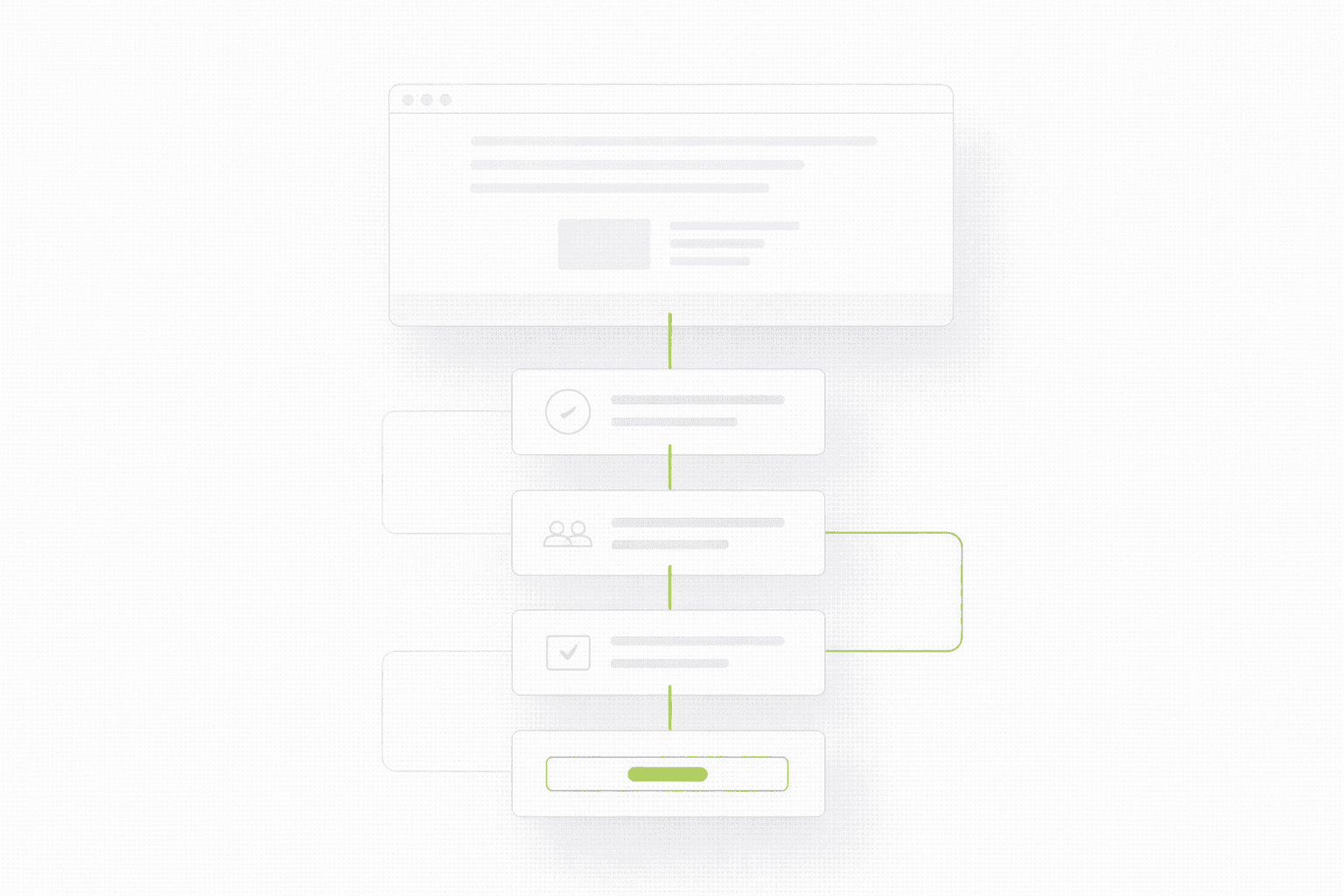
Even when the message is right and the visitor is qualified, conversion can still break down because of structural friction.
Friction is anything that slows down, confuses, or creates hesitation in the person trying to take the next step. It can be:
a form that asks for too much information too early
a CTA button that is visible but does not feel compelling
a navigation menu that offers too many choices at the exact moment someone was about to commit
a pricing section that raises more questions than it answers
The tricky part about friction is that it is invisible to the person who built the page. They know what everything means. They know where the CTA is. They know why the form needs those fields. First-time visitors do not have that context, and they do not have the patience to figure it out. When they hit friction, they do not push through. They stop.
One of the most useful exercises you can run: walk through your own page as a stranger with a specific goal in mind, and time yourself. Note every moment where you slowed down, had to look for something, or felt uncertain. Every one of those moments is a conversion risk.
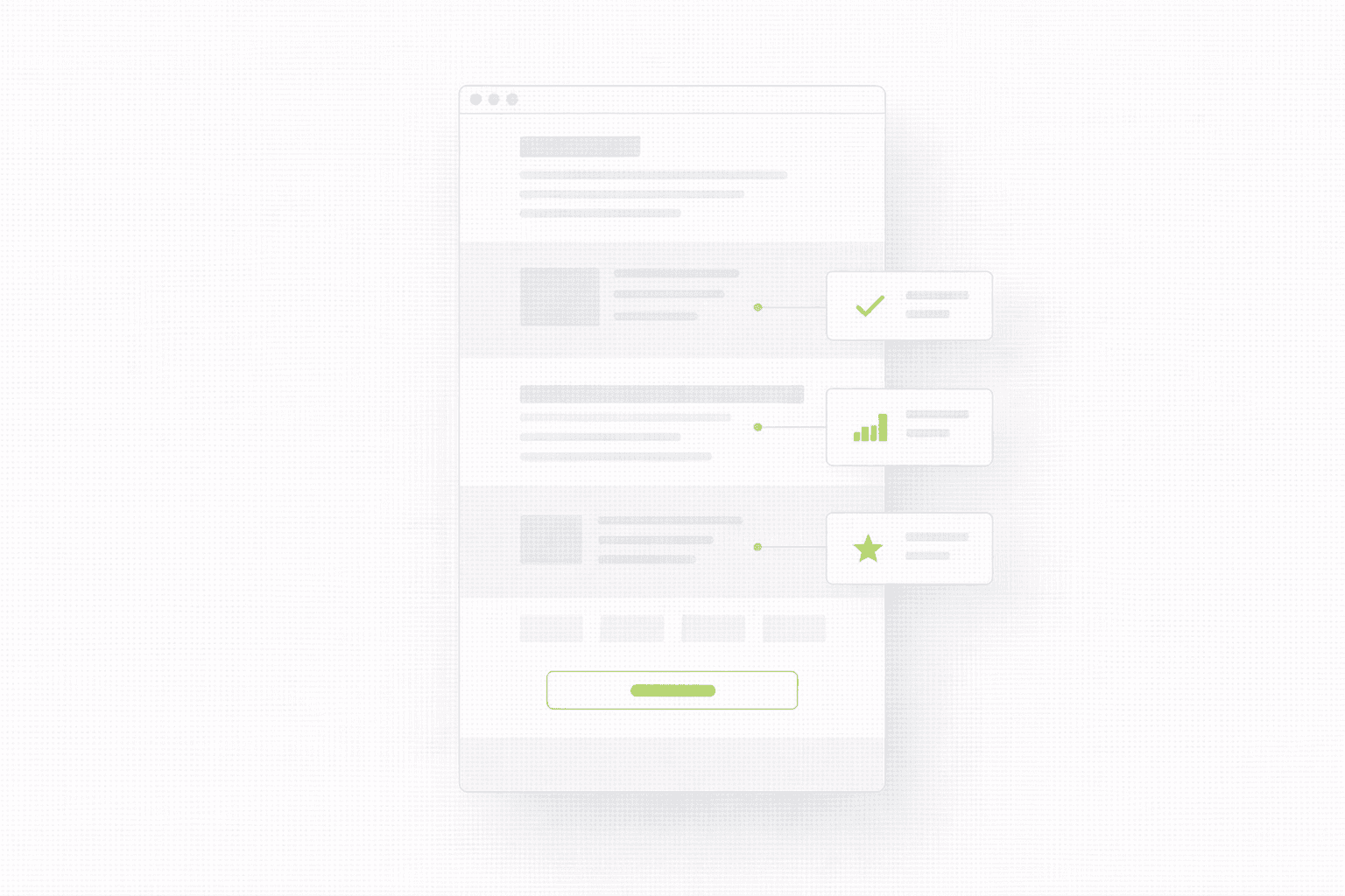
The Proof Problem
Most B2B and SaaS pages have some version of social proof. Logos, a handful of testimonials, maybe a case study buried somewhere. But proof only works if it appears at the right moment in the reader's journey, and if it is specific enough to be convincing rather than just decorative.
"Great product, highly recommend" is background noise.
"We cut our onboarding time by 40% in the first month" is proof.
A logo grid on the homepage sounds credible in theory. But if a visitor is on your pricing page wondering whether companies like theirs have used this successfully, that logo grid three screens back is not helping them. The proof needs to be where the doubt is.
Good conversion pages think about proof architecturally. At each stage of reading, what is the visitor skeptical about? Then place specific, credible evidence exactly there. Not at the top because it looks professional. Where the question is actually forming.
Why a Redesign Is Often the Wrong First Step
When traffic is good and leads are bad, the instinct is to redesign.
It feels like a decisive move. It feels like a break from whatever is not working. But a redesign without diagnosing the actual problem is expensive and frequently produces the same results with different colors.
The companies that improve conversion most efficiently tend to identify one specific failure point first. Is it the message? Is it the friction? Is it the proof? Is it the targeting? Then they fix that thing, measure, and build from there.
If you are not sure whether your situation calls for a full rebuild or something more targeted, this is worth reading first: Landing Page vs Website Redesign: What to Build First (If You Want Leads Soon)
A page does not need to be beautiful to convert well. It needs to make a clear case, remove obstacles, and deliver the right evidence at the right moment. Those three things are diagnostic, not aesthetic. If you work through them and conclude the structure itself is the root cause, then a redesign makes sense. But you want to go into that rebuild knowing exactly what you are fixing, not hoping a fresh start figures it out.
How to Actually Diagnose This
If you are in this situation right now, start with your analytics but ask a different question. Instead of "where are people coming from," ask "where are people dropping off." At what point in the page does the session end? That exit point is almost always adjacent to the real problem.
Then do a cold read of your own homepage. Cover your company name. Read the first two sentences of your hero section. Ask yourself honestly: does this tell a stranger what this is, who it is for, and why they should care, in a way that would make them want to keep reading?
Most pages fail this test. Which is useful information.
If you want a more structured version of this, a focused audit maps the specific breakdown points before any design or copy work begins. The goal is to find the one or two things that are actually costing you leads, not produce a 40-point list that never gets actioned. See how the 48h Audit works
Traffic without leads is one of the most demoralizing situations a founder or marketer can face. You have the rankings, you have the sessions, and somehow none of it converts. This article breaks down the real reasons why that happens and what to fix first.
Traffic Is Not Proof That Your Website Works
There is a specific kind of frustration that comes from having a website that looks like it is performing. The rankings are decent. Monthly sessions look respectable. Someone on your team runs the analytics report and says "traffic is up." And yet the pipeline is quiet. Leads are thin, or the ones that do come in are wrong, or sales keeps saying "the quality just is not there."
This situation is more common than most people admit, and it creates a strange paralysis. Because if traffic is up, something must be working. So you keep the page as it is, run more ads, maybe commission more content. And nothing really changes.
The problem is that traffic and conversion are two entirely separate problems.
Traffic is an acquisition problem. Conversion is a clarity and positioning problem. You can solve one without touching the other. And when most websites underperform, it is almost never the traffic that is broken.
What Visitors Are Actually Experiencing
Stop thinking about your website as a page. Start thinking about it as a conversation.
Every visitor who lands on your site is trying to answer a handful of questions, usually in about eight to fifteen seconds.
What is this?
Is this for me?
Do I believe it?
What do I do next?
If those questions go unanswered, the visitor leaves. Not because they hated the design, not because the page was slow, but because the page failed to make a case. Visually it might be fine. Technically it might be fast. But cognitively, it created no momentum. Nothing pulled the reader forward.
This happens constantly, even on websites that look professional and cost real money to build. Good design does not automatically produce good conversion. A well-built Webflow site with the wrong message will underperform a plainer site with the right message almost every time. Visitors are not buying your aesthetics. They are trying to understand whether this thing is worth their time.
The Clarity Problem
The most common reason traffic does not convert is that the page is not clear enough, fast enough, to the right person.
There is a pattern that shows up constantly. The hero section says something like "Grow your business with smarter solutions." The subheadline tries to explain what the product does in one sentence and ends up technically accurate but meaningless to someone who just landed from a search. The rest of the page explains features reasonably well, but nothing ever speaks directly to the specific problem the visitor actually showed up with.
The visitor came because they had a pain, a question, or a goal. They typed something into Google that reflects that. If the page does not immediately connect to what they were thinking about, they do not read further. They do not assume it will get clearer. They leave, because there are eleven other tabs they can try.
This is not a visual problem. It is not a traffic problem. It is a messaging problem.
The fix is not a redesign. The fix is rewiring the copy to speak to the specific visitor, with the specific problem, at the specific moment they arrived. If that is the part your site is failing at, read this too: Homepage Messaging That Converts: A Simple Framework for Your First Screen
The Qualification Problem
Some websites generate leads but the wrong kind.
Sales teams waste time on demos that go nowhere. Free trials get activated by people who were never going to buy. Contact form submissions come in from someone who wanted a quote for something you do not offer.
This traces back to the same root cause: the page is not specific enough about who it is for and who it is not for. When a page tries to appeal to everyone, it qualifies no one. The friction of submitting a form or clicking a CTA is low enough that vaguely curious people convert. But vague curiosity does not become a real pipeline.
The fix is specificity. Pages that convert qualified buyers tend to do something most pages avoid, which is making the ideal customer feel seen while making everyone else feel like this is probably not for them. That might sound counterintuitive. It feels risky to "narrow" your message. But the result is almost always a smaller number of leads that are dramatically more likely to close.
A SaaS pricing page that says "built for ops teams at Series A to Series C companies" will produce better-qualified demos than one that says "for teams of all sizes," even if the traffic is identical. Read more on this: How to Qualify Leads on Your Website Without Killing Conversions
The Friction Problem
Even when the message is right and the visitor is qualified, conversion can still break down because of structural friction.
Friction is anything that slows down, confuses, or creates hesitation in the person trying to take the next step. It can be:
a form that asks for too much information too early
a CTA button that is visible but does not feel compelling
a navigation menu that offers too many choices at the exact moment someone was about to commit
a pricing section that raises more questions than it answers
The tricky part about friction is that it is invisible to the person who built the page. They know what everything means. They know where the CTA is. They know why the form needs those fields. First-time visitors do not have that context, and they do not have the patience to figure it out. When they hit friction, they do not push through. They stop.
One of the most useful exercises you can run: walk through your own page as a stranger with a specific goal in mind, and time yourself. Note every moment where you slowed down, had to look for something, or felt uncertain. Every one of those moments is a conversion risk.
The Proof Problem
Most B2B and SaaS pages have some version of social proof. Logos, a handful of testimonials, maybe a case study buried somewhere. But proof only works if it appears at the right moment in the reader's journey, and if it is specific enough to be convincing rather than just decorative.
"Great product, highly recommend" is background noise.
"We cut our onboarding time by 40% in the first month" is proof.
A logo grid on the homepage sounds credible in theory. But if a visitor is on your pricing page wondering whether companies like theirs have used this successfully, that logo grid three screens back is not helping them. The proof needs to be where the doubt is.
Good conversion pages think about proof architecturally. At each stage of reading, what is the visitor skeptical about? Then place specific, credible evidence exactly there. Not at the top because it looks professional. Where the question is actually forming.
Why a Redesign Is Often the Wrong First Step
When traffic is good and leads are bad, the instinct is to redesign.
It feels like a decisive move. It feels like a break from whatever is not working. But a redesign without diagnosing the actual problem is expensive and frequently produces the same results with different colors.
The companies that improve conversion most efficiently tend to identify one specific failure point first. Is it the message? Is it the friction? Is it the proof? Is it the targeting? Then they fix that thing, measure, and build from there.
If you are not sure whether your situation calls for a full rebuild or something more targeted, this is worth reading first: Landing Page vs Website Redesign: What to Build First (If You Want Leads Soon)
A page does not need to be beautiful to convert well. It needs to make a clear case, remove obstacles, and deliver the right evidence at the right moment. Those three things are diagnostic, not aesthetic. If you work through them and conclude the structure itself is the root cause, then a redesign makes sense. But you want to go into that rebuild knowing exactly what you are fixing, not hoping a fresh start figures it out.
How to Actually Diagnose This
If you are in this situation right now, start with your analytics but ask a different question. Instead of "where are people coming from," ask "where are people dropping off." At what point in the page does the session end? That exit point is almost always adjacent to the real problem.
Then do a cold read of your own homepage. Cover your company name. Read the first two sentences of your hero section. Ask yourself honestly: does this tell a stranger what this is, who it is for, and why they should care, in a way that would make them want to keep reading?
Most pages fail this test. Which is useful information.
If you want a more structured version of this, a focused audit maps the specific breakdown points before any design or copy work begins. The goal is to find the one or two things that are actually costing you leads, not produce a 40-point list that never gets actioned. See how the 48h Audit works
See more articles
Browse the archive for teardowns, checklists and playbooks you can copy straight into your next build.