How to Improve Website Conversion Rate Without More Traffic

@nadolconverts
Kacper Nadol
More traffic is usually the first answer people reach for. It is also often the most expensive one. If your site is already getting visits, the faster win is usually improving what happens after the click.
More traffic sounds exciting. Better conversion usually makes more money.
This is one of those boring truths people keep trying to skip.
When results are weak, the first instinct is usually to push harder on acquisition. More ads. More content. More channels. More spend. More outreach. More top-of-funnel activity.
Sometimes that is the right move. A lot of the time it is not.
If your website is already getting traffic, even modest traffic, the bigger opportunity is often hidden in what happens after the click. Not because conversion work is glamorous, but because it is multiplicative. If the same traffic starts producing more qualified leads, more booked calls, more signups, or more checkouts, you do not just get “a nicer site”. You get better economics.
That is why conversion work is so often the cheaper lever.
If you want the broader diagnostic layer behind that, start here: Website Audit Checklist
The math is usually more brutal than people expect
Let’s make this simple.
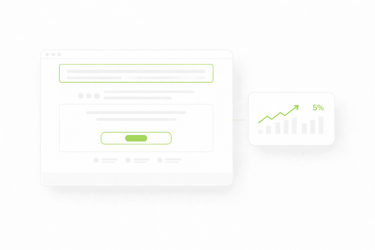
Say your site gets 2,000 visits a month and converts at 1 percent. That gives you 20 conversions.
If you double traffic without improving the page, you get 40 conversions. Sounds good, until you remember that doubling traffic is usually expensive, slow, or both.
Now take the same 2,000 visits and move the site from 1 percent to 2 percent. That also gives you 40 conversions. Except now you did it without needing twice the acquisition effort.
And if your cost per click is not cheap, the difference gets ugly fast.
This is why “improve the page first” is not conservative advice. It is often the smarter commercial move.
Where conversion rate usually leaks
Most websites do not underperform because of one catastrophic mistake. They underperform because a few predictable issues quietly stack together.
The first screen is vague.
The proof comes too late.
The CTA feels too committal.
The form asks for too much.
The page looks fine on desktop and feels annoying on mobile.
The structure buries the strongest selling points.
The copy sounds polished, but not specific enough to create conviction.
None of those problems are dramatic on their own. Together, they are expensive.
If you want the full breakdown of why landing pages stall, this connects directly: Why Your Landing Page Doesn’t Convert
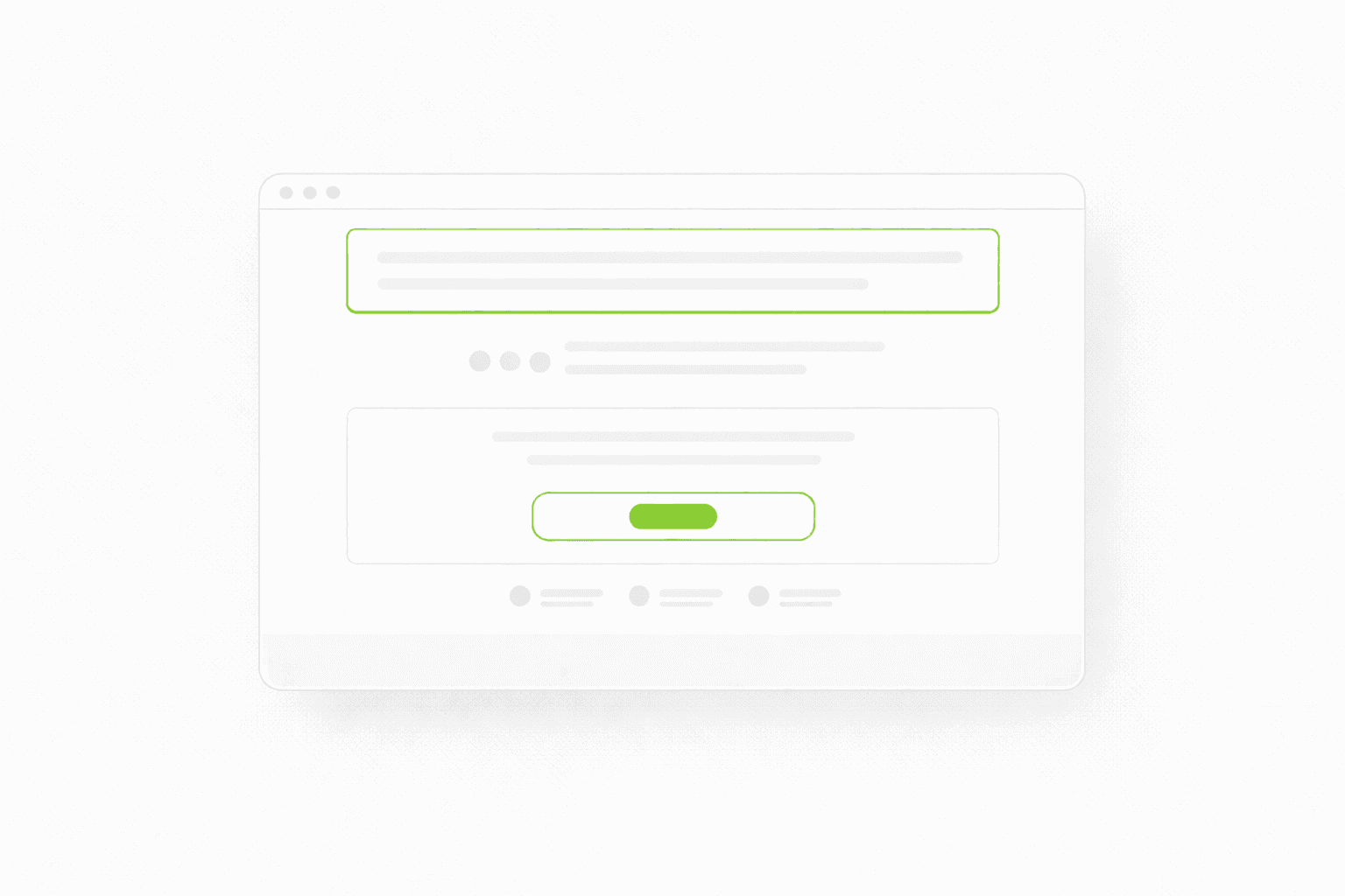
1) Fix the first screen before you touch anything else
A lot of teams try to improve conversion from the middle of the page down.
That is backwards.
The first screen does most of the filtering. If the visitor does not understand what you do, who it is for, and why it matters, the rest of the page barely gets a chance.
You do not need genius copy here. You need clarity.
A stronger first screen usually does four things:
states the outcome
makes the audience visible
hints at the mechanism
reduces risk with some early proof
This is why homepage messaging is not just “brand tone”. It is conversion infrastructure.
For a cleaner framework on that exact part, read this: Homepage Messaging That Converts
2) Move proof earlier than feels comfortable
A lot of websites ask for trust way too early and provide proof way too late.
The page opens with a promise, then another promise, then a block about the team, then some features, and only later, after enough scrolling to lose momentum, the actual evidence appears.
That sequencing kills momentum.
The stronger the claim, the earlier the proof should show up. Even one concrete proof element can do a lot of work:
a short testimonial with a specific outcome
a logo row
a result snapshot
a before/after section
a case-study link placed exactly where the argument needs support
3) Reduce friction in the next step
This is where a lot of sites quietly lose people who were actually interested.
The CTA itself is often not the problem. The problem is what the CTA implies.
If the page still feels cold and the next step feels like a commitment, people pause. And when people pause online, they usually disappear.
A practical way to think about it:
The level of commitment should match the level of trust on the page.
This affects:
CTA wording
number of form fields
what you ask for up front
how clearly you explain what happens next
You do not need to make every next step ultra-soft. You do need to stop making cold visitors feel like they are entering a contract.
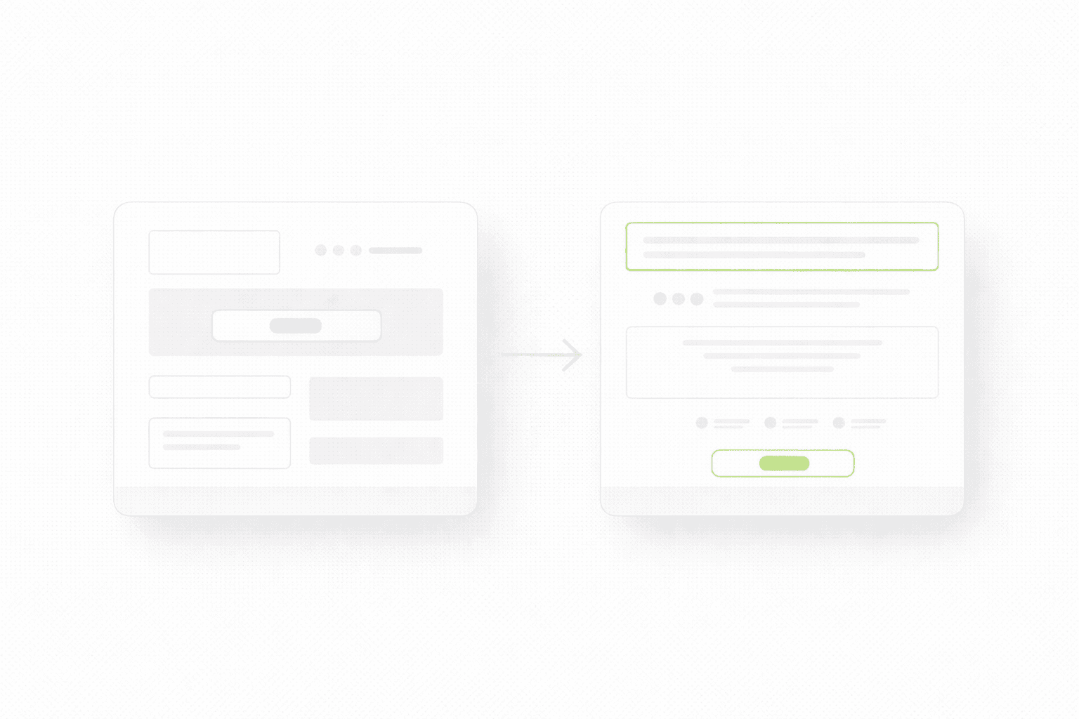
4) Reorder the page before you rewrite the whole thing
A lot of low-converting pages do not need a full rewrite. They need better order.
The strongest proof is buried.
The clearest explanation sits halfway down the page.
The CTA appears too early or too late.
The most persuasive section is separated from the claim it should support.
That is not really a writing problem. It is sequencing.
This is also why some teams waste months talking about redesign when the faster win is simply restructuring the key page. If you are stuck between those two paths, this will help: Landing Page vs Website Redesign
5) Review mobile like it is the main version, not the secondary one
This is still underestimated.
A page can feel “basically fine” on desktop and still bleed conversions on mobile because:
the first screen gets visually crowded
the CTA drops too low
sections feel denser than they looked in the mockup
forms become annoying
media slows everything down just enough to matter
If a large share of your traffic is mobile, then your mobile version is not a responsive variant. It is the real site.
That shift in mindset alone usually changes what teams prioritise.
6) Stop treating redesign as the default answer
Sometimes the site does need deeper work. A stronger structure, cleaner system, better copy, better visual hierarchy, better page architecture.
But a lot of teams jump to redesign because “something feels off”, when the real issue is much narrower:
weak headline
buried proof
clumsy next step
page trying to talk to too many people at once
A redesign can fix those things, but it is not the only way. Sometimes a focused rebuild of the key pages gets you most of the lift without the cost and drag of a full restart.
If you want the practical version of that decision, start here: Website Redesign Checklist
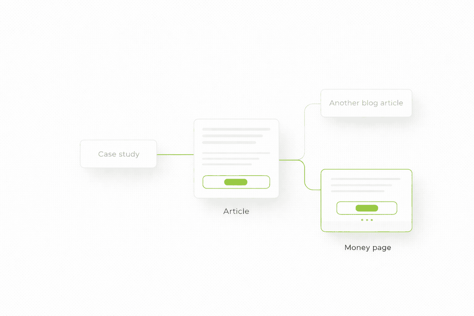
7) Use projects as proof, not decoration
This is where blog, SEO, and business goals actually align.
A lot of agencies treat portfolio pages as isolated showcase pieces. That is lazy. If a project proves the point your article is making, it should be woven into the article at the exact moment the reader needs evidence.
So yes, do it. Just do it with discipline.
What usually moves results first
If you want the short version, the highest-leverage order is usually this:
First, make the first screen clearer.
Then, move proof earlier.
Then, reduce friction in the next step.
Then, clean up mobile.
Then, decide whether the page needs restructuring or a broader rebuild.
Most teams waste time because they start from the bottom of that stack.
If you want a clean fix list for your site
If you want to know where your page is leaking conversions, what to change first, and whether the problem is a page issue or a broader site issue, start here.
More traffic is usually the first answer people reach for. It is also often the most expensive one. If your site is already getting visits, the faster win is usually improving what happens after the click.
More traffic sounds exciting. Better conversion usually makes more money.
This is one of those boring truths people keep trying to skip.
When results are weak, the first instinct is usually to push harder on acquisition. More ads. More content. More channels. More spend. More outreach. More top-of-funnel activity.
Sometimes that is the right move. A lot of the time it is not.
If your website is already getting traffic, even modest traffic, the bigger opportunity is often hidden in what happens after the click. Not because conversion work is glamorous, but because it is multiplicative. If the same traffic starts producing more qualified leads, more booked calls, more signups, or more checkouts, you do not just get “a nicer site”. You get better economics.
That is why conversion work is so often the cheaper lever.
If you want the broader diagnostic layer behind that, start here: Website Audit Checklist
The math is usually more brutal than people expect
Let’s make this simple.
Say your site gets 2,000 visits a month and converts at 1 percent. That gives you 20 conversions.
If you double traffic without improving the page, you get 40 conversions. Sounds good, until you remember that doubling traffic is usually expensive, slow, or both.
Now take the same 2,000 visits and move the site from 1 percent to 2 percent. That also gives you 40 conversions. Except now you did it without needing twice the acquisition effort.
And if your cost per click is not cheap, the difference gets ugly fast.
This is why “improve the page first” is not conservative advice. It is often the smarter commercial move.
Where conversion rate usually leaks
Most websites do not underperform because of one catastrophic mistake. They underperform because a few predictable issues quietly stack together.
The first screen is vague.
The proof comes too late.
The CTA feels too committal.
The form asks for too much.
The page looks fine on desktop and feels annoying on mobile.
The structure buries the strongest selling points.
The copy sounds polished, but not specific enough to create conviction.
None of those problems are dramatic on their own. Together, they are expensive.
If you want the full breakdown of why landing pages stall, this connects directly: Why Your Landing Page Doesn’t Convert
1) Fix the first screen before you touch anything else
A lot of teams try to improve conversion from the middle of the page down.
That is backwards.
The first screen does most of the filtering. If the visitor does not understand what you do, who it is for, and why it matters, the rest of the page barely gets a chance.
You do not need genius copy here. You need clarity.
A stronger first screen usually does four things:
states the outcome
makes the audience visible
hints at the mechanism
reduces risk with some early proof
This is why homepage messaging is not just “brand tone”. It is conversion infrastructure.
For a cleaner framework on that exact part, read this: Homepage Messaging That Converts
2) Move proof earlier than feels comfortable
A lot of websites ask for trust way too early and provide proof way too late.
The page opens with a promise, then another promise, then a block about the team, then some features, and only later, after enough scrolling to lose momentum, the actual evidence appears.
That sequencing kills momentum.
The stronger the claim, the earlier the proof should show up. Even one concrete proof element can do a lot of work:
a short testimonial with a specific outcome
a logo row
a result snapshot
a before/after section
a case-study link placed exactly where the argument needs support
3) Reduce friction in the next step
This is where a lot of sites quietly lose people who were actually interested.
The CTA itself is often not the problem. The problem is what the CTA implies.
If the page still feels cold and the next step feels like a commitment, people pause. And when people pause online, they usually disappear.
A practical way to think about it:
The level of commitment should match the level of trust on the page.
This affects:
CTA wording
number of form fields
what you ask for up front
how clearly you explain what happens next
You do not need to make every next step ultra-soft. You do need to stop making cold visitors feel like they are entering a contract.
4) Reorder the page before you rewrite the whole thing
A lot of low-converting pages do not need a full rewrite. They need better order.
The strongest proof is buried.
The clearest explanation sits halfway down the page.
The CTA appears too early or too late.
The most persuasive section is separated from the claim it should support.
That is not really a writing problem. It is sequencing.
This is also why some teams waste months talking about redesign when the faster win is simply restructuring the key page. If you are stuck between those two paths, this will help: Landing Page vs Website Redesign
5) Review mobile like it is the main version, not the secondary one
This is still underestimated.
A page can feel “basically fine” on desktop and still bleed conversions on mobile because:
the first screen gets visually crowded
the CTA drops too low
sections feel denser than they looked in the mockup
forms become annoying
media slows everything down just enough to matter
If a large share of your traffic is mobile, then your mobile version is not a responsive variant. It is the real site.
That shift in mindset alone usually changes what teams prioritise.
6) Stop treating redesign as the default answer
Sometimes the site does need deeper work. A stronger structure, cleaner system, better copy, better visual hierarchy, better page architecture.
But a lot of teams jump to redesign because “something feels off”, when the real issue is much narrower:
weak headline
buried proof
clumsy next step
page trying to talk to too many people at once
A redesign can fix those things, but it is not the only way. Sometimes a focused rebuild of the key pages gets you most of the lift without the cost and drag of a full restart.
If you want the practical version of that decision, start here: Website Redesign Checklist
7) Use projects as proof, not decoration
This is where blog, SEO, and business goals actually align.
A lot of agencies treat portfolio pages as isolated showcase pieces. That is lazy. If a project proves the point your article is making, it should be woven into the article at the exact moment the reader needs evidence.
So yes, do it. Just do it with discipline.
What usually moves results first
If you want the short version, the highest-leverage order is usually this:
First, make the first screen clearer.
Then, move proof earlier.
Then, reduce friction in the next step.
Then, clean up mobile.
Then, decide whether the page needs restructuring or a broader rebuild.
Most teams waste time because they start from the bottom of that stack.
If you want a clean fix list for your site
If you want to know where your page is leaking conversions, what to change first, and whether the problem is a page issue or a broader site issue, start here.
See more articles
Browse the archive for teardowns, checklists and playbooks you can copy straight into your next build.