Website Redesign Process: What Actually Happens (And What Separates Good Rebuilds from Wasted Ones)

@nadolconverts
Kacper Nadol

Most companies treat a website redesign as a design project with a beginning, middle, and end. The companies that get real results from a redesign treat it as a commercial project with strategic work upfront, deliberate sequencing, and a process that is structured to produce conversion, not just a refreshed appearance. This article walks through what that process actually looks like.
Why Most Redesign Processes Produce Mediocre Results
Most website redesigns follow a predictable sequence. The team decides the current site needs to be replaced. They brief an agency or assemble internal resources. The designer produces mockups. Stakeholders review and request changes. The developer builds. The copy gets filled in toward the end. The site launches.
This process produces websites. It rarely produces websites that perform meaningfully better than what they replaced.
The reason is that the steps that determine commercial performance — understanding the buyer, defining the conversion goals, structuring the argument, deciding what the site needs to communicate and in what order — either do not happen or happen too late in the process to actually shape the outcome. By the time the design is approved and the build is underway, the structural decisions have already been made implicitly, often by whoever produced the first set of mockups based on aesthetic preferences rather than commercial logic.
The companies that get strong results from a redesign do not have access to better designers or developers. They follow a different process — one where the commercial thinking happens first and the design and build follow from it rather than precede it.
Phase One: Diagnosis Before Solution
The first phase of a redesign that actually works is diagnostic, not creative. Before deciding what the new site should be, you need to understand what is wrong with the current one and why.
This phase is the single most commonly skipped step in website redesign, and the one whose absence does the most damage. Teams default to "the current site looks dated" or "the current site is not generating leads" without going deeper. The result is a rebuild that addresses symptoms rather than root causes, often shipping the same fundamental problems in a more polished visual package.
A real diagnostic phase asks several specific questions and produces specific answers.
What is the current site failing at, precisely? Lead volume, lead quality, conversion rate, brand perception, support for sales conversations, ability to scale traffic, ability to be updated by the team? Each of these is a different problem with a different solution.
Where in the current site is the failure happening? At the hero level, where visitors leave immediately? Mid-page, where the argument is not building? At the CTA, where qualified visitors do not commit? Different drop-off points indicate different problems and require different interventions.
What is working on the current site? This question gets skipped almost universally and matters significantly. There are usually elements of the current site that perform well and should be preserved or built upon rather than discarded in the name of a fresh start.
What is the actual buyer experience right now? Not the team's perception of it. The visitor's experience as evidenced by analytics, recorded sessions, sales call notes, and customer feedback. The gap between what the team thinks the site is doing and what it is actually doing is usually larger than expected.
This phase takes one to three weeks done seriously. It is the foundation for everything that follows. Skip it and the rest of the process is essentially guessing at scale. The full framework for diagnosing a site that is not performing is here: Website Not Converting? Here's How to Find Out What's Actually Wrong
Phase Two: Strategy Before Design
The second phase translates the diagnosis into commercial direction. What does the new site need to accomplish? Who is it for? What does it need to communicate, and in what order? What proof, what objection handling, what conversion paths?
This phase is also commonly skipped or compressed into a single meeting before design begins. The compression is expensive. The strategic decisions made hastily here determine everything the design and build will execute against. Hasty strategy produces hasty execution that looks polished but performs poorly.
A real strategy phase produces concrete artifacts. Not a brand guideline document or a moodboard. Decisions about who the primary buyer is in specific terms. The single conversion goal each page is built around. The argument the site is making, written in plain prose before any copy gets polished. The proof available and where it will be placed. The objections that need to be handled and how. The structural decisions about how the site is organized to support all of this.
These artifacts are the brief for everything that follows. They are not aesthetic. They are commercial. The designer reads them and understands what hierarchy to create, what visual emphasis to apply, what sections to build around. The copywriter reads them and understands what argument to make, what tone to use, what objections to address. The developer reads them and understands what functionality the site actually requires versus what would be nice to have.
Without these artifacts, every subsequent decision gets made by whoever has the strongest opinion in the moment, based on whatever instinct they bring to that decision. With them, decisions get made against a shared standard, and disagreements get resolved by referring back to the strategic foundation rather than by power dynamics or aesthetic preference. The full framework for assembling these inputs is here: How to Write a Landing Page Brief That Actually Gets You a Converting Page
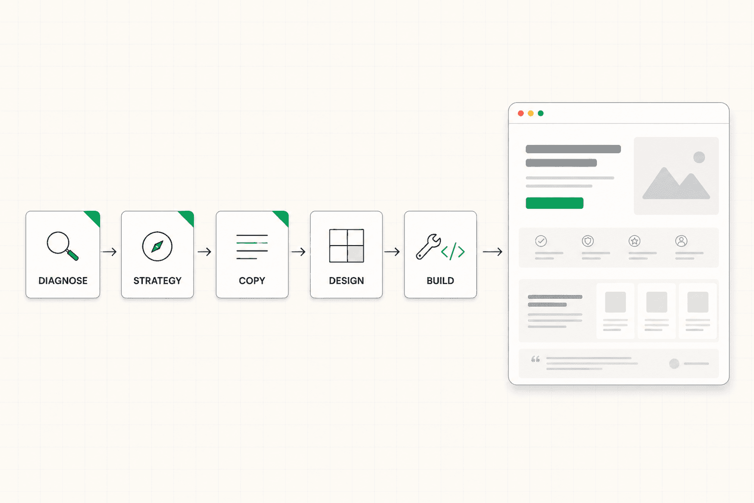
Phase Three: Copy Before Design
This is the phase order that almost no one follows and that almost everyone needs to.
The default sequence is design first, copy second. The designer produces layouts. The copywriter fills in the boxes. The result is copy that has been forced into a structure that was decided before the words were known, which means the structure is almost always wrong for what the copy actually needs to do.
The better sequence is copy first, design second. The copy establishes what the site is saying, in what order, and with what emphasis. The design then creates a visual presentation that supports the specific argument the copy is making.
Writing the copy first does not mean writing finished copy. It means writing the argument in plain prose, then drafting the actual sentences for each section, then revising those sentences until they do specific conversion work. The output is messy and unstyled. It is also the foundation for design that actually serves the message rather than the other way around.
This sequence also catches problems earlier. If the argument is weak when written in plain prose, no amount of beautiful design will hide it. The team can revise the strategy before the design budget gets committed. If the design comes first, the same weak argument gets polished into a beautifully presented version of itself that still fails to convert, and the team only discovers the problem after launch.
For most B2B and SaaS rebuilds, this phase takes three to six weeks depending on the scope and how much of the underlying strategic work has been done. The output is a complete set of copy for every page, in the order it will appear, with the argument fully built before any pixels get placed. The full framework for the writing process itself is here: How to Write a Landing Page: The Process That Actually Produces a Converting Page
Phase Four: Design as Argument Made Visual
With the strategy and copy established, the design phase becomes a smaller and more focused task. The designer is no longer making structural decisions about what the page should contain. They are creating the visual hierarchy that supports the specific argument the copy is making.
This shift changes everything about how design feedback works. Reviews are no longer about taste — "I prefer this color" or "this feels more modern." They are about function — "does this hierarchy support what the copy is trying to do, and if not, what specifically would serve it better?"
The design decisions that matter most in this phase are not the ones teams typically spend time on. The color palette and typography are usually settled in the first round. The decisions that take work are the ones about visual weight, where the eye lands first, what gets emphasized and what gets de-emphasized, how the proof is integrated rather than separated, how the mobile experience holds the same hierarchy at a different screen size.
A common failure in this phase is over-designing. Animations that delay the headline becoming visible. Decorative elements that compete with the message. Visual treatments that look impressive but slow the reader down or distract from the conversion path. The discipline is to ask, for every visual decision, whether it is making the argument easier to follow or harder. If the honest answer is harder, the decision needs to be revised, regardless of how visually striking the result is.
Phase Five: Build with Performance and Maintainability Built In
The build phase is the most operationally sensitive part of the process and the one whose long-term implications get the least attention during decision-making.
How the site is built determines page speed, mobile experience, SEO performance, and the team's ability to update the site without a developer after launch. A site built on the wrong platform or with the wrong technical approach can be functionally identical to a well-built site for the first few months and then become a significant operational drag as the business needs evolve and the site cannot keep up.
For most B2B and SaaS sites today, a properly built Framer or Webflow site offers a strong balance — fast load times, good mobile experience, easy updates by non-developers, and the ability to scale into more complex functionality if needed. Custom-coded sites still have their place for genuinely complex requirements, but the default assumption that "real" sites need to be custom-built has not aged well. Most companies that go custom for reasons of perceived sophistication end up with sites that are slower to update, more expensive to maintain, and not measurably better than what they would have gotten on a modern no-code platform.
The build phase also includes the integrations, tracking, and operational tooling that the site will rely on after launch. Analytics setup, CRM integration, form routing, tag management, performance monitoring. These get treated as afterthoughts and then become emergency tickets in the first weeks after launch. Building them properly during the build phase saves significant friction later. The case for thinking through tooling and platform choice before committing to a rebuild is here: Framer Landing Pages: When It's a Great Choice (and When It's Not)
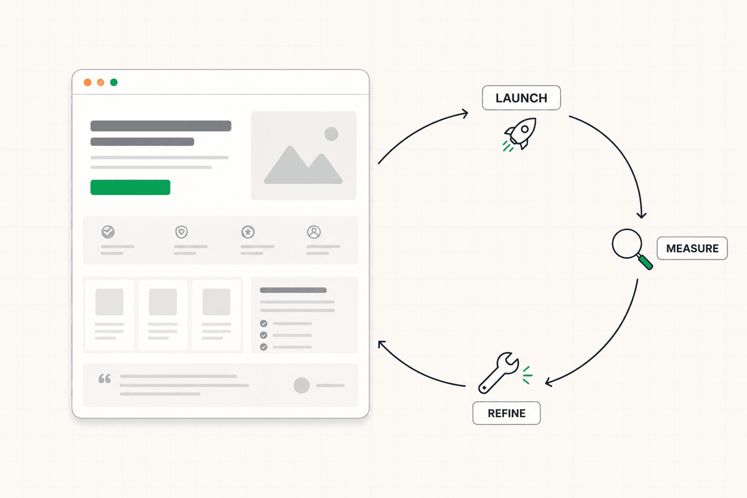
Phase Six: Launch as a Starting Point, Not a Finish Line
Most redesign processes treat launch as the end. The site goes live, the team celebrates, the agency invoices the final milestone, and everyone moves on.
The teams that get the most out of a redesign treat launch differently. They have a post-launch monitoring plan. They expect the first iteration of the site to be imperfect and plan to refine it based on real performance data over the following weeks and months. They track the metrics that matter — conversion rate, lead quality, sales pipeline impact — and use them to identify what the new site is actually doing and where it is still leaving conversions on the table.
This phase is where many redesigns leak value. A site that launches and then sits unchanged for two years is a snapshot of strategic thinking at a single moment, slowly drifting out of alignment with the business as the product evolves, the buyer changes, and the competitive context shifts. The sites that keep performing are the ones treated as living assets that get refined, not finished projects that get abandoned.
A practical version of this phase looks like a structured review thirty, sixty, and ninety days after launch. What is the new site actually doing? Where is it underperforming expectations? What sections need refinement based on real visitor behavior rather than pre-launch assumptions? Are the qualitative signals from sales and customer interactions confirming or contradicting the strategic assumptions the site was built on?
The teams that build this phase into the process get more out of every redesign than teams that treat launch as the end.
What Separates Strong Redesigns from Wasted Ones
After many redesigns it becomes clear that the difference between rebuilds that produce real commercial results and rebuilds that produce expensive refreshes comes down to a few specific things.
Strong redesigns start with diagnosis. The team knows specifically what is wrong with the current site before deciding what the new one should be. Wasted redesigns start with frustration. The team knows the current site is not working and goes straight to "let's redesign it" without identifying the actual cause.
Strong redesigns invest in strategy before design. The decisions about who the site is for, what it needs to communicate, and how it is structured are made deliberately before any pixels get placed. Wasted redesigns let those decisions get made implicitly through design iteration, which means they get made based on aesthetic preference rather than commercial logic.
Strong redesigns put copy before design. The argument is written out, refined, and made specific before the visual treatment is decided. Wasted redesigns ask the copywriter to fill in boxes that the designer already drew, which forces the message into a structure that may not serve it.
Strong redesigns treat launch as a starting point. The team plans for refinement after the site goes live based on real performance data. Wasted redesigns treat launch as completion and the site drifts out of alignment with the business over the following years.
The cost difference between a strong redesign and a wasted one is rarely in the budget. It is in the process. The same money spent on the same agency with the same designers can produce a site that transforms the business or a site that looks better and performs the same, depending entirely on whether the strategic work happens upstream or gets skipped.
Before You Start a Redesign
If you are about to start a website redesign, the highest-leverage thing you can do before any agency conversation is build a clear picture of what is actually broken about the current site and what the new one needs to accomplish commercially.
That clarity changes every conversation that follows. It allows you to evaluate proposals against a specific standard rather than a vague brief. It tells you quickly whether the agency you are talking to is responding to your actual problem or proposing their standard solution to a generic version of it. And it often surfaces that some of what looks like it needs a rebuild is actually fixable within the existing site at a fraction of the cost.
A structured audit produces that clarity faster than internal debate. See how the 48h Audit works
The Short Version
A website redesign that produces real commercial results follows a specific process. Diagnose what is wrong with the current site first. Translate that diagnosis into strategic direction. Write the copy before the design. Design the visual presentation around the argument the copy is making. Build with performance and maintainability in mind. Treat launch as the start of refinement, not the end of the project.
Most redesigns skip the first two phases, compress the third, and treat the last one as optional. The result is sites that look refreshed and perform similarly to what they replaced.
The companies that get the most out of a redesign are not the ones with the biggest budgets. They are the ones whose process puts the strategic work first.
Keep reading