Contact Page: How to Build One That Doesn't Quietly Kill Leads

@nadolconverts
Kacper Nadol

The contact page handles the highest-intent visitor on your entire site, someone who has already decided they want to talk to you, and most companies build it in ten minutes and never think about it again. This article covers what actually costs you leads there and how to fix it.
The Page That Gets No Attention and the Most Ready Visitor
Every other page on a website has to work to earn a conversion. The homepage has to establish relevance. The landing page has to build an entire argument. The pricing page has to justify the cost. The contact page does not have to persuade anyone of anything, because by the time a visitor reaches it, they have already decided they want to talk to you.
This is exactly what makes it strange that the contact page is so often the least considered page on the entire site. It gets built quickly, sometimes generated automatically by whatever platform the site runs on, with a generic heading, a form, and whatever fields felt reasonable at the time. Nobody debates the wording. Nobody tests it. It is treated as plumbing rather than as the final, highest-stakes moment in the entire funnel.
But a visitor who reaches the contact page is the most valuable visitor you have. They read the homepage, or the landing page, or the service page, and they were convinced enough to click through to this specific destination. Losing them here, after everything else on the site already did its job, is one of the most expensive and most avoidable kinds of loss available.
The Cost of a Generic Form Is Higher Than It Looks
The default contact page is a heading that says "Contact Us," a form with name, email, and message, and a submit button. It works, in the sense that it technically allows someone to send a message. It does almost nothing else.
The problem is that a bare form gives the visitor no reassurance about what happens after they click submit. Will someone respond today? This week? Is this the right way to reach you, or should they have called instead? Is there a faster path if they are ready to move quickly? A visitor who has already decided to reach out still has real uncertainty about the process they are entering, and a page that leaves that uncertainty unaddressed introduces hesitation at the exact moment it should be removing it.
This matters more than it seems like it should, because the visitor at this point has nothing left to lose by leaving. They were not persuaded by anything on this specific page, since there is usually nothing here to persuade them with. If the last impression is a form with no context and no clarity, a meaningful share of otherwise-ready visitors will hesitate, decide to think about it, and never come back. The way unresolved uncertainty costs conversions at the final step applies here too: Why Your Landing Page Doesn't Convert: 9 Real Reasons (And What to Fix First)
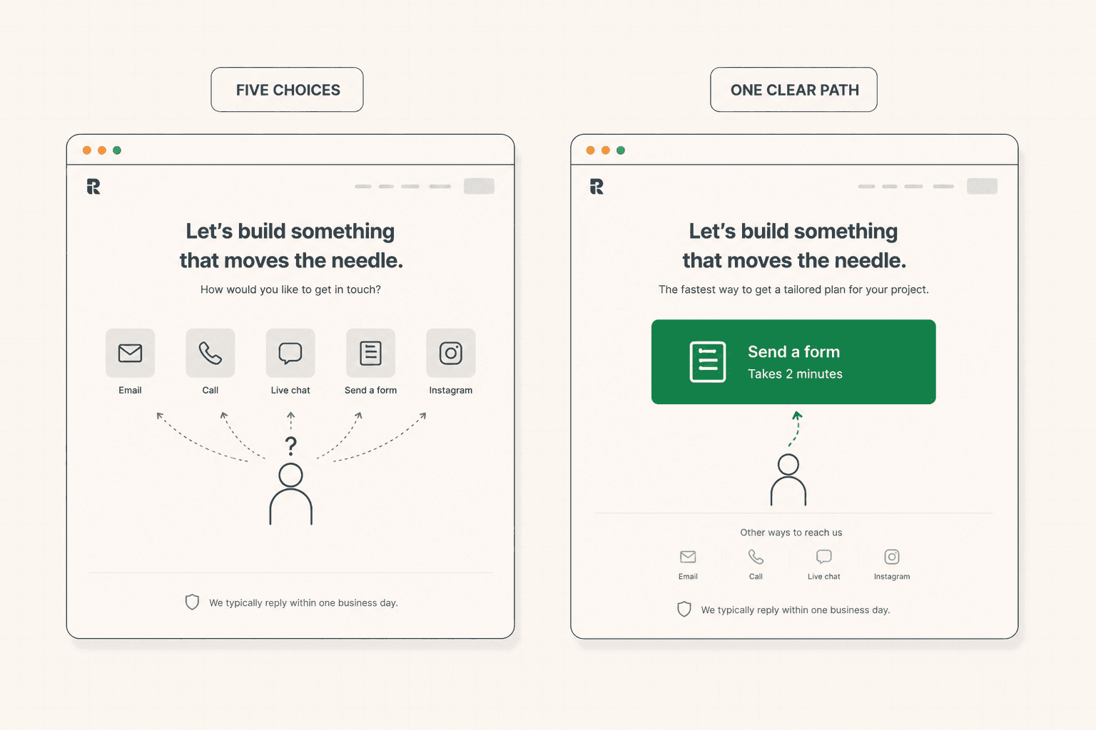
Give Them One Clear Path, Not Five
A common mistake on contact pages, especially for established businesses, is listing every possible way to get in touch at once. A form. An email address. A phone number. A live chat widget. Social media links. Each option is reasonable on its own, and together they create a decision the visitor did not come here to make.
A visitor who reaches the contact page already committed to reaching out now has to figure out which of five channels is actually the right one. Is the form faster or slower than email? Does the phone number go to a real person or a queue? Is chat only for support, or can they ask about pricing there too? Each unanswered question adds friction at the exact moment friction should be at its lowest, since the visitor has already done the hard part of deciding to act.
The fix is hierarchy. Pick one primary path, ideally the one that gets the visitor to an actual conversation fastest, and make it the obvious, dominant choice on the page. Other channels can still exist for the people who genuinely prefer them, but they should sit as secondary options rather than compete equally for attention. A page with one clear, confident path converts better than a page offering five choices with no guidance about which one to take.
Skip the Black Hole Whenever You Can
"We'll get back to you soon" is one of the more quietly damaging phrases on a contact page, because it asks the visitor to trust a process they cannot see and gives them no way to know if it worked.
The visitor who submits a contact form has no confirmation that anyone will actually respond, no sense of how long it might take, and no way to know whether their message landed correctly or vanished into an inbox nobody checks. For a visitor who was ready to move quickly, this uncertainty is a real cost, and some of them will simply look elsewhere rather than wait indefinitely for a reply that may or may not come.
Where it is possible, the strongest fix is to skip the black hole entirely and let the visitor book directly onto a calendar, seeing available times and locking one in themselves rather than submitting a request and waiting. This closes the gap between deciding to reach out and having an actual conversation scheduled, which is exactly the gap where momentum quietly dies. Where a direct booking option genuinely does not fit the business, the next best thing is being specific about what happens next: a stated response time, a confirmation that the message was received, and clarity about who they will hear from. The full framework for closing this exact gap on a booking-focused page is here: Demo Request Page: How to Get More Qualified Demos Booked (Not Just More Clicks)
Ask for What You Need, Nothing More
The form itself deserves the same discipline that applies to any lead capture form, and the contact page is a place where it is especially tempting to ask for too much, since the visitor is already committed and the form feels like a natural place to gather extra information.
Every additional field is still a small cost, even for a highly motivated visitor. Fields that genuinely help route the inquiry to the right person or prepare for the conversation are worth including. Fields that exist because they might be useful someday, or because someone thought it would be nice to know, are not. The same rule applies here as anywhere else: each field should earn its place by serving either the response or the qualification, and anything that does not should be cut. The full framework for form design is here: Lead Capture Form: How to Build One That Converts (And Qualifies)
For businesses that receive a wide range of inquiries, from small quick questions to serious opportunities, a short qualification question, framed naturally, can help route the message appropriately without adding meaningful friction. But this is a targeted addition to a short form, not a justification for a long one.
The Contact Page Is Still a Trust Moment
It is easy to assume that by the time someone reaches the contact page, trust has already been established elsewhere on the site, and the contact page's only job is mechanical. This is only partly true. Some visitors arrive at the contact page directly, from a search result, a referral, or a bookmark, without having read anything else on the site first, and for them the contact page is doing the trust-building work that would normally happen earlier in the journey.
Even a small amount of reassurance helps here. A short line about who they will be talking to, a specific result or two, a brief indication of what kind of businesses you typically work with, all reduce the residual doubt a visitor might still be carrying, even at this late stage. This does not need to be extensive. A contact page is not the place for a full case study. But treating it as entirely neutral territory, assuming all the persuasion already happened, misses the visitors who landed here first. The way proof should be placed relative to where doubt actually forms is covered here: Social Proof: How to Use It So It Actually Converts (Not Just Decorates)
This is a small thing that a surprising number of otherwise well-built sites get wrong, treating the last page in the funnel as if it needed no persuasion at all simply because it comes last. It is one of the patterns worth watching for across a whole site, and it is the kind of detail I end up flagging often in the newsletter when going through a real site page by page.
Mobile Matters Here as Much as Anywhere
A meaningful share of contact page visits happen on mobile, particularly for visitors who found the site through a search on their phone and decided in the moment to reach out. A form that is tedious to complete on a small screen, or a calendar booking widget that does not render cleanly on mobile, costs conversions from exactly the visitors who are motivated enough to act on the spot.
The same principles that apply to any mobile form apply here: appropriately sized fields, the right keyboard type for each input, autofill enabled, and a booking widget, if one exists, that works cleanly without requiring the visitor to zoom or scroll awkwardly. Given that the contact page is often the very last step before a real conversation happens, mobile friction here is an especially expensive place for it to exist. The full framework for mobile-specific friction is here: Mobile Conversion Optimization: Why Most Sites Lose Sales on Phones
How to Audit Your Own Contact Page
Look at your page and count the number of distinct ways it offers to get in touch. If there are more than two or three, decide which one should be the clear primary path and make the others visibly secondary.
Check what happens after someone submits the form. Do they see a specific confirmation, a stated response time, or any indication of what happens next? Or does the page thank them vaguely and leave them to wonder.
If a direct booking option would fit your business and does not currently exist, consider whether adding one would close the gap between a visitor deciding to reach out and an actual conversation happening.
Count the fields on your form and ask whether each one is serving a genuine need for response or qualification, or whether it exists out of habit.
And test the whole experience on a phone, since a meaningful share of the most motivated visitors on this exact page are likely to be there.
If you are not sure whether your contact page is converting the way it should, a structured audit looks at this alongside everything else on the site. See how the 48h Audit works
The Short Version
The contact page handles the most ready visitor on the entire site, someone who already decided to reach out, and it is usually the least considered page on the site as a result.
Give visitors one clear, confident primary path rather than five competing options. Skip the black hole of "we'll get back to you" wherever a direct booking option can replace it, and be specific about what happens next where it cannot. Ask for only what the form genuinely needs. Include a small amount of reassurance for the visitors who land here without having read anything else first. And check the mobile experience specifically, since it often carries the most motivated visitors of all.
None of this requires a redesign. It requires treating the last page in the funnel with the same care as the first one.
Keep reading