Website Navigation: How to Design It So It Doesn't Cost You Conversions

@nadolconverts
Kacper Nadol

Navigation is one of the few elements that appears on every single page of a site, which makes it one of the highest-leverage things you can get wrong. This article covers how navigation quietly costs conversions and what a navigation built for conversion actually looks like.
The One Element That Appears Everywhere
Most of the elements discussed in conversion work live on a single page. A hero belongs to one page. A pricing table belongs to one page. Navigation is different. It sits at the top of every page on the site, which means whatever it does well or poorly, it does on every single visit, to every single visitor, at every single point in their journey through the site.
This makes navigation one of the highest-leverage elements on a website and one of the least examined. Teams spend real time debating hero copy and CTA wording, then build the navigation menu in an afternoon by listing every page the site has and putting them in a row. The navigation gets treated as a solved problem, a piece of standard furniture rather than a conversion decision.
But navigation is doing real work, or real damage, on every page a visitor sees. It is either helping them move toward a decision or constantly offering them a way to wander off before they get there. Most sites have navigation that does the second thing without anyone noticing, because the cost shows up as a slightly lower conversion rate across the whole site rather than as an obvious failure on any single page.
Navigation Is a Menu of Exits
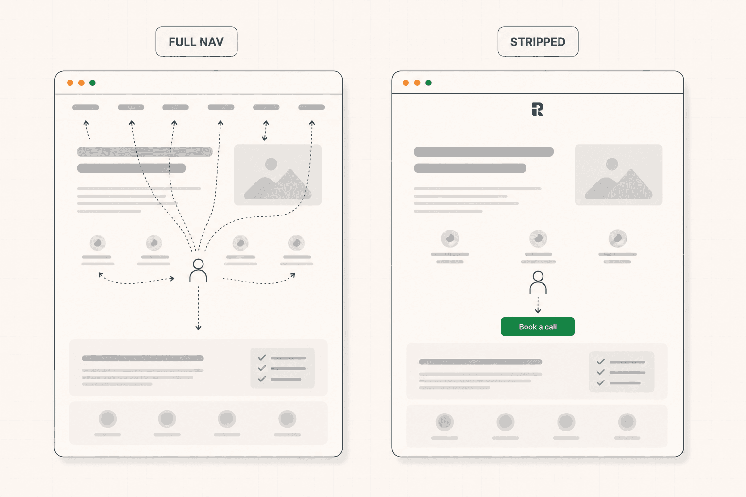
Every item in a navigation bar is an invitation to leave the page the visitor is currently on. This is true even when the destination is another page on the same site, because the visitor was on a specific page for a reason, likely reading an argument that was building toward a specific action, and the navigation offers them a reason to abandon that argument before it finishes.
This is most damaging on high-intent pages. A visitor reading a landing page or a service page is being walked through a specific case, building toward a specific conversion point. A navigation bar sitting at the top of that page with eight menu items is constantly whispering that there are other things to look at, other places to go, other decisions to postpone the current one for. Every scroll upward, every accidental glance at the top of the page, is an opportunity to click away from the argument that was being built.
This does not mean navigation should never exist. It means the cost of navigation, the exits it offers, should be weighed deliberately against what the page is actually trying to accomplish, rather than added by default because every website has one. The way friction compounds at every point in a page is covered here: Why Your Landing Page Doesn't Convert: 9 Real Reasons (And What to Fix First)
Landing Pages Often Need Less Navigation, Not More
For a page whose entire job is to move one specific visitor toward one specific action, a full site navigation bar is usually working against the page's own goal.
A landing page built to drive demo bookings or convert paid traffic is a controlled environment by design. The visitor arrived from an ad or a search result with a specific intent, and the page exists to walk them through a single argument toward a single decision. A navigation bar with links to the homepage, the about page, the blog, and six service pages gives that visitor eight new places to go instead of the one place the page was built to send them.
Many of the highest-converting landing pages deliberately strip navigation down to almost nothing, sometimes just a logo with no clickable links, or a single link back to a broader part of the site for the small number of visitors who genuinely want it. This is not a design trend. It is a direct application of the same principle that governs every other element on a converting page: anything that does not move the visitor toward the goal is a cost, and a full navigation bar is rarely helping a landing page do its one job. The same discipline of cutting anything that does not serve the goal is covered here: Landing Page Checklist: What Actually Needs to Be on the Page (And Why)
The Rest of the Site Still Needs Navigation, Just Deliberately
Stripping navigation makes sense for a focused landing page. It does not make sense for a full marketing site, where visitors genuinely need to move between pages, explore services, and find the information relevant to where they are in their own research. The goal for the rest of the site is not to remove navigation but to build it around how visitors actually think, rather than how the site happens to be organized internally.
The most common navigation mistake on full sites is structuring the menu around the company's internal organization rather than the visitor's mental model. A navigation bar with items named after internal team structures or product line names that only make sense to people inside the company forces every visitor to translate unfamiliar labels before they can even decide where to click. Menu labels should use the language a visitor would actually use to describe what they are looking for, not the language the company uses to describe itself internally.
The second common mistake is too many items competing for attention. A navigation bar with ten or twelve links spreads the visitor's attention across choices most of them will never need, and the sheer number of options creates a small cognitive tax on every single page load. Most sites can serve their actual visitor needs with far fewer top-level items than they currently show, using dropdowns or a secondary structure for anything that is genuinely secondary.
The CTA in the Navigation Deserves Real Thought
For sites where navigation stays, the CTA placed inside it is one of the most consistently visible conversion elements on the entire site, present on every page a visitor loads, and it is often treated as an afterthought.
A generic "Contact" link in the navigation does almost none of the work a specific CTA could do. "Book a call," "Get my audit," or whatever the site's actual primary conversion action is, placed prominently in the navigation, gives every visitor on every page a consistent, visible path to the thing that actually matters commercially, regardless of which page they happen to be reading. Because it appears everywhere, even a small improvement in how compelling that button is compounds across every page view on the site. The full framework for what makes CTA copy actually work is here: Call to Action Examples: What Actually Makes a CTA Convert (Beyond Button Color)
The visual weight of that CTA matters too. A navigation bar where the primary action blends in with the other menu items as just another line of text is wasting the most consistently visible real estate on the site. Giving it real visual distinction, a filled button rather than a text link, a color that stands apart from the rest of the navigation, signals to every visitor on every page that this is the one thing worth noticing among everything else in the menu.
Mobile Navigation Is a Different Problem Entirely
The hamburger menu, a small icon that expands into a full navigation panel, has become the default mobile navigation pattern, and it deserves more scrutiny than it usually gets, because it hides the entire navigation behind an extra tap and an icon whose meaning some visitors still do not immediately recognize.
For sites where navigation matters, exposing the most important one or two destinations directly rather than hiding everything behind the hamburger icon reduces friction for the visitors most likely to want them. For landing pages, the mobile version should follow the same logic as desktop: if the navigation was stripped down on desktop because it competes with the page's single goal, it should stay stripped down on mobile, where every additional tap and every additional decision costs proportionally more given how much smaller and more distracting the mobile context already is. The full framework for mobile-specific friction is here: Mobile Conversion Optimization: Why Most Sites Lose Sales on Phones
A mobile navigation menu that opens to reveal the same ten items as the desktop version, requiring extensive scrolling within an already-small screen, is one of the more common and more overlooked sources of mobile friction on sites that otherwise seem well built.
Sticky Navigation: Useful and Costly at the Same Time
A navigation bar that stays visible as the visitor scrolls, rather than disappearing once they move past the top of the page, has a genuine benefit: it keeps the primary CTA accessible at all times, which matters because a visitor who reaches the end of a compelling section and is ready to act should not have to scroll back to the top to find a way to do so.
But a sticky navigation also means the menu of exits discussed earlier is present at every single scroll position, not just at the top of the page. This is a real tradeoff, not a free win. The way to get the benefit without the full cost is to make the sticky version minimal, often just the logo and the primary CTA, rather than carrying the full navigation menu down through the entire scroll. This preserves the accessibility benefit of a persistent CTA while removing most of the constant exit temptation that a full sticky menu creates.
I keep coming back to this same principle across almost every element on a page: the question is never whether something is useful in isolation, it is whether its cost, measured in what it distracts from, is worth what it adds. That tradeoff-first way of evaluating a page is most of what shows up in the newsletter when I break down a real site.
How to Audit Your Own Navigation
Start by identifying which pages on your site are meant to hold a visitor's attention through a single focused argument, landing pages, service pages, high-intent conversion surfaces, and ask honestly whether a full navigation bar belongs on them or whether it is offering exits from a page built to prevent exactly that.
For the rest of the site, read your navigation labels as a first-time visitor and ask whether they use language you would actually think in, or language that only makes sense to someone who already works at the company.
Count your top-level navigation items. If the number is in double digits, some of them are probably competing for attention they do not need, and a secondary structure or a simple trim would likely serve visitors better than the current spread.
Look at the CTA inside your navigation, if there is one. Is it specific and visually distinct, or is it a generic text link buried among the rest of the menu, wasting the most consistently visible position on the entire site.
And test the mobile version specifically, checking how many taps and how much scrolling stand between a mobile visitor and the thing they actually came to find.
If you are not sure whether your navigation is helping or quietly costing you conversions across the site, a structured audit looks at this alongside everything else the site is doing. See how the 48h Audit works
The Short Version
Navigation appears on every page of a site, which makes it one of the highest-leverage elements available and one of the least examined. Every item in a navigation menu is an invitation to leave the page a visitor is currently on, and on high-intent pages built around a single argument, that invitation works directly against the page's own goal.
Landing pages often convert better with navigation stripped down to almost nothing. The rest of the site needs navigation, but built around how a visitor actually thinks rather than around internal company structure, with a specific and visually distinct CTA rather than a generic link buried in the menu. Mobile navigation deserves the same scrutiny as desktop, and sticky navigation is a genuine tradeoff between accessibility and constant exit temptation, best resolved by keeping the sticky version minimal.
None of this requires a redesign. Most of it is a rethink of an element most sites built once and never questioned again.
Keep reading